Introducing the Filtering Feature!
Nov 3, 2016
We’ve been busy with redesigning our analytics backend and now we’re ready to introduce some filtering capabilities that you have been asking for a while already. With the new filtering feature, you can get answers to questions like:
How long does it take to complete a specific type of task (e.g. bug) on average?
How long do new features stay in the QA step?
What is my team’s velocity during this month vs last month?
What is the velocity or cycle time of a specific user?
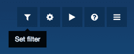
To set a filter for a chart, click the filter icon on the top right corner of your dashboard.
You can filter the chart by label, user, workflow state, or date range. If you're using Jira, you can also filter by issuetype, component, priority or a version. Notice that the available options depend on the type of chart that you're filtering so that each chart come with filtering options relevant to that specific chart.

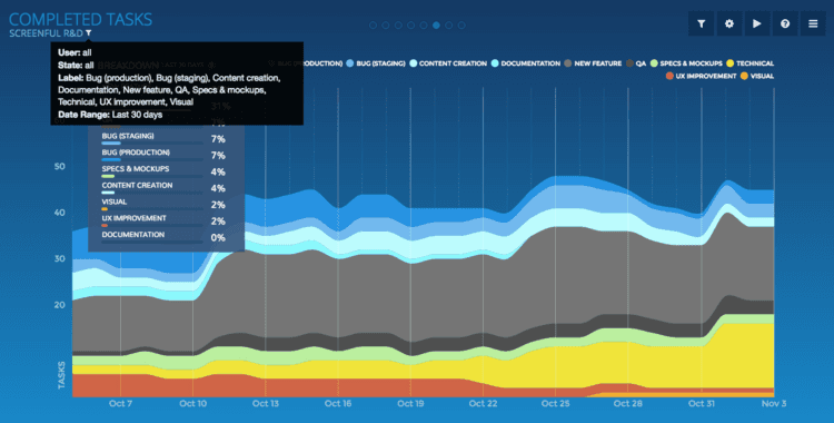
Once you've made your selections, click View to see the filtered chart. You'll notice that a small filter icon has appeared to the top left corner. Moving your mouse pointer over that icon reveals the set filter.
To remove the filter, go back to filtering window and click Reset to default.
You can share a filter with other users by clicking Set as default. That makes the filtered view as the default setting for this chart for all users.
Initially the filtering feature is available in Completed Tasks and Time in State charts. We’ll be expanding the use of this feature throughout your dashboard in the future releases.
Let us know if you have questions or feedback by contacting hello@screenful.com. To stay on the loop, read our blog, or follow us on LinkedIn.