Completed Tasks Screen
The Completed Tasks chart shows you how your work is split across different activities. Each colored area corresponds to a type of activity, such as bug fix or new feature. You can see the distribution of the completed tasks within a time period so that you can see trends and can start eliminating wasteful activities.

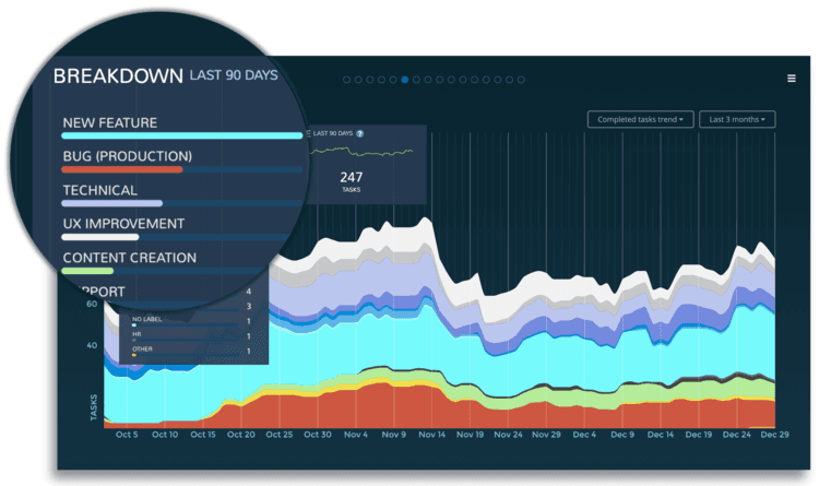
SEE THE DISTRIBUTION OF WORK DONE PER WORK TYPE
The chart overlay shows the number of tasks/points completed during the selected date range. It tells you what type activities are taking most of your time. The key is to label your tasks with meaningful categories so that you know which activities you want to spend more time on, and which ones you would like to eliminate.
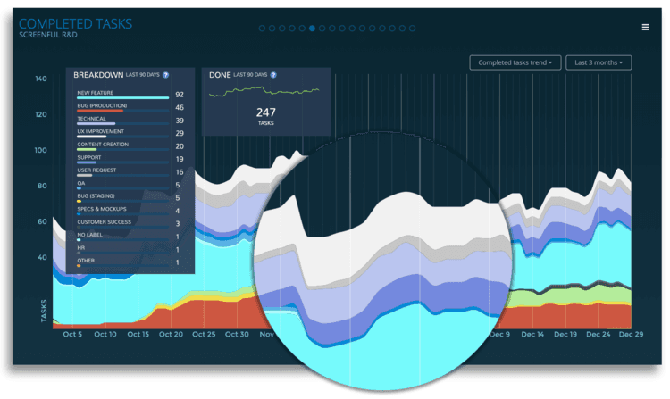
SEE THE TREND OF COMPLETED WORK PER WORK TYPE
The completed tasks trend shows the trend of different activities over time.
Are you spending more time on meaningful activities and less time on doing rework or fixing bugs? Learn how to read the stacked area chart.
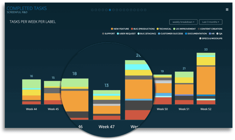
SEE THE WEEKLY, MONTHLY, AND QUARTERLY BREAKDOWN
You can quickly see how many tasks/points have been completed per week, month, or quarter. You can further slice and dice to what types of tasks those were and who they were assigned to.
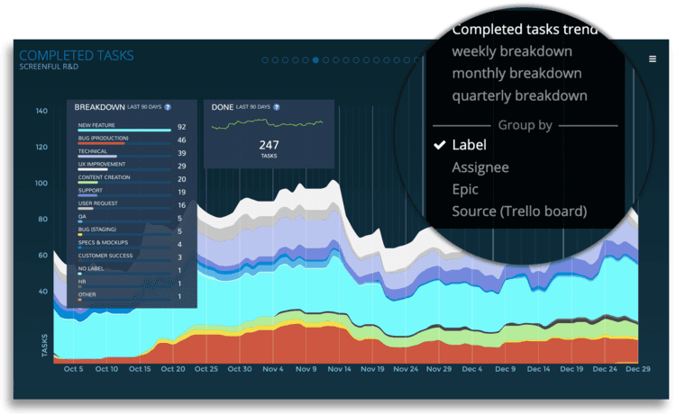
SLICE & DICE PER BOARD, EPIC, LABEL, ASSIGNEE...
Use the quick menu to switch between different reports. Use the group by options to see the number of tasks or points completed per dimension such as label, source or assignee.
Explore and find the exact report you were looking for!