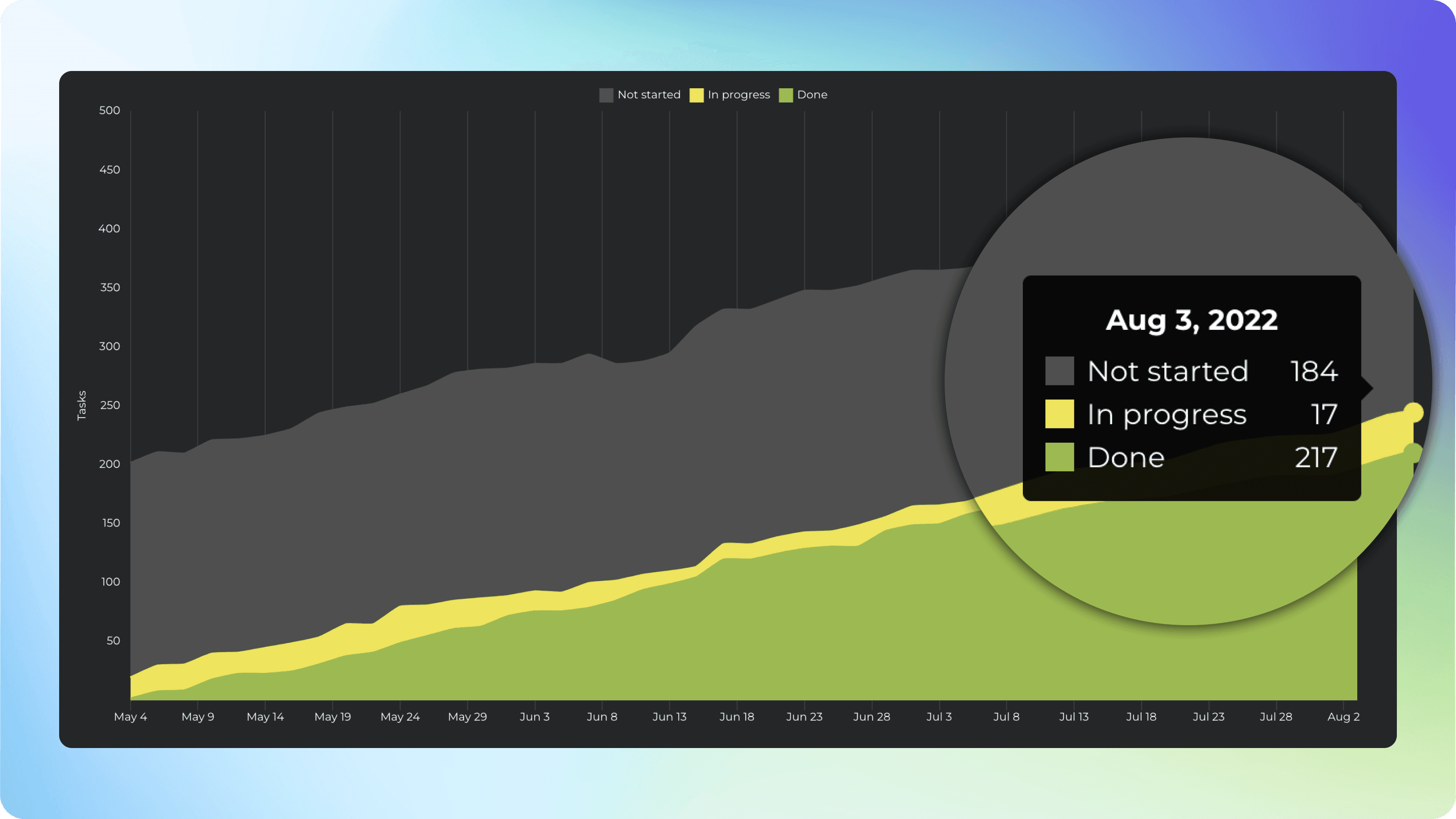
Cumulative flow chart
Cumulative flow diagram shows the amount of work in different stages of your workflow during the lifetime of your project. It allows teams to visualize their effort and project progress, and to see the if work is piling up or causing bottlenecks. It is an essential tool for assessing the health of a Kanban process.
See the breakdown of tasks in different states
The top left overlay shows the number of tasks (or story points) in each workflow step at any given time. These are the tasks that you’ve created for the project.
You can click trough to see the individual tasks.
See the trend of completed work
The chart on the background shows the the amount of work completed vs work still in other states. The green colour shows the number of tasks completed over time.
An upward trend indicates progress towards the goal, flat trend indicates stalled progress.
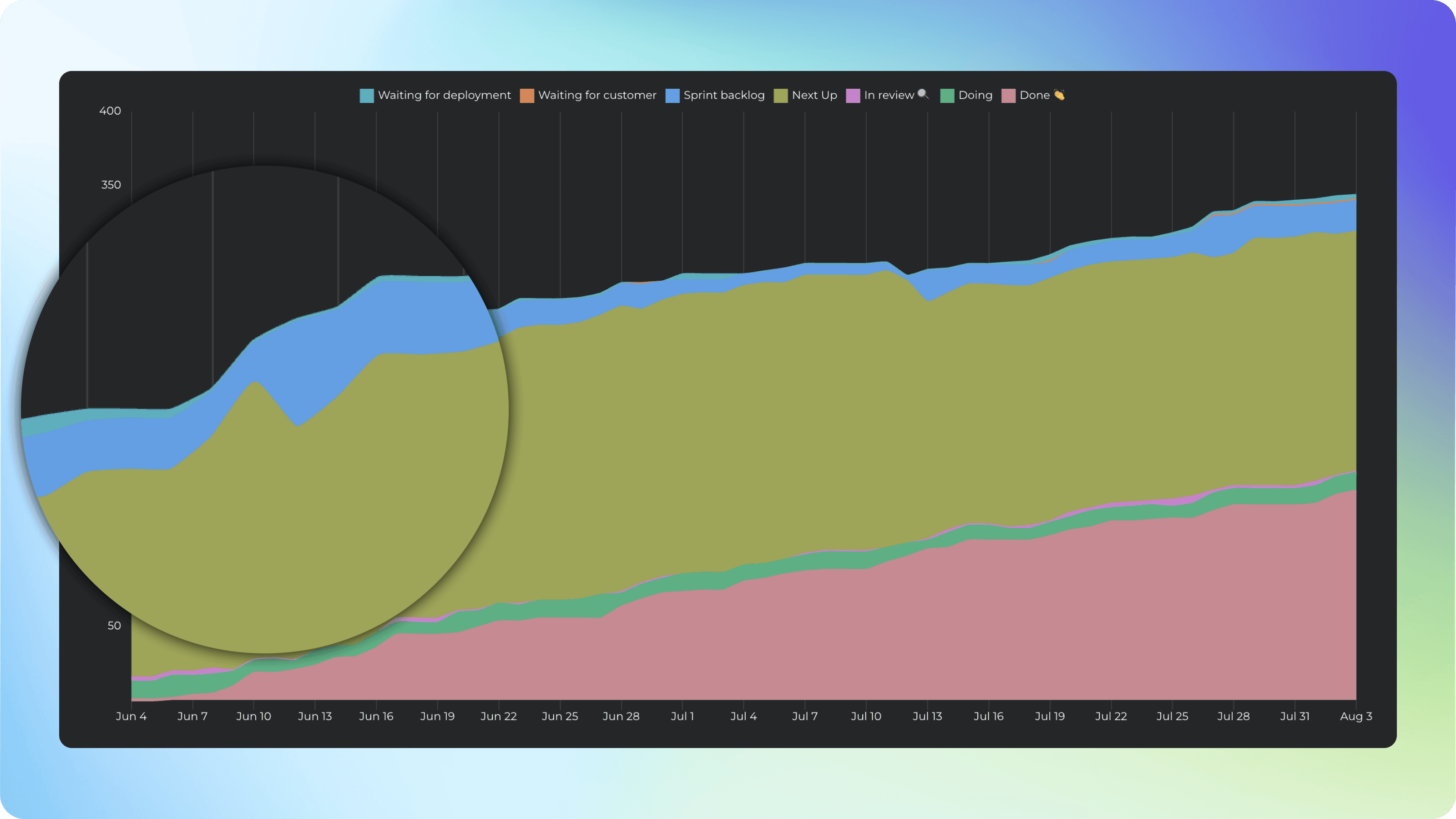
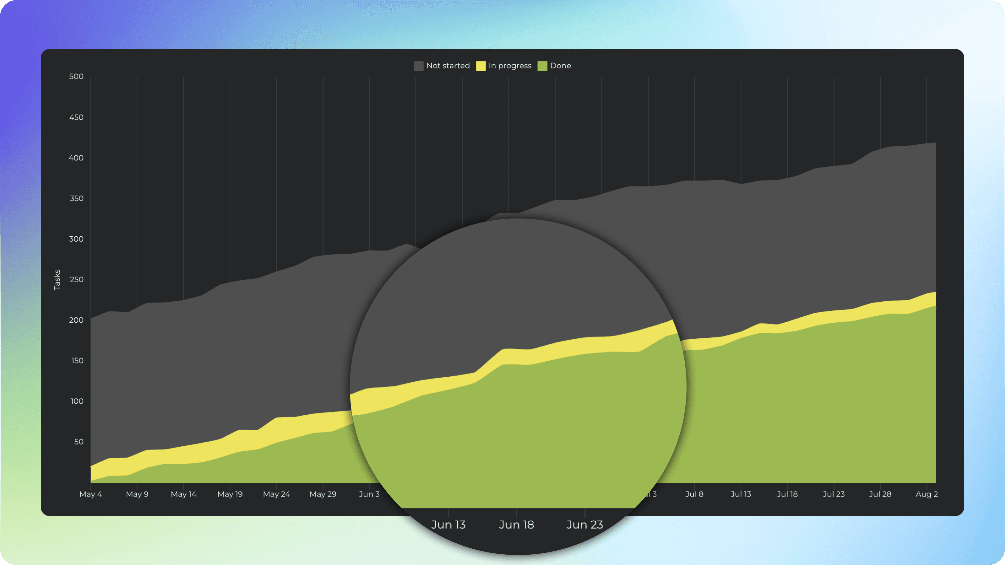
Spot bottlenecks early to avoid delays
Each coloured area of the chart represents the number of tasks (or story points) in a specific workflow state at a given moment. The horizontal axis indicates time, and the vertical axis indicates the number of tasks.
You can identify bottlenecks by looking at the widening areas in the chart. Are tasks piling up in a specific workflow state or assignee?
Learn More
How to set up: Getting started with Screenful
From our blog: Introducing the new Cumulative flow diagram