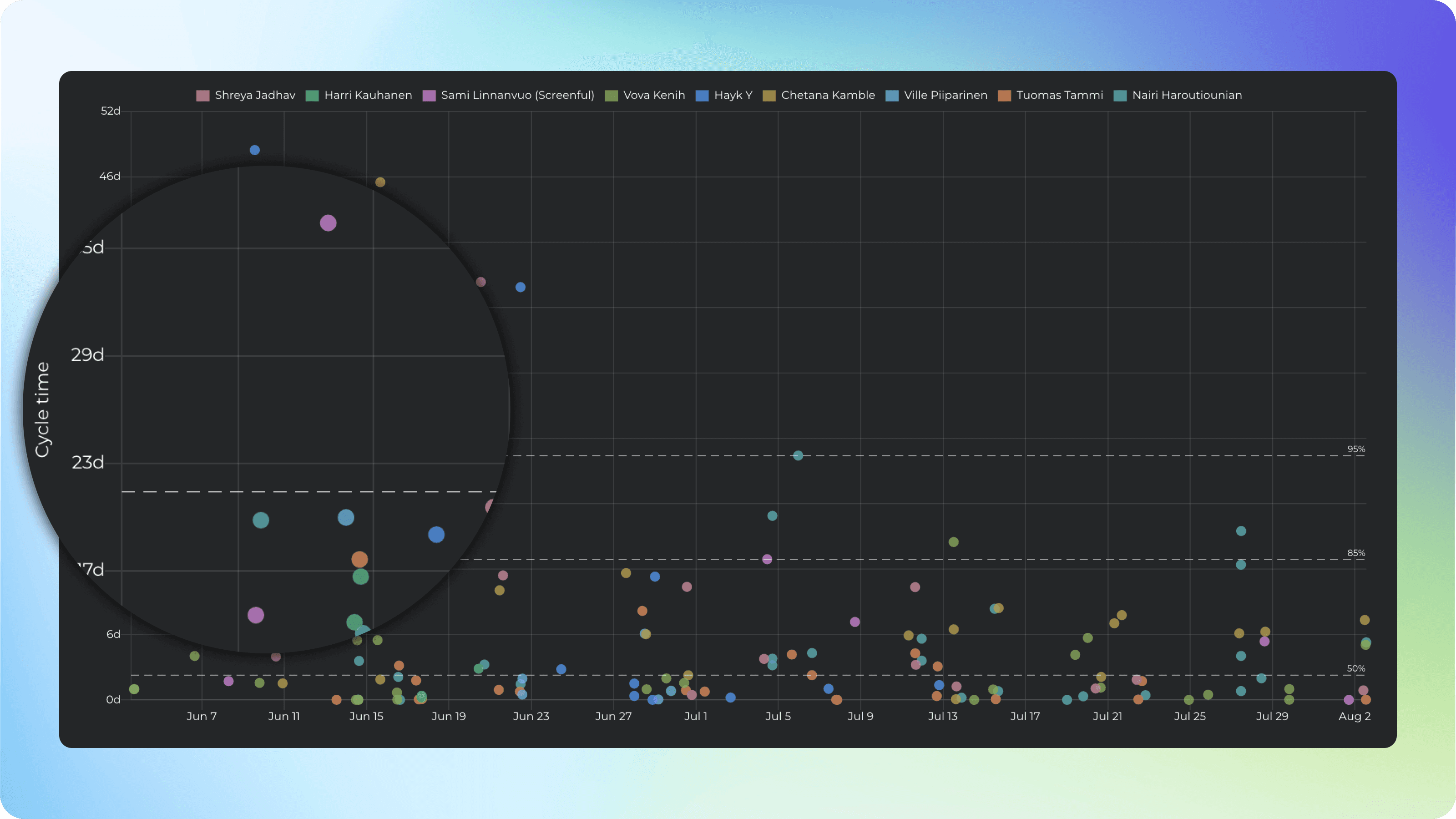
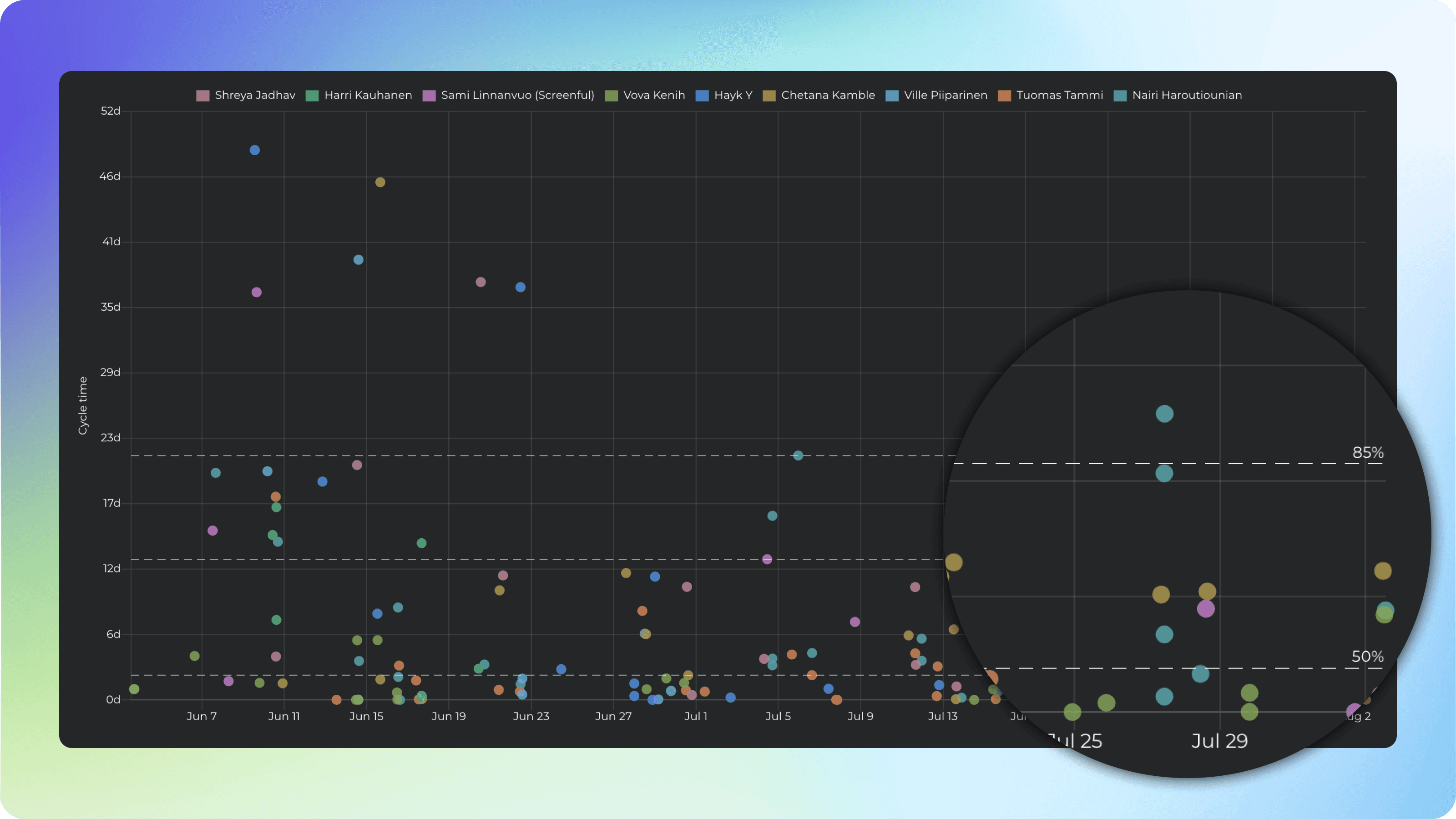
Scatter plot
The Scatter plot chart tells how long it takes to work on individual tasks. It shows the cycle time of each task, mapped on a timeline. Only completed tasks are included in this chart.
Track your cycle times
Each data point in the chart corresponds to an individual task. Thе chart shows when tasks have been completed and how long it took to complete them. The horizontal axis shows the observed date range, the vertical axis shows the cycle time in days. The higher up the circle, the longer it took to complete the task. The circle size is determined by the work estimate (e.g. in story points or card size).
See the percentiles
The dotted horizontal lines represent the percentiles. The left edge shows the number of days, and the right edge shows how many percentages of the tasks were completed in a shorter time than that. The 50th percentile shows the median time to complete a task.
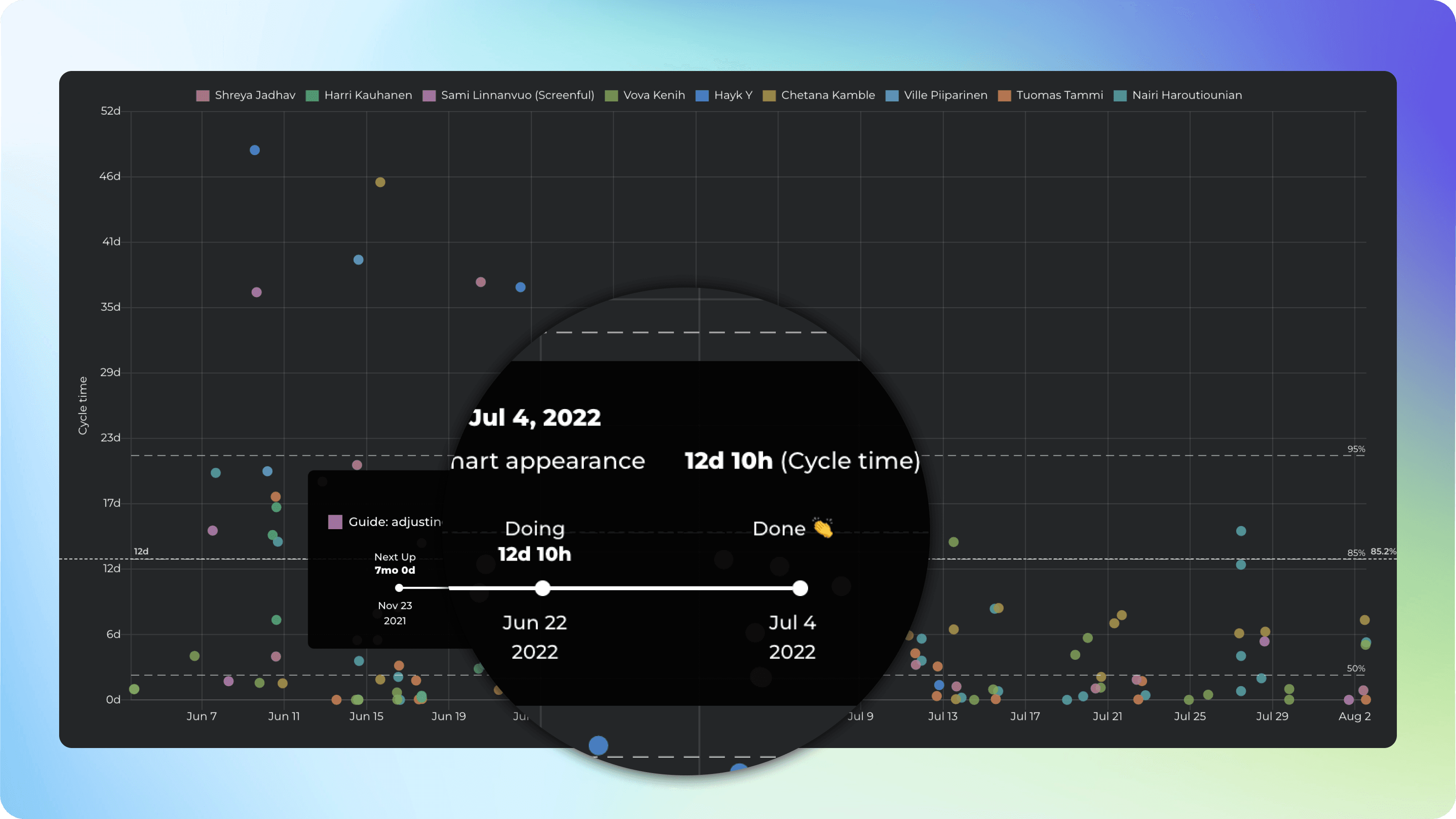
See the timings per workflow state
Hovering the mouse over an individual circle opens a tooltip showing all the steps that the task took during its journey through the workflow, and how long it stayed in each individual workflow state.
That allows you to dig deeper in order to find the real bottlenecks in your workflow.