
Tracking and reporting sales pipelines with Trello and Screenful
Feb 5, 2024
Trello is a great tool for tracking all kinds of work, from planning holiday trips to coordinating house renovations. Why not then use it to track your sales pipeline? One thing that salespeople don’t like to do is spend a lot of time updating a clunky old CRM system. But Trello is a different breed. People learn it immediately, and dragging cards to the done list is very satisfying.
However, you'll start losing visibility if you’re working with many leads and closing them in masses (which I hope you do!). That’s when you need to add a bit of analytics to the mix in the form of charts and reports. Here's how to do it.
Contents:
Setting up Trello as a CRM tool
First, you need to create a workflow for your sales team. If you don't have a board ready, a good way to get started is to pick the example sales pipeline board. It has the following workflow states (lists in Trello terminology):
New
Discovery
Proposal
Negotiation
Won
Lost
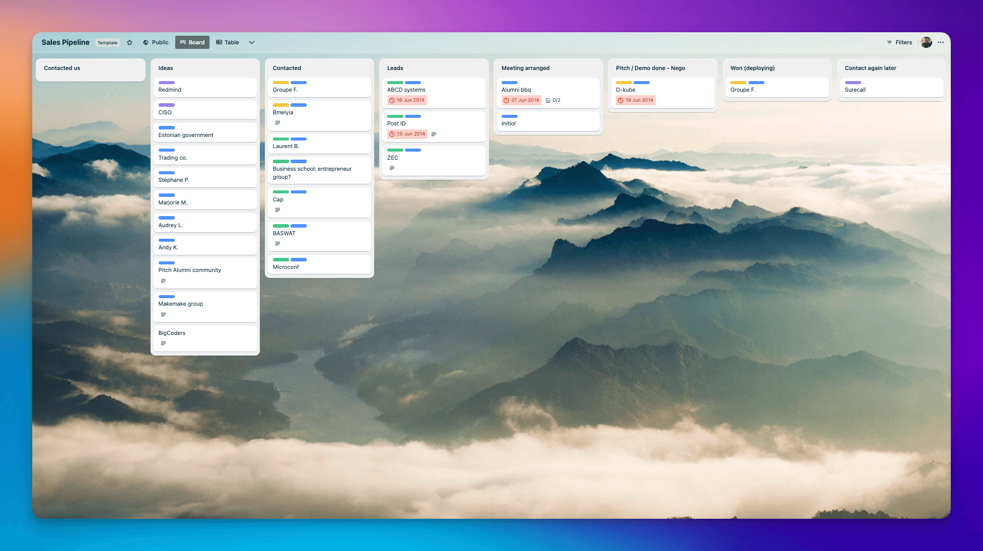
You’re not limited to these stages. You can add or remove stages to make it suit your specific workflow. Go ahead and tailor it to fit your needs.
Integrating Screenful with Trello
The Analytics & Reports by Screenful is available as Trello Power-Up. Once installed, you can access your Screenful charts and reports within the Trello UI.
You need to authorize Screenful to access the Trello API to get started. Once done, you will be shown a list of boards. Select one or more boards from the list to be imported to Screenful.
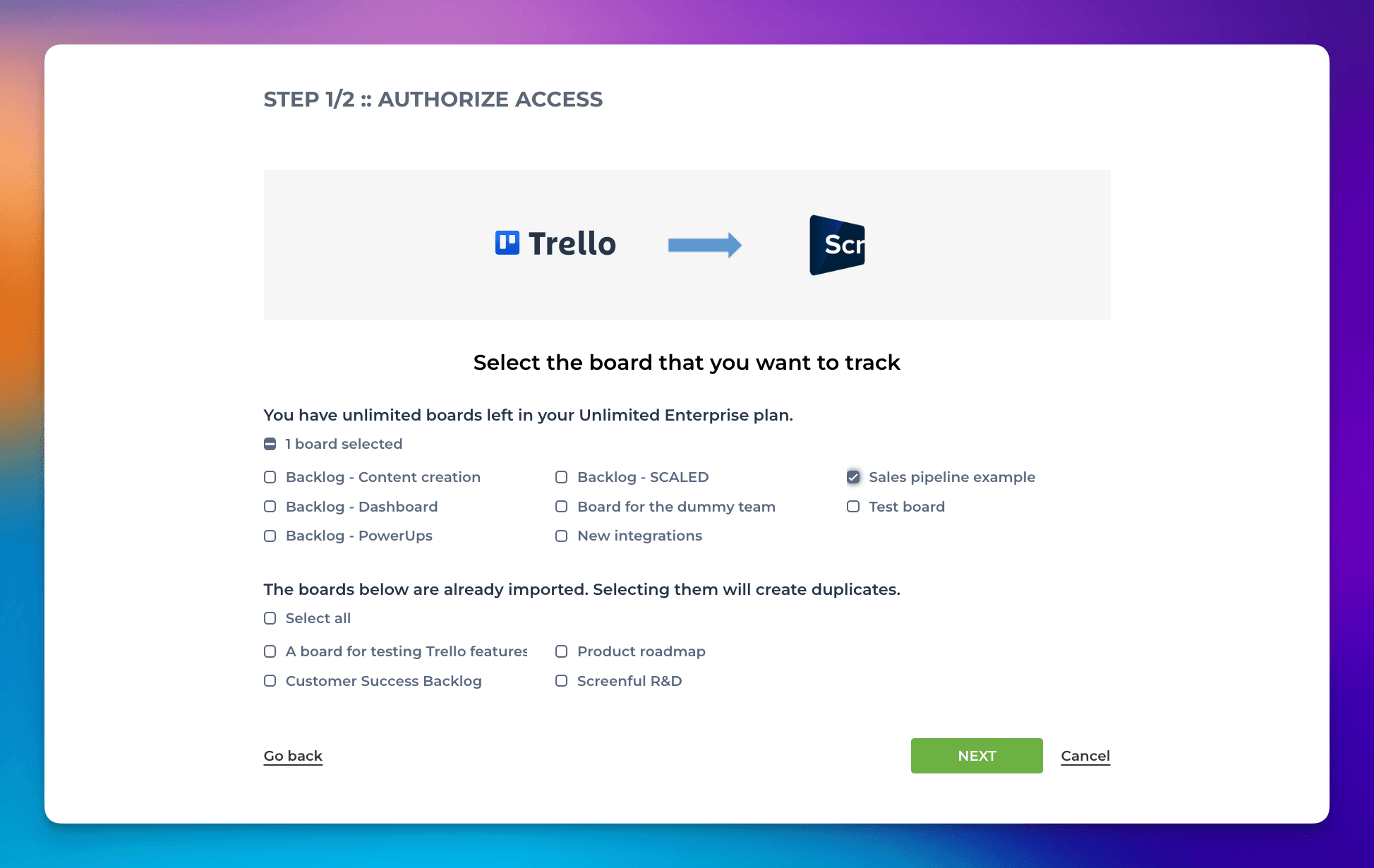
Once you have selected the boards for importing, the next step is to review your workflow.
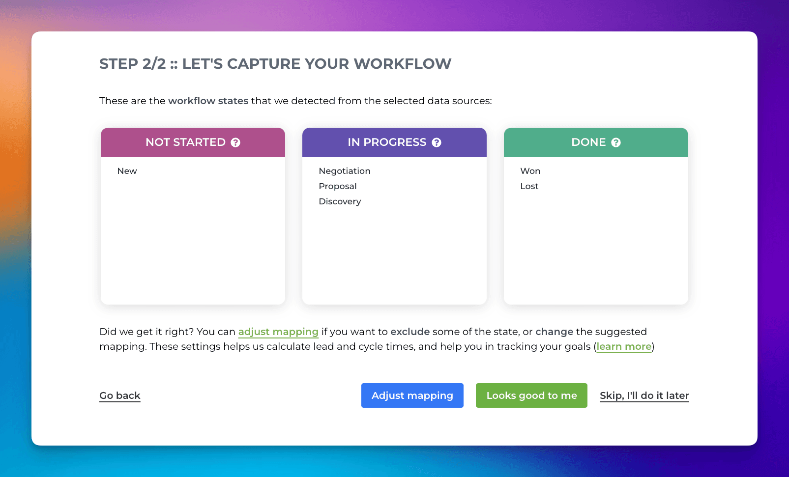
When importing a board to Screenful, Screenful will automatically map the columns on your board to Not started, In progress, and Done.
In this example, the New column contains leads waiting in line for someone to start pursuing them. It is mapped to Not started. Once someone starts working on a lead, it goes through the states from Discovery to Proposal. Those lists are mapped to In progress. Finally, the lead ends up in either Won or Lost.
The workflow settings help Screenful understand what different states in your workflow mean and automatically generate reports based on the status of a card.
You can confirm the suggested mapping by clicking Looks good to me. The data import process starts, and you can access the automatically generated charts and reports within a few minutes.
Measuring the sales pipeline velocity
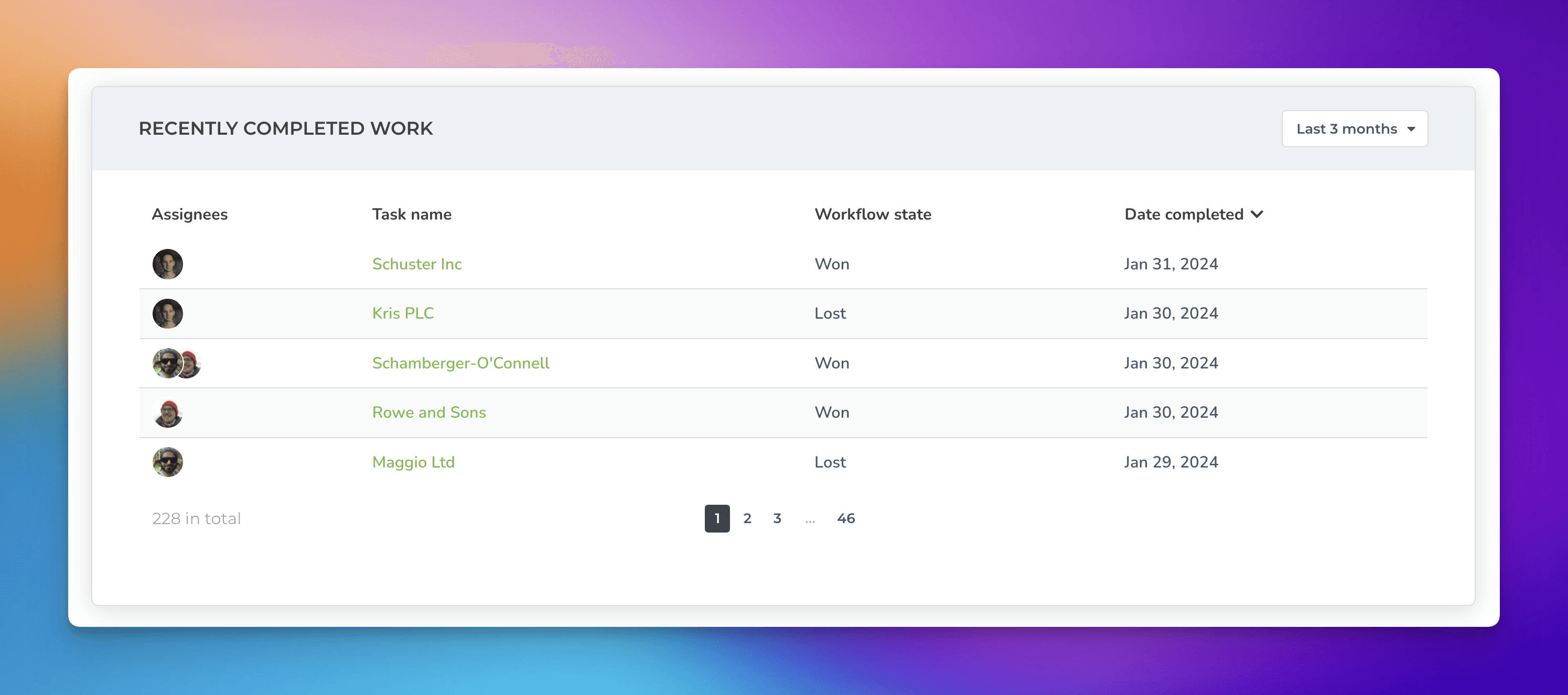
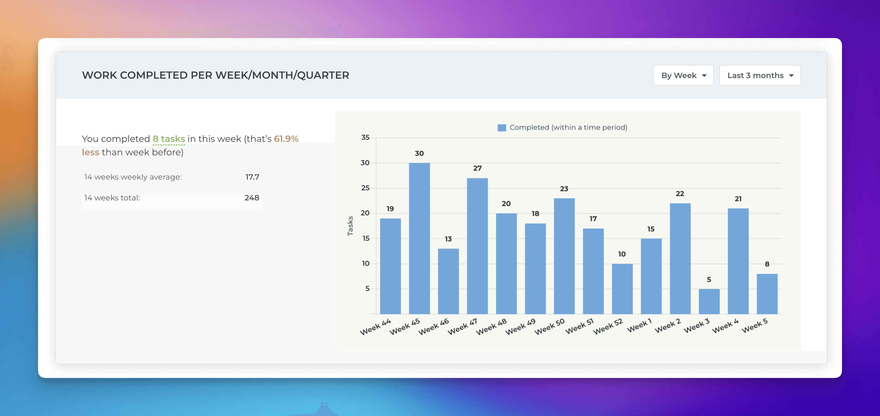
Wanna see how many leads you’ve closed? Head to the Insights->Completed tab to see your pipeline velocity and trends. The topmost list shows the most recently completed items. Clicking the name opens the card in Trello.
The Work completed per week/month/quarter chart shows the total number of leads closed within a date range. The numbers in the chart are card counts, but you can change the unit to any custom number field on your board. For example, if you have set monetary values, such as total value in USD, you can switch the chart to display total amounts in USD.
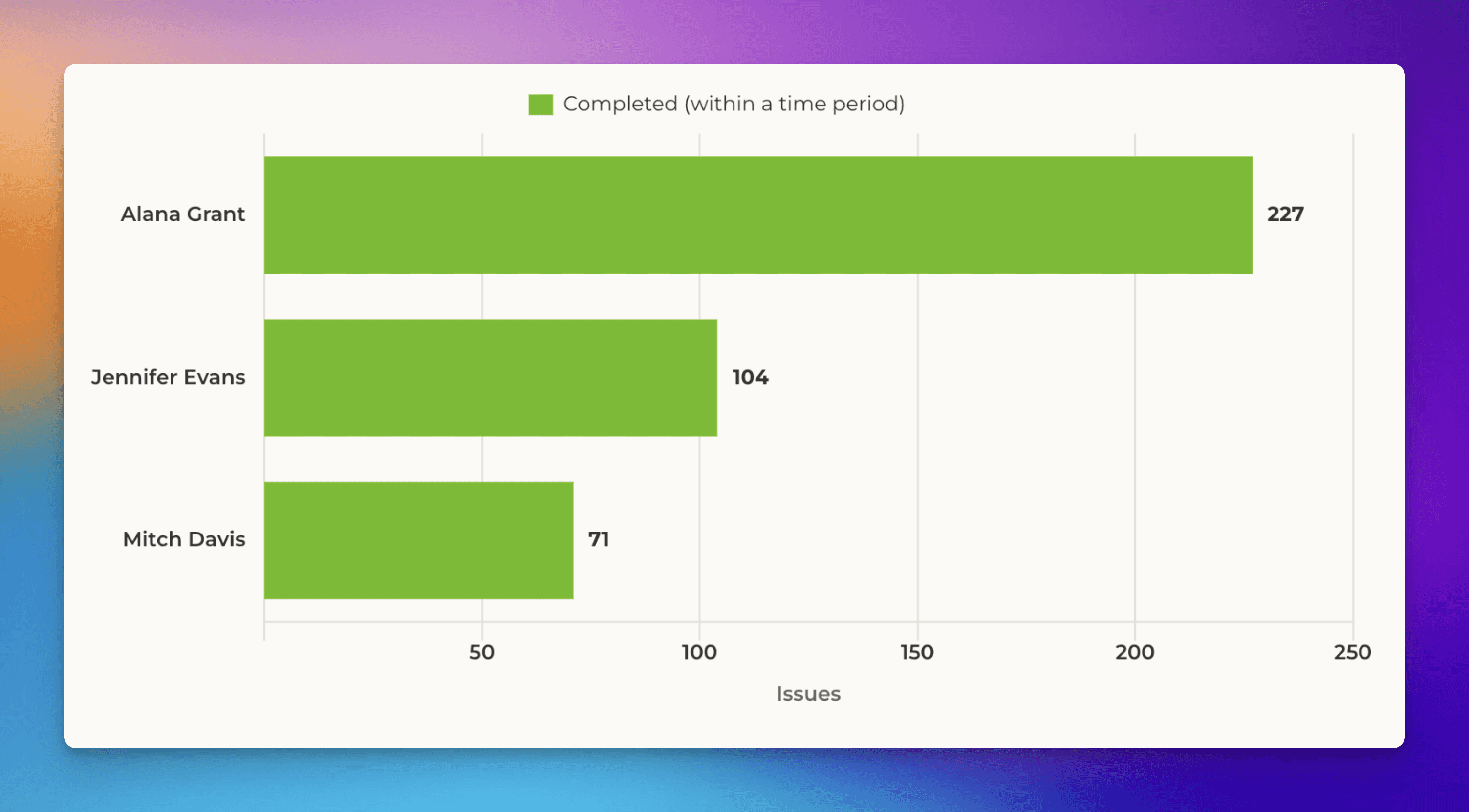
The Type of work completed chart allows segmenting the leads by any drop-down column in your board. For example, if you change the grouping to Owner, you'll see how many deals were closed per deal owner.
In addition to grouping by Owner, you can group by any other property of a lead, such as Country, Priority, or Stage.
The Completed work trend chart shows how many leads were closed over time by Owner:
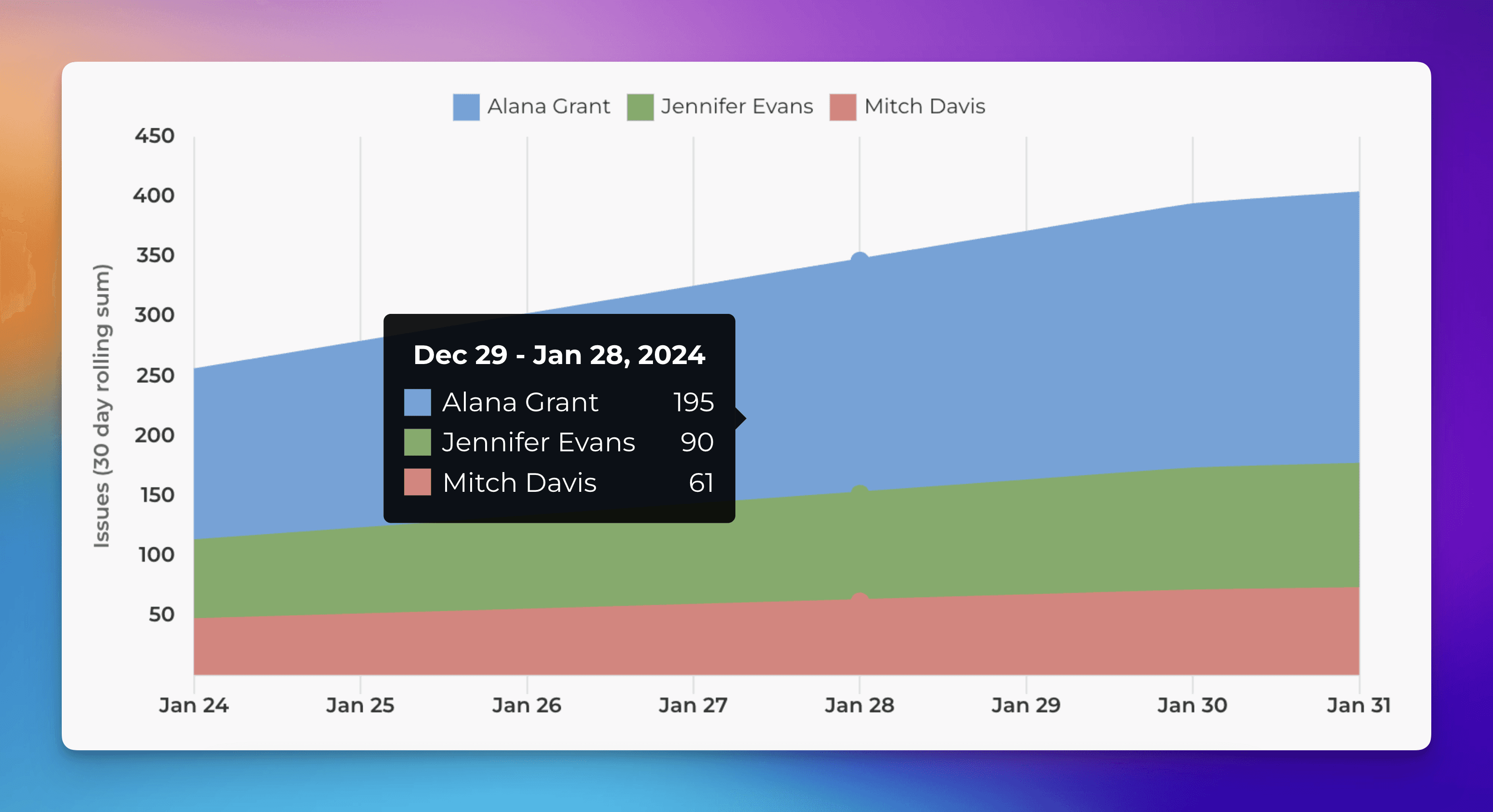
Looking at the trends lets you see whether your team is closing more leads than in the past.
You can also track each step in your funnel separately by following the steps in this how-to guide.
You can learn more about the Insights feature from this guide.
Tracking the cycle time of your sales pipeline
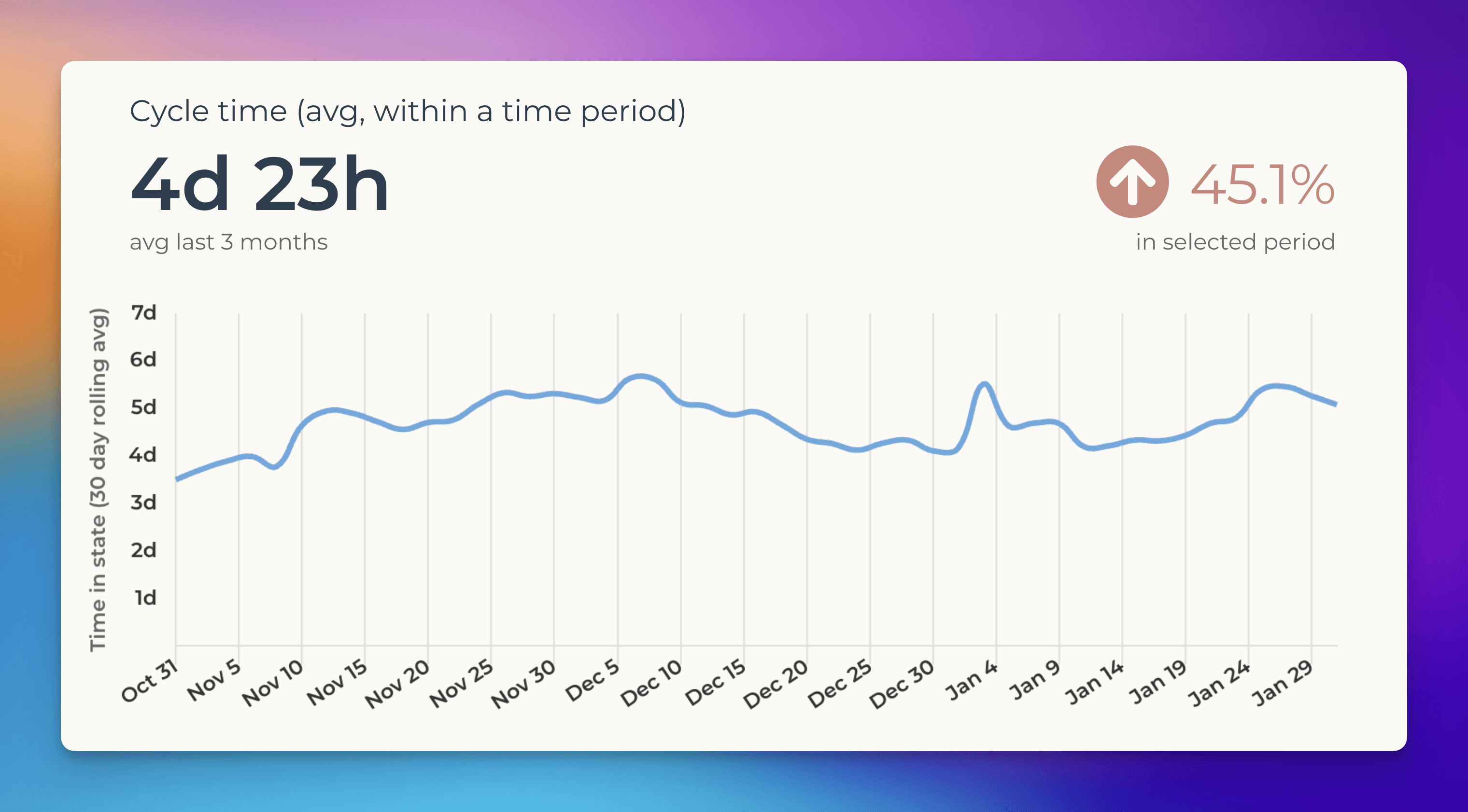
The Insights->Timings shows how long it takes to close a deal. The cycle time is the total time that elapses from the moment when the work is started on a lead until it's closed. Measuring the cycle time of your sales process is critical as it helps you understand which leads are likely to be quick to close and which are likely to take longer.
The Cycle time trend chart shows the average time it took to close a lead over the selected time period:
You can get even more specific by looking at the cycle time of each stage in your process separately. Do you know which step is taking the longest time? The Cycle time per workflow state chart shows you that.
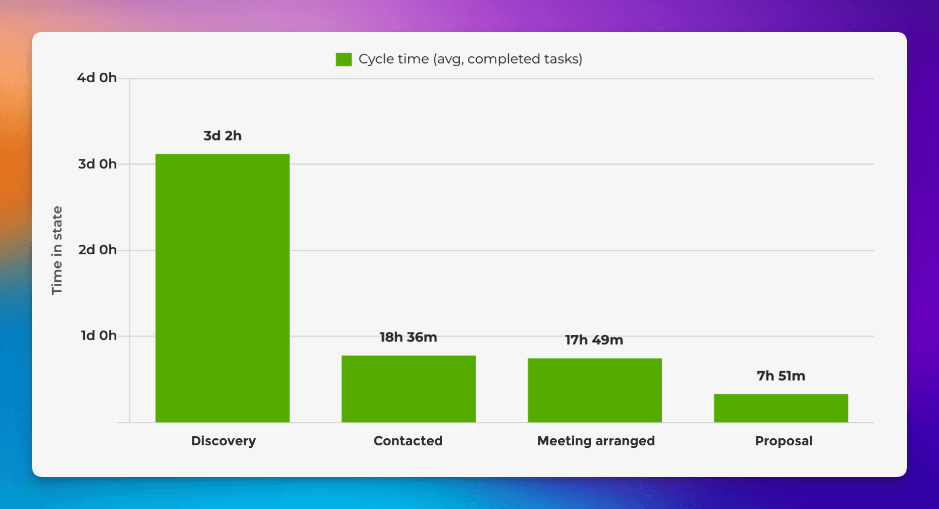
Each bar in the chart represents a stage, and the numbers show how long leads have stayed on each stage on average during the selected date range. In this example, the Discovery phase takes the longest on average.
You can dig even deeper by filtering this data. For example, if you're labeled your leads by company size, you can see how much company size affects the cycle time. Alternatively, you might want to know whether leads in specific industries are quicker to close than on average. Exploring the data can reveal new insights that help you prioritize which leads to pursue first.
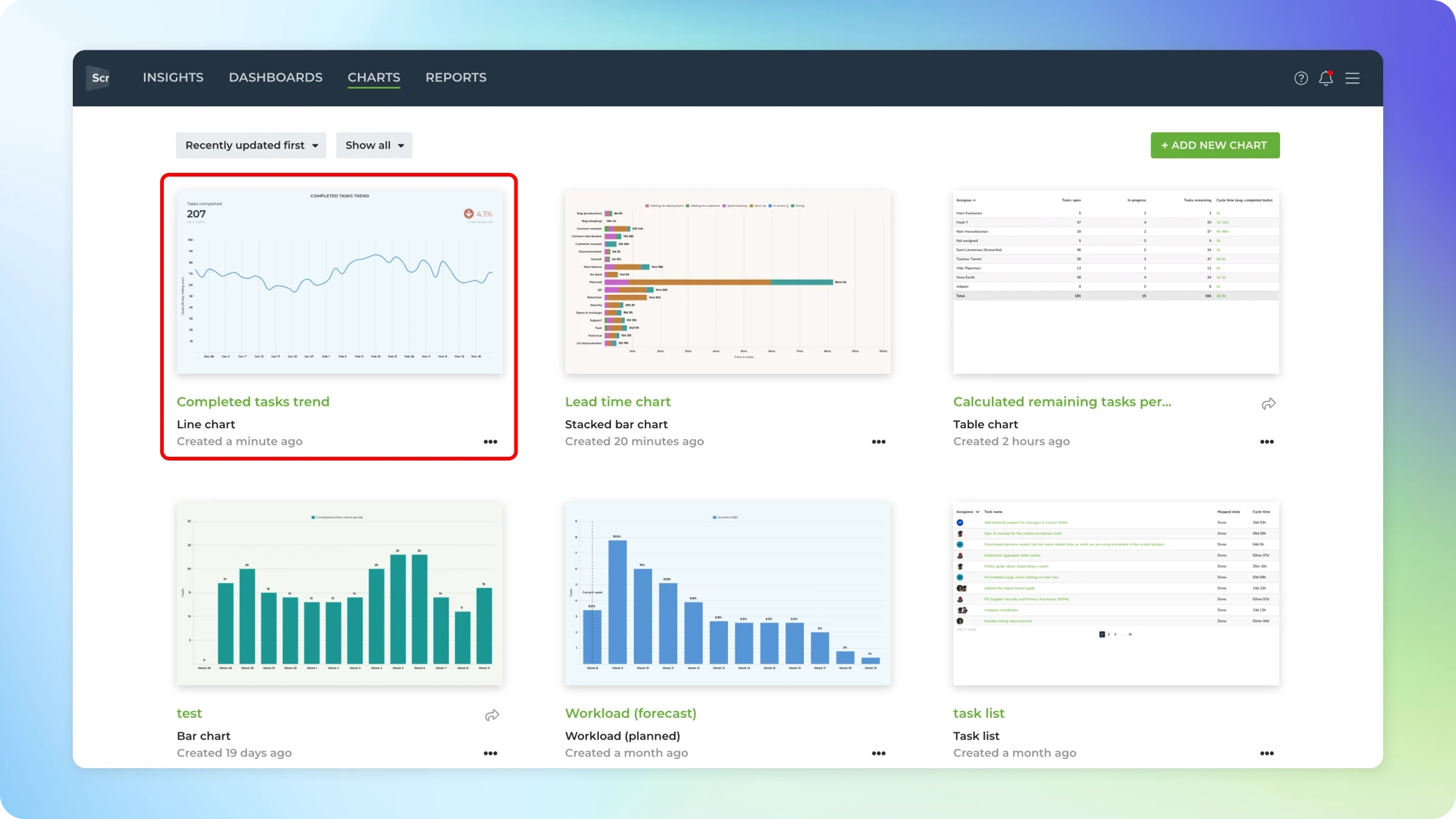
Creating custom charts
To create a custom chart from the data in Trello, go to the Charts tab and click Add new chart on the top right corner. A modal is opened with a set of chart templates. You can create a new chart from scratch or pick one of the predefined charts.
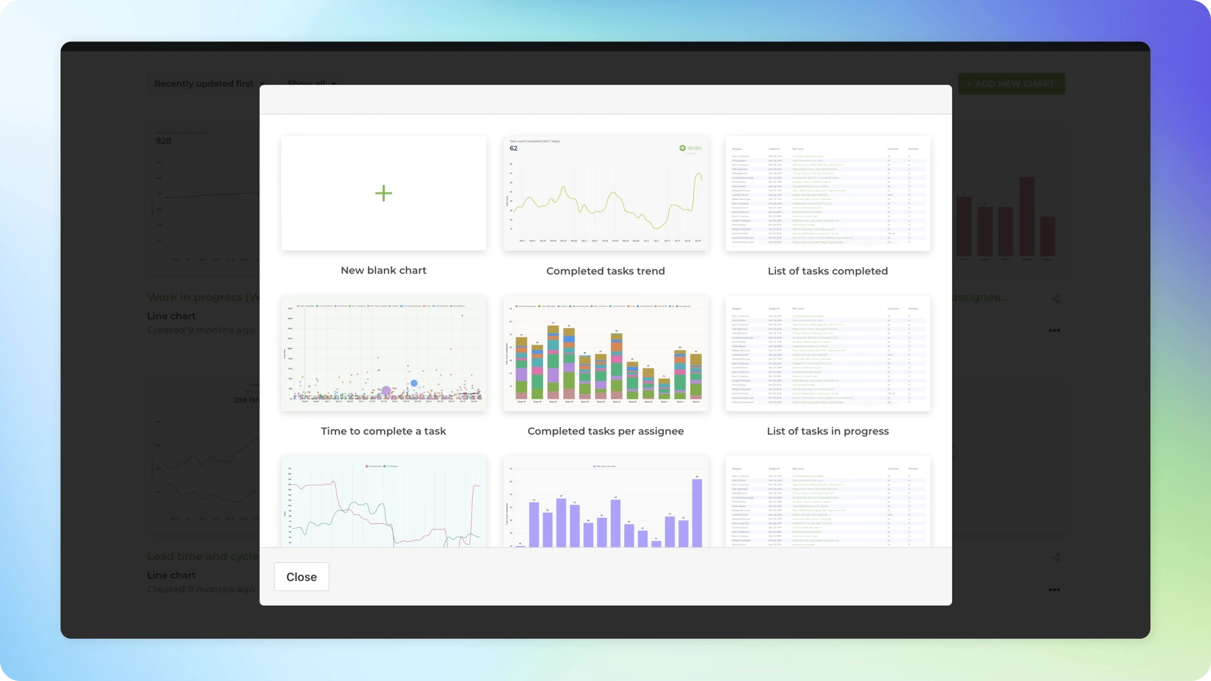
Clicking one of the chart templates opens a preview with live data. You can select the Trello boards from the Data Sources menu above the chart. You can pick one or more data sources for your chart and see the results immediately.
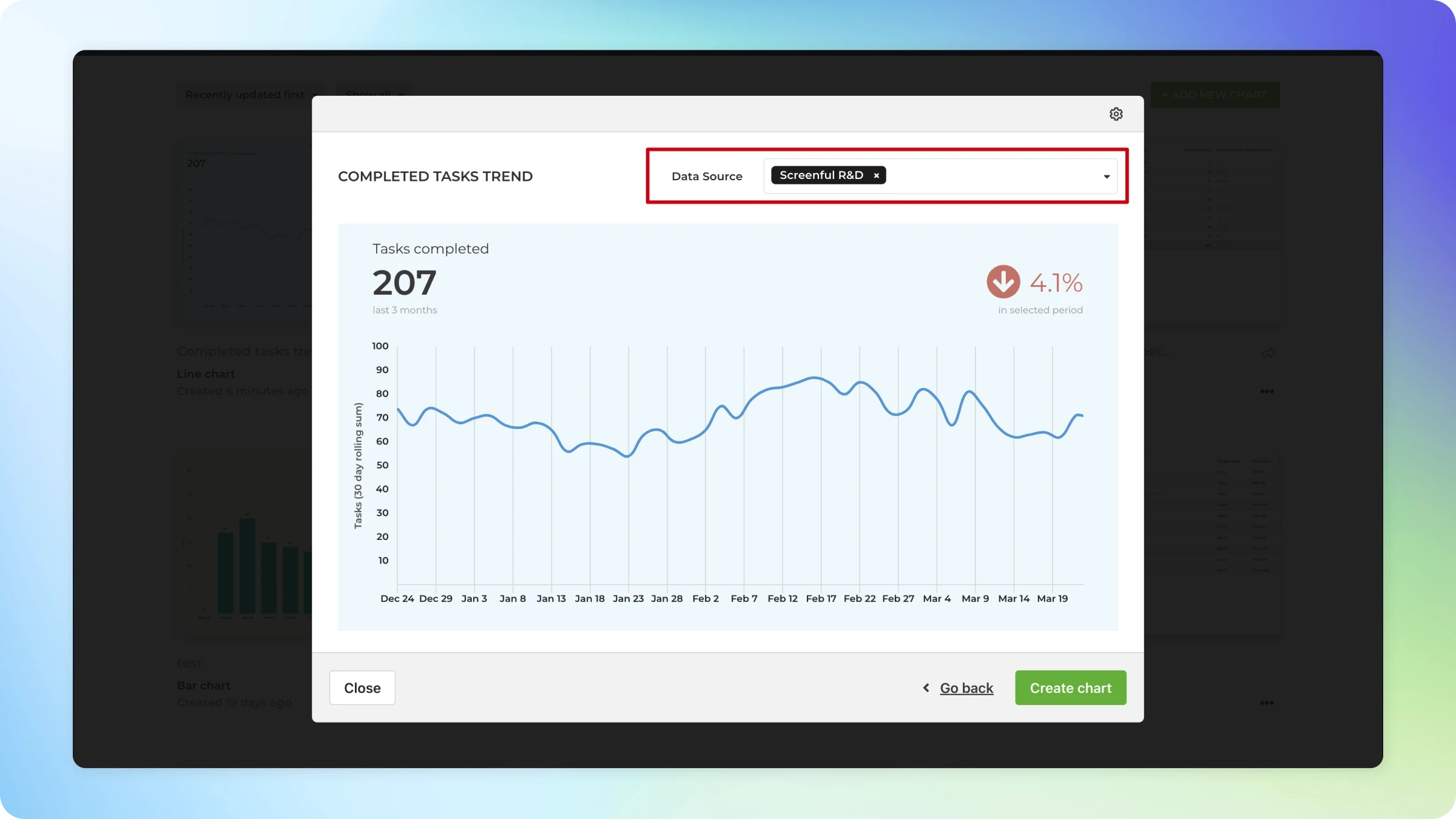
After picking a template, click the Configure icon on the top right corner to open the chart for editing.
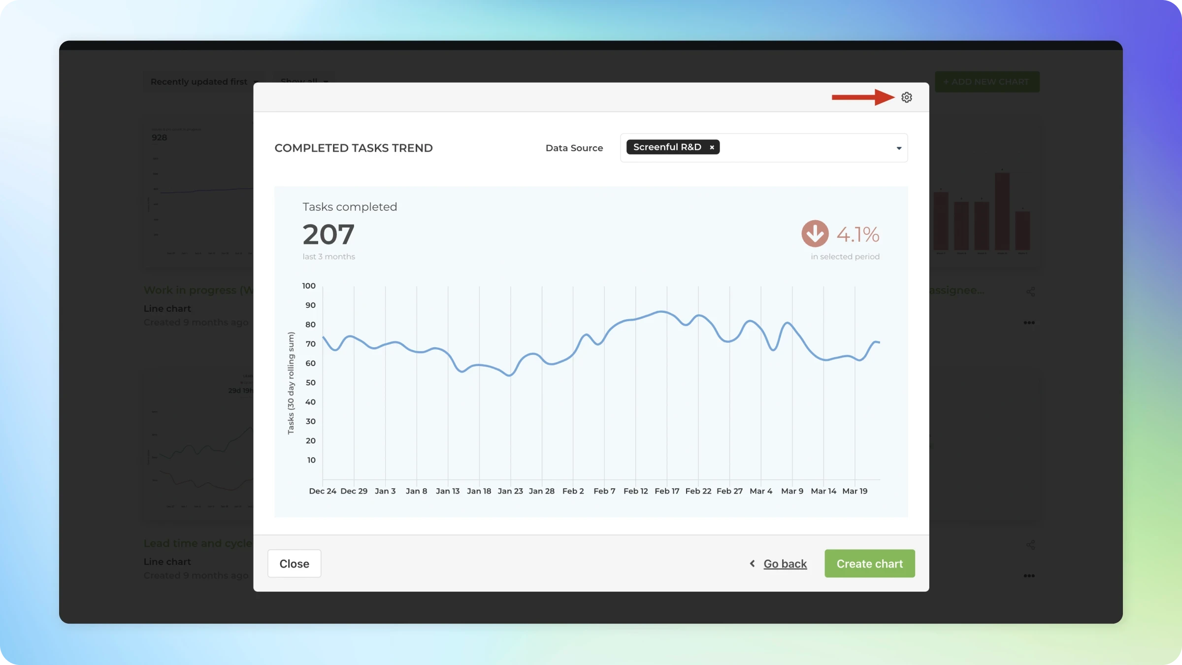
The chart editor opens, revealing the chart settings. If the chart is close to what you’re looking for, you can make it perfect with just a few adjustments.
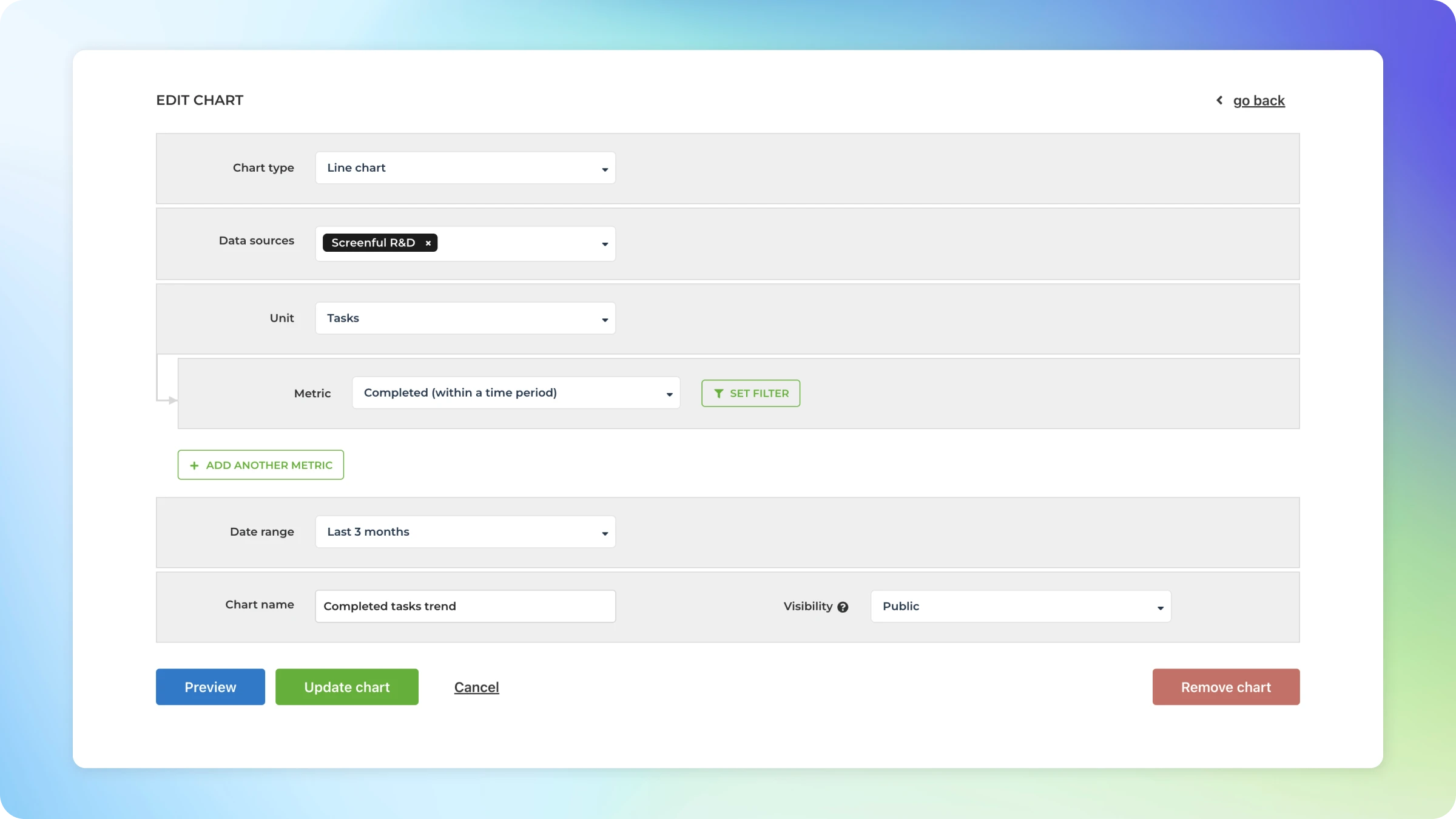
When you click Create chart, the chart is created, and you can find it under the Charts tab under the main navigation.
Once you have created the needed charts, you can schedule them as automated reports.
Summary
In this post, I showed you how to use Trello for tracking a sales pipeline. It provides great flexibility for customizing the board to match your sales process. However, you'll start losing visibility if you’re working with many leads and closing them in masses (which I hope you do!). That’s when you need to add a bit of analytics to the mix in the form of charts and reports.
By measuring your sales pipeline, you can see how well you’re doing. But more importantly, it helps you to find insights that improve your sales process.
To get started with Screenful, read the Getting Started guide and sign up for the free trial.
Let us know if you have questions or feedback by contacting hello@screenful.com. To stay on the loop, read our blog, or follow us on LinkedIn.