Task list
The Task list chart allows you to view your data as rows and columns. Each row is an item (task, ticket, issue). You can select any item properties to be shown in the columns. You can filter the list to contain any subset of items, such as those assigned to a specific individual, or the ones that are blocked or overdue.
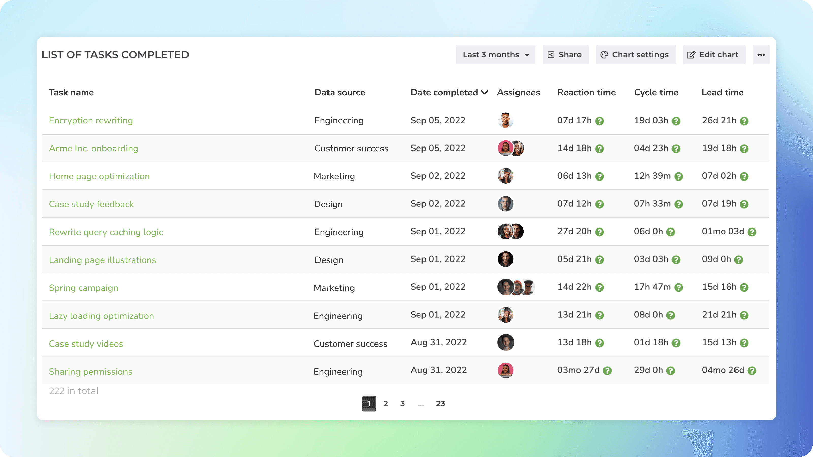
See timings for individual tasks
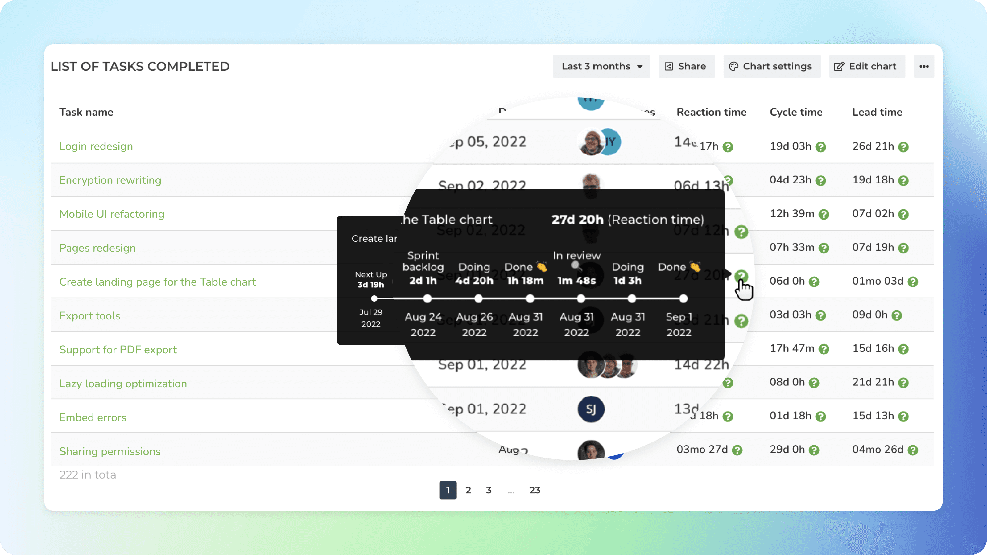
If you have selected a timing metric as one of the columns, a question mark is shown next to the timing value.
Hovering the cursor over the question mark shows all the steps that the task took before its completion, and how long it stayed in each workflow state.
Sort by the time in progress to see the tasks that took the longest or shortest time to complete.
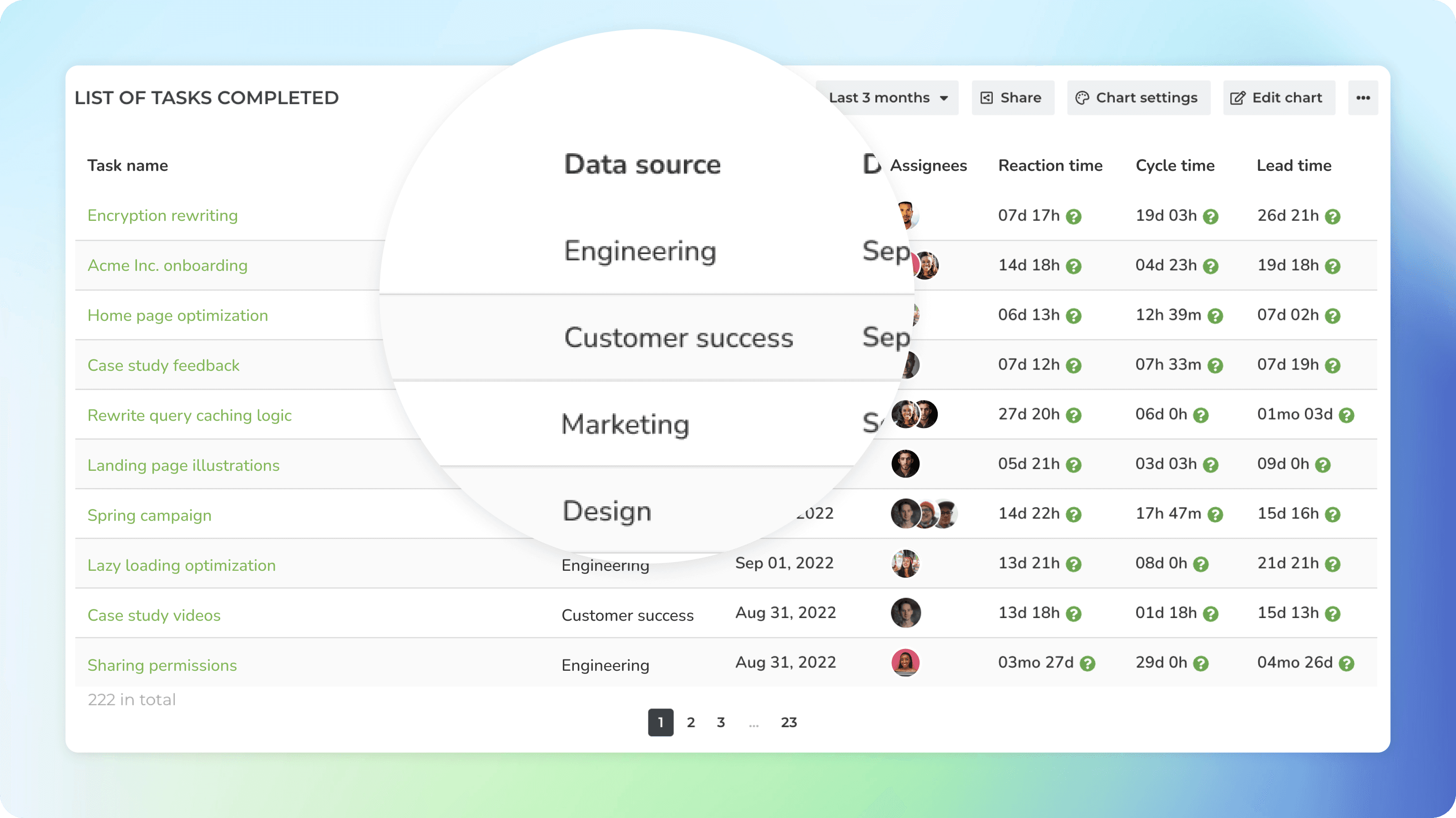
Combine data from multiple sources in a single chart
If you have multiple teams, or use multiple boards within a single team, you can include them all as data sources to the chart.
You can create task lists that combine data across all of your boards, providing a high-level view without having to switch between boards.
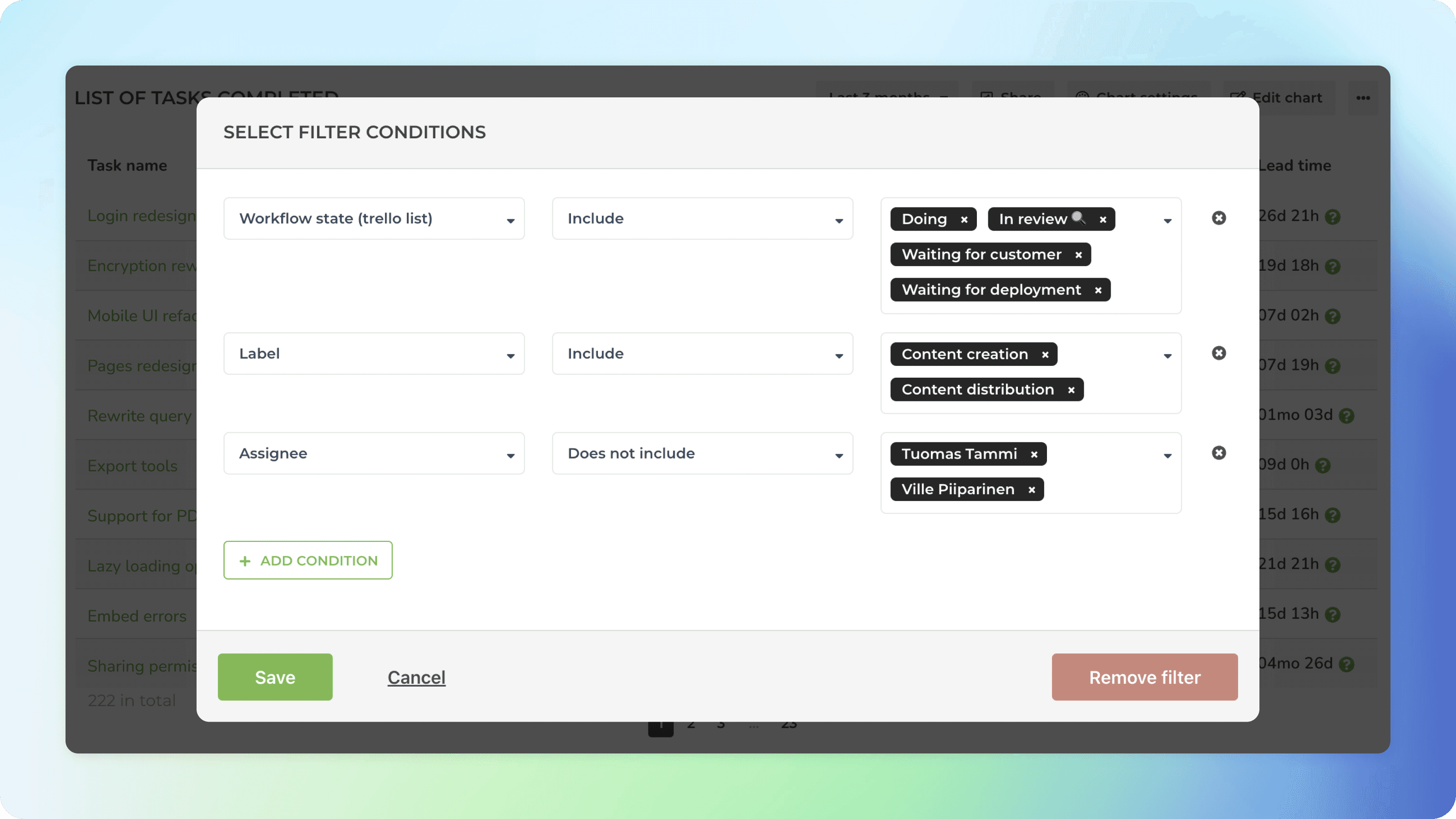
Use advanced filters to slice and dice your data
You can filter the list by any property such as task type (bug, user story, new feature), assignee, label, or epic.
You can also filter by any of your custom date or timeline fields, start dates, or due dates.
You can set advanced filters such as overdue, blocked, completed in time, or completed overdue.
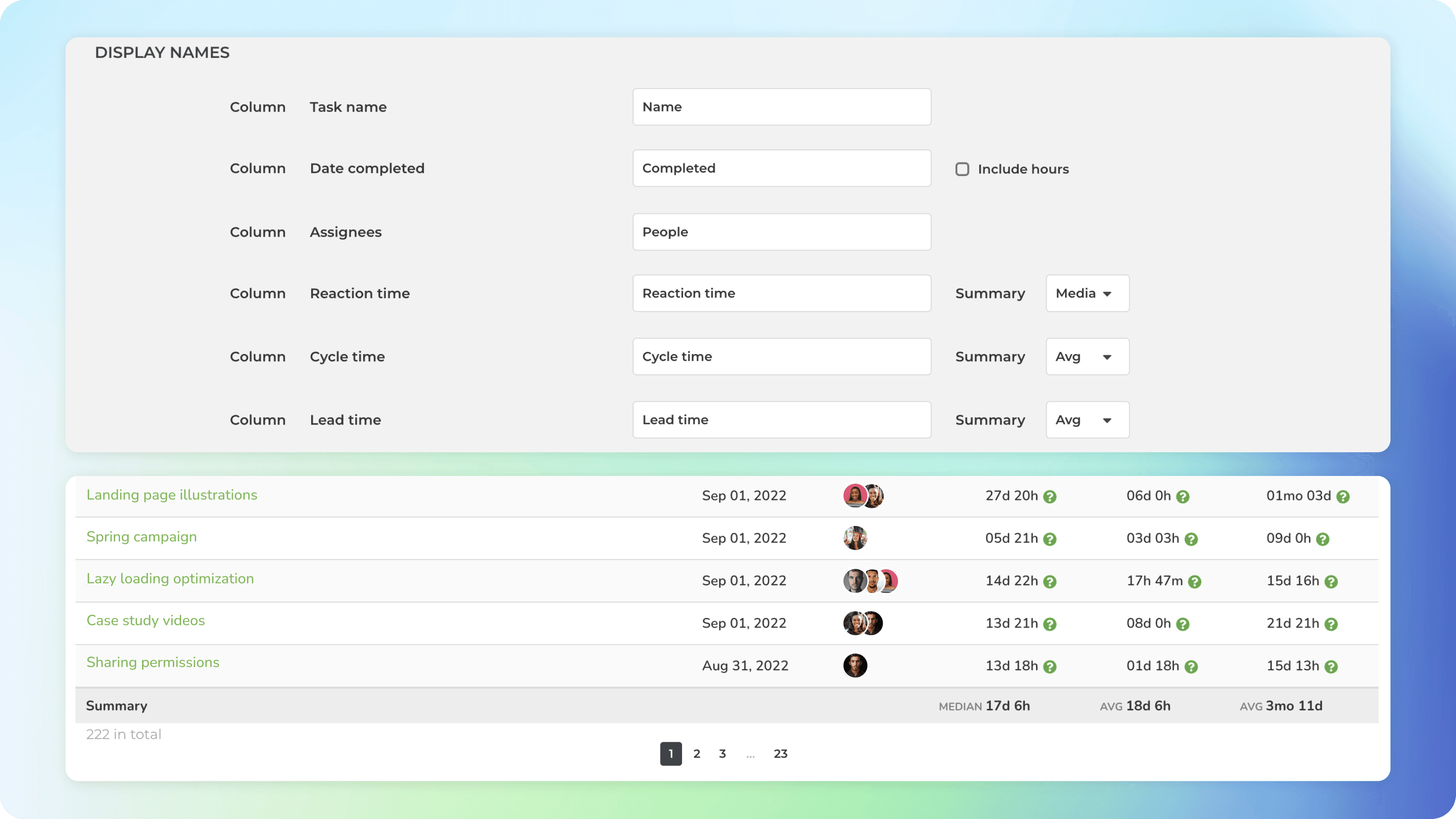
See a summary for each column
If you have added numeric columns to your chart, you can see the totals in the summary row.
A summary can be either:
Sum: Shows the sum of the numbers in the column.
Average: Shows the average of the numbers in the column.
Median: Shows the median of the numbers in the column.
The Summary type can be configured for each column separately in the chart settings.
Learn More
From our blog: 💊 Reports on steroids 1/3: Configurable summaries