Get actionable insights from your Trello data with Screenful Insights
Mar 6, 2023
If you’ve ever tried to report on what’s happening in your Trello boards, you’ve probably felt stuck and underwhelmed with Trello’s native reporting options.
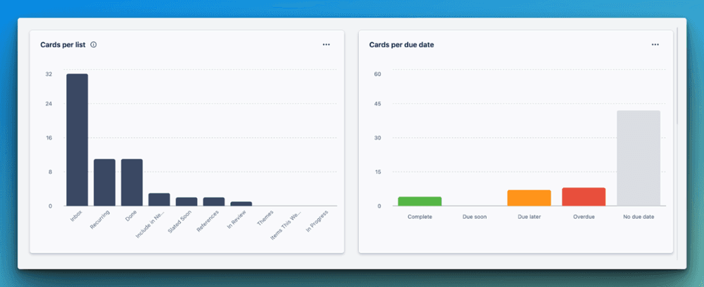
As a Trello premium user, Dashboard Views provide the best insights you’ll get out of the box, showing your cards on a board grouped by various dimensions, such as lists and labels.
It’s a nice visual, but customization and insights are limited. You can’t filter the data to get a slice of the story. You can’t group attributes like labels and members in the same chart. And a real bummer— this information is only reflective of one board.
While you can use Workspace Tables and Calendars to combine cards on multiple boards into a single layout, you won’t get any meaningful data around them.
Another native Trello alternative is Dashcards, which offers filtering options to dive into a specific metric.
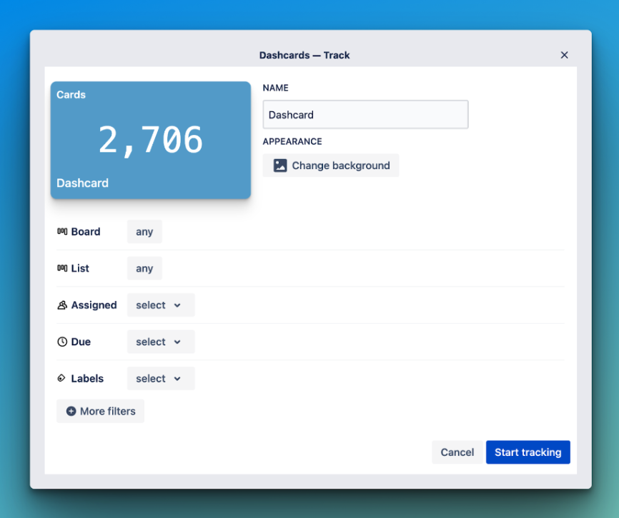
But it’s just that—a metric: a simple number showing you how many cards meet the criteria of what you’ve set. It updates in real-time but doesn’t show you the difference between what that number was last week vs. now or what that metric would look like broken out by another dimension, like by members.
For many folks, these options are all they need for reporting. Maybe they’re just grabbing a quick number or showing a distribution of cards between members or labels. However, you’ll want to try third-party alternatives like Screenful if you need more robust reporting.
Get actionable insights right away
I’d always been hesitant about trying other tools for reporting in Trello because I assumed the configuration would be complicated. Boy, was I wrong.
Getting set up in Screenful is as easy as connecting your Trello account and checking a box next to the boards you want to import.
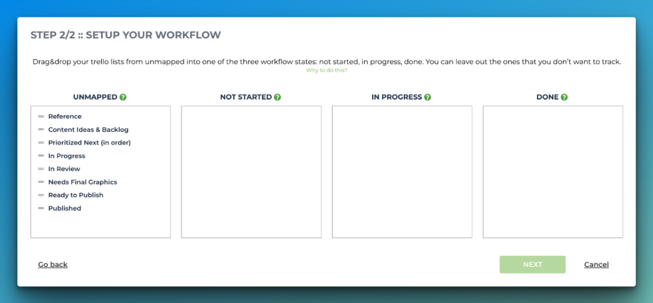
The last step is mapping your lists to the stages of your workflow. This allows Screenful to share insights about how your team is getting work done, such as how long it takes to complete tasks and any stages they might be getting stuck in.
Bring all your boards together
You can import multiple data sources into Screenful, which means there’s plenty of room for all your Trello boards. Instead of seeing one slice of your workflow, you can get insights about multiple teams and processes to understand what’s happening across the board(s). Pun intended.

Now when you look at charts, you’ll see information reflected from all your boards in one chart without having to piece everything together.
It doesn’t matter if you use the same labels and lists across your boards or if they’re completely different.
Get immediate insights in minutes
After you connect your data, you’re immediately taken to the Insights tab in Screenful with no further setup required. This is where you go from seeing a bunch of cards to visualizing what you can optimize.
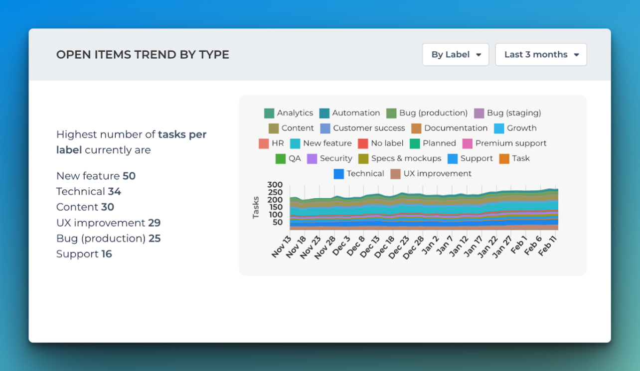
See open items by labels to understand if a specific type of task tends to be neglected. Maybe there’s an improvement you can make that would decrease the friction to accomplish it.

If new features are the least likely to be completed, you may need to be more strict about the criteria for acting on a new feature request.
See what direction your completion rate is trending
You might also need to ask, “Am I regularly leaving tasks undone? Is this getting better or worse?” The Open Items Trends chart shows if incomplete task carryover is a regular occurrence or only occasionally. If you see this climbing each week, it might be time to be more realistic about what you can add to your sprint.

If you only notice a spike here and there, check the calendar to see what was going on during those times. Are you seeing a correlation between the situations that get your team in over their heads? Maybe your team was at a conference, or a new release came out. Make better strategies to account for those times in the future.
As you adjust workflows, you’ll need to track progress to see what’s working. Another Insight Chart combines the trends and label visualizations into a single chart showing precisely what types of open tasks are trending in a better direction.
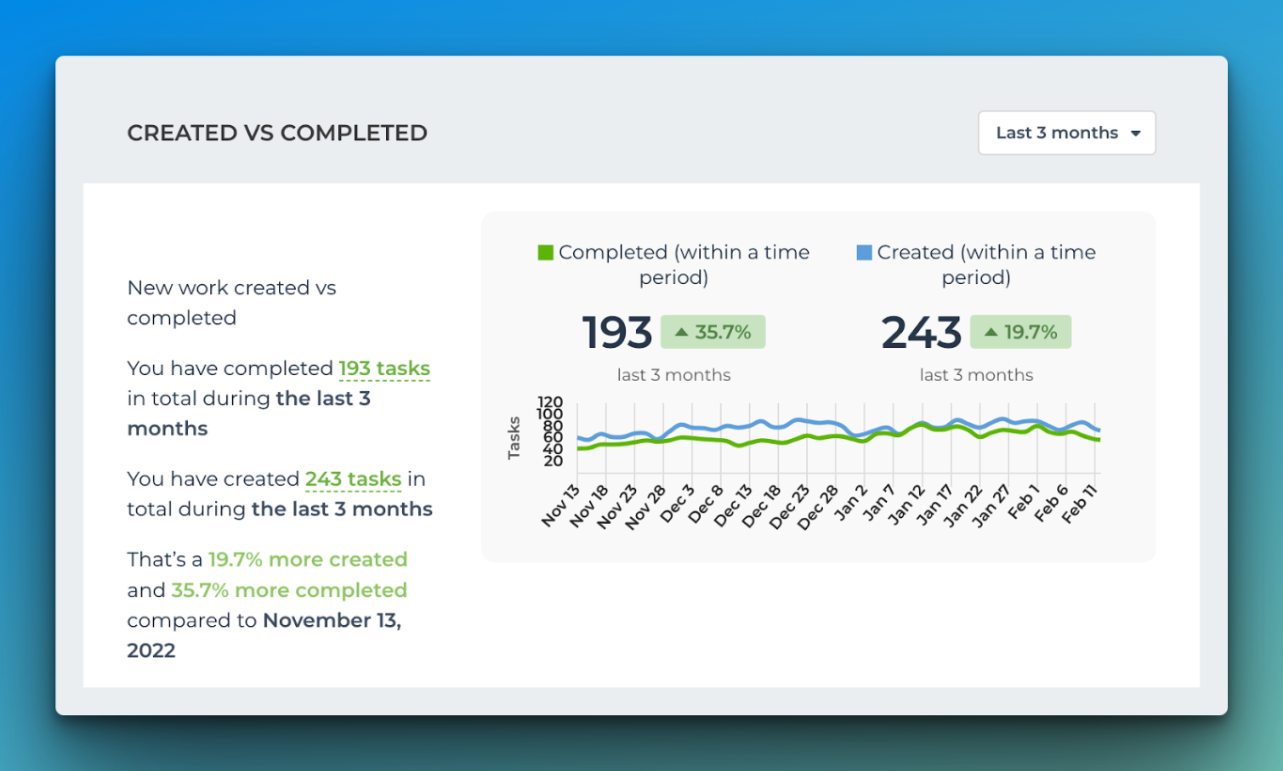
Prevent a bottomless backlog
One of my favorite charts is the “Created vs. Completed” chart, which ties it all together. If you’re creating more work for yourself than you’re completing, is it any wonder you’re never feeling ahead on your project?
Estimate completion dates
Screenful provides two views and dates for estimating a project’s completion: One showing an exact date if no work is added and another if work is added.
This helps prevent scope creep as everyone wants new features because a tiny thing here and there doesn’t seem like a lot… but over time, it’s going to drastically change your completion dates because you’re going to spend so much time playing catch-up.
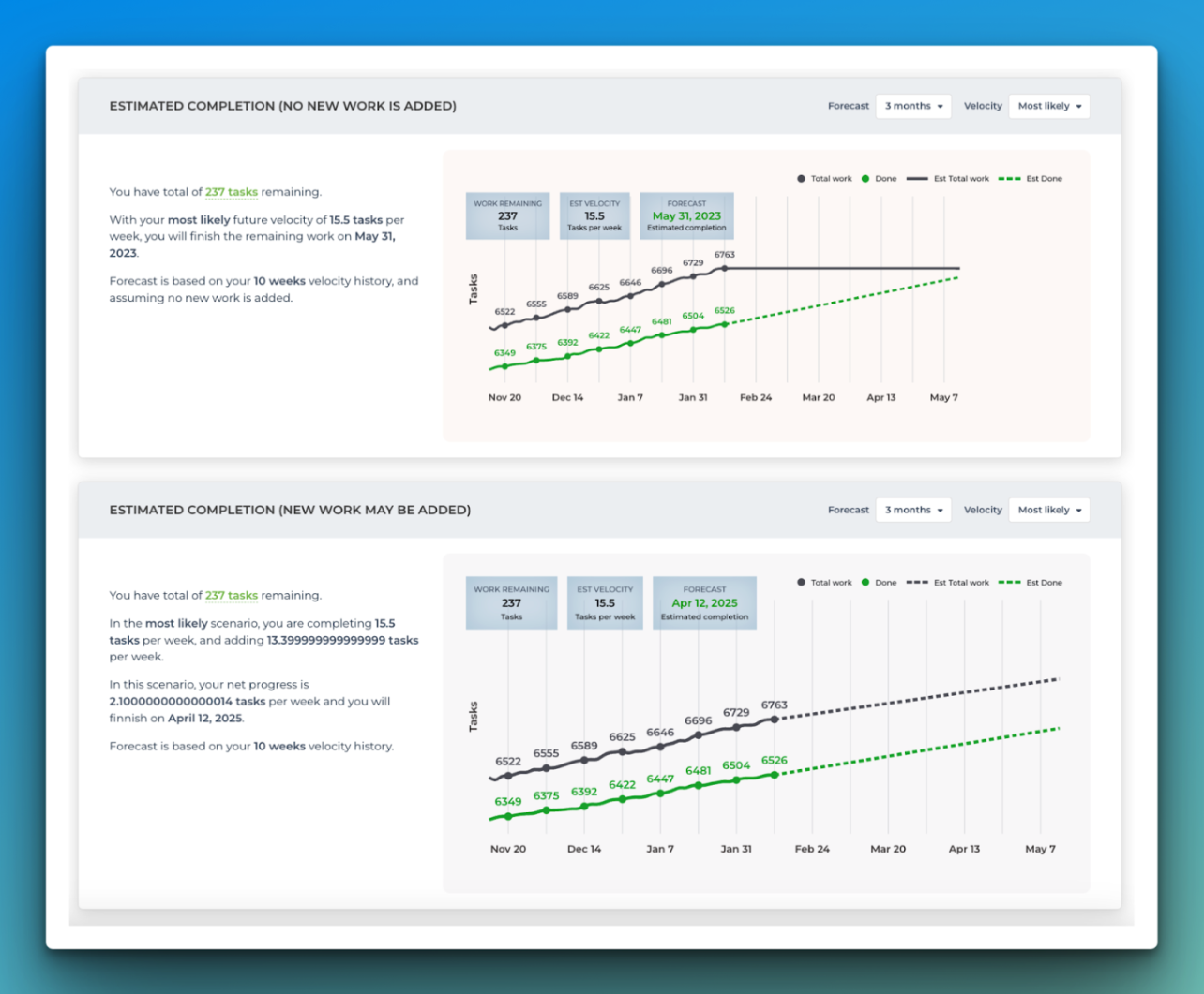
By default, it shows the most likely outcome, but adjusting the likelihood shows the best and worst-case scenarios for project completion dates.
Customizable
Everything we’ve gone through is provided out of the box with no configuration needed. But if something got your attention and wasn’t exactly what you were looking for, you can create filters for your Insights board—something you can’t do from Trello’s Dashboards View.
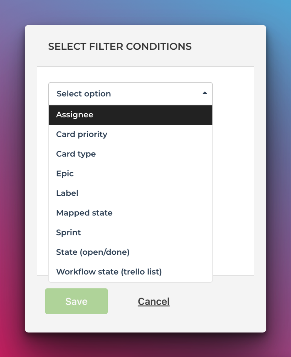
You can also change the dimension the data is sliced by, such as members, lists, or labels. This helps you focus on the metrics and attributes you care about.
I also like the ability to toggle between different periods, as sometimes I’m looking for data this week but then want to see what that looked like last month. While Trello’s timeline and Calendar views let you quickly switch between those same periods, the only thing that changes is the specific cards you see, not any reported data. Unfortunately, no options in the Trello Dashboard view show you Dashboard data over a historical period.
Reliable Syncing
My number one requirement for any third-party tool that integrates with Trello is to sync data accurately. It’s a show-stopper if I have issues with cards not showing up or changes reflected in a third-party tool.
Screenful passed the sync test with flying colors, as I couldn’t find any discrepancies between data from my boards and what was showing up in Screenful. If anything, I needed to adjust the workflow mapping to ensure I had configured the right lists.
Beautiful UI
Screenful isn’t the first or only reporting tool for Trello, but it might be the most aesthetically pleasing. The UI is so beautiful and easy to navigate. It’s clear where to click, and your eyes naturally move in the flow of content.
The charts are beautiful and would look appropriate in any presentation or email.
Okay, what’s the catch?
Impressive, but nothing can be too perfect, right?
Screenful isn’t the cheapest option you’ll find for Trello reporting. With a starting price of $49/month, you might have to work hard to justify all the aforementioned benefits to your CFO.
You’ll also need to ensure your boards fit a specific structure to start using Screenful. For instance, if you’ve been tracking task status with labels, there’s no way to map that with Screenful. Depending on how many boards and cards you have, this could take quite some time to rework.
If you’re looking for a reporting tool for your Trello boards, take Screenful for a spin. With a free trial, you’ll have plenty of time to try it out and see if it’s the right fit for you and your team.
Avísanos si tienes preguntas o comentarios contactando hello@screenful.com. Para estar al tanto, lee nuestro blog, o síguenos en LinkedIn.

This article was written by Brittany Joiner
Brittany is a Trello expert with over a decade of experience in using this tool to improve nearly every aspect of her life. As an Atlassian community leader, she regularly answers users' questions about Trello and helps them find creative solutions. You can learn more about her at BrittBuildsThings