Visualize your data like never before
Visualize your data like never before
Visualize your data like never before
Create custom charts from the underlying data
Slice & dice by any of your custom fields


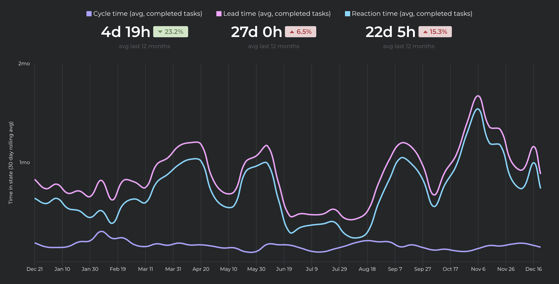
Line chart
Compare multiple metrics with a Line chart and see the longer-time trends.
Total work completed over time
Created vs completed tasks
Open Bugs vs Bugs Squashed
Estimated Time vs Logged Time
Compare multiple metrics with a Line chart and see the longer-time trends.
Total work completed over time
Created vs completed tasks
Open Bugs vs Bugs Squashed
Estimated Time vs Logged Time
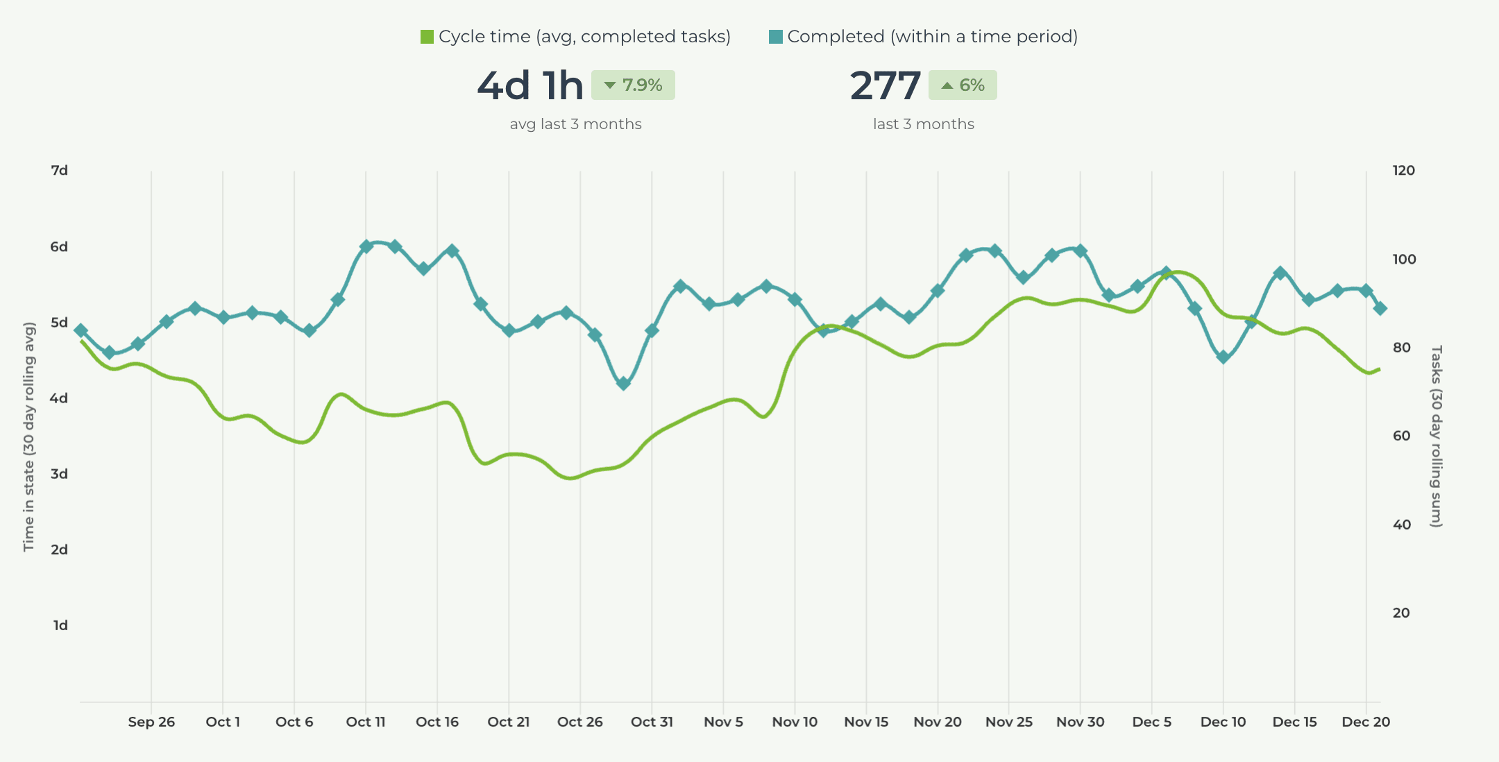
Line chart with dual axis
Plot two different units in one chart with the Dual Axis Line chart. Pick one metric on the left axis and another on the right axis, and see the trends over the selected time period.
Plot two different units in one chart with the Dual Axis Line chart. Pick one metric on the left axis and another on the right axis, and see the trends over the selected time period.
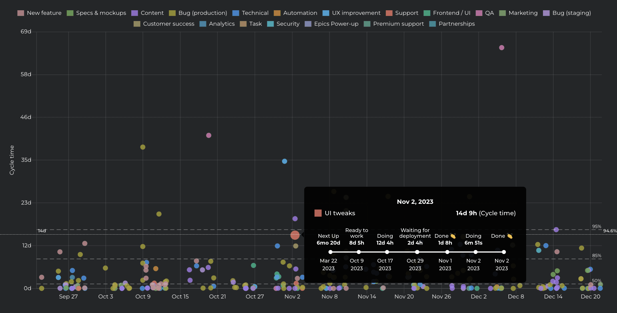
Scatter plot
See the outliers visually in a Scatter Plot chart. Each circle is a completed work item. The higher the circle, the longer it took to complete it. Hover the mouse to see how long each step took.
See the outliers visually in a Scatter Plot chart. Each circle is a completed work item. The higher the circle, the longer it took to complete it. Hover the mouse to see how long each step took.
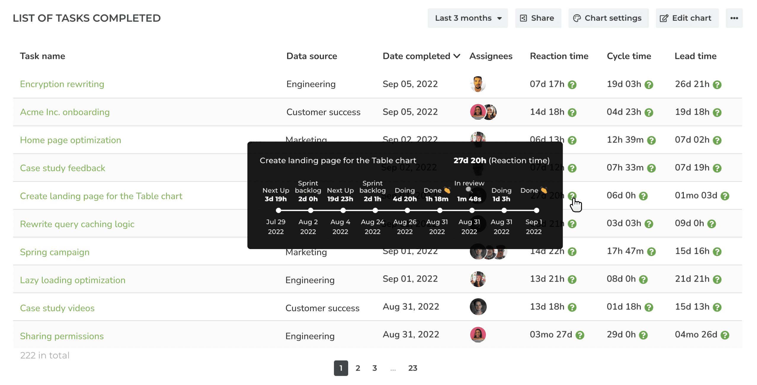
Task list
View your data as rows and columns in a Task list. You can filter the list to contain any subset of items.
Which tasks are currently in progress?
Who's working on what?
Which tasks are blocked, high priority, or overdue?
View your data as rows and columns in a Task list. You can filter the list to contain any subset of items.
Which tasks are currently in progress?
Who's working on what?
Which tasks are blocked, high priority, or overdue?
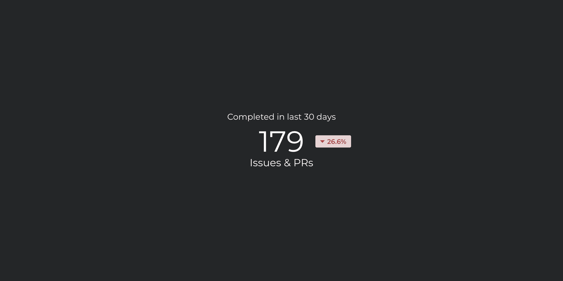
Number chart
The Number chart displays the selected metric as a single number. Track any metric as a single number.
The Number chart displays the selected metric as a single number. Track any metric as a single number.

Table chart
The Table chart allows viewing data as rows and columns. It aggregates the task data into sums, averages, and other statistics.
Create progress lists for your projects, epics, or any other work scope.
The Table chart allows viewing data as rows and columns. It aggregates the task data into sums, averages, and other statistics.
Create progress lists for your projects, epics, or any other work scope.
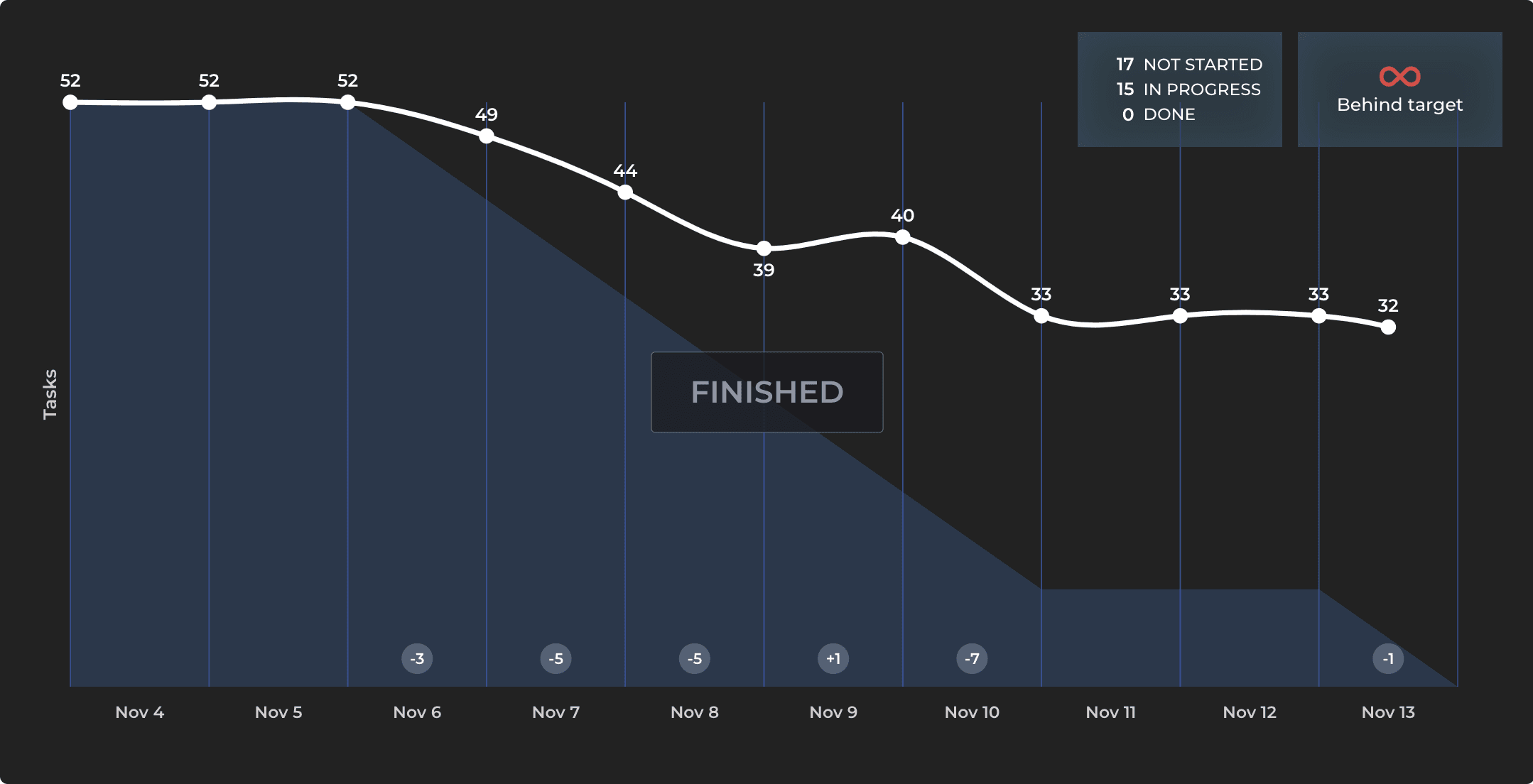
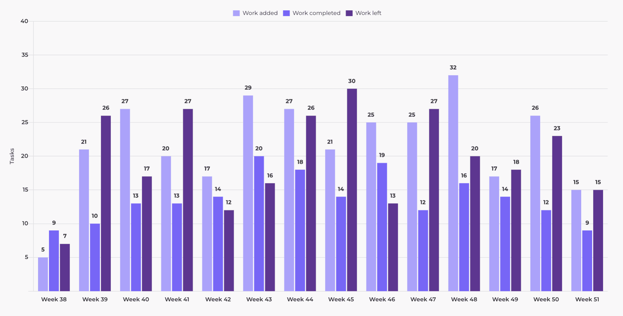
Burndown chart
The Burndown chart shows the amount of work completed in a work scope (such as an epic or sprint) and the total amount of work remaining. It can be used to predict the likelihood of completing the work in time.
The Burndown chart shows the amount of work completed in a work scope (such as an epic or sprint) and the total amount of work remaining. It can be used to predict the likelihood of completing the work in time.

Workload
The Workload chart shows how much work is assigned to each team member for the coming days, weeks, and months. It helps you to quickly see who can take more work and who is overloaded with too much work.
The Workload chart shows how much work is assigned to each team member for the coming days, weeks, and months. It helps you to quickly see who can take more work and who is overloaded with too much work.
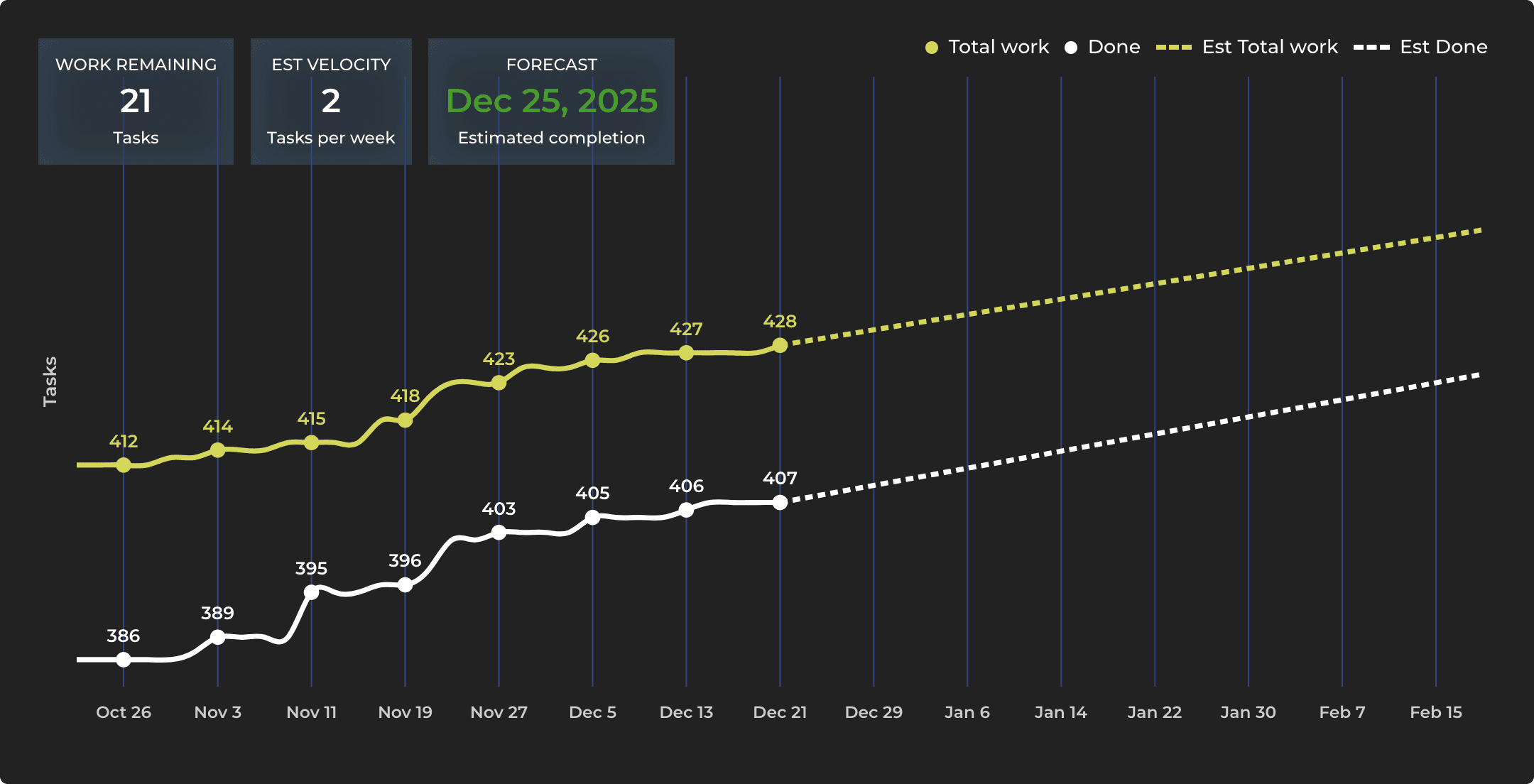
Forecasting chart
The Forecasting chart allows you to track progress toward a milestone such as the completion of a customer project or a new product release. What is the most likely delivery date based on historical velocity?
The Forecasting chart allows you to track progress toward a milestone such as the completion of a customer project or a new product release. What is the most likely delivery date based on historical velocity?
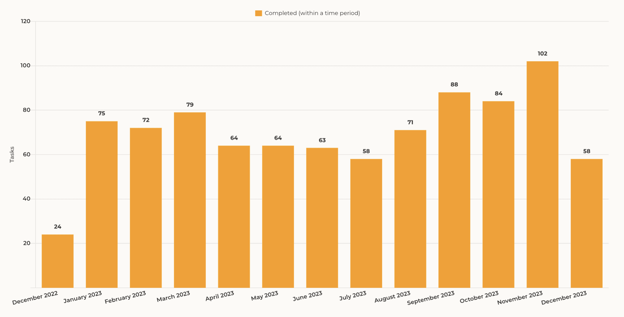
Bar chart
The Bar chart is a graph that shows one bar per grouped item (assignee, label, project, etc.). You can use any of your number fields as the unit in the chart.
The Bar chart is a graph that shows one bar per grouped item (assignee, label, project, etc.). You can use any of your number fields as the unit in the chart.
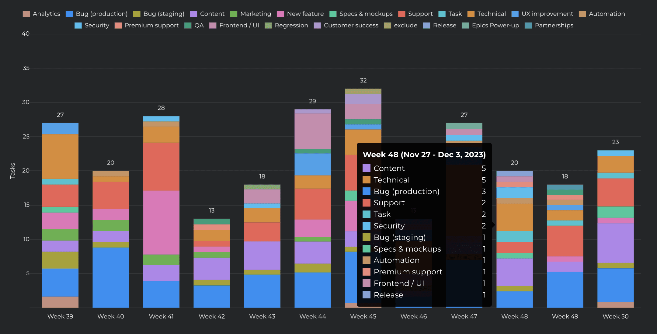
Stacked bar chart
The Stacked Bar chart adds one dimension to the bar chart, allowing for the segmentation of the bars. Track work by any property (assignee, label, etc.) or by week/month/quarter.
The Stacked Bar chart adds one dimension to the bar chart, allowing for the segmentation of the bars. Track work by any property (assignee, label, etc.) or by week/month/quarter.
Multi-bar chart
The multi-bar chart allows for the comparison of multiple number fields in a single chart. Eeah bar represents a single unit (number field). Compare two or more numeric custom fields in a single chart.
The multi-bar chart allows for the comparison of multiple number fields in a single chart. Eeah bar represents a single unit (number field). Compare two or more numeric custom fields in a single chart.
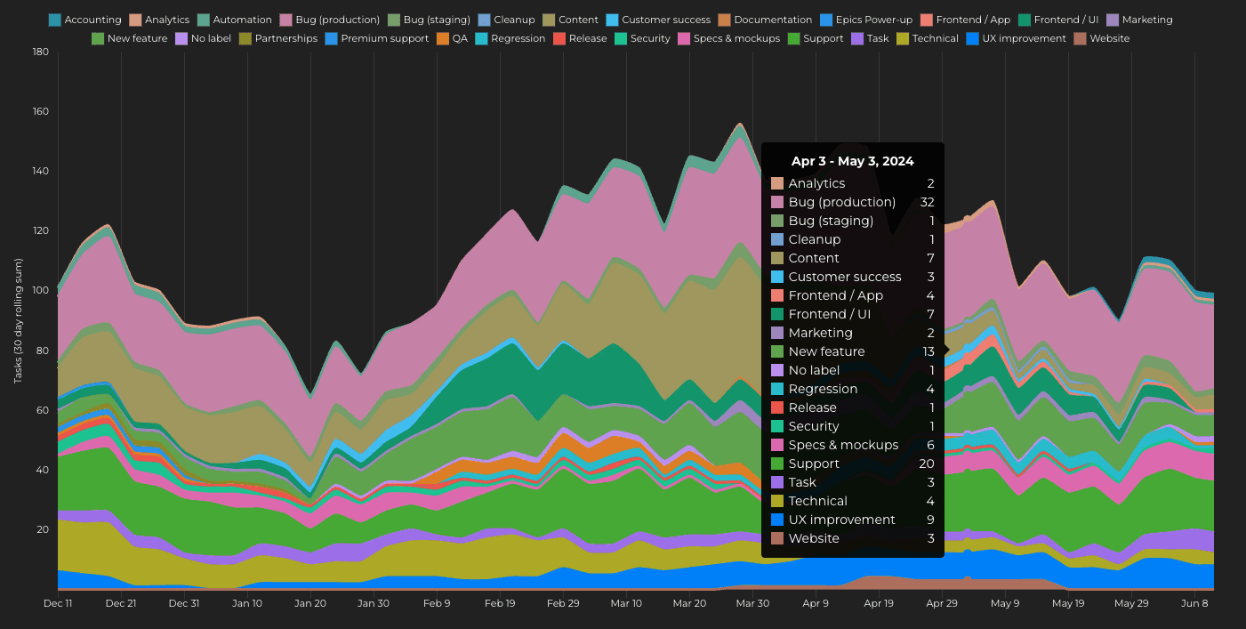
Stacked Area Chart
The Stacked Area chart shows you how your work is split across different activities, and what are the longer term trends.
The Stacked Area chart shows you how your work is split across different activities, and what are the longer term trends.
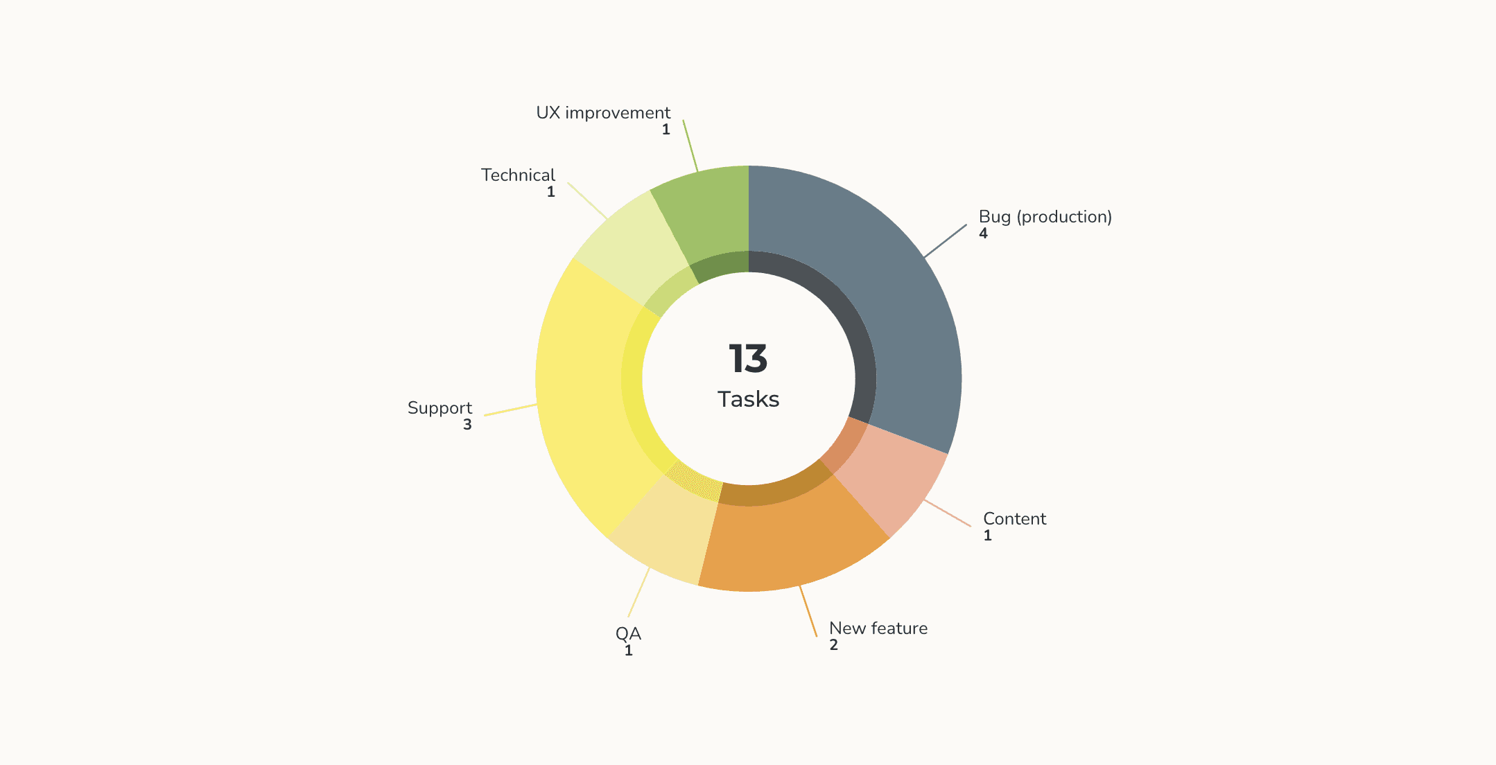
Pie chart
The Pie chart can be used for showing part-to-whole relationship in your data. The slices in the pie represent percentages of the total.
The Pie chart can be used for showing part-to-whole relationship in your data. The slices in the pie represent percentages of the total.
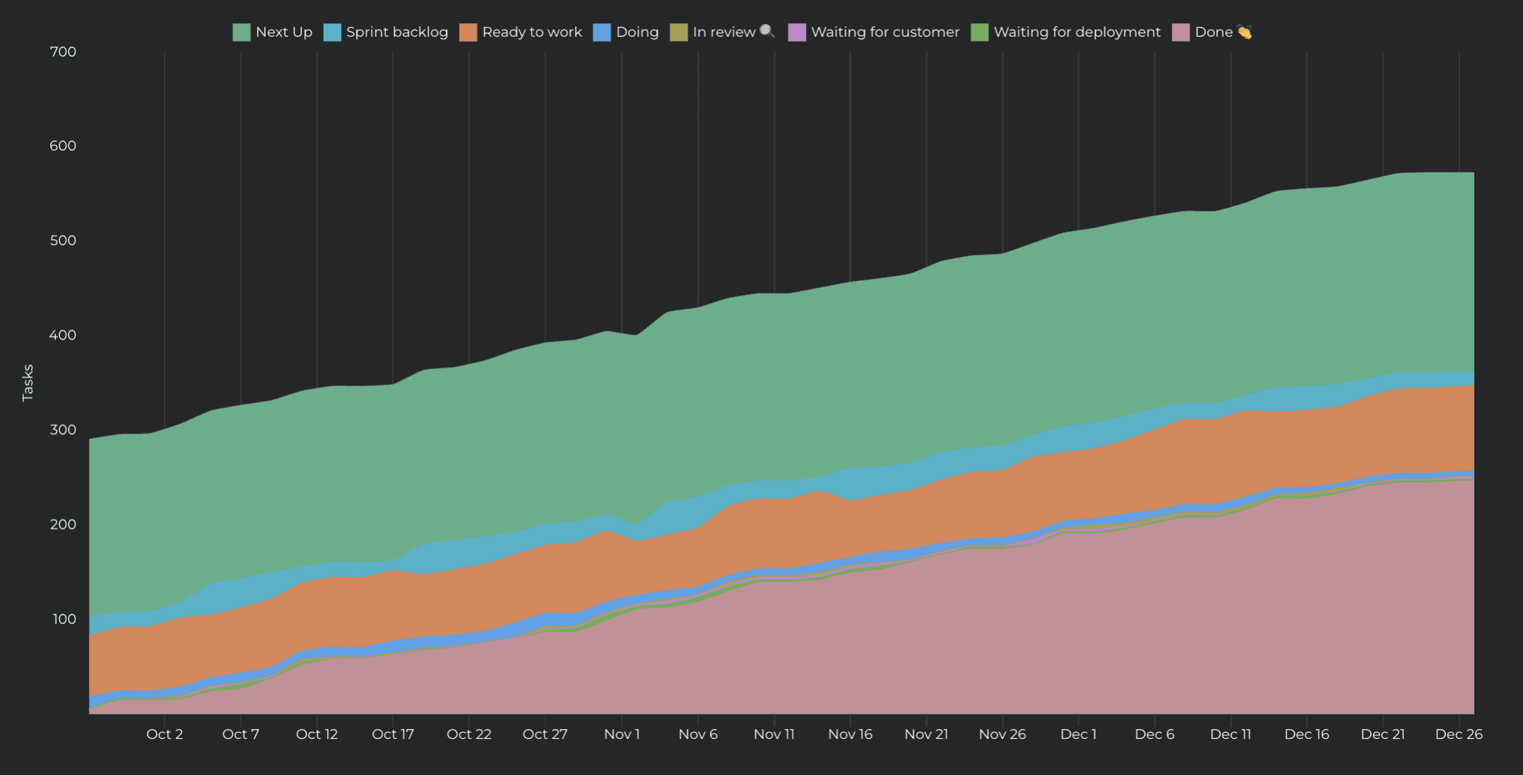
Cumulative flow chart
The Cumulative Flow Diagram (CFD) shows the amount of work in different stages of your workflow during the lifetime of your project. This chart helps you to see trends and spot bottlenecks in your workflow
The Cumulative Flow Diagram (CFD) shows the amount of work in different stages of your workflow during the lifetime of your project. This chart helps you to see trends and spot bottlenecks in your workflow