Introducing the pie chart 🥧 📊
Mar 30, 2023
Our library of custom charts just got a new chart type: the pie chart. You’re probably familiar with pie charts and might wonder why we haven’t shipped such a basic chart earlier. After all, we have already shipped 15 custom charts before introducing a pie chart. The reason is that most pie charts suck. Within the data visualization community, the pie chart is often considered the least useful of all charts, the one everyone likes to bully 😔
While we don’t fully disagree, we still believe that pie charts can be great for visualizing data when they are used correctly. Pie charts are particularly well-suited for visualizing data when:
The dataset consists of a relatively small number of categories
The primary goal is to compare individual categories to the whole
Percentages or relative proportions are of greater importance than exact numerical values
If you have a lot of categories to display, we recommend using a bar chart or a stacked bar chart instead. With these disclaimers, we’re excited to introduce our pie chart.
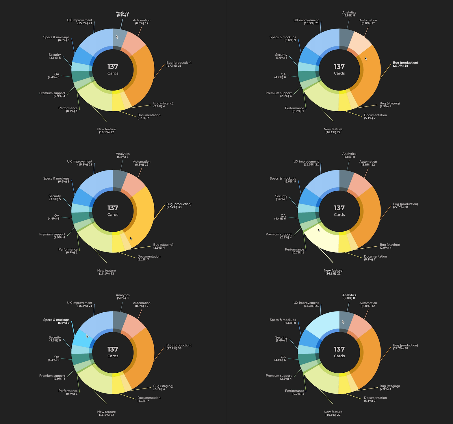
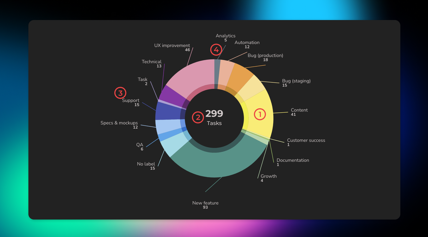
Here’s the chart in action:

So what makes our pie chart so special? We’ve made several design decisions to avoid the pitfalls that are common with the pie charts we’ve seen (i.e. the ones that do suck):
The chart has a donut form (instead of solid circle), making it easier to read and compare when there are multiple categories with similar proportions.
The center of the chart is used to display the sum of values, providing additional context to the data being displayed.
All the data (labels and values) is visible without the user having to mouse hover.
Instead of a separate legend, labels are directly connected with arcs.

Pie charts excel at visualizing the parts of a whole relationship. They're a good choice when you have a fairly small number of options to compare.
Avísanos si tienes preguntas o comentarios contactando hello@screenful.com. Para estar al tanto, lee nuestro blog, o síguenos en LinkedIn.

