Report columns and the number chart!
Oct 30, 2020
Here’s an update of the latest improvements to the recently announced Reports product. We’ve added columns to help you to build more complex layouts to your reports. We’ve also introduced a new Number chart, which you can place on your reports or dashboards in order to display a single number or measure.
Using columns in reports
In our initial release, you were able to place any of your custom charts into a report by adding one on top of another. We’ve added some more flexibility for setting the layout by enabling side by side placement of charts. You can now use two columns for displaying the content in your reports.
Here’s how to add a column to a report:
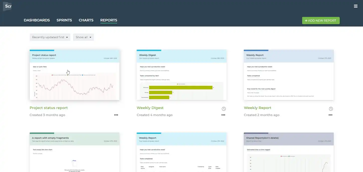
You can set any two charts next to each other to any row in your report. You can also mix them with the text blocks so you can have two custom charts in the same row, or two text blocks, or charts and text blocks mixed.
Go ahead and start adding columns to your reports!
Introducing the Number chart
We’ve added a new chart to our library of custom charts. With the Number chart, you can display a single number (such as number of tasks or story points) or a measure (such as lead or cycle time), and have it placed in a report or a dashboard. Here’s how to do it.
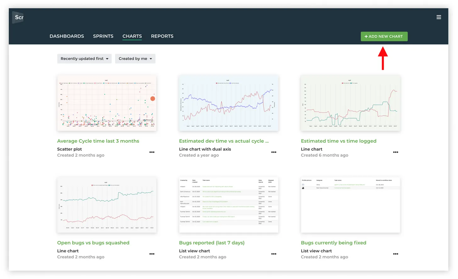
When you’re in the Charts tab, you can create a Number chart by clicking the Add new chart button on the top right of the header bar:
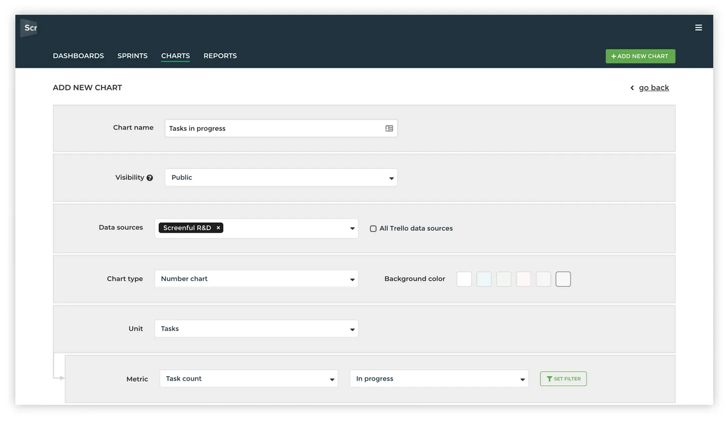
The chart editor is opened and you can set the name for the chart, select the data source, and set the visibility of the chart. From the Chart type menu, select Number chart
Once you’ve selected the chart, you can select the metric you want to display such as a task count, story points, lead or cycle time, or the number of hours worked or estimated. You can also select any of your custom fields as the unit for your Number chart.
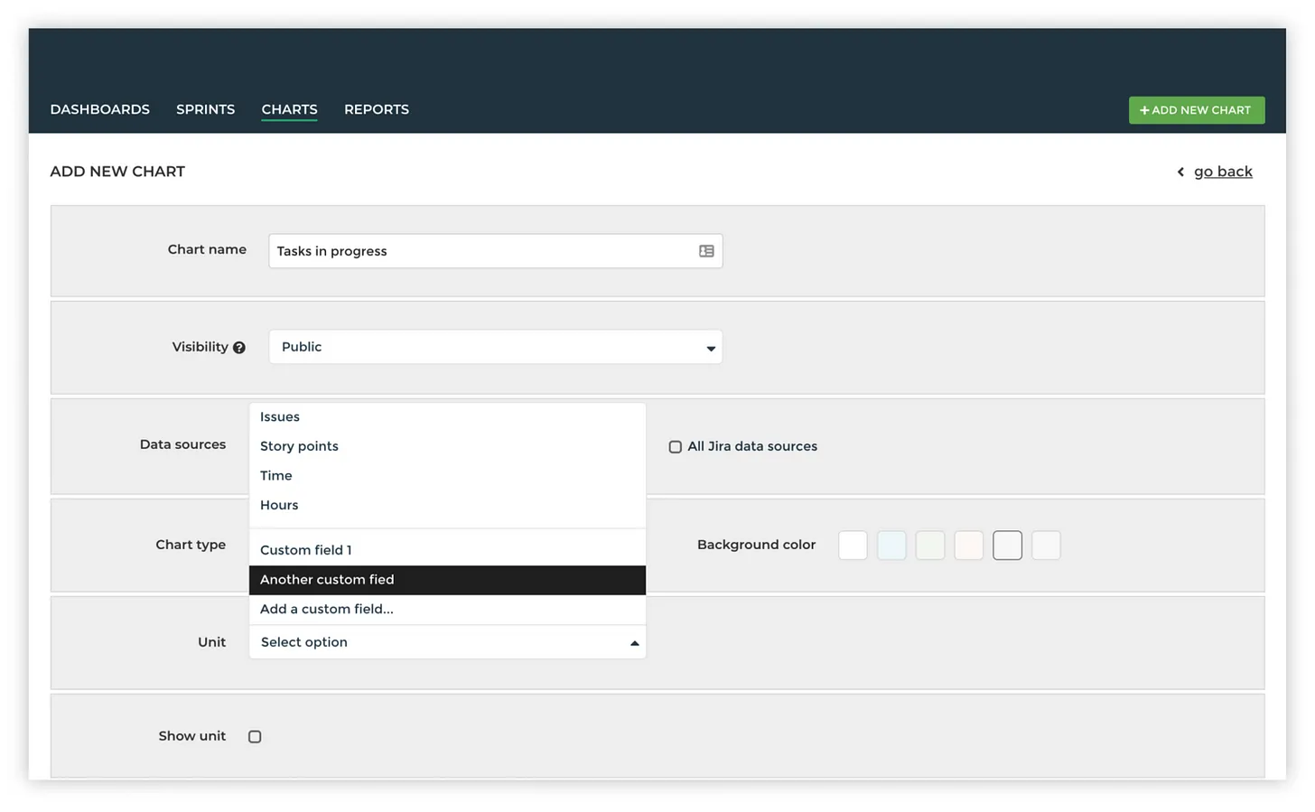
Pick the metric that you want to track with a Number chart. You can set a filter to include only tasks that contain specific assignees, epics, labels, projects, or any other properties that are available for your tasks.
Once you click Create chart, a Number chart is created and you can add it to any of your dashboards or reports.
Using Number charts in reports
Number charts are great when all you want to do is to display a single number. This is often the case when you want to track an individual KPI. You can add any of your Number charts to a report by creating a chart under the Charts tab and then adding it a report.
You can combine data from any of your projects or boards into a single number. If you have more than one KPIs, you can place them all in a single report. Here’s an example report with two KPIs presented on the top of a report as Number charts:
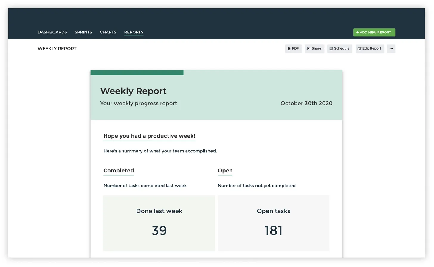
It is a great way to share the numbers that really matter with your team, and the rest of the organisation. Once you have your key metrics nailed, go ahead and share them with others using TV dashboards and reports.
Avísanos si tienes preguntas o comentarios contactando hello@screenful.com. Para estar al tanto, lee nuestro blog, o síguenos en LinkedIn.

