How to see all your Asana workload on a single chart
Mar 3, 2022
Have you ever struggled to balance meddling in your team’s tickets and ensuring that the workload is equal and fair for everyone? Balancing the project workload is one of the most critical parts of managers’ jobs.
The Workload chart shows how much work is planned for the future across all of your Asana boards. It takes all the tickets with a set due date and summarizes the total planned work by day, week, month, or quarter.
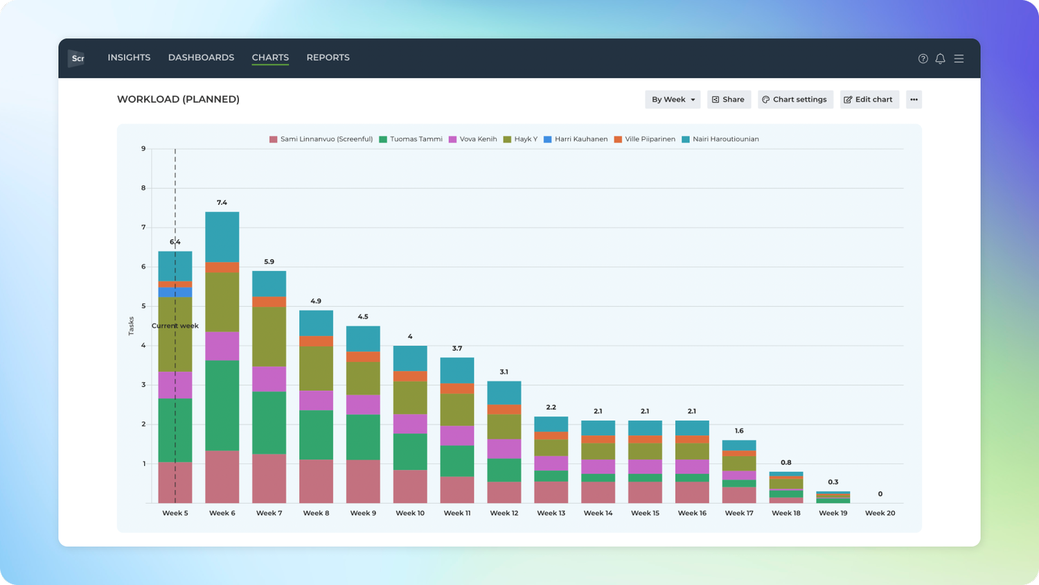
Here’s an example chart made with Analytics & Reports by Screenful:

In this example, the chart is grouped by Week, and the bar segment is Assignee. The chart shows how much work is allocated per Week for each Assignee. The leftmost bar is the current Week, and the bars to the right are in the coming weeks.
As the chart's name suggests, it only shows the work with a planned duration. That means an issue must have at least a due date set to be included in this chart. Issues without any deadlines are not included in this chart.
The work is evenly distributed for the remaining days. For example, if you have 20 issues with a due date in 10 days for each, two issues will be allocated per day.
You can also set a start date for an issue, and the chart will take that into account. If the start date is not specified, the chart allocates the work from today until the due date.
Adding dates to Asana tasks
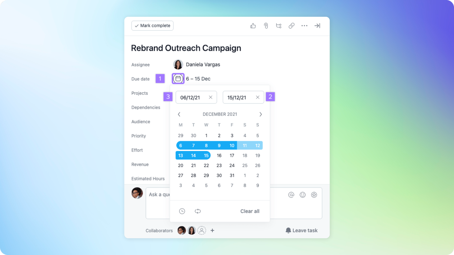
To add a start date
Click on the Due Date field within the task.
Click on or type in the due date.
Click on or type in your desired start date to the left of the due date.

Notice that there may be some delay before the dates become visible in the Screenful. Once you have set the dates, they will be reflected in the chart after the next data sync which is run automatically once per hour. You can trigger the sync manually at any time by selecting the Data sync options from the main menu.
Configuring the Workload chart
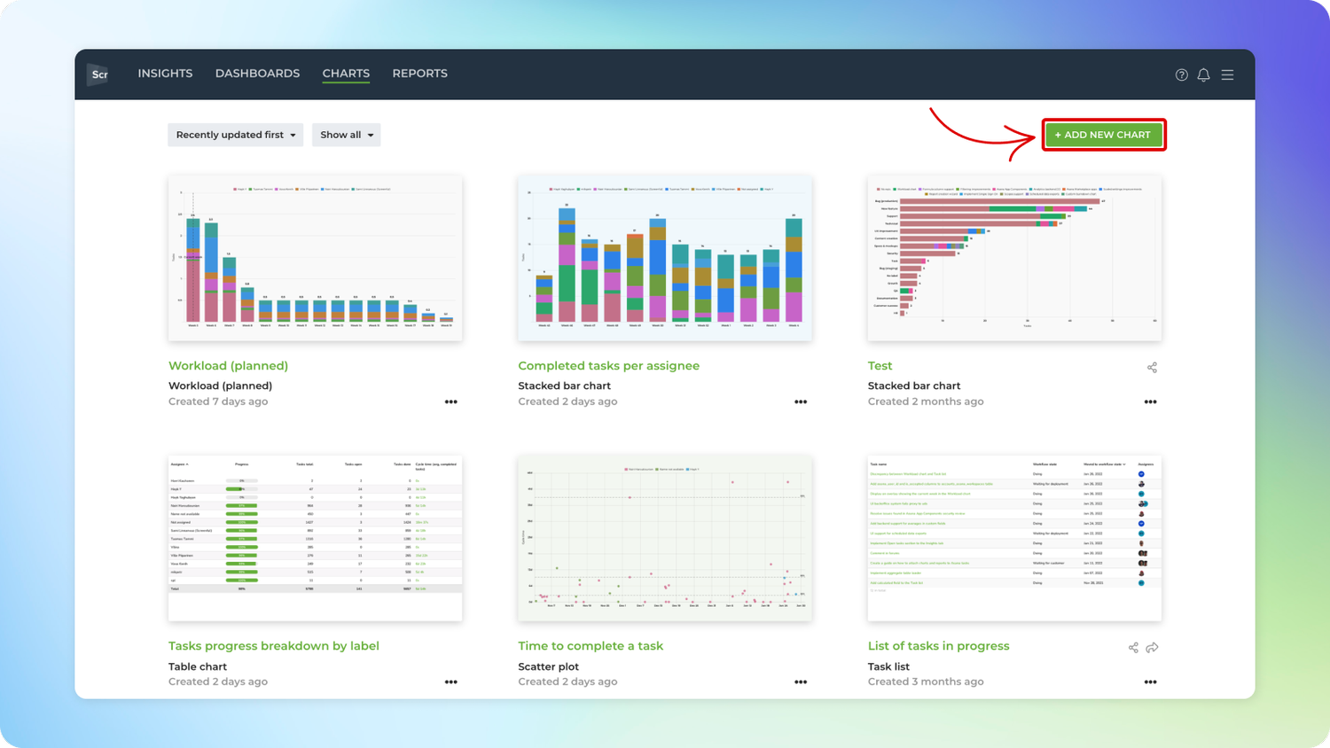
To create a Workload chart, go to the Charts tab and click Add new chart.

A modal is opened with a set of chart templates. Select New blank chart to open the chart editor:

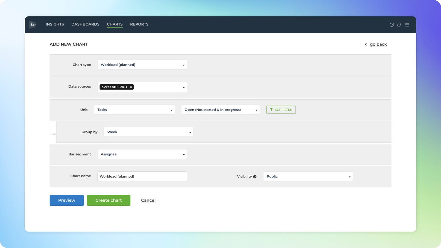
In the editor, select Workload as the chart type. In this example, we’ve selected grouping to be by Week, and bar segment to be Assignee. That produces a similar-looking chart.

Notice that you can use any of your custom fields as the unit. By default, the chart uses Tasks as the unit, but you can change it to any custom fields from the unit menu. So, for example, if you have set work estimates for your tickets (e.g., as Story points), you can configure the chart to use those.

Hope it helps! If you run into any questions - feel free to message us and we’ll do our best to help you out 😉
Avísanos si tienes preguntas o comentarios contactando hello@screenful.com. Para estar al tanto, lee nuestro blog, o síguenos en LinkedIn.

This article was written by Vova Kenih
Vova is the Head of Growth at Screenful, the company that turns data into visual stories. You can find him on Twitter @vovakenih