Time in state screen
Time in state chart shows you how long your tasks stay in each step of your workflow on their journey to completion. It is a very powerful chart to have in hand when you want to understand how quickly your tasks are completed, and whether there are bottlenecks in your workflow.

HOW LONG EACH WORKFLOW STEP TAKES?
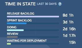
The top left overlay shows the average time a task stays in each workflow state before completion. Each bar represents one workflow step, and the number on the right shows how long a task has stayed on this step on average during the observed time range.

SEE THE TOTAL TIME SPENT ON SELECTED STATES
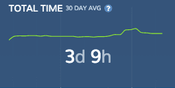
The overlay on the right shows the time a tasks has stayed in the selected states on average. The average is calculated from the tasks completed during the last 30 days.

IS YOUR WORK FLOWING SMOOTHLY OR PILING UP?
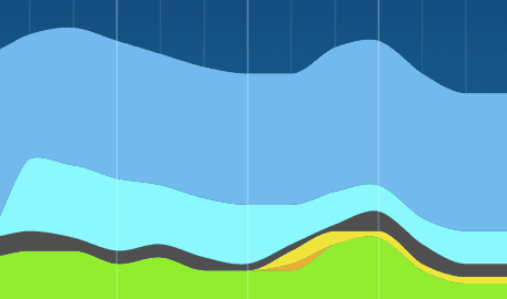
The main chart in the background allows you to see trends - are some steps getting faster or slower. Each coloured area represents one workflow state. The horizontal axis indicates time, and the vertical axis indicates the number of days. Each point in the vertical axis shows the average number of days a task has stayed in each state during the previous 30 day period.
Learn More
From our blog: Ensuring a steady flow of work