Renaming the text labels
When you create a custom chart, you only need to provide the name of the chart. All other labels are automatically generated based on the units and metrics selected for the chart. However, you don’t have to stick with the auto-generated names as you can rename them.
To rename the text labels, click Chart settings on top of the chart view, and scroll to the bottom of the page:
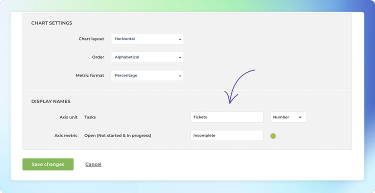
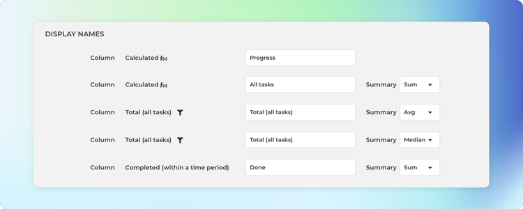
In the Display names section, you’ll see a list of units and metrics selected for the chart. In the input field on the right, you’ll see the given name. By default, it is the same as the name of the unit or metric but you can rename it to what best represents your data. In this example, Tasks is renamed to Tickets, and Open (Not started & In progress) is renamed to Incomplete.
Here’s the chart with the updated names:

Adjusting the rolling window size in the line charts
When displaying data as a line chart, a sliding window is used to smooth away the daily fluctuations so that you can see the trend from the noise. The rolling window size is now configurable in the chart settings.

If you select 1 day rolling window, each point in the horizontal axis display the number of items (e.g. tasks created or tasks completed) per day. With 7 day rolling window, each point in the horizontal axis display the sum (or average depending on what metrics was selected) over the previous 7 days period.
Here’s an example chart with 30 days rolling window. When you hover the mouse over the chart, the tooltip shows the values for the previous 30 days period.

The longer the rolling window, the less variation there is in values, creating a smoother trend line. With smaller window sizes, you can see more details but the overall trend may get distorted by the daily fluctuations.
Configuring summaries in tables and lists
The Table chart aggregates the task data into sums, averages, and other statistics. Each row in a table chart is a segment such as label, epic, assignee, or a project. The Task list chart allows for creating lists. Each row in the Task list is an item (task, ticket, issue). You can select any item properties to be shown in the columns. Both of these chart types come with a configurable summary row.
By default, the Task list chart does not include a summary. To enable the summary row, visit Chart settings and use the toggle Show summary row to enable the summary row for the chart.
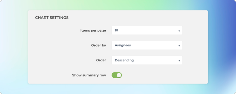
In the Chart settings, you can configure the type of summary for each column to be either sum, average, or median. If you select None, no summary is displayed.
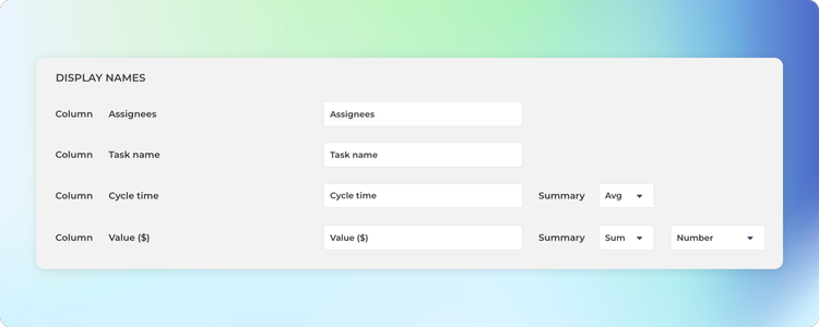
The summary menus are shown for each column that contains numerical or timing data.
Once you have saved the settings, the chart starts displaying a summary row at the bottom.
If you have added numerical columns to your reports such as estimates or story points, or financial data like budgets and costs, you can use the summary row to display the totals for the selected columns.
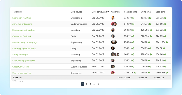
The Table chart also comes with a summary row that displays the sum, average, or median for each column in the table. You can configure the summary type in the chart settings
Here’s an example Table chart with the summary row:
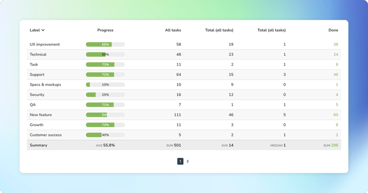
Unlike in the Task list chart, the summary row in the Table chart is fixed, and there is no setting to toggle it on or off. However, you can configure each column separately, and if you select None, no summary is displayed for that column.
Adjusting the colors of the chart
Go to the Chart settings and scroll to the bottom of the page. In the Display names section, you’ll see a colored circle next to each metric, displaying the currently selected color for that metric. When you click the circle, a modal is opened allowing you to pick a color from a palette.
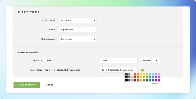
Notice that some charts (such as the stacked area chart) have auto-generated colors based on the selected grouping, and therefore the color selection is not available for them.
Switching to the dark mode
If you need to place a chart into a dark background, or you just prefer your UI as dark, we’ve got you covered! In the chart settings, you’ll find the Dark mode slider
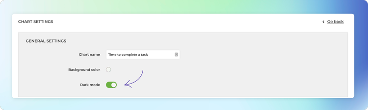
When you click the slider, the chart switches to the dark mode

Configuring date formats, number formats, and currencies
Different countries have different standard formats for numbers and dates. You can configure the date and the number format to match your local standards under the Account settings.
The Date Format menu contains the most common date formats
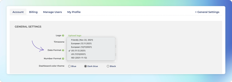
When you pick a date format, the selected format will be applied to all of the charts in the account. The Number Format menu contains the most common number formats

When you pick a number format, the selected format will be applied to all of the charts in the account.
If your data represents monetary values, you can specify a currency under the Chart settings. In the Display Names section, you can select between number and Currency

When a currency is selected, the associated currency symbol is shown in front of the numbers. Here’s an example line chart with currency set as “$” to represent the amount in USD. Both the Amount earned on the top left, and the tooltip display the selected currency symbol.
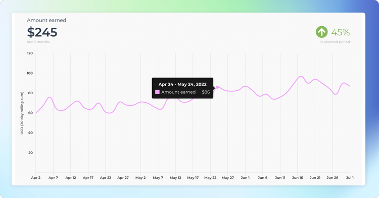
The currency setting is a chart specific feature. In the chart settings, you can specify which of the metrics are currencies. If your numbers represent a currency, you can make it more explicit by displaying it as the currency. The default for a numeric field is Number i.e. just a plain number, not a currency.