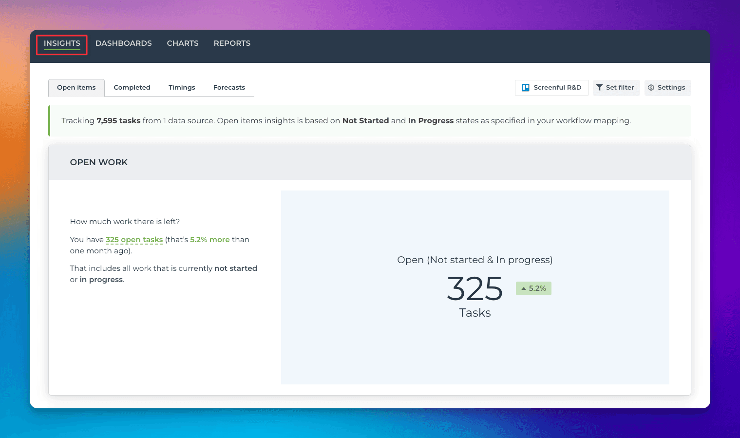
Where to find the Insights feature?
The Insights tab allows you to explore and learn about the data before creating any of your own charts (you can charts under the Charts tab). It consists of pre-generated charts divided into four sections: Open items, Completed, Timings, and Forecasts. You can access it from the top navigation:
You can adjust the charts by selecting the data sources, filters, and other settings. When you master those, you'll likely get most of your questions answered when it comes to the most common metrics and charts, without having to create a custom chart for it.
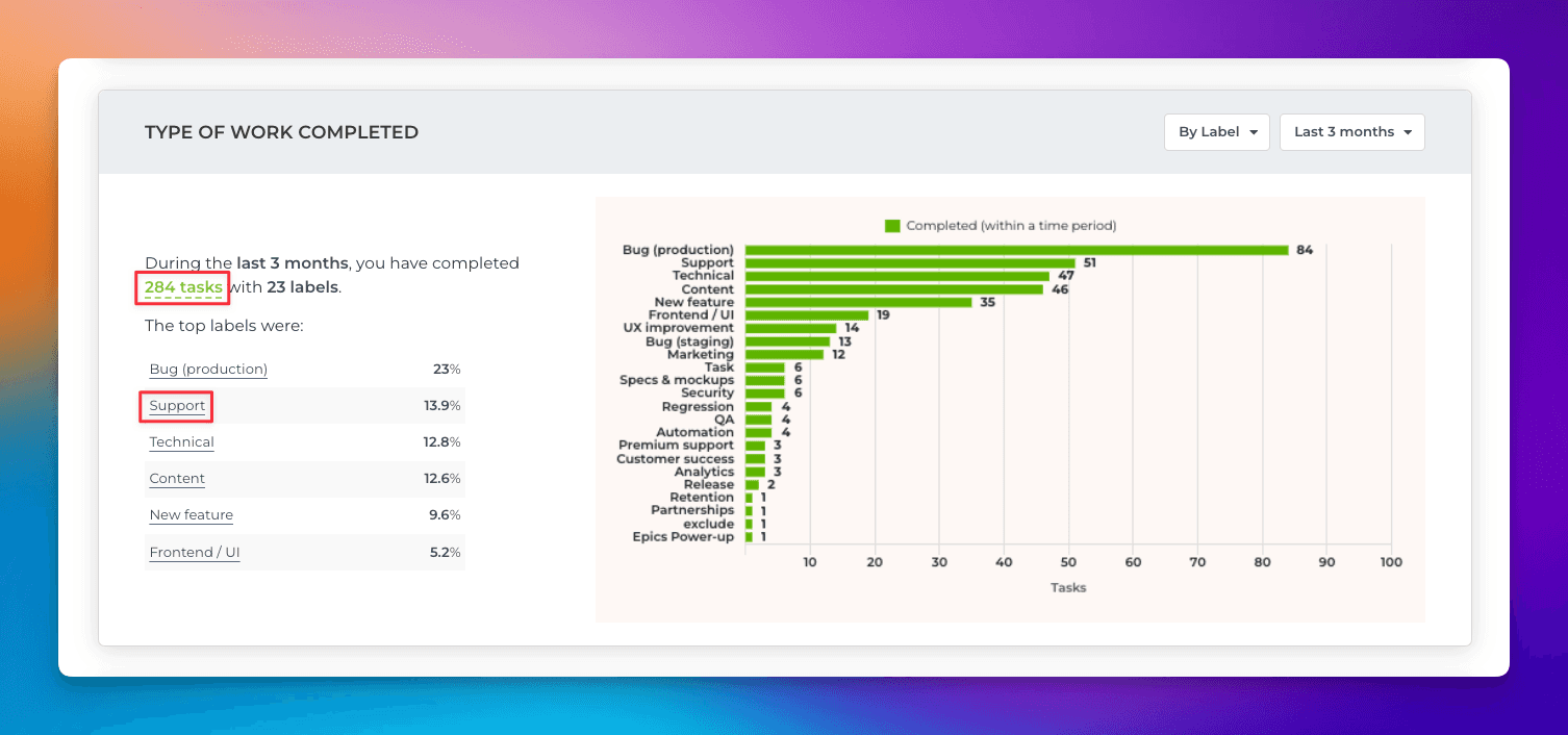
Interact with click-through and mouse hovers
You can interact with the charts with click-throughs and mouse hovers. The chart description contains links that allow you to see the individual items behind the numbers:
When you click a link, a modal is opened, showing the list of items:
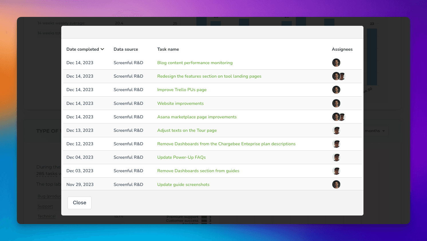
Clicking the name of an item opens it in the source tool.
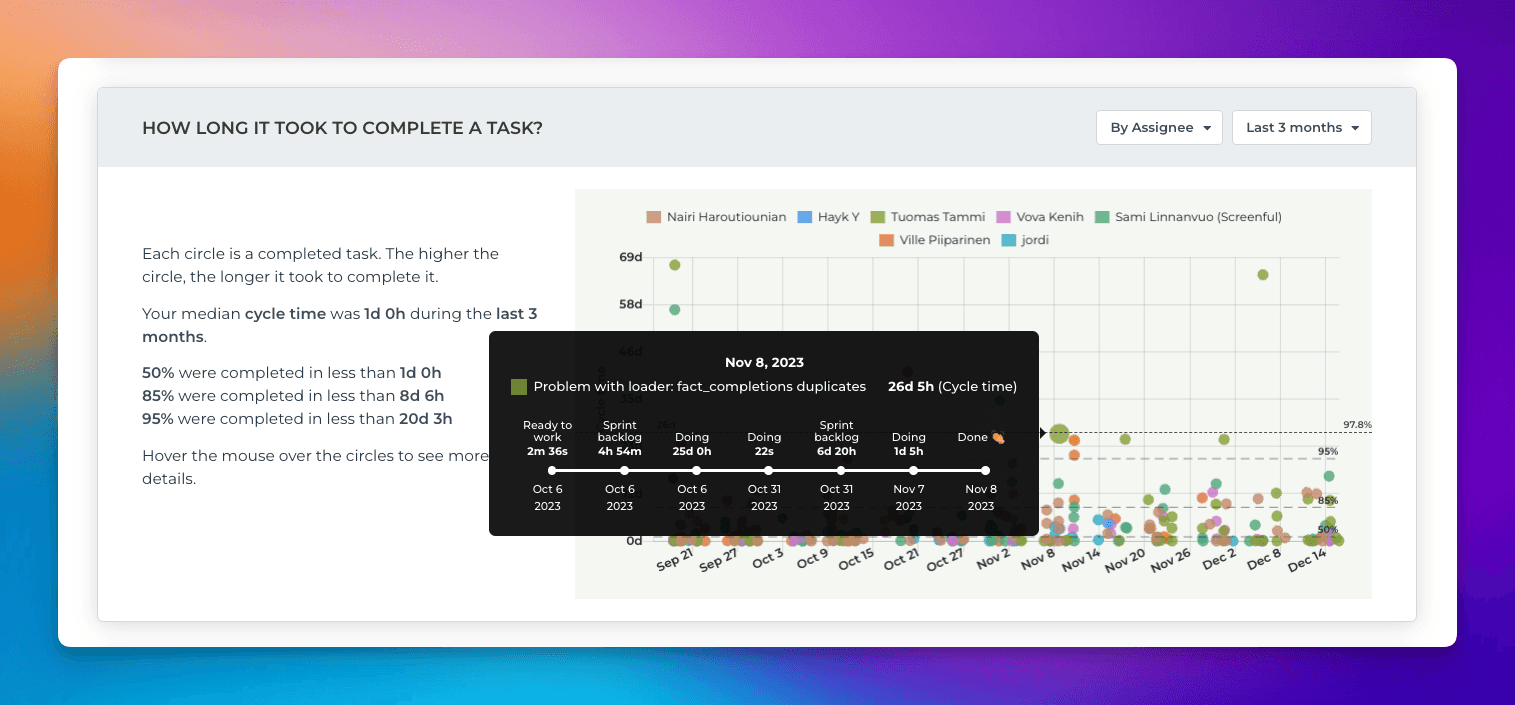
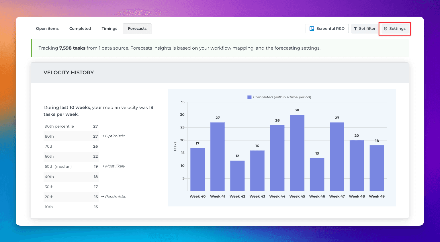
The Timings tab shows how long it takes to complete a task. You can mouse-hover over the question marks to see how long a task stayed on each workflow step:
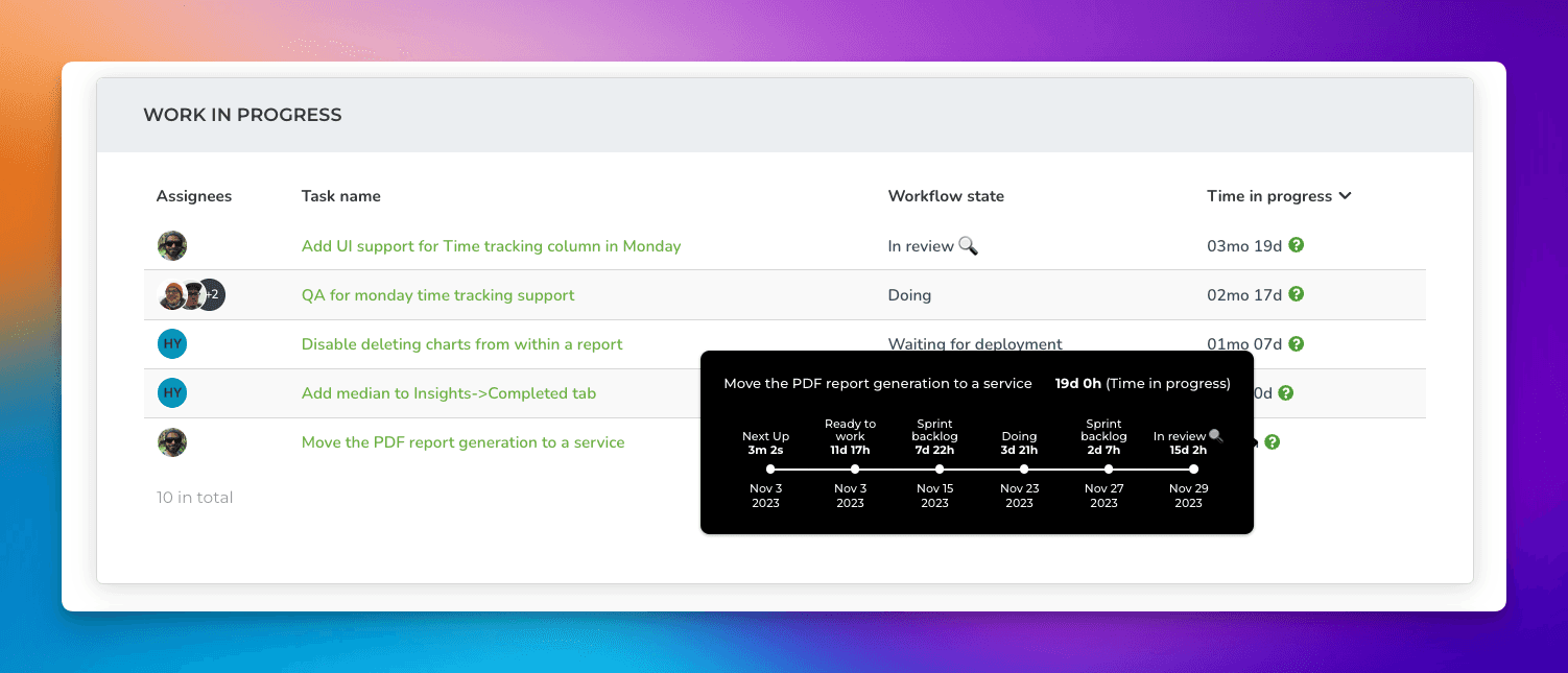
The modal shows which workflow states the task has visited while progressing through your workflow. The first step on the left shows where it started, and for each step, you can see how much time the task spent on it before moving to the next workflow state.
You can also hover the circles in the scatter plot to see the same:
The Insights tab provides complete transparency on how the metrics are calculated. Drill down to individual items to see the outliers and the items that need your attention.
Select the data sources
You can select the boards you have imported from the data sources selection control on the top right. Once you have selected one or more data sources, all charts within the Insihts tabs will use that selection.

Pick one or more data sources to feed data to your chars:
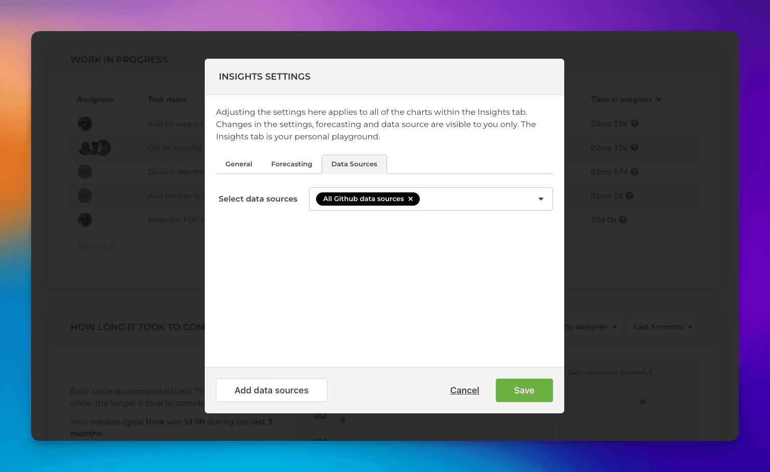
You can either select individual data sources, or you can select all data sources, which will include all the data sources in your account.
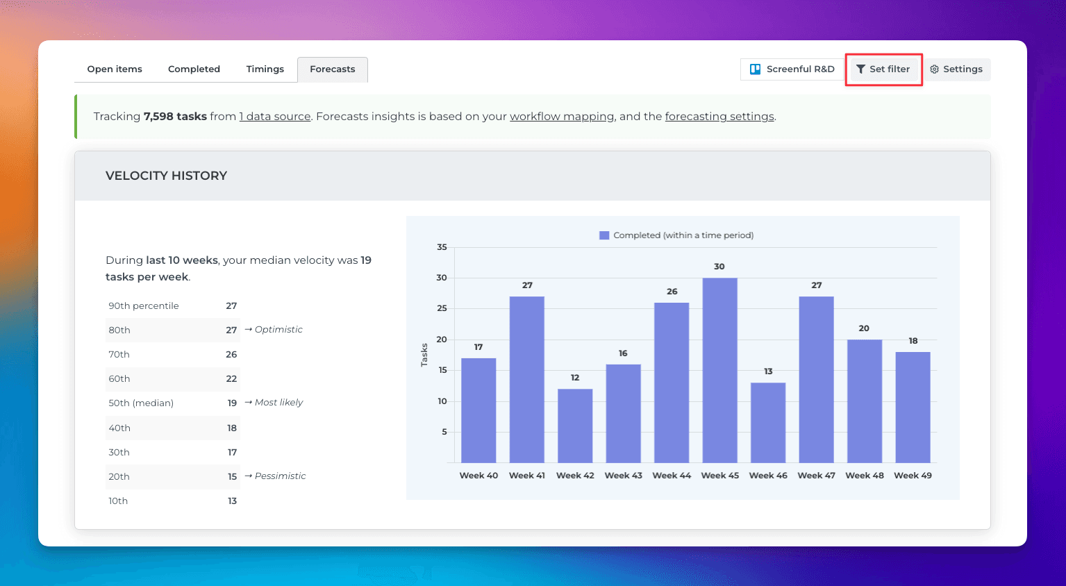
Adjust filters and settings
You can narrow down your data to any subset by setting a filter. You can find the filter feature in the top right corner:
You can filter by any of the task properties available in your data such as assignee, group, label, board, project, sprint, milestone. You can also filter by any of your custom fields.
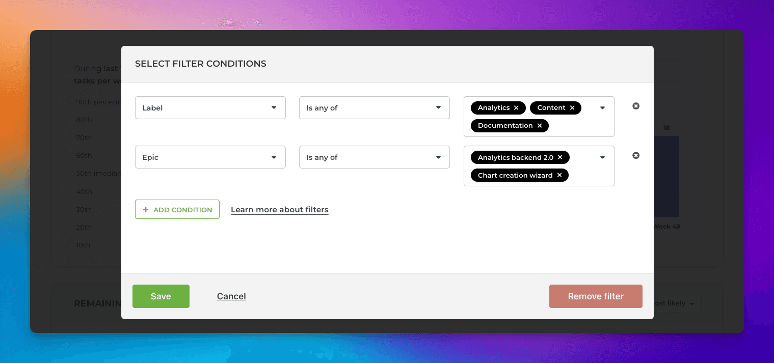
You can set multiple filters by selecting them one by one. You can learn more by reading the filtering guide.
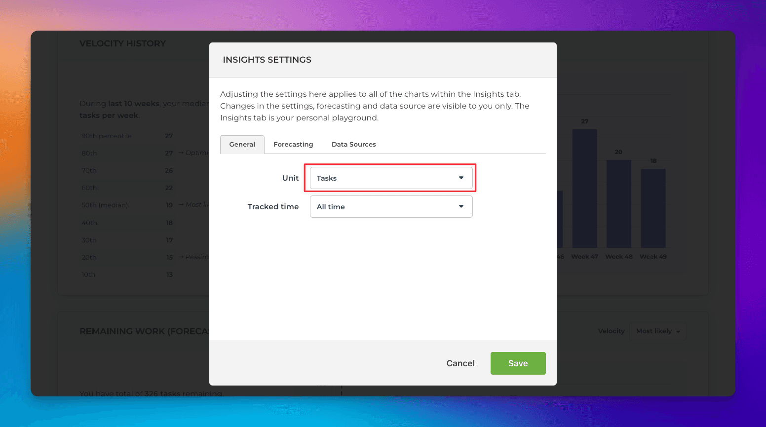
The Insights tab comes with its own settings, which you can access by clicking Settings on the top right:
The Settings modal is opened, with settings specific to the Insights tab. For example, you can choose which unit is used in the charts from the Unit menu. By default, the charts are counting tasks/issues, but you can change it to whatever numeric field you have in your board (e.g. hours or story points).
You can learn more about the Insights tab on the Tour page.
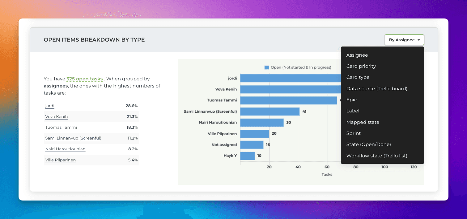
Adjust the charts with quick menus
Some of the charts display grouped data. You can change the grouping by selecting a property from the Group by menu:
If a chart displays time-based data, you can adjust the date range:
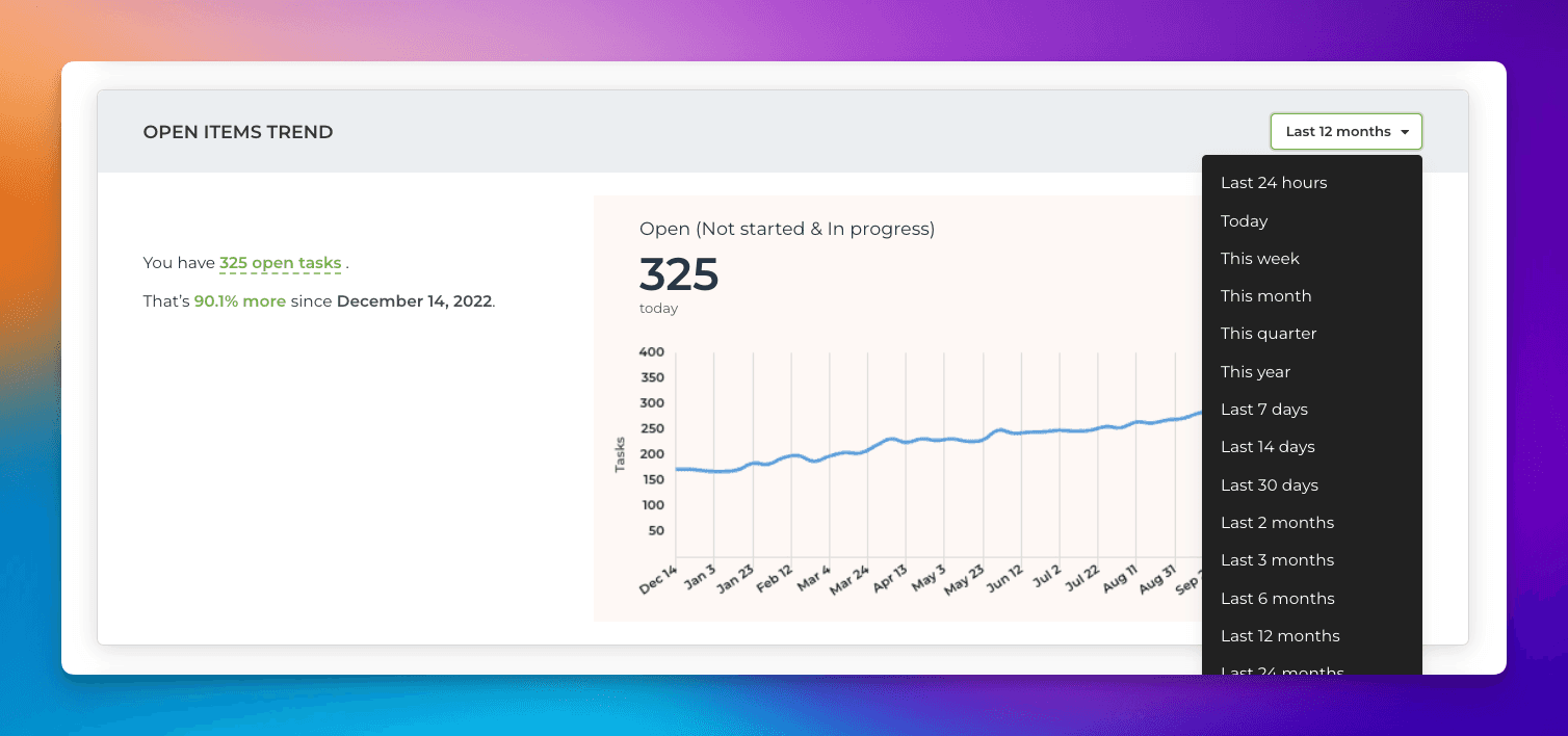
Notice that the length of the available history depends on the plan. For trial accounts, it is six months.