
Get data-driven forecasts for your Linear projects with the Forecasting chart
Jan 26, 2026
The forecasting chart for Linear shows the progress toward a milestone, such as the completion of a customer project or a new product release. You'll see how much work is done vs remaining, and get data-driven forecasts based on your team's past velocity.
It works even if you don't use any specific methodology, such as Scrum or Kanban, and regardles of whether you have time estimates in place or not.
Contents:
How does the Forecasting chart work?
If you want to know how long it will take to finish all the remaining work in the backlog, the traditional approach is to break it down into stories, and provide an estimate for each story. Once you have the estimates in place, you can count the total time and come up with an estimated delivery date.
However, this is time-consuming and unreliable as estimating future work is hard. A data-driven approach looks at your historical data and makes a prediction based on that.
Here’s a chart that shows how much work a team has completed per week during the last 10 weeks:
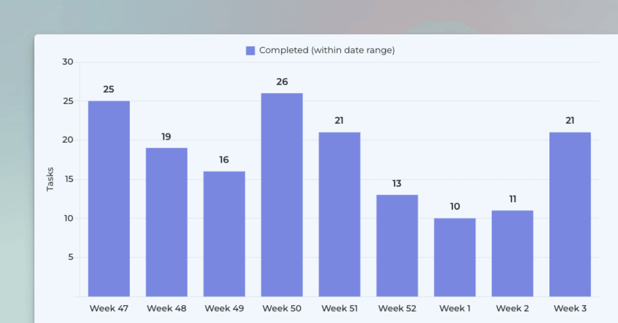
The Forecasting chart looks at the weekly history of the team’s throughput and creates three scenarios based on the distribution of the work completed per week:
Optimistic: 80th percentile
Most likely: 50th percentile
Pessimistic: 20th percentile
The optimistic scenario expects that your team completes more work than in 80% of the past weeks. In the most likely scenario, your team completes the equal amount as what is the median week. In the pessimistic scenario, the team completes only as much as 20% of the past weeks.
The percentiles are configurable so it’s up to you to decide what you consider optimistic or pessimistic considering your current situation. What is important is that the forecast is now based on actual data instead of pure guesswork.
What do the numbers in this chart tell me?
The chart consists of two lines, a yellow line representing the total work scope and a white line representing the work done. The middle point of the chart is the current day. Left to it is history, and to the right is the forecasted future, represented as the dotted lines. The lines may extend beyond the borders of the chart, both on the left and right. There is a date range menu on top of the chart that allows you to zoom in and out in the timeline.
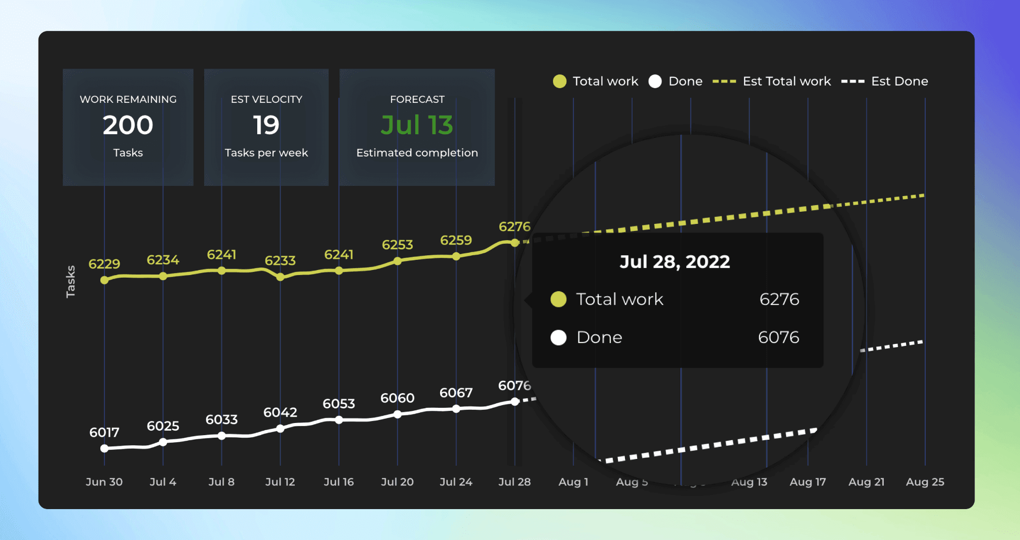
As time progresses, the white line approaches the yellow line helping you to gauge when the remaining work might be completed. The numbers can represent estimates, if available, or simply issue counts.
The overlays on the top show the amount of work remaining, the estimated team velocity, and the estimated completion date.
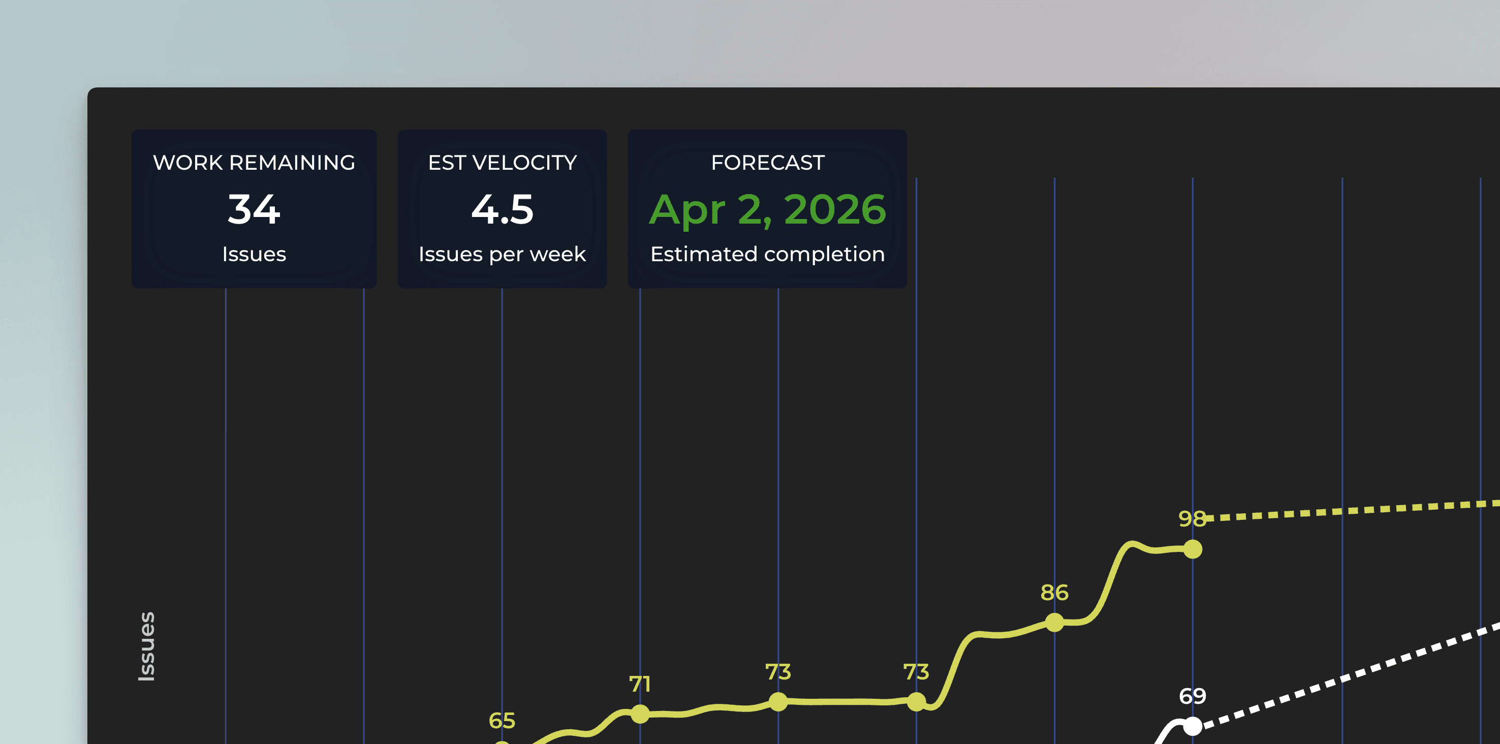
The work remaining is the difference between the work done and the total scope of work. The estimated velocity shows how much work you are expected to complete per week. The estimated completion date is when the two lines are expected to meet (if ever).
Will this work if my tasks aren’t all the same size?
Your Linear issues don’t need to be uniformly sized for this approach to work. If you compare 100 past Linear issues with a sample of 100 issues from your current backlog, their average size will be roughly the same. This holds true whether you measure size using estimates or simply by issue count.
What matters more than individual issue size is the consistency of your historical throughput. The more stable your throughput, the more reliable your projections become. When your team completes a similar amount of work week after week, your process becomes far more predictable.
Keep in mind, though, that if your team’s conditions change significantly (such as a team member leaving), you’ll need to update the chart scenarios (percentiles) to reflect the new reality.
What is the difference between full velocity and filtered velocity?
Since the work scope can be limited to any subset of tasks, the estimated velocity may need to be adjusted accordingly. Whether you use the full team velocity or a reduced velocity depends on how much of the team’s capacity applies to the filtered scope. For example, filtering a forecasting chart by a specific label results in a velocity based only on the historical throughput of tasks with that label.
You can control this behavior in the chart settings by choosing either Full velocity or Filtered velocity:
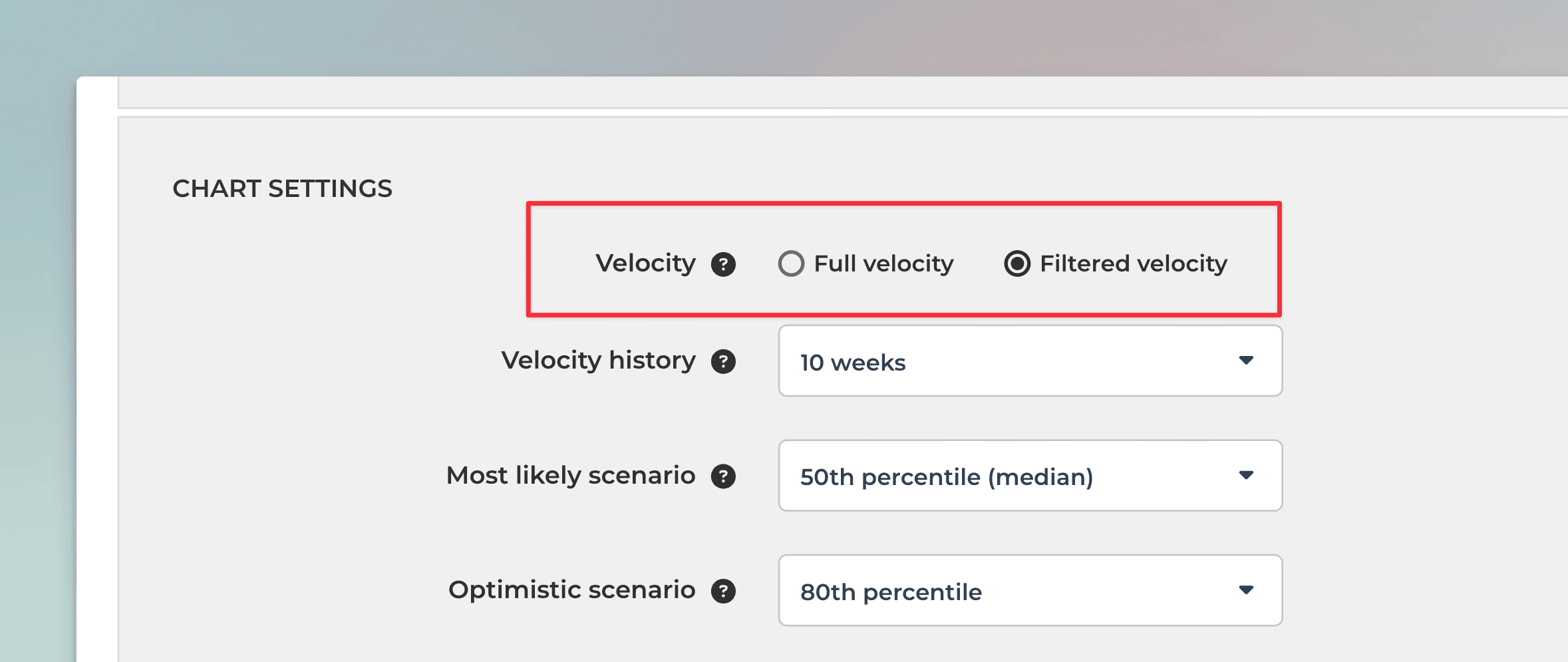
Use filtered velocity in cases like this:
“As a manager, I want to see how much work is assigned to John Smith and how long it might take him to complete his tasks.”
In this scenario, the work scope is limited to a single team member. Since that person completes the work independently, a filtered velocity provides the most accurate forecast.
Use full velocity in cases like this:
“As a manager, I want to understand how long it will take to complete all work planned for the next milestone.”
Here, the scope is filtered to a future milestone, but there is no historical velocity specific to that milestone yet. As a result, using the full team velocity is more appropriate.
By default, the chart applies filtered velocity whenever a filter is set, meaning the filter affects both the work scope and the historical velocity used for the forecast.
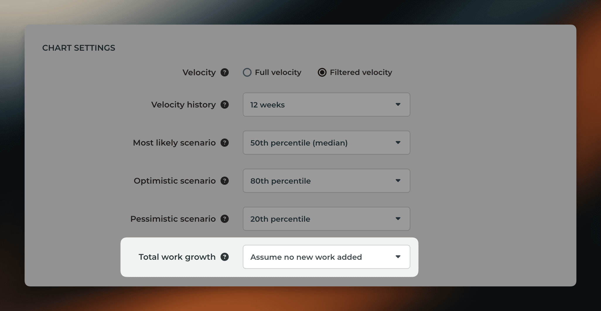
What does the growth of the work scope mean?
While you can expect to complete work in the future, it is quite likely that the amount of work to be completed increases as well. The expected growth in the work scope can be taken into account in the forecast. The forecast for the work scope is based on the same principles as the forecast of the work completed i.e. percentiles. In the chart settings Total work growth, you can specify how much you expect the work scope to grow in the future.
When Assume no new work added is selected, the forecast for the total work is flat:
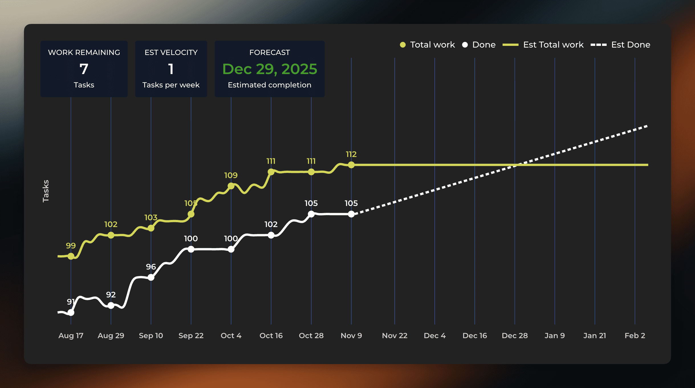
With this setting, the chart provides an answer to the question “how long does it take to complete the current backlog of work?”.
When 50th percentile is selected, the chart assumes that there will be new work added to the scope at the same pace as in a median week in the past.
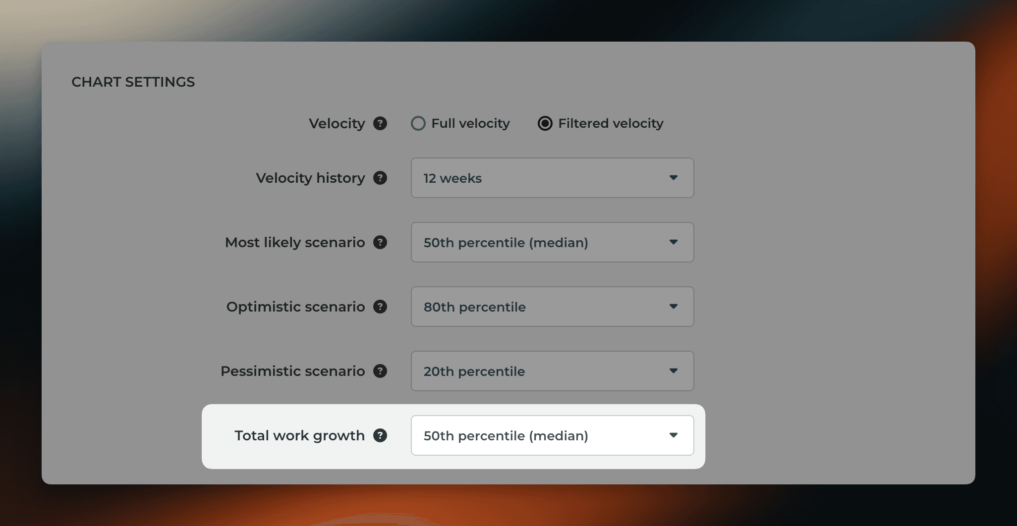
Now the forecast for the total work is trending upwards and the estimated completion date is pushed further.

It is possible that total work grows faster than the work done. For example, at the beginning of a project, new tasks may be added faster than they are completed. That is perfectly fine, even expected. In such a situation, an infinity symbol, instead of a date, is shown on the right overlay.
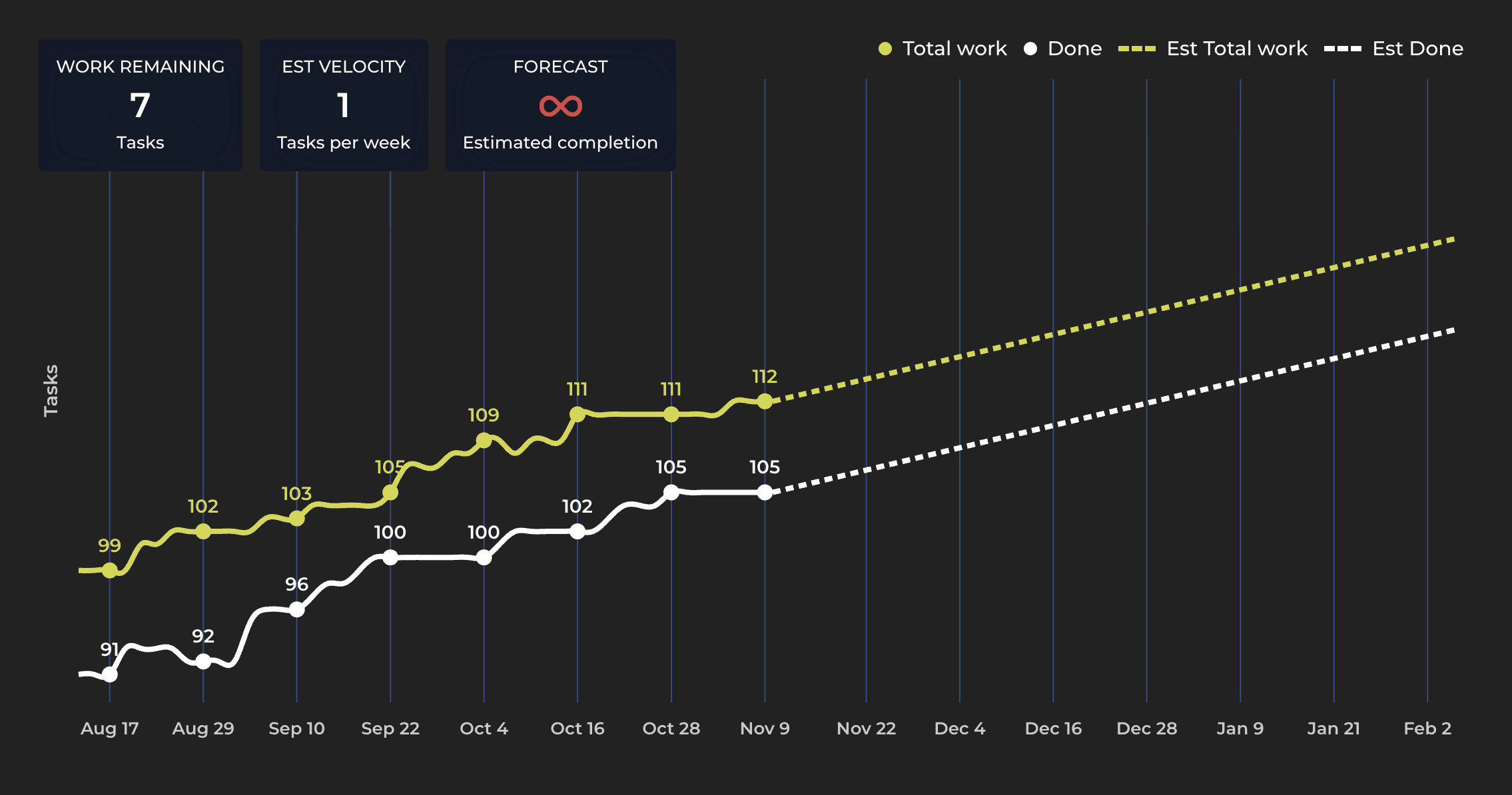
As your project progresses, less new work is introduced, and the amount of remaining work starts diminishing. As soon as the lines are forecasted to meet, the right overlay switches to display the date again.
Learn more about the Forecasting chart at the Tour page.
About Screenful
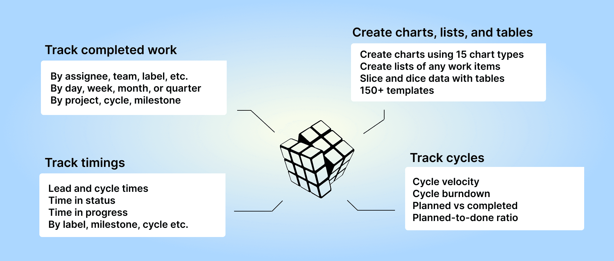
Screenful provides multidimensional analytics of the data in Linear. You can slice & dice your data with 15 different chart types, and click through to drill into details.
Analytics & Reports by Screenful is available in Linear integrations. For more information, see the guide for setting up Screenful with Linear.
Let us know if you have questions or feedback by contacting hello@screenful.com. To stay on the loop, read our blog, or follow us on LinkedIn.
