Guide contents:
Adding columns to a report
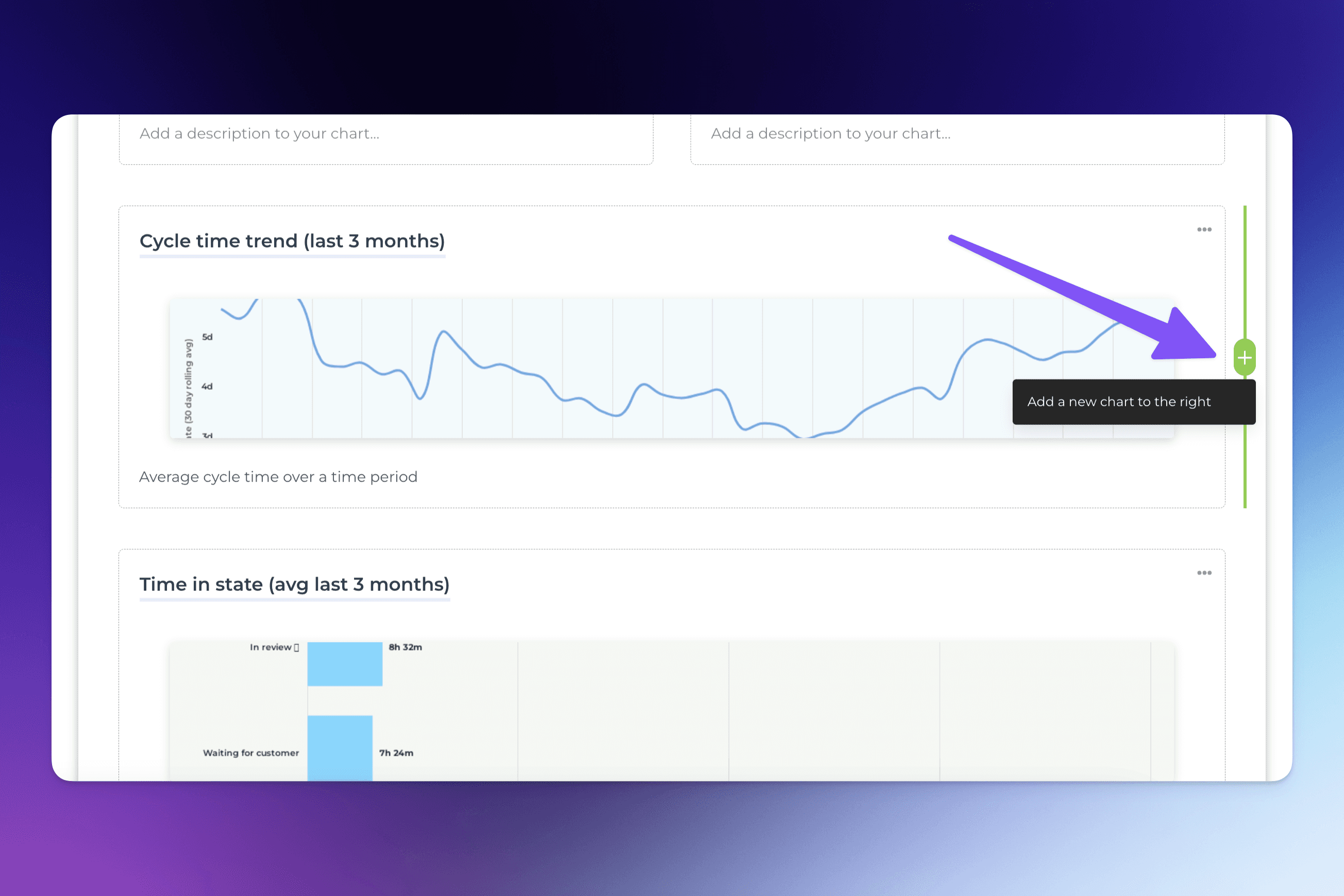
The content in a report can be in one or two columns. One chart can take the whole width, or you can set any two charts next to each other. You can also mix them with the text blocks so you can have two custom charts in the same row, or two text blocks, or charts and text blocks mixed.
To split a row into two columns, hover over either sides of an existing chart, click the “+” button and select Add a new chart:
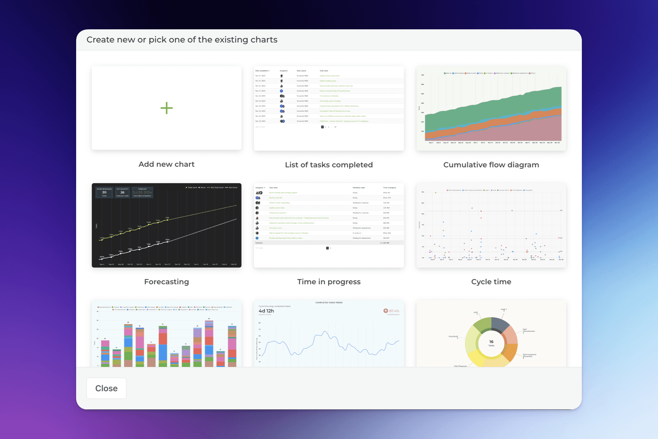
A modal is opened with a set of chart templates. You can either use one of the existing charts, create a new chart from the template gallery, or create a new chart from scratch.
Customize with colors and logo
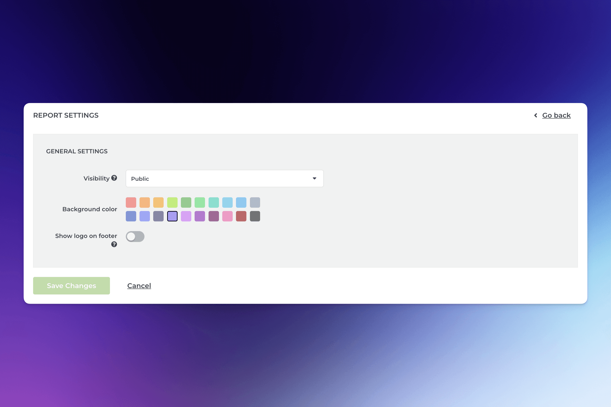
At the top of the report, you’ll find the Setting button. There you can adjust the report’s visibility, select a color theme, and add a custom logo.
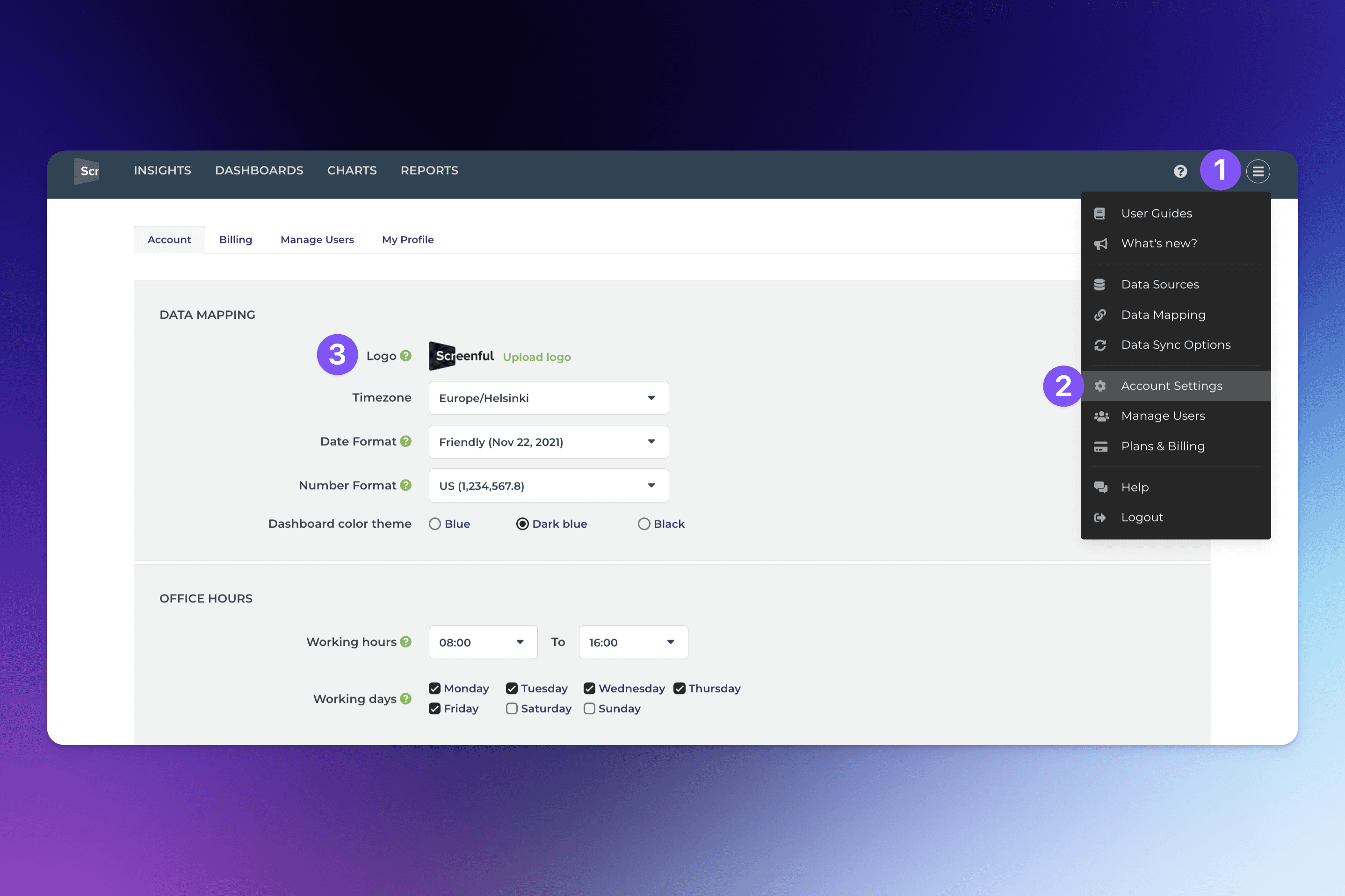
To add a logo to the report, you first need to upload the logo file on the Account settings:
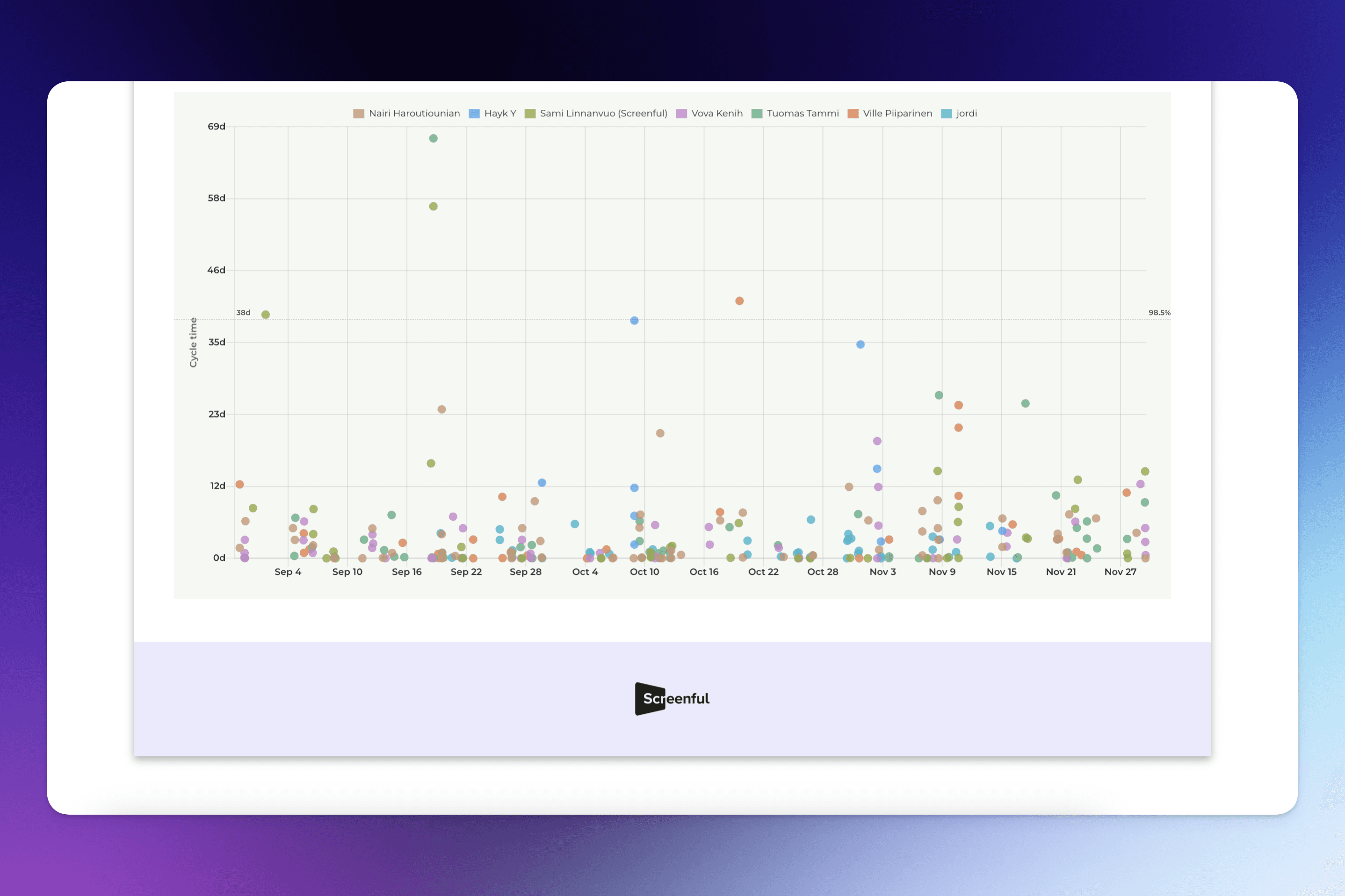
Once you’ve uploaded the logo, the logo will appear on the report footer for those reports that have the Show logo on the footer setting enabled: