This tutorial shows how to create charts using data from custom fields in ClickUp. All your custom fields are automatically imported and made available for charts. How you can use them in charts depends on their type. For example, your number fields can be used as units, and your dropdown fields can be used for grouping and filtering.
See also these related guides
Chart editor guide
ClickUp units, metrics, and properties
Screenful Knowledge base
When you add a new field to a project, it is imported during the next data sync (the data is synced automatically once per hour, and you can trigger sync manually anytime in the integration settings).
Guide contents:
Creating charts using Number field
Your ClickUp Number fields can be used as a unit of a chart. For example, if you have assigned estimates for tasks (e.g. hours or story points) using a custom numeric field, you can select it as a unit for a chart.
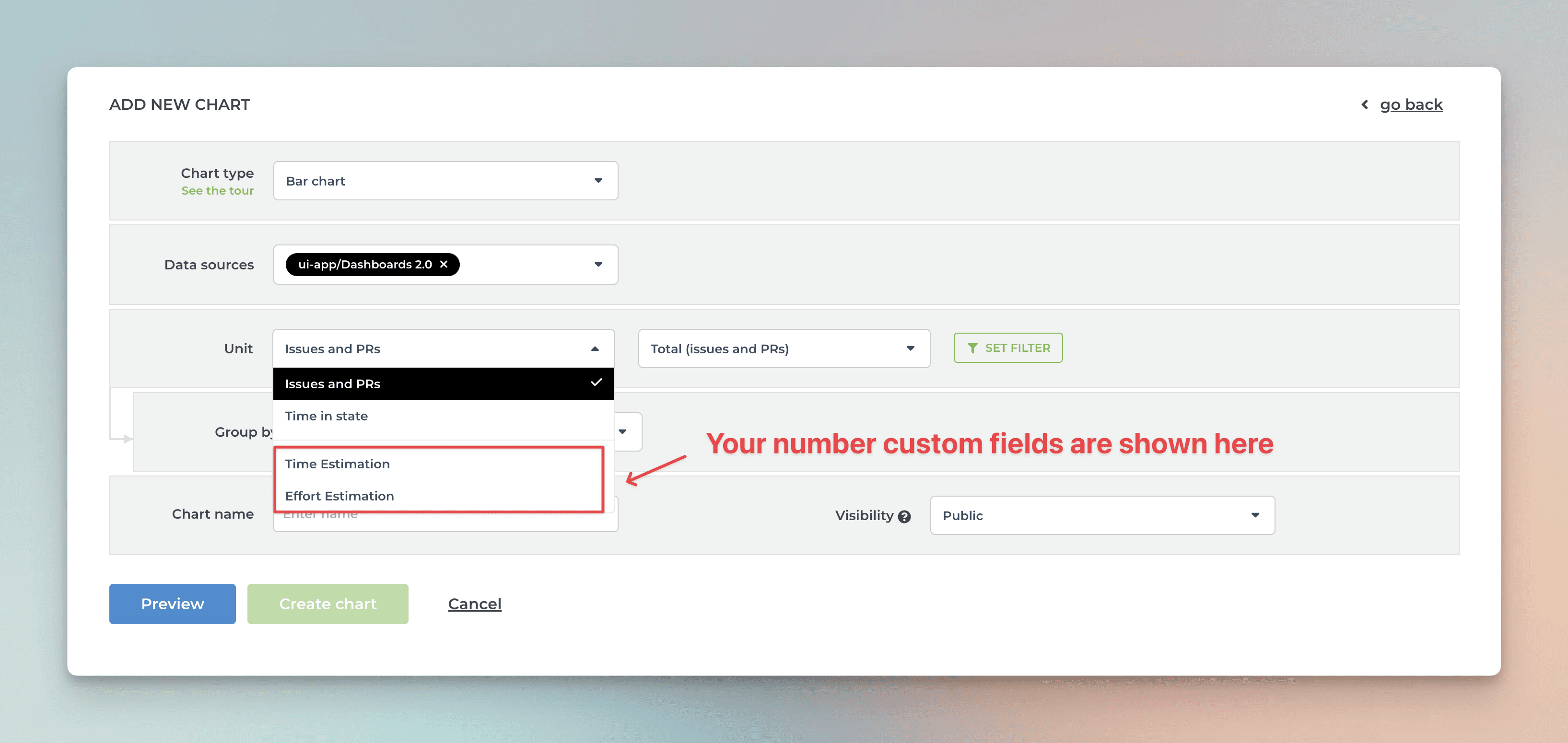
Screenful will automatically make all numeric fields available in the Unit menu in the chart editor.
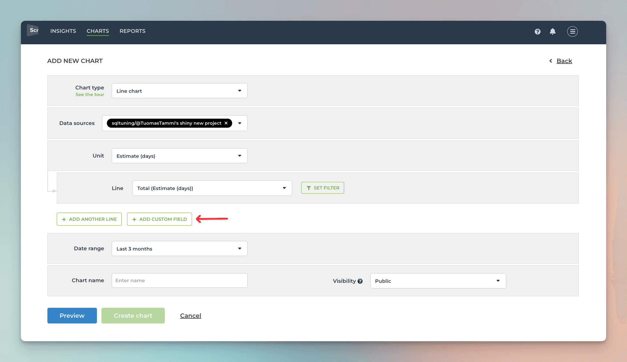
What if you have multiple number fields and want to have all of them in one chart? Let’s assume you want to compare the values of three different number fields over time. You can do that by adding them to a multibar chart. First, pick one of the custom fields as the unit for the chart. After that, use the Add custom field button to add the other two fields:
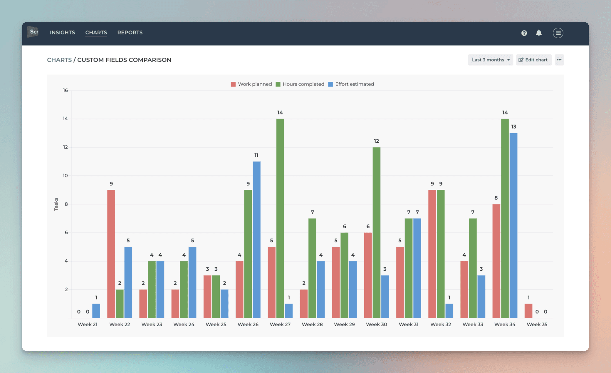
Here’s the final chart with three different metrics grouped by week:
If you have a Dropdown field that you'd like to use as a unit, you can change the default field mapping.
Creating charts using Dropdown field
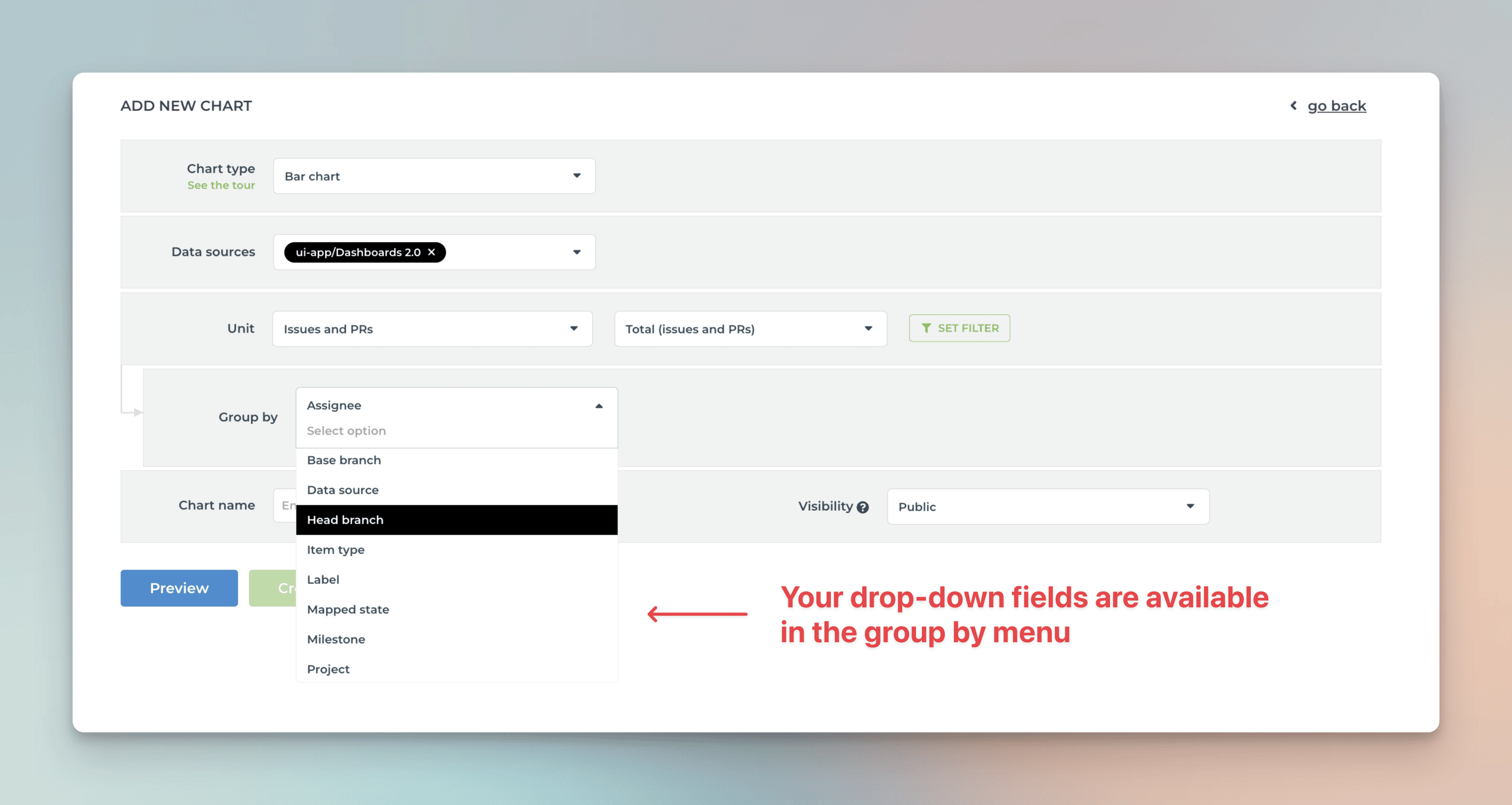
By default, your ClickUp Dropdown fields are available for grouping and filtering. When you are creating a chart that has a grouping option, you'll find all your select menus in the Group by menu:
When you want to filter the chart content, you'll find your select menus in the Filter window:
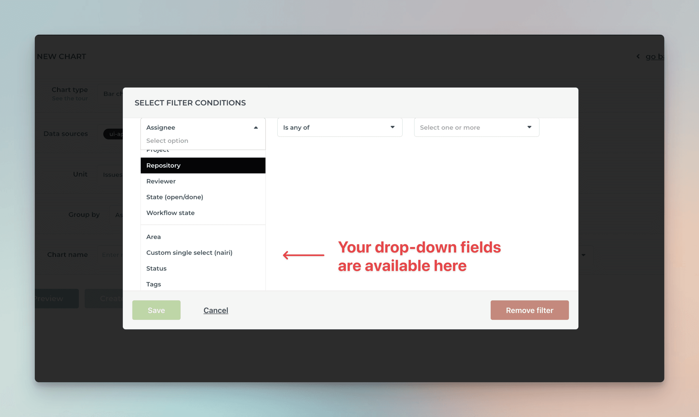
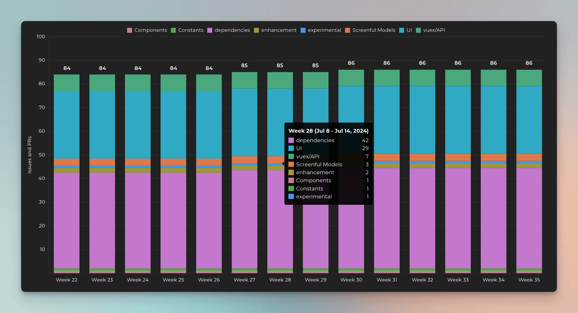
Here's a Stacked bar chart stacked by a dropdown field Component:
By default, your dropdown fields are available for grouping and filtering. If you want to group & filter by Text fields, you can adjust the default field mapping.
Creating charts using Date field
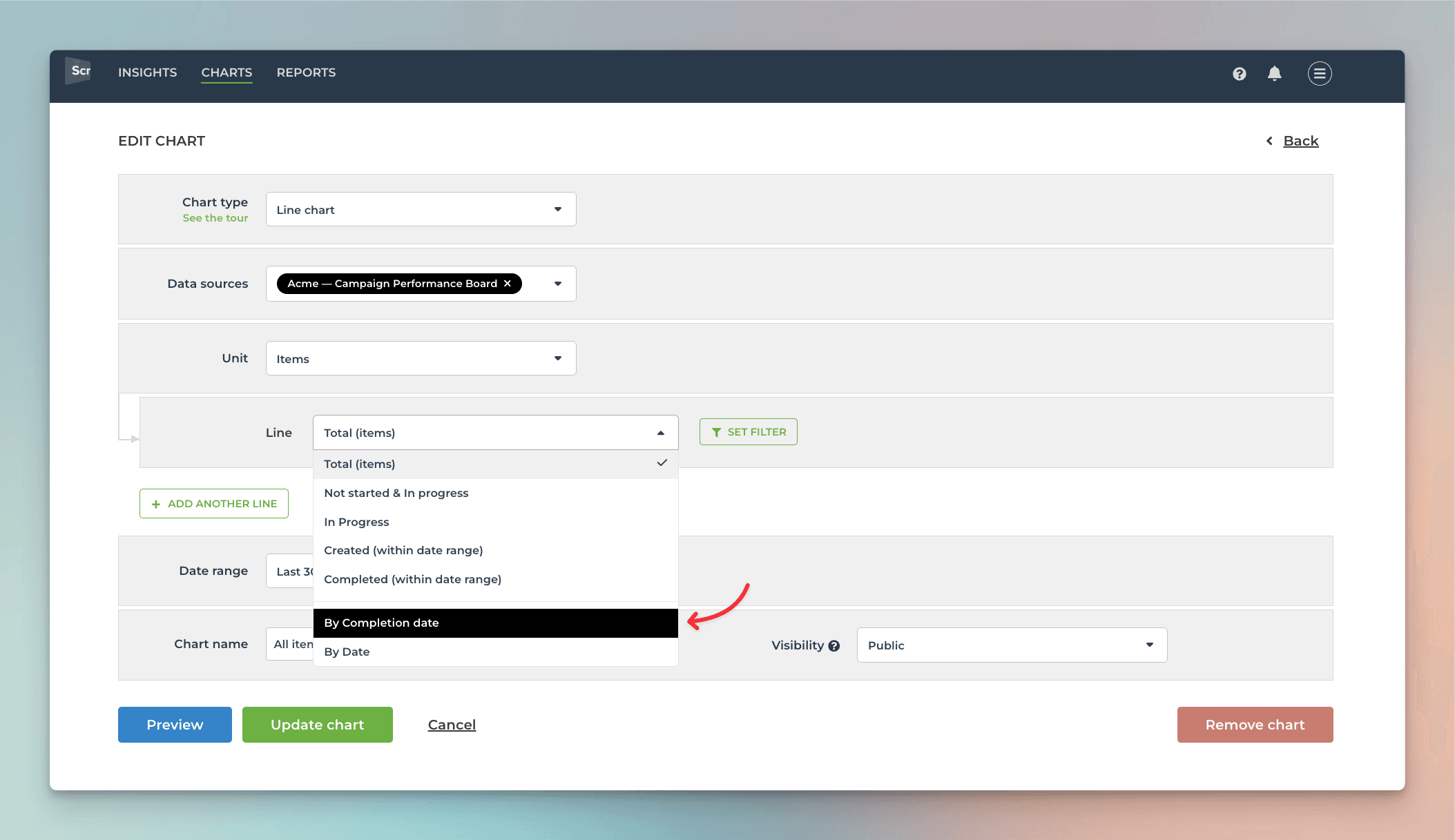
All your ClickUp Date fields are automatically imported and made available for charts. Let's assume you have a custom date field, Date completed, on your board. By selecting Date completed as the metric for the chart, you can create a chart that shows how many items have the date within the selected date range.
That will work the same way as if you had selected Completed (within date range), except that it will only look at the value in the date field. If the date is in the past, it is considered completed, regardless of the workflow state of that item.
Here's the resulting chart:
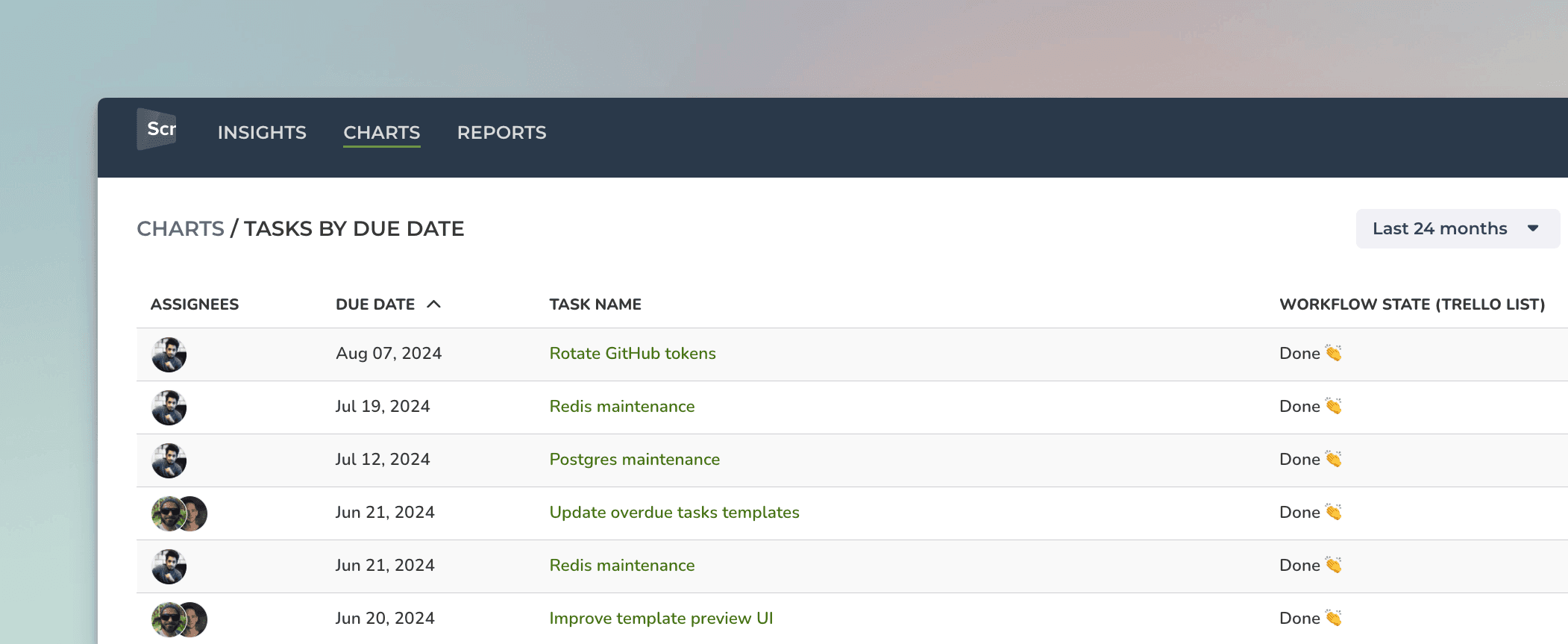
You can also create Task lists and filter them by custom date columns. Here's an example configuration for a Task list:
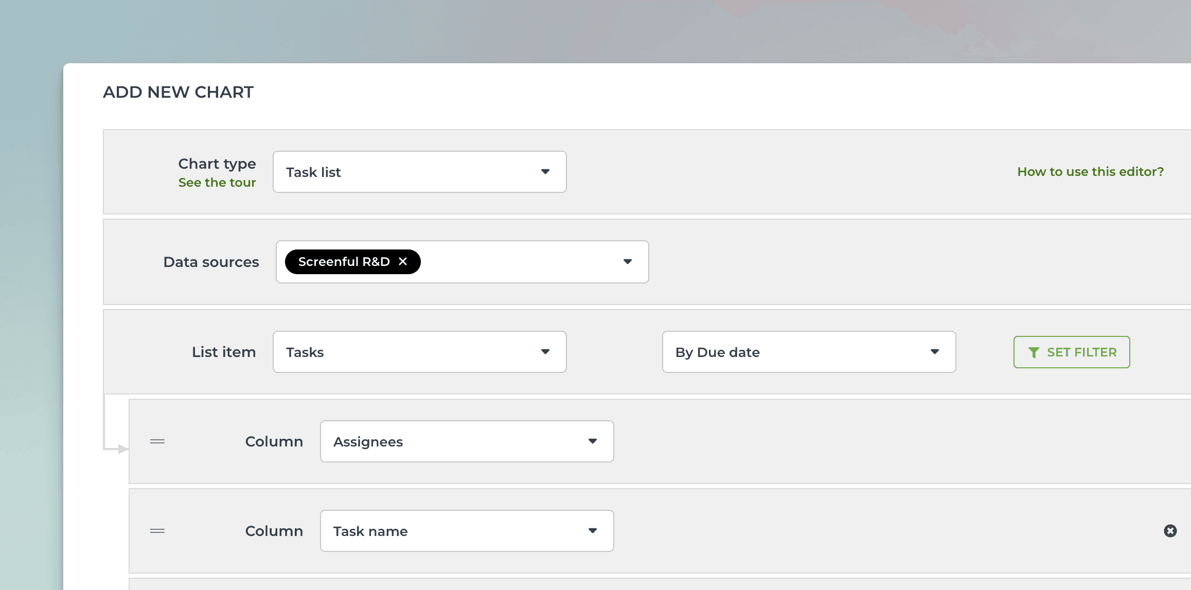
When you pick a date field from the menu, the resulting task list contains items that have the date within the selected date range:
You can track any number field by any date field. You can pick a number field from the Unit menu:
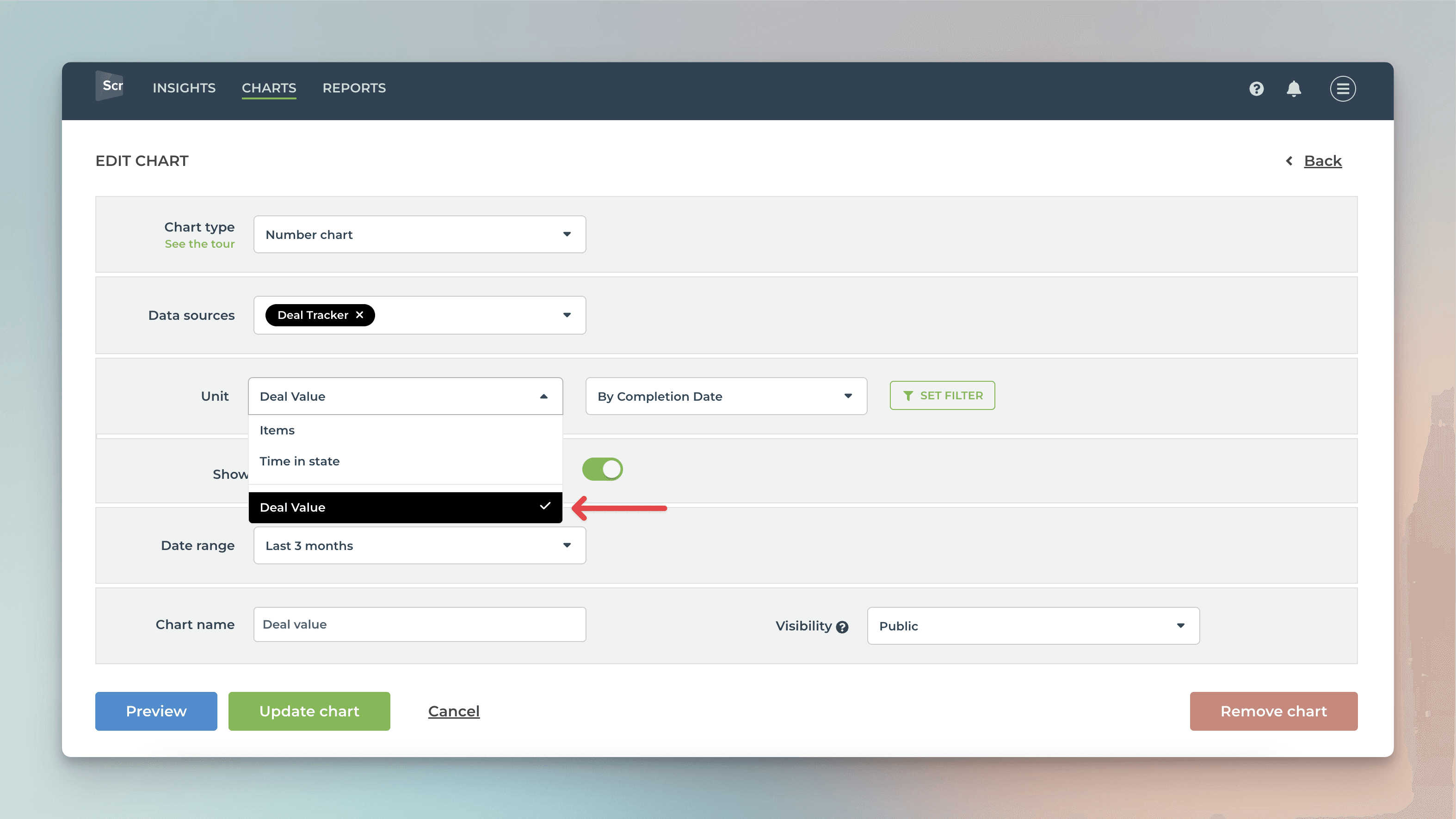
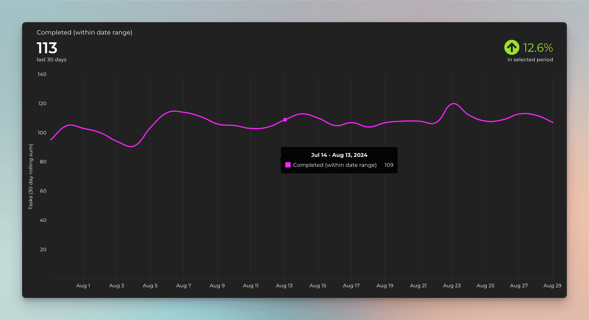
In this example, I have selected Deal value as the unit and by Completion date as the metric for the chart. Here's the resulting chart:
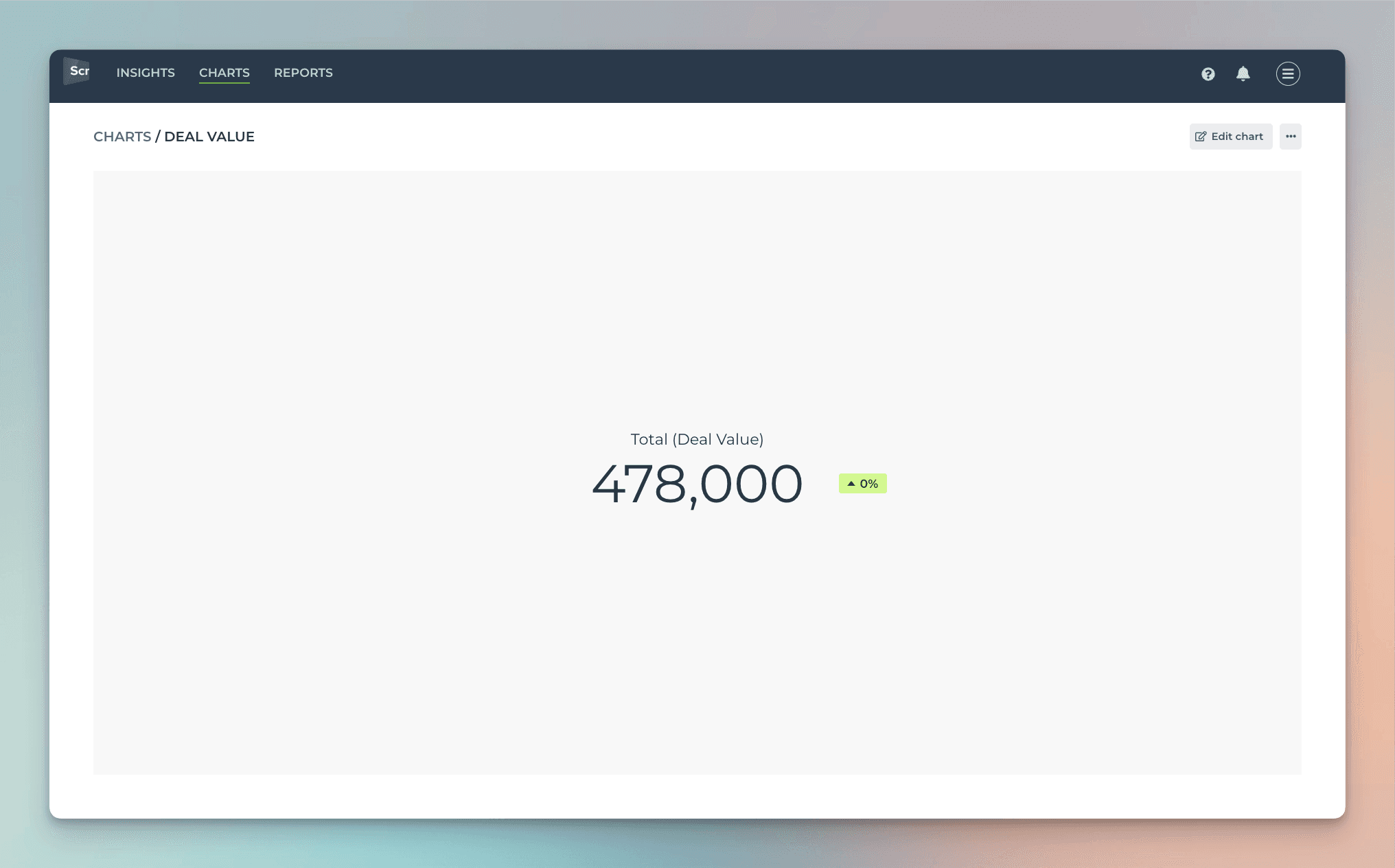
The chart shows the deal value generated during the selected period based on the Completion date column.
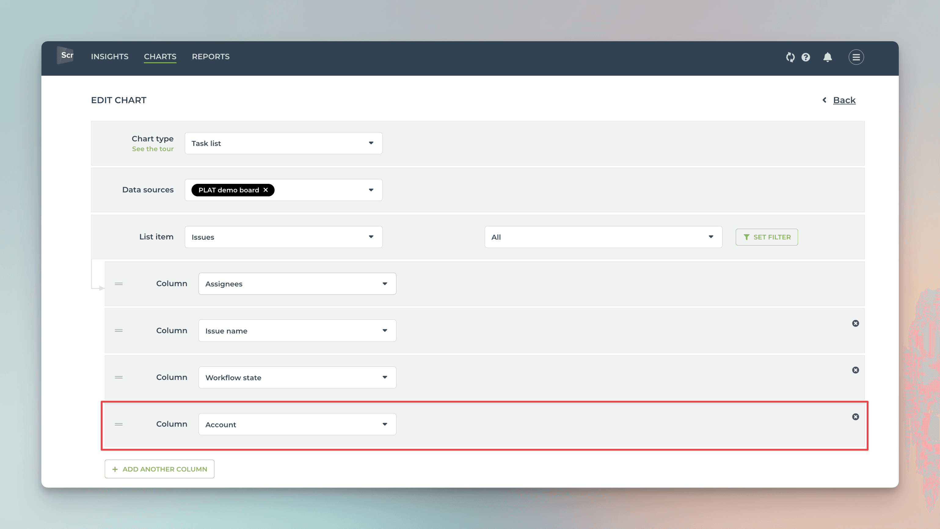
Creating charts using Text field
Your ClickUp Text or Textarea fields are automatically imported and available for charts. By default, they are mapped in Screenful to Text type, which means they can be used as a column in a Task list:
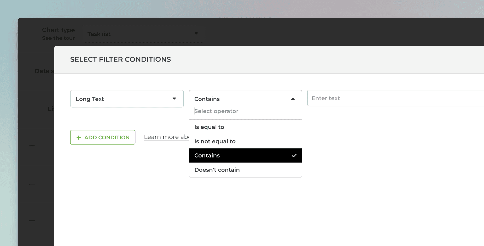
You can filter charts by any of your Text fields. To filter by text field content, use the Contains option to enter keywords that match the content of the text field.
You can enter multiple keywords by using the pipe "|" character as a separator:
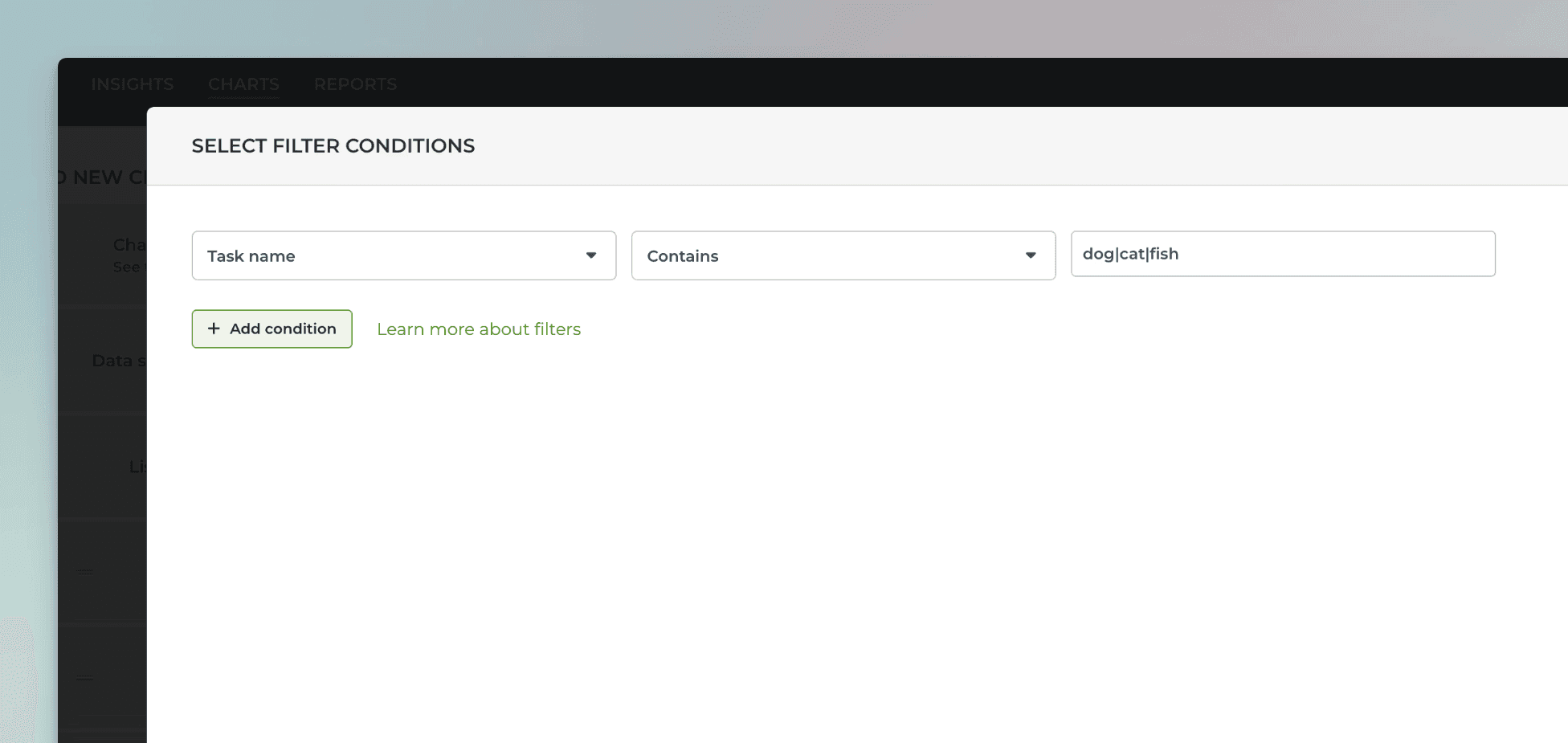
For example, searching "dog|cat|fish" would match all items with the word "dog", "cat", or "fish" in the task name.
If you want to use your text fields for segmenting the charts (group by), you can change the default mapping at Data Mapping->Custom Fields:
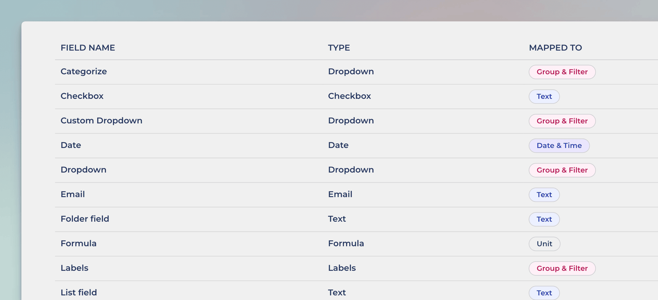
In this example, the Text field Checkbox is mapped to Text. Clicking the row opens it for editing:
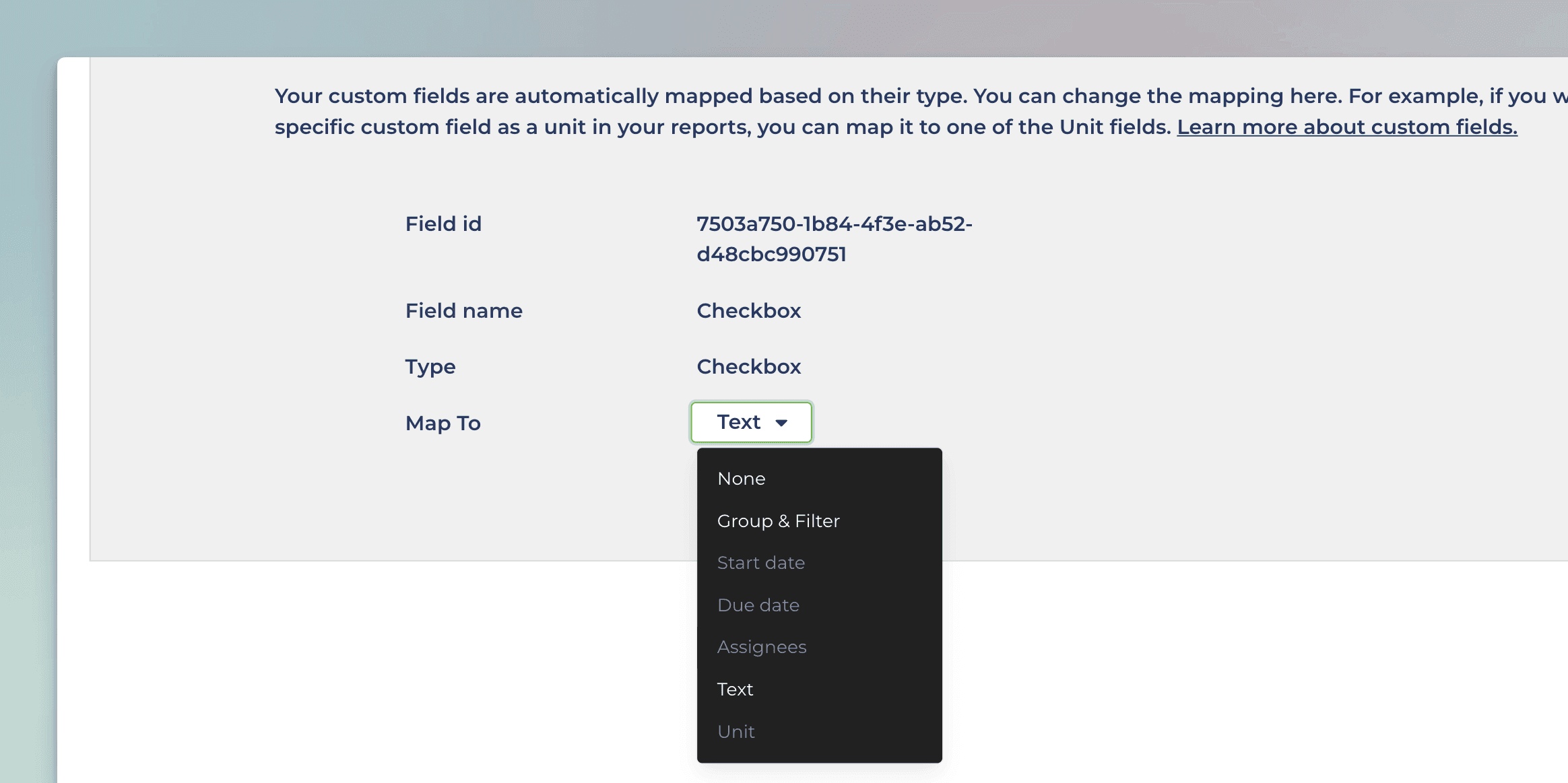
Selecting Group & Filter from the menu enables using the field in group by menu in addition to the filter menu.
Creating charts using Formula field
When creating a chart, formula fields are selectable in the unit menu:
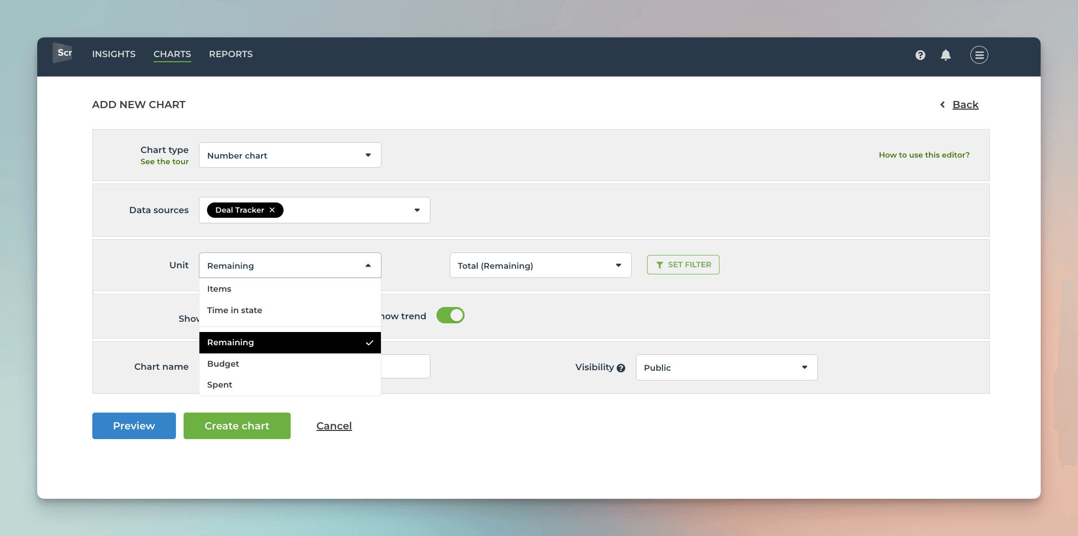
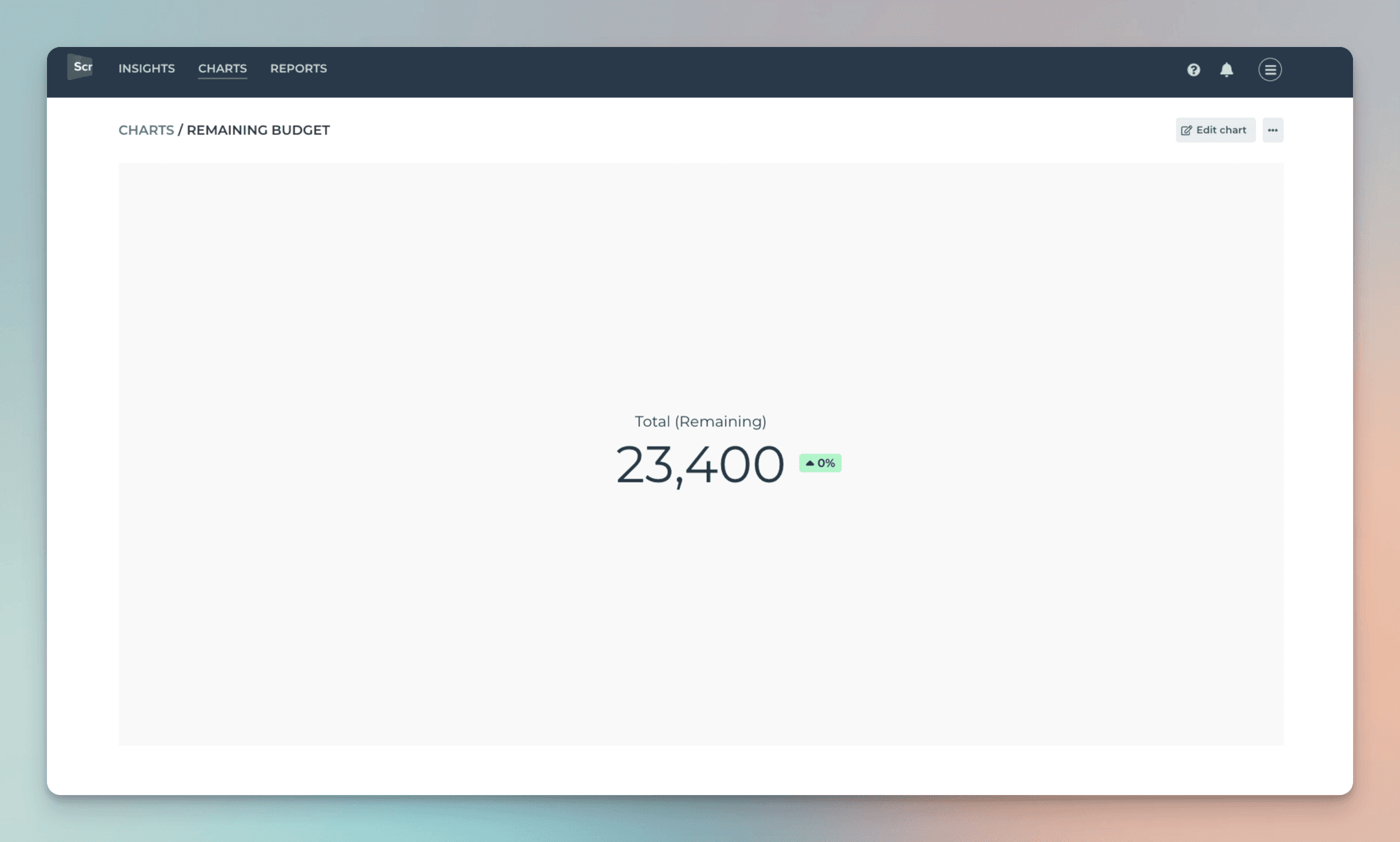
In this example, the unit menu contains two Number fields: Budget and Spent. There is also a formula field Remaining, that shows the difference between the budget and spent. When you select Remaining as the unit for the chart, you'll see the sum of Remaining:
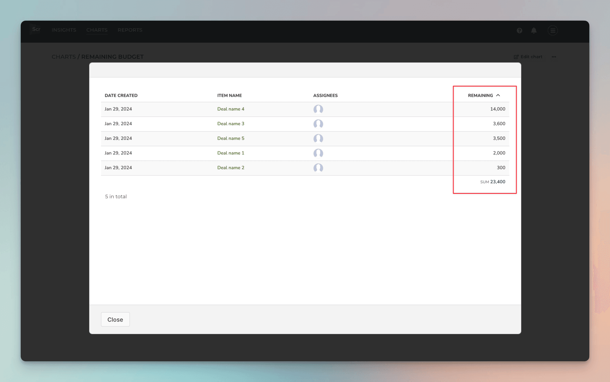
When you click through the number, you'll see the individual items and how much is Remaining per each item:
Formula custom fields are automatically imported and treated according to their type. If the value is a number, it can be used as a unit like the Number fields. If the value is a date, it can be used similarly to the Date fields. You can see the mapping of a formula field in the custom fields mapping page. You can learn more from this guide.
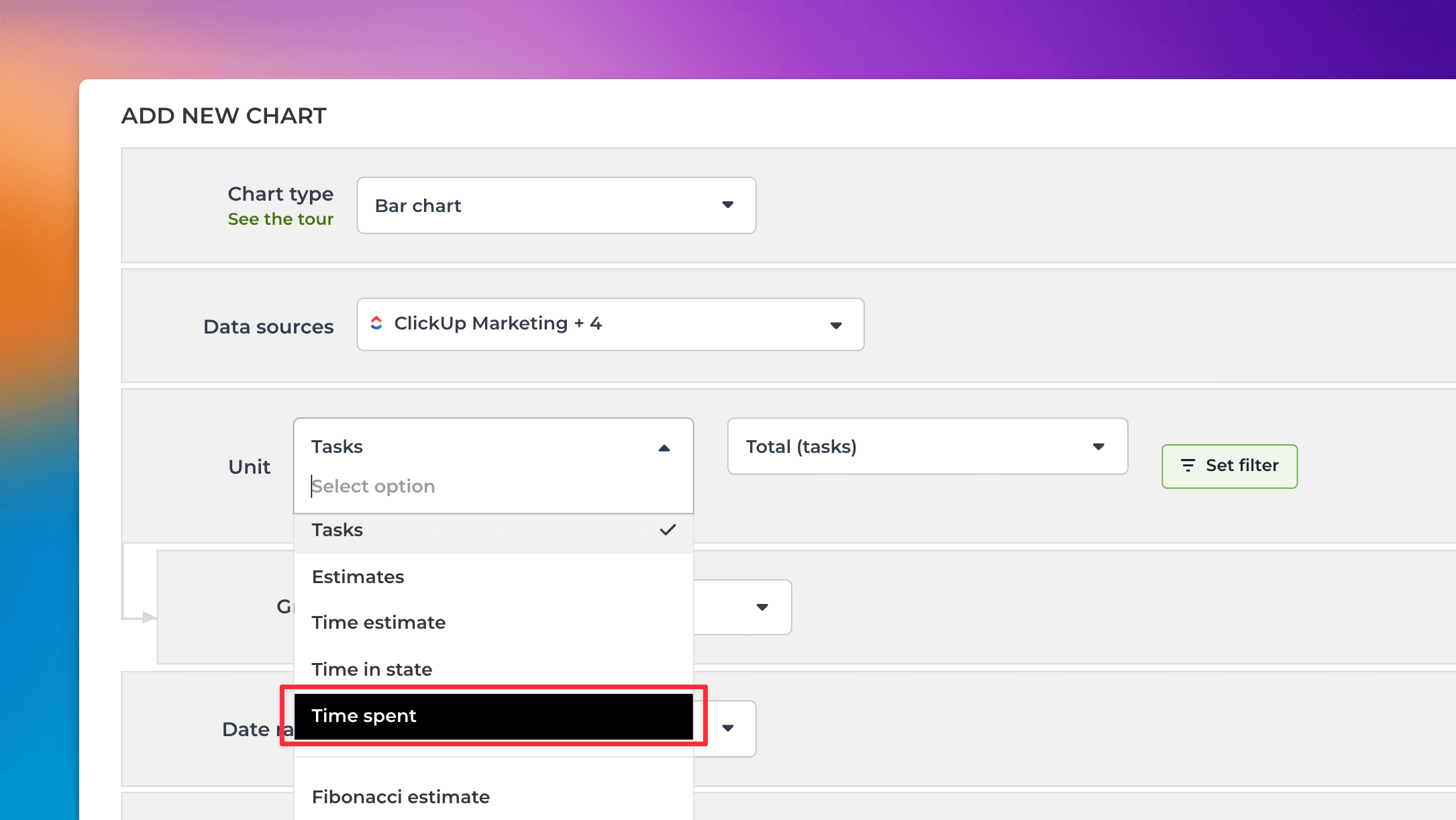
Creating charts using Time spent field
To create a chart using time tracking data, start by clicking Add new chart in the Charts tab. Select Time spent from the Unit menu:
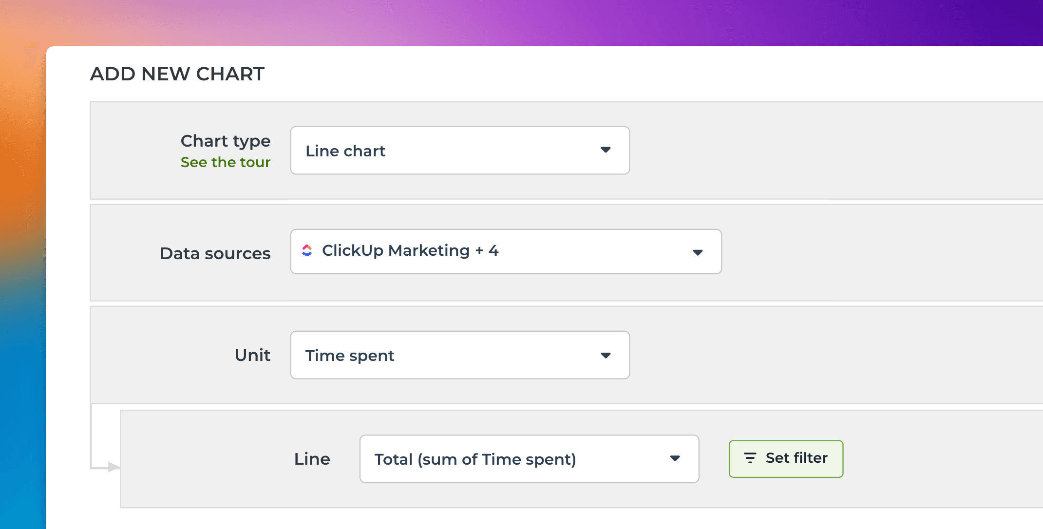
When Time spent is selected as the Unit, the Metric menu contains only one option: Total (sum of Time spent). Here’s an example configuration of a line chart that shows the total amount of hours logged over time:
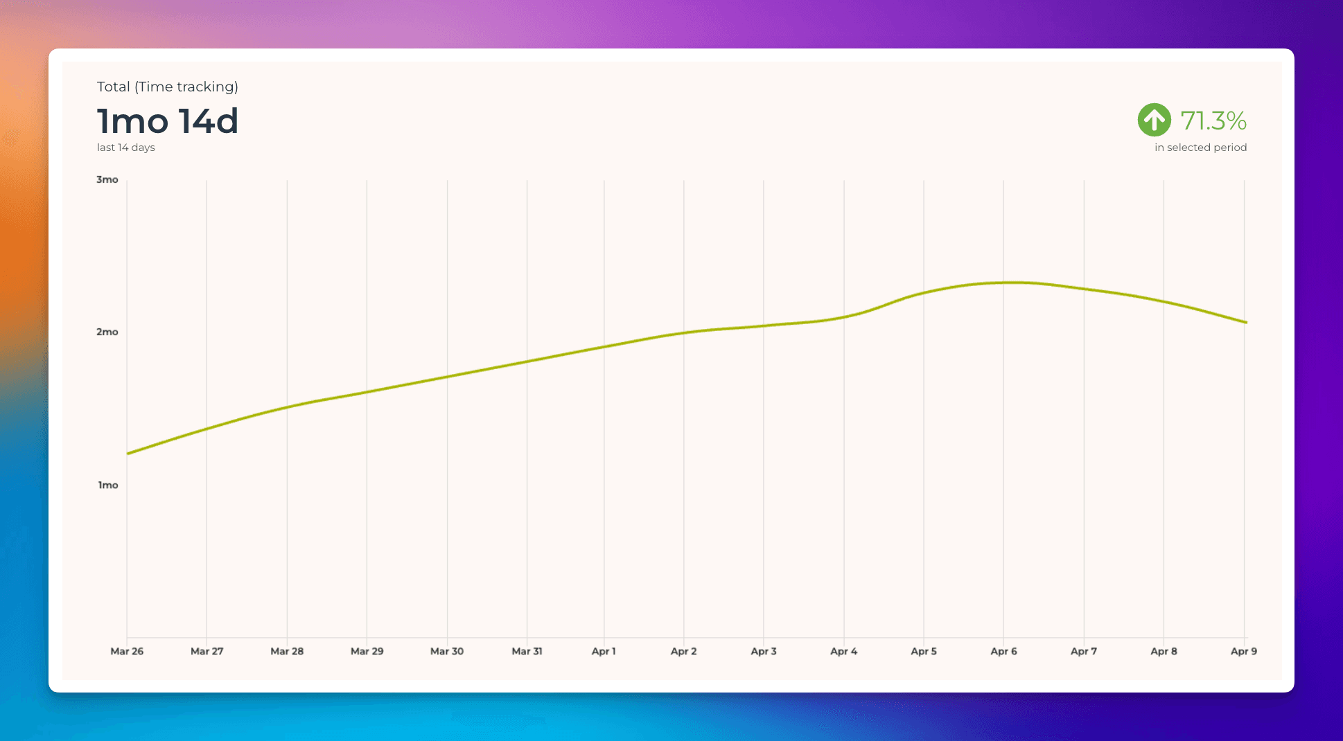
The Date range refers to when the hours were logged. Here’s the resulting chart:
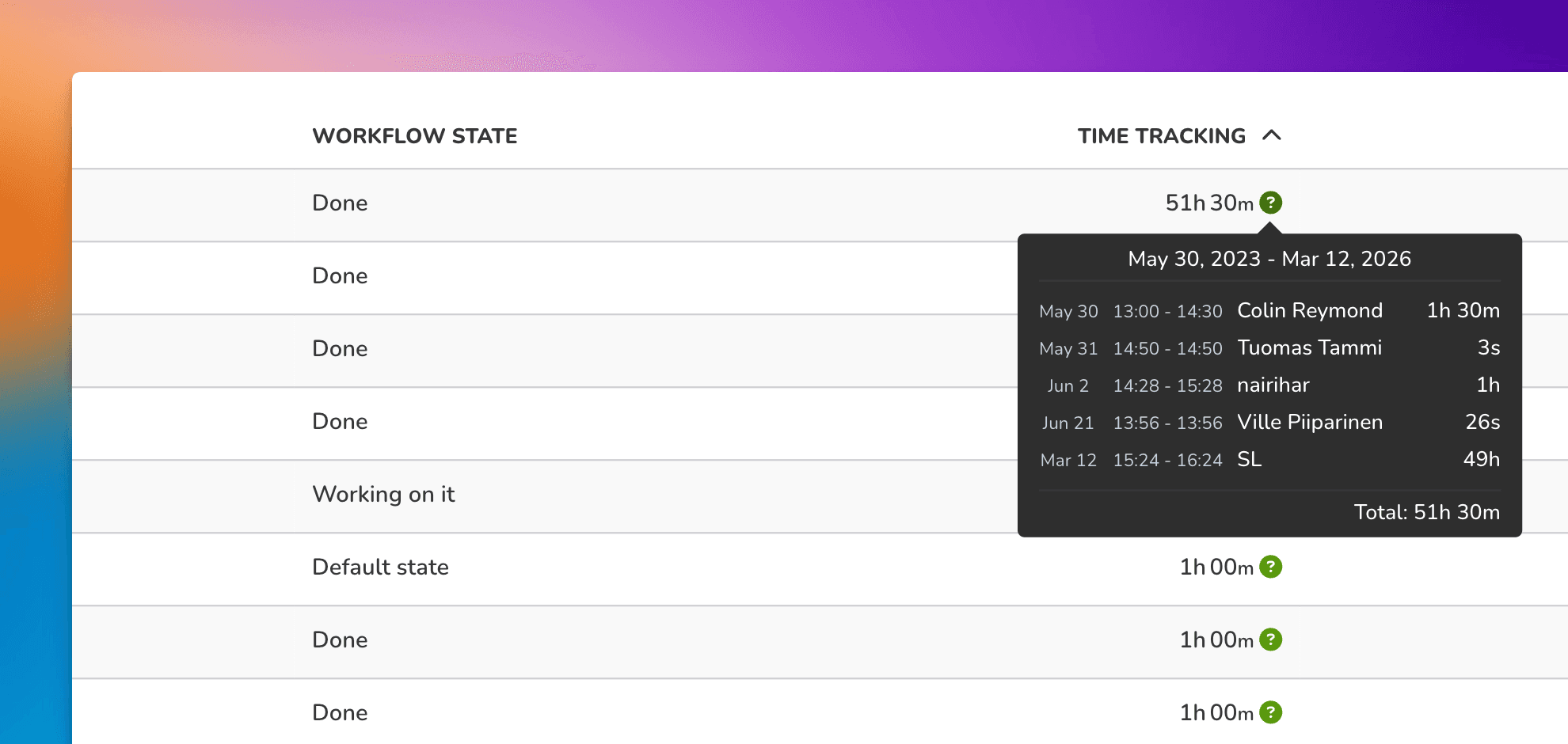
Charts are clickable. When you click through, you'll see the individual time entries for each task:
You can create charts from your top-level tasks, subtasks, or both. You can choose between these options by setting a filter (use the filter Item type).
You can create time reports by selecting Task list as the chart type. To see how many hours have been logged by a team member by task within a time period, select Time spent (within date range) from the menu:
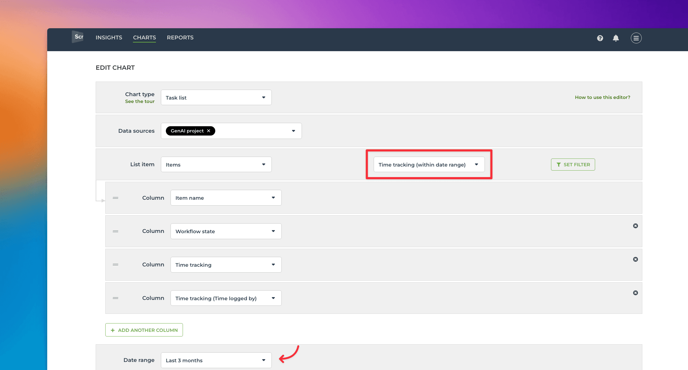
Selecting it reveals a date range menu that allows you to narrow the results to items with time logged within the selected period.
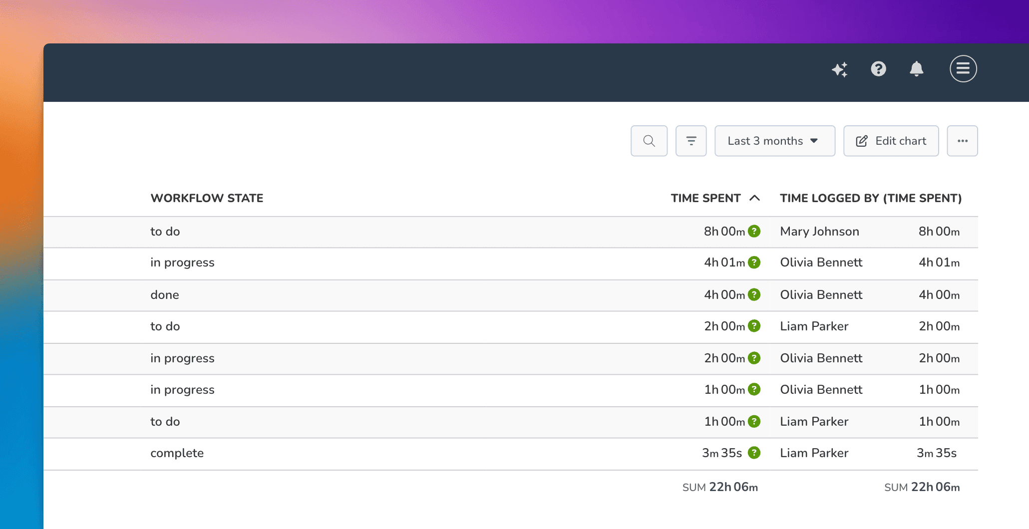
Now the Time spent and Time logged by (Time spent) show the total time logged for tasks within the specified date range. You can use the filter feature to narrow the list to any subset of tasks.
Hovering the mouse over the question mark reveals the individual time entries:
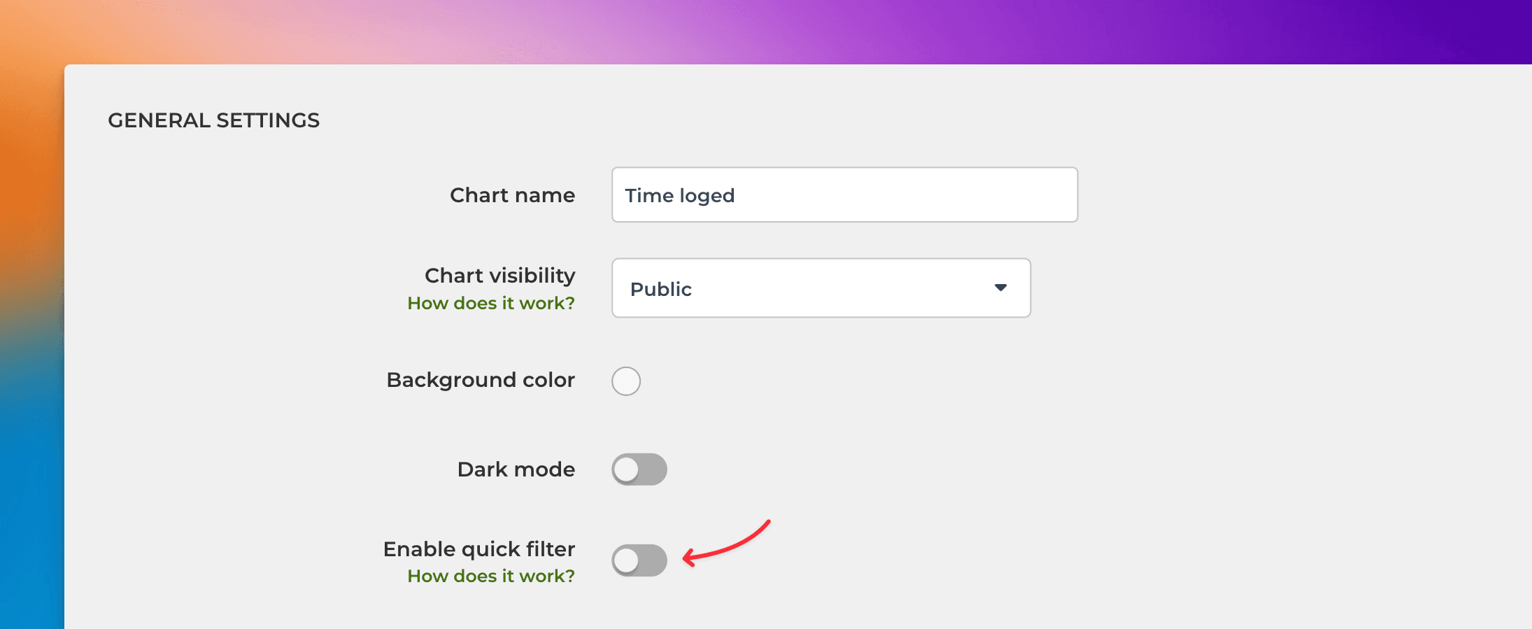
In the chart settings, you can configure a quick filter that will be shown at the top of the chart. If you set a quick filter for Time logged by (Time spent), you can easily filter the report to see each individual's timesheet.
In the chart settings, use the toggle to enable the quick filter. Clicking the toggle reveals the filter options. Select Time logged by (Time spent) from the list:
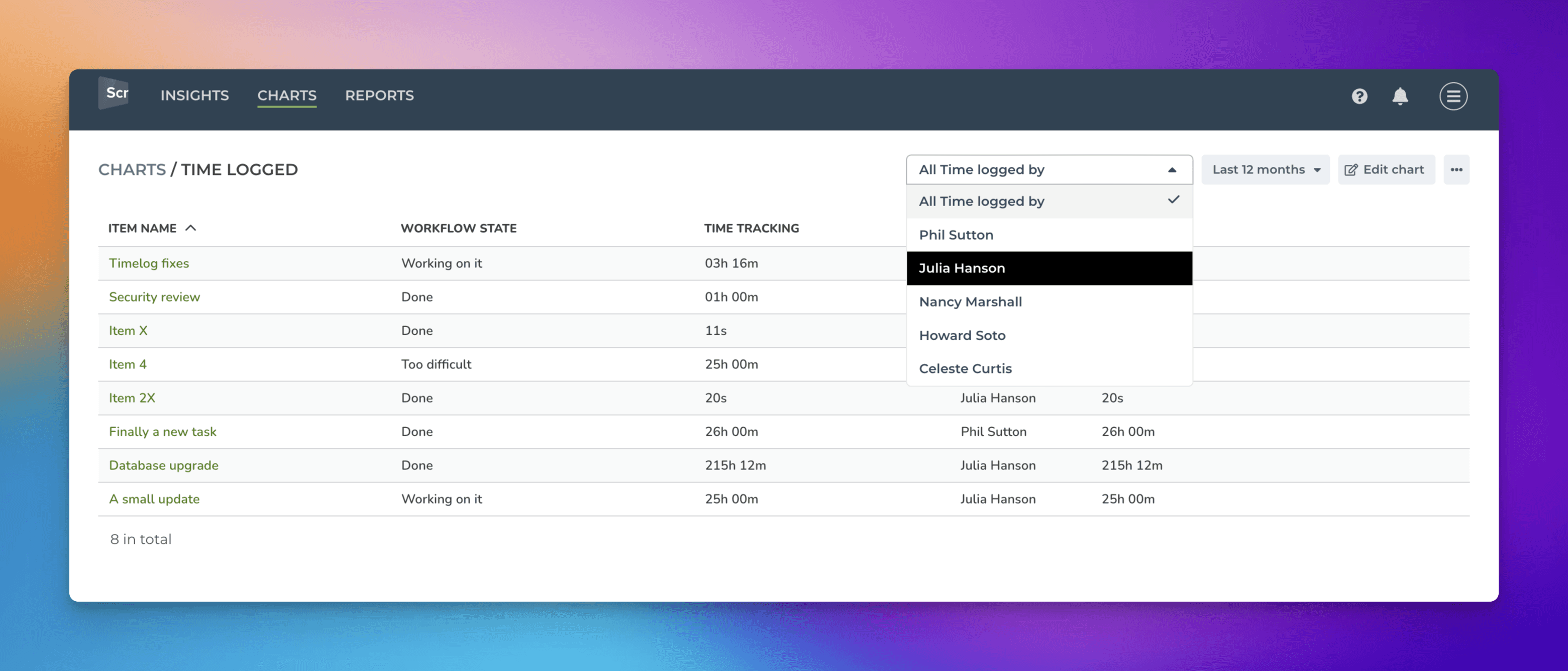
Once a quick filter is enabled, you can filter the list by any individual by picking a name from the menu:
Learn more: Creating reports using ClickUp time tracking field
Creating charts using Status field
The Status field is special because it is used as a source of your workflow. When you import a board to Screenful, you are asked to pick the status column that contains your workflow. The stages in your workflow are mapped to Not started, In progress, and Done. That allows Screenful to understand your data better and calculate metrics automatically.
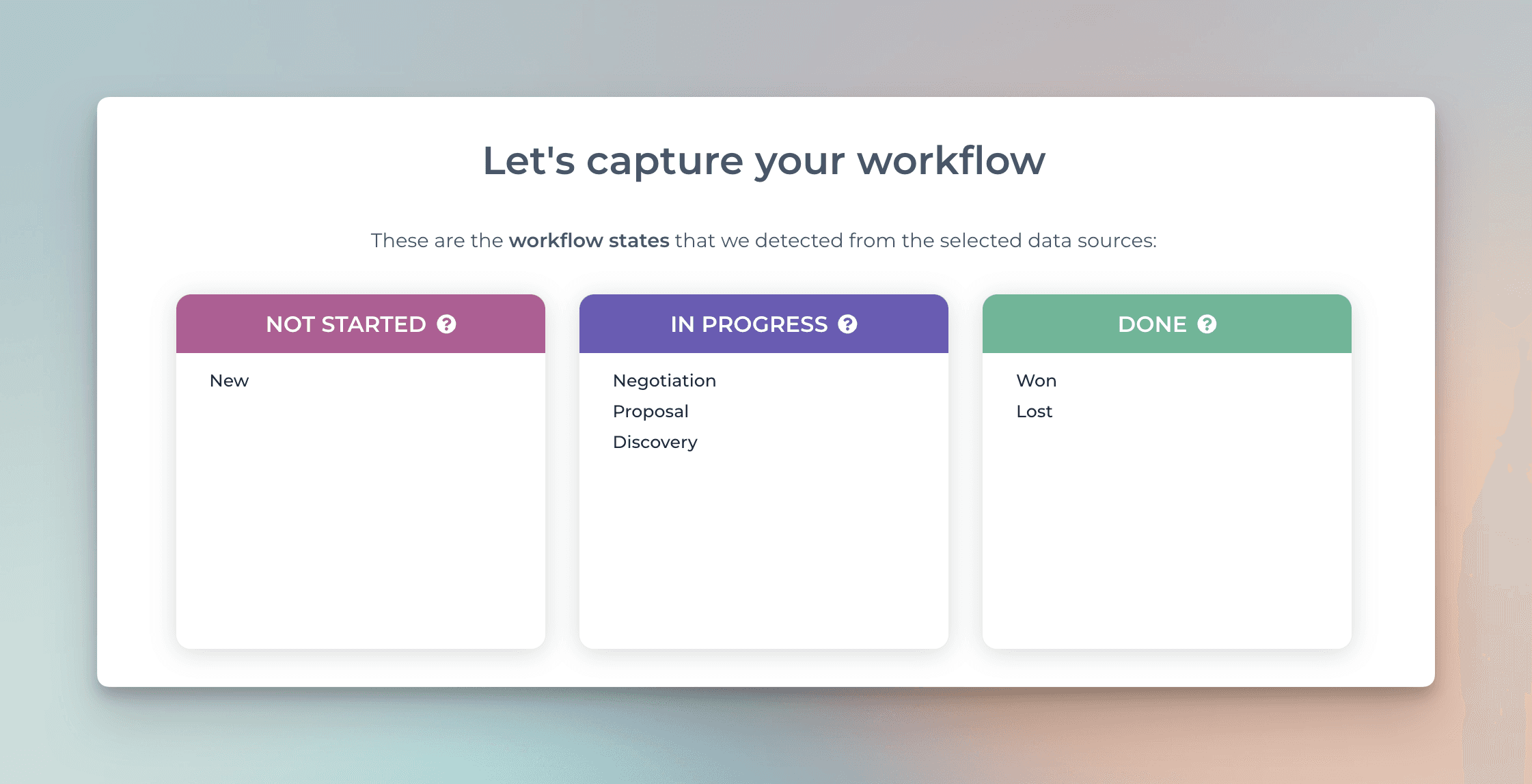
Because of this mapping, you can create charts using the metrics available in the chart editor:
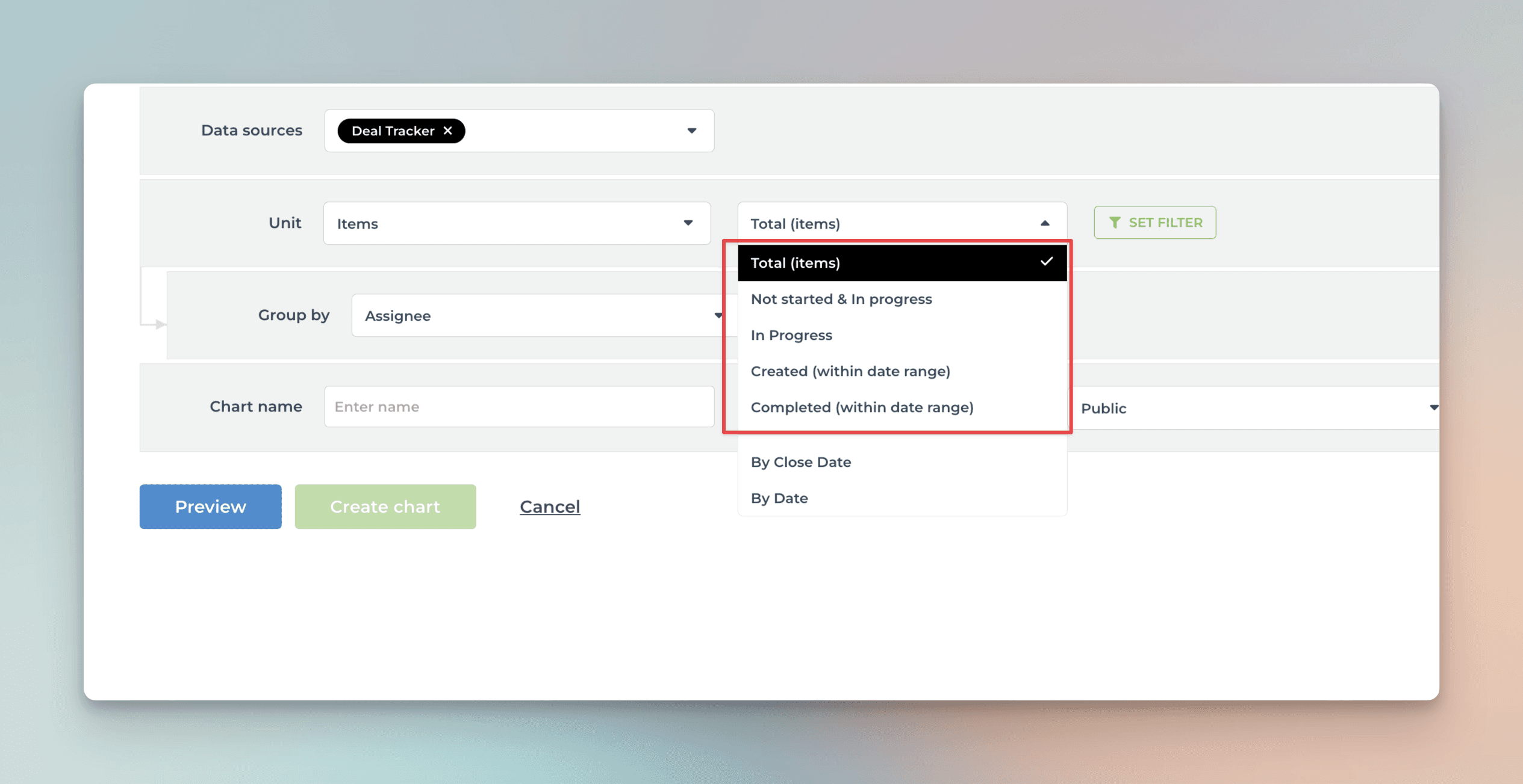
The options in the menu filter the items as follows:
Total (items) -> Include all tasks
Not started & In progress -> Include tasks that are in the stages mapped to Not started or In progress
In progress -> Include tasks that are in the stages mapped to In progress
Created -> Include all tasks created within a date range, regardless of stage
Completed -> Include all tasks moved to a stage mapped to Done within a date range.
Learn more about workflow mapping from this guide.
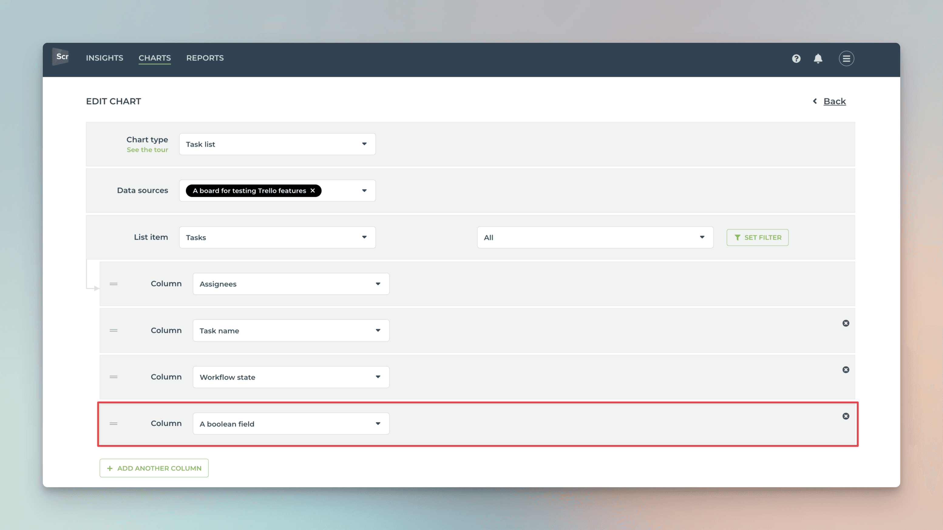
Creating charts using Checkbox field
Your ClickUp Checkbox fields are automatically imported and available for charts. By default, they are mapped in Screenful to Text type, which means they can be used as a column in a Task list.
Here's the resulting chart:
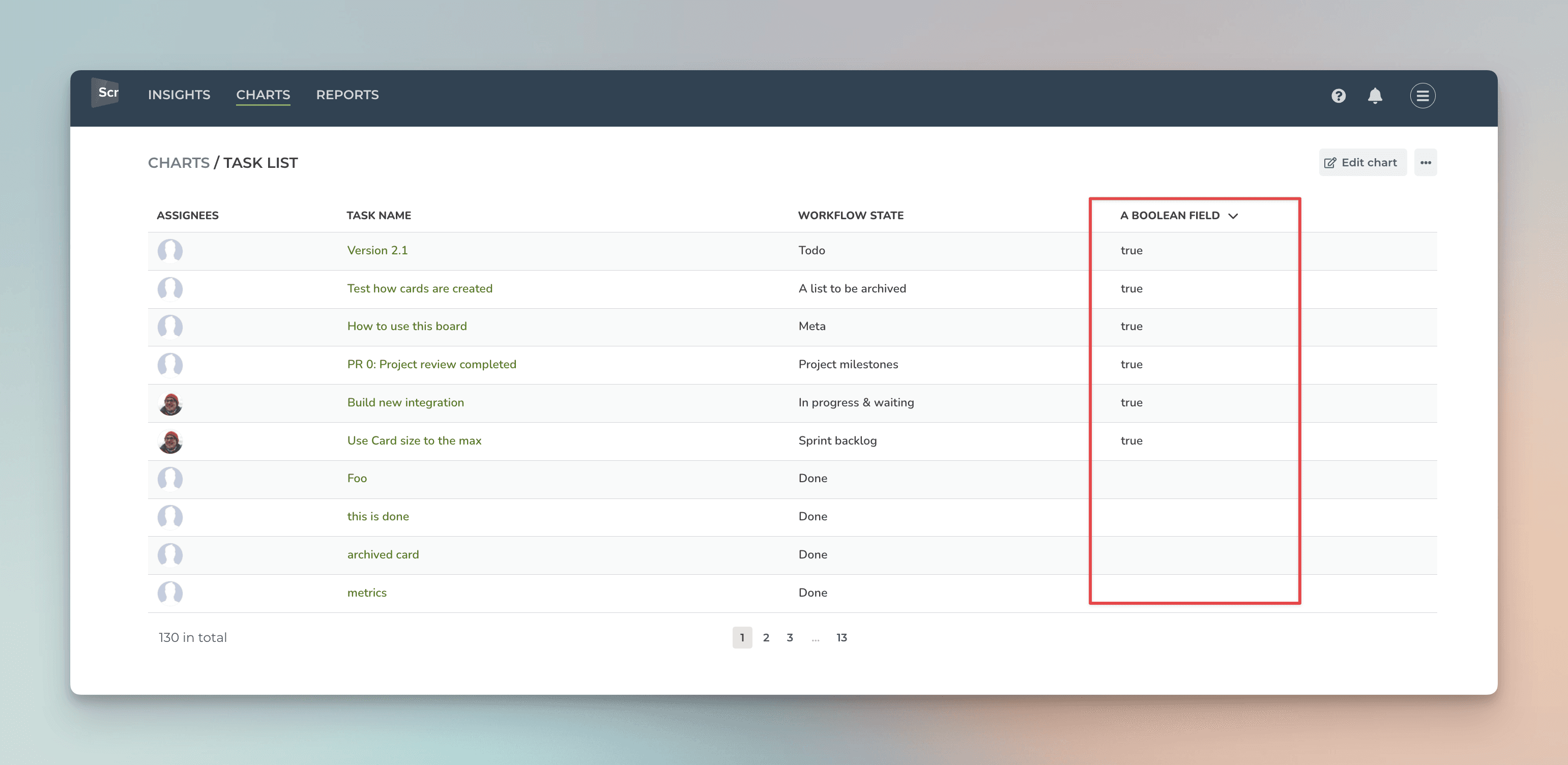
If the checkbox is checked, the value true is shown. Otherwise, the value is empty.
Learn more
Book a free onboarding call
Need help with setting up your charts and reports? Don't find a metric you are looking for? Book a call with our expert. We'd love to help you supercharge your reporting!