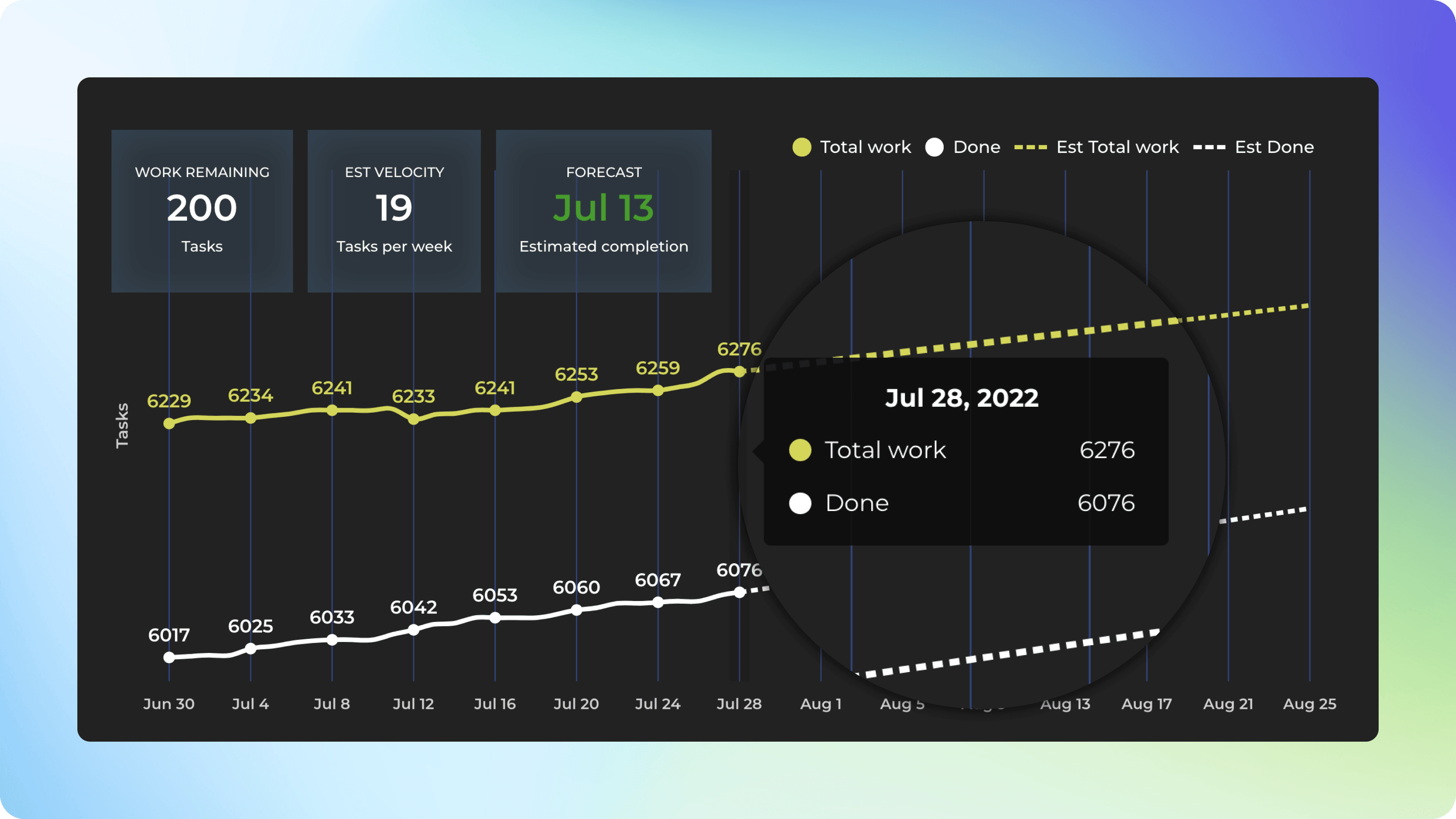
Forecasting chart
The forecasting chart shows the progress toward a milestone, such as the completion of a customer project or a new product release. You'll see how much work is done vs remaining, and get data-driven forecasts based on your team's past velocity.
Are you in danger of scope creep?
The yellow line shows the total amount of work allocated for the project and the changes made to the scope along the way.
The difference between the yellow and the white line is the remaining work at any given time.
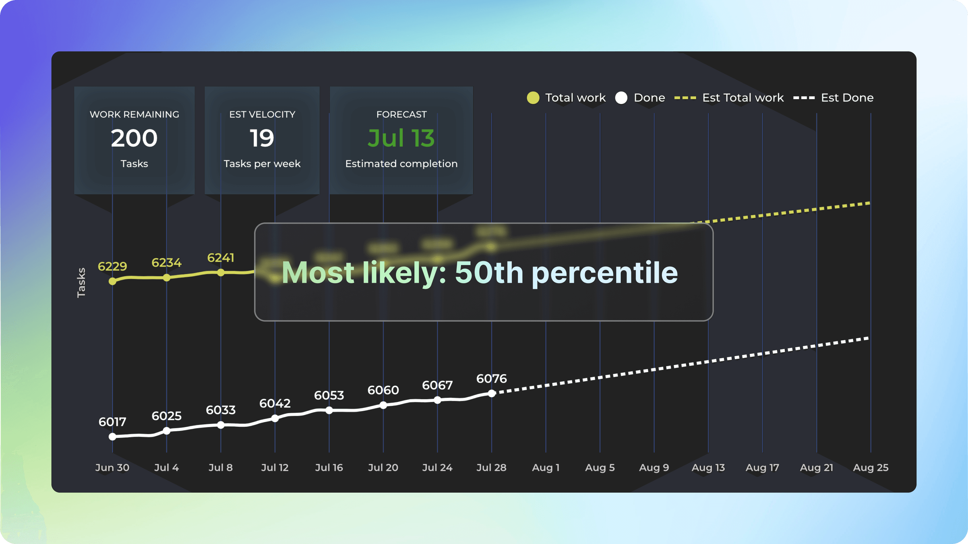
Get data-driven forecasts
You can get forecasts based on your team's historical velocity. The optimistic scenario expects that your team completes more work than in 80% of the past weeks. In the most likely scenario, your team completes the equal amount as what is the median week. In the pessimistic scenario, the team completes only as much as 20% of the past weeks.
The percentiles are configurable in the chart settings.
Narrowing down the scope of work
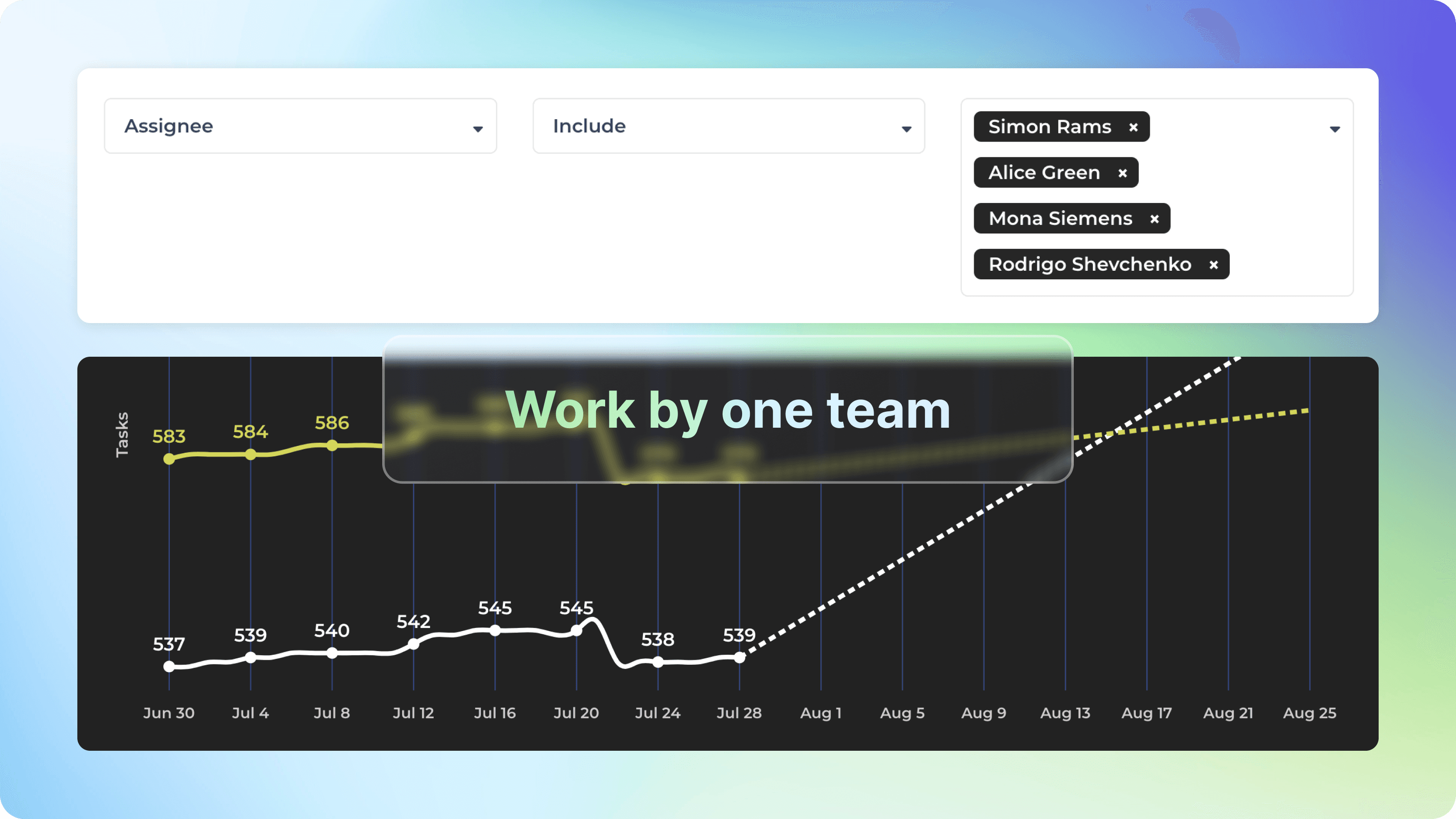
By default, the scope is all the tasks in the underlying data sources that you’ve included. You can narrow it down to any subset of items by setting a filter.
In the filter window, you can define your scope by filtering by any property e.g. label, epic, assignee, etc. of your tasks. Using the filter for the scope selection allows exploration of what-if scenarios.
Learn More
From our blog: When will it be done? A data-driven approach to estimating project completion
From our blog: Agile & Lean metrics: Velocity
Tour: Forecasting Insights
Common questions
Does this chart assume some specific methodology such as Agile/Scrum/Kanban? Does this chart assume I have estimated my tasks?
No and No. It is a tool to get forecasts based on the amount of work you’ve completed in the past, regardless of the process to get that work done.
What do the numbers on this chart mean?
The forecasting chart is based on monitoring the completed tasks and incomplete tasks. The white line represents the number of tasks that are completed. The yellow line represents the total scope of the project, it is the sum of completed and open tasks. The difference is the amount of work that remains to be done.
How is the most likely completion date estimated?
In the most likely scenario, the team completes the same amount as in the median week in the past. By default, the chart looks at ten past weeks and uses the median (50th percentile) as the most likely future velocity. The length of the history and the most likely velocity can be adjusted in the chart settings. Learn more.
How is the team velocity calculated?
The velocity scenarios are based on the historical team velocities during the selected period (last ten weeks by default). In the settings, you can specify what you consider most likely, pessimistic and optimistic velocity for your team (based on actual data history). If you have a filter set, you can select in the chart settings whether to use the filtered velocity or full velocity.
What changes when I select filtered vs. full velocity in the chart settings?
The full velocity is the total amount of work completed. The filtered velocity shows how much work was completed for that specific work scope, specified by the filter settings. For example, if you filter the chart with a certain label, the filtered velocity is the velocity of the tasks associated with that specific label. Learn more.
Does the forecast take into account the fact that there can be more work added to the scope along the way?
Yes, It is possible to include the expected growth of the total work into the forecast. The chart setting for that is called Total work growth. Learn more.
What if my work added grows faster than work done?
If more work is added than completed, the forecast lines never meet, and instead of the completion date, an infinity symbol is shown on the right overlay. Once you start completing more than adding, the forecast day becomes visible again.
How is your calendar week defined in the velocity calculation?
Calendar week is from Monday to Friday according to the set time zone. Have questions? Email at support@screenful.com