Get birds-eye view across your projects, epics, and milestones
Apr 8, 2024
If you have organized your work into higher-level abstractions such as Jira epics, GitHub milestones, or Asana projects, you can use the Table chart to gain a birds-eye view of their progress across your boards. This guide shows you how to do it.
Contenido:
Step 1: Create a Table chart
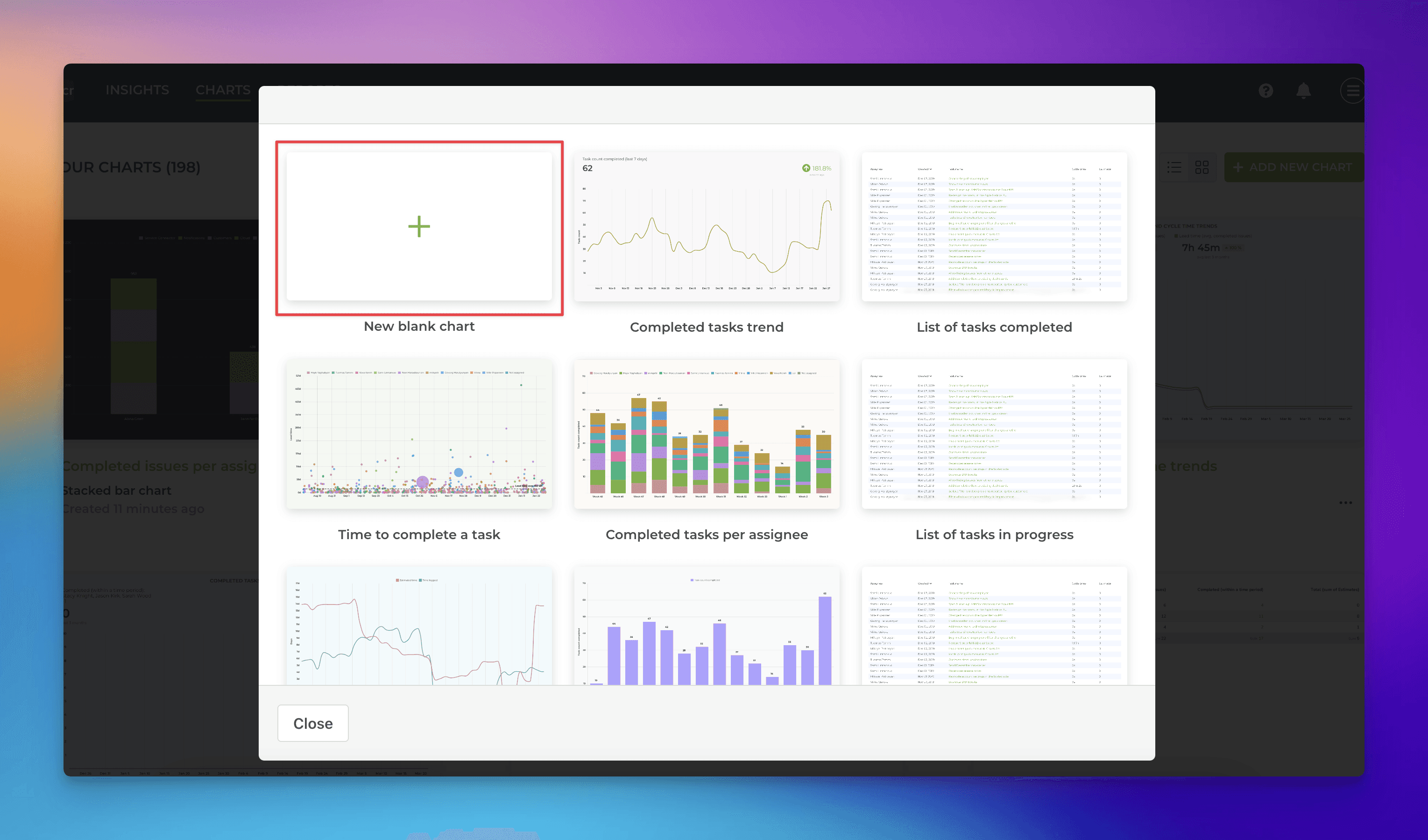
Go to the Charts tab and click Add new chart in the top right corner. From the modal, pick New blank chart:
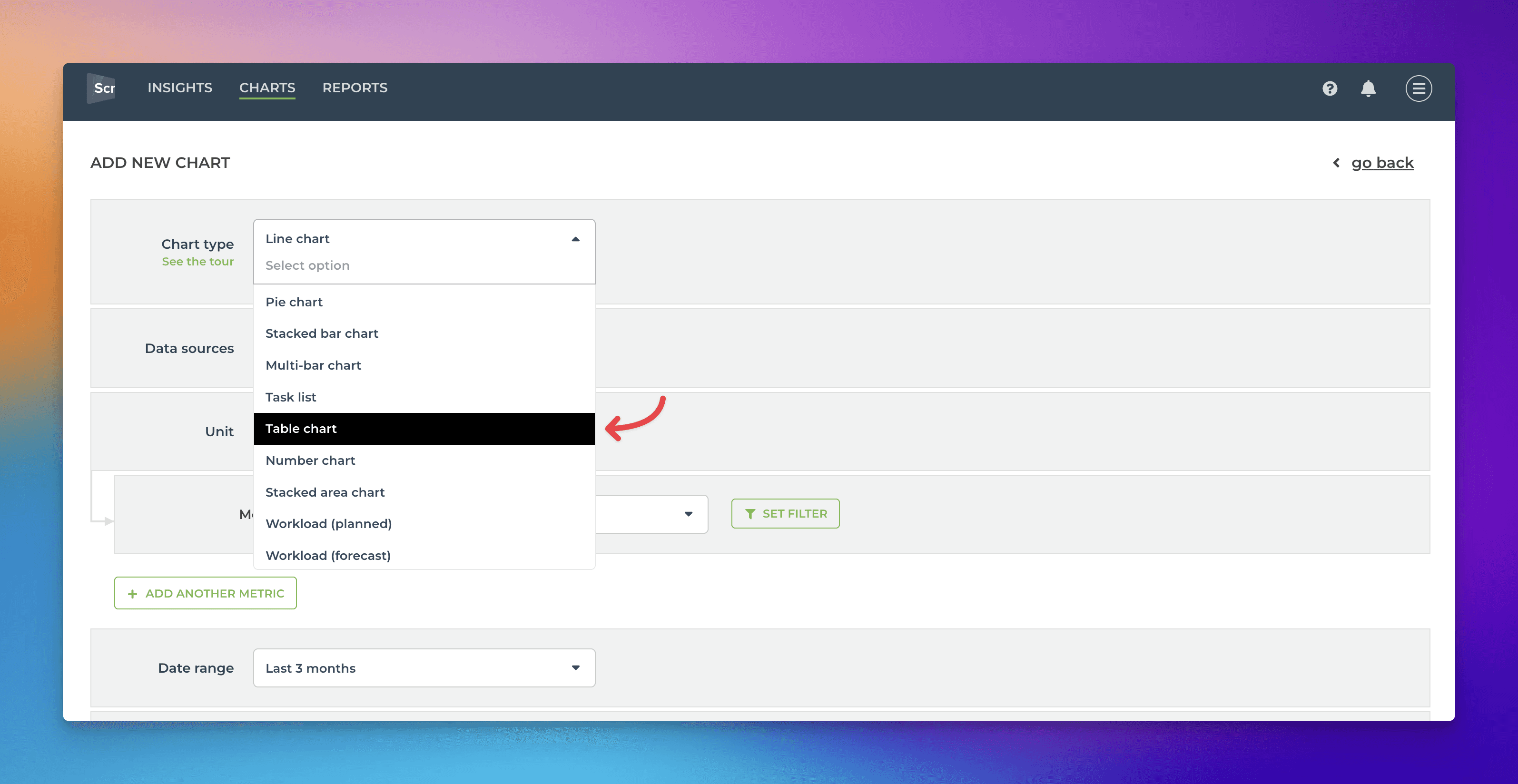
In the chart editor, select Table chart as the chart type:
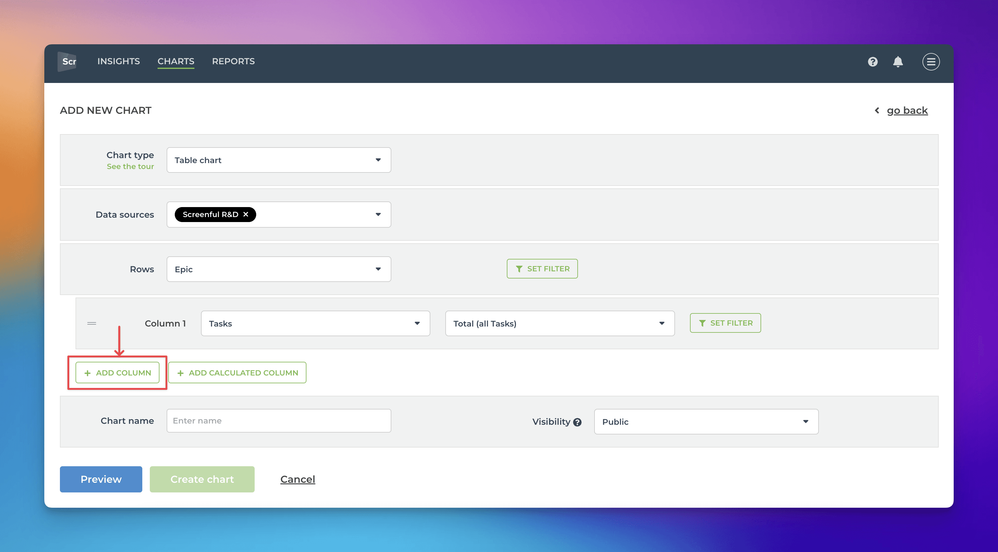
Select all the data sources you want to use in the chart from the Data sources menu. The select select what is used as Rows in the table. In this example, I have selected Epic as a row.
The first column is automatically added. Click Add column to add another column:
Once the column is added, click Set filter:
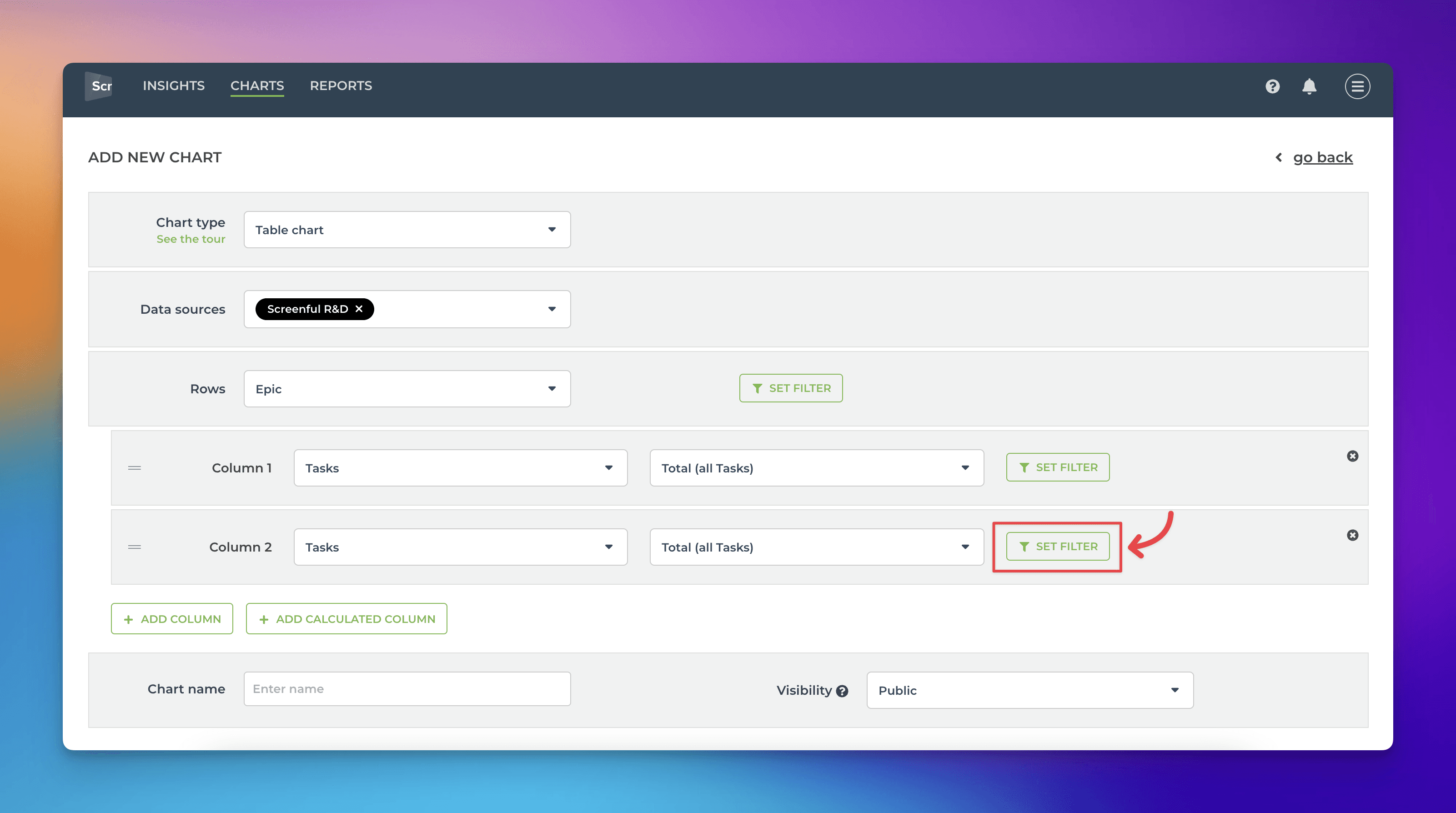
In the filter modal, set a filter Mapped state is any of Done
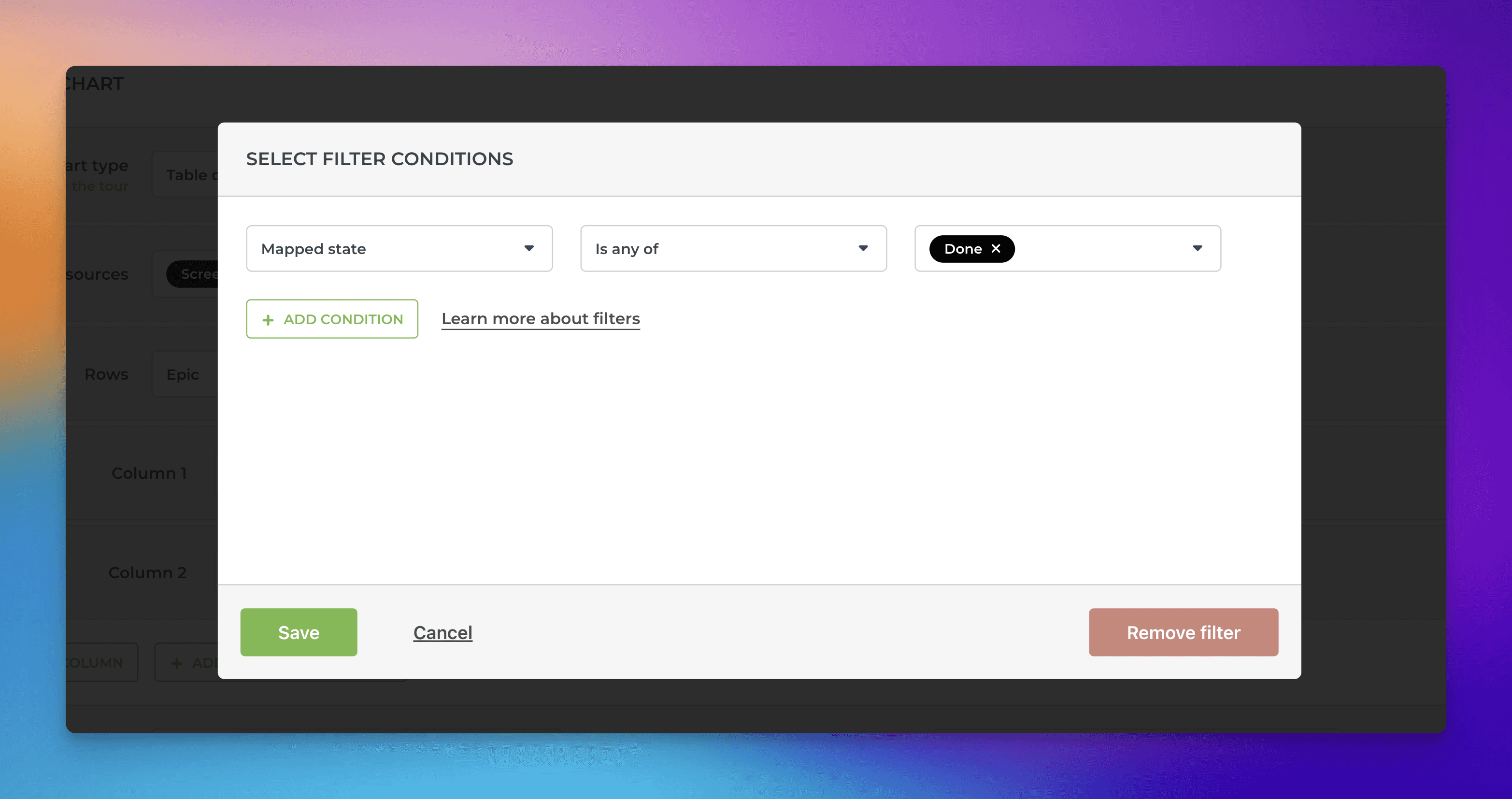
Click Save to close the filter modal. Our table now has two columns: one showing the total number of items and one showing the total number of items that are in the Done state. The next step is to create a calculated column showing the ratio between those two.
Start by clicking Add calculated column:
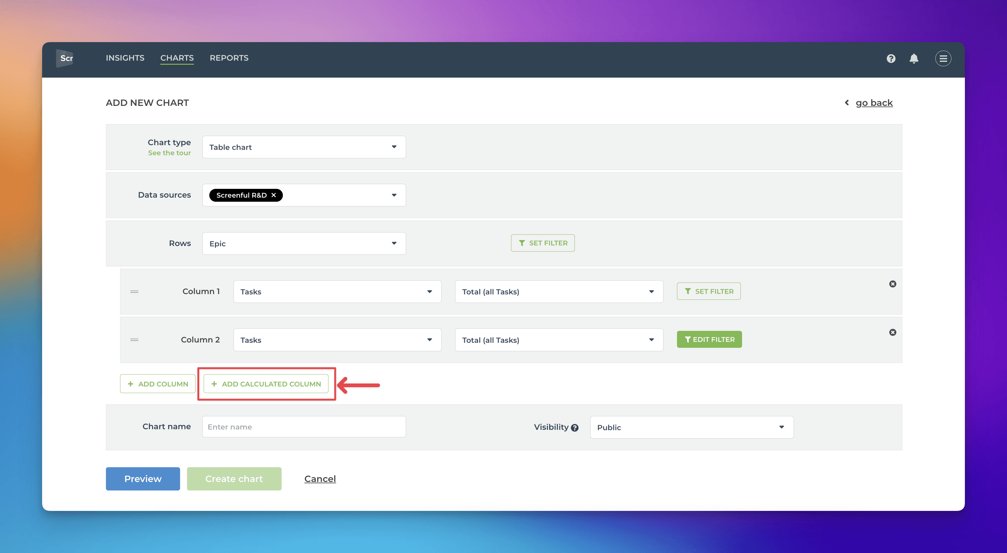
The formula modal opens, allowing you to enter a formula that does a calculation between the columns in the chart. The column we want to create divides the number of tasks in the Done state with the total number of tasks, providing the completion percentage. Here's the formula you can use:
( { 2 Total (all Tasks) } / { 1 Total (all Tasks) } ) * 100
For those interested in learning more, there is another guide for using the calculated column with more details about its capabilities. Here's the formula entered:
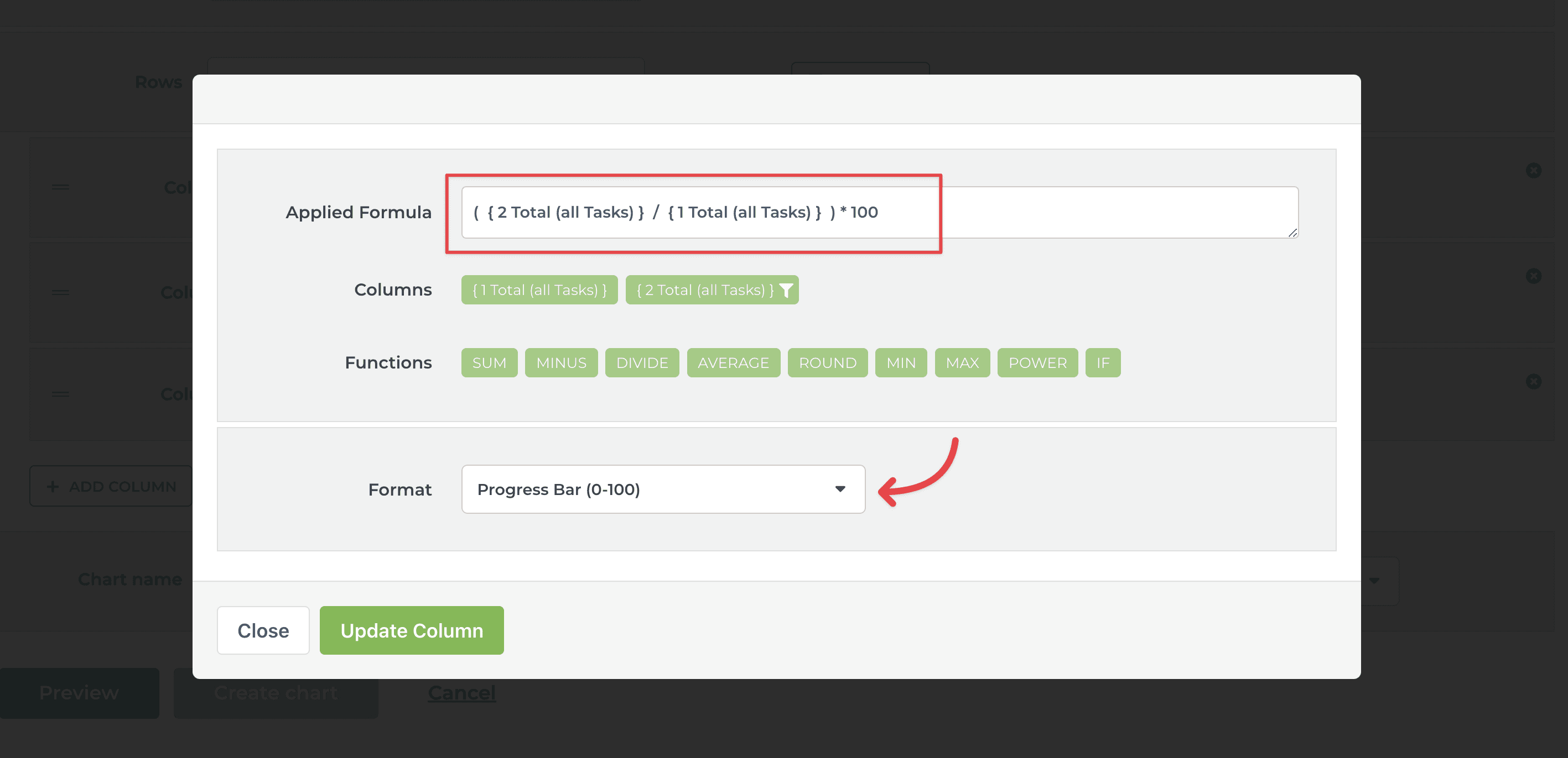
Notice that I've also selected Progress bar as the format of the column. Click Add column to add it to the chart. Click Update column to save the settings.
We have now the basic information set up, and we can preview our chart.
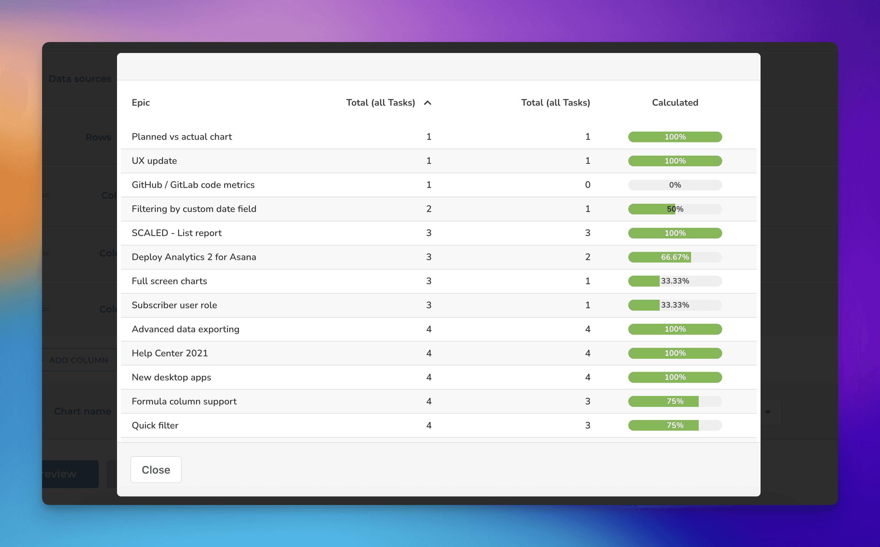
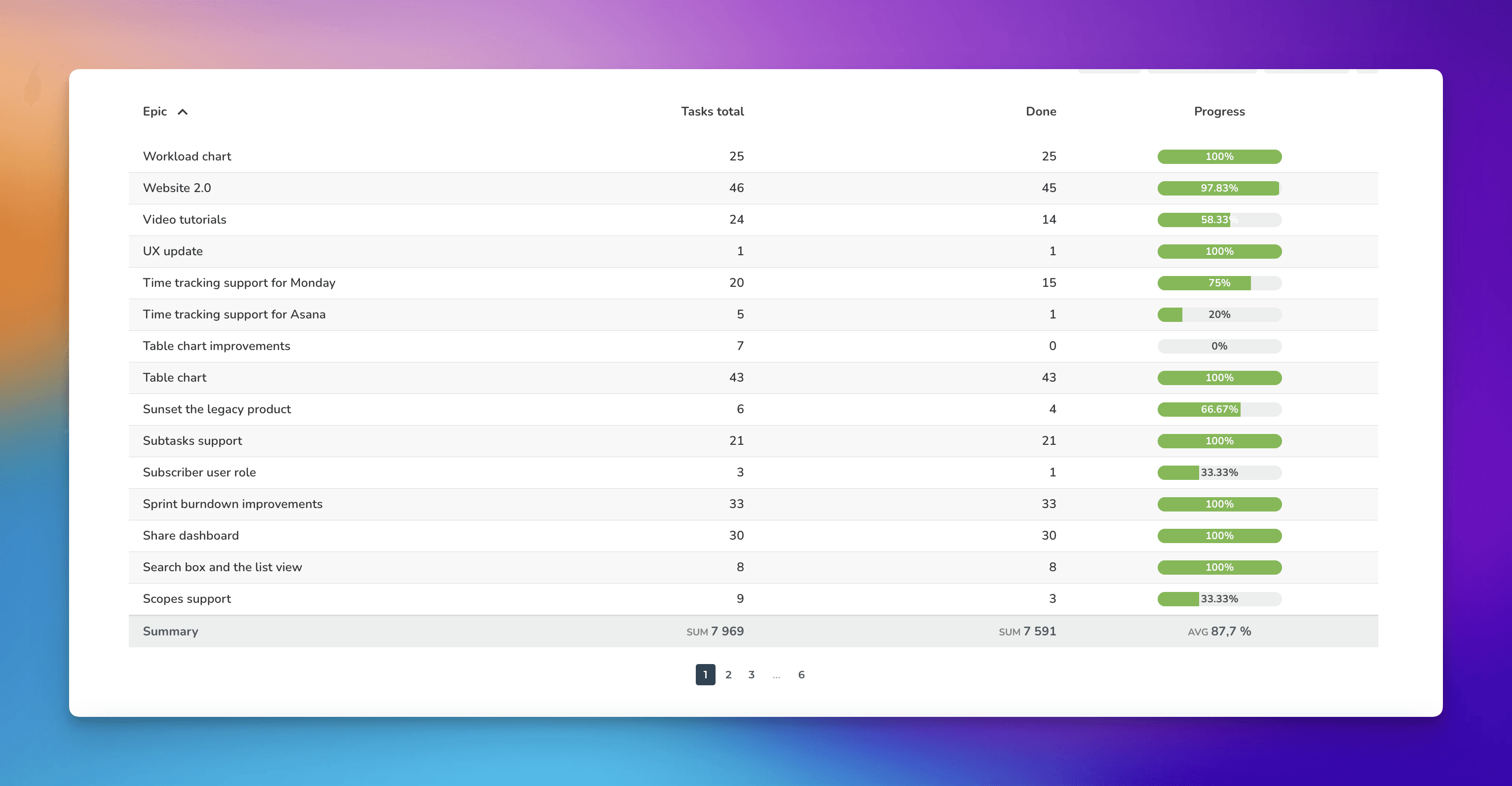
The chart shows an epic list with a progress bar showing how much work has been completed so far.
Step 2: Configure columns
The column headings are named according to the selected metric. You can change the headings in the settings to your liking:
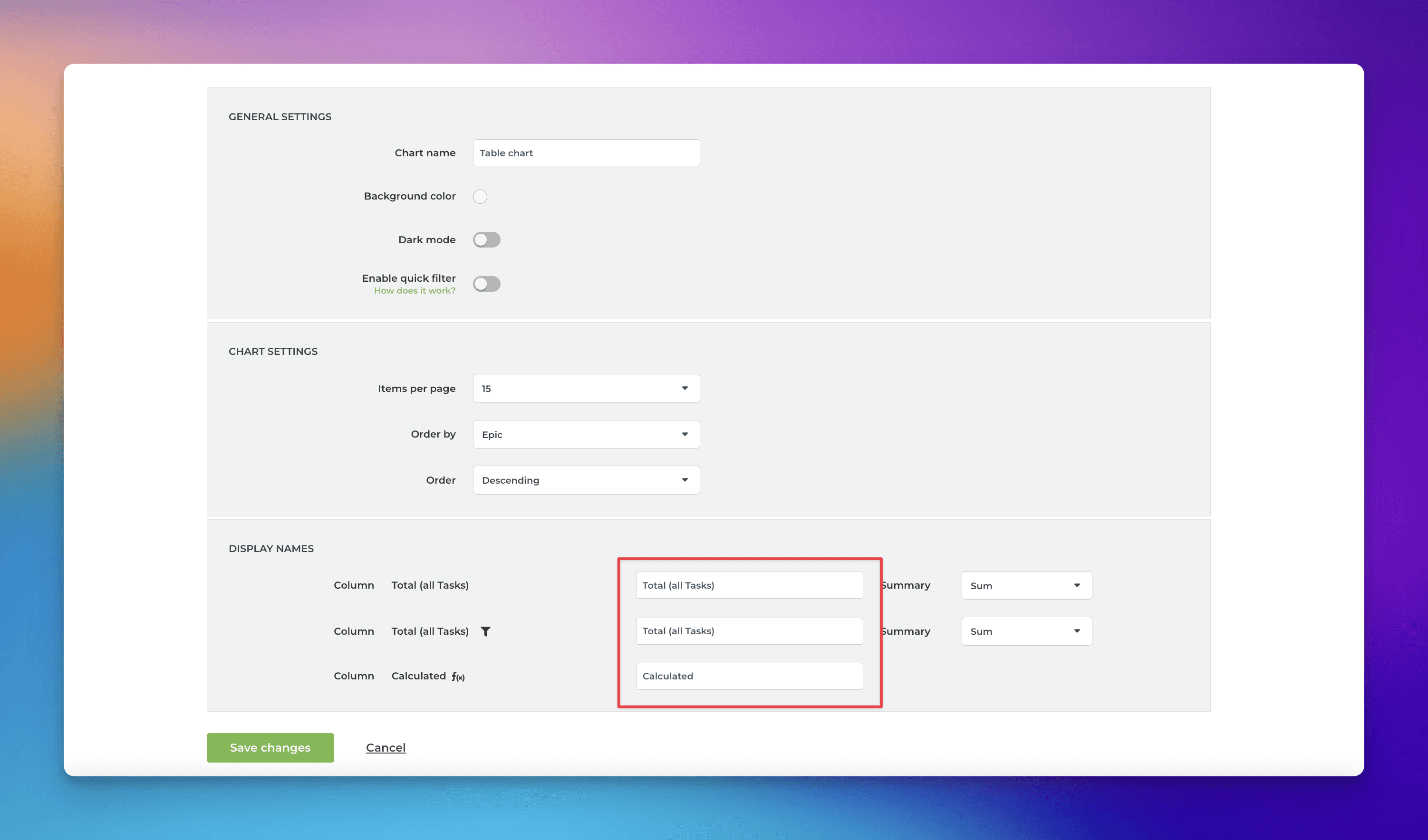
Here's the chart after renaming the columns to Tasks total, Done, and Progress:
Step 3: Select the sorting criteria
Before we are ready to share that chart, we can make some adjustments to make it even better. If you have many epics or aggregated data from many boards, you may end up with too many rows, which leads to pagination. You may not see the most relevant epics/projects/milestones on the first page.
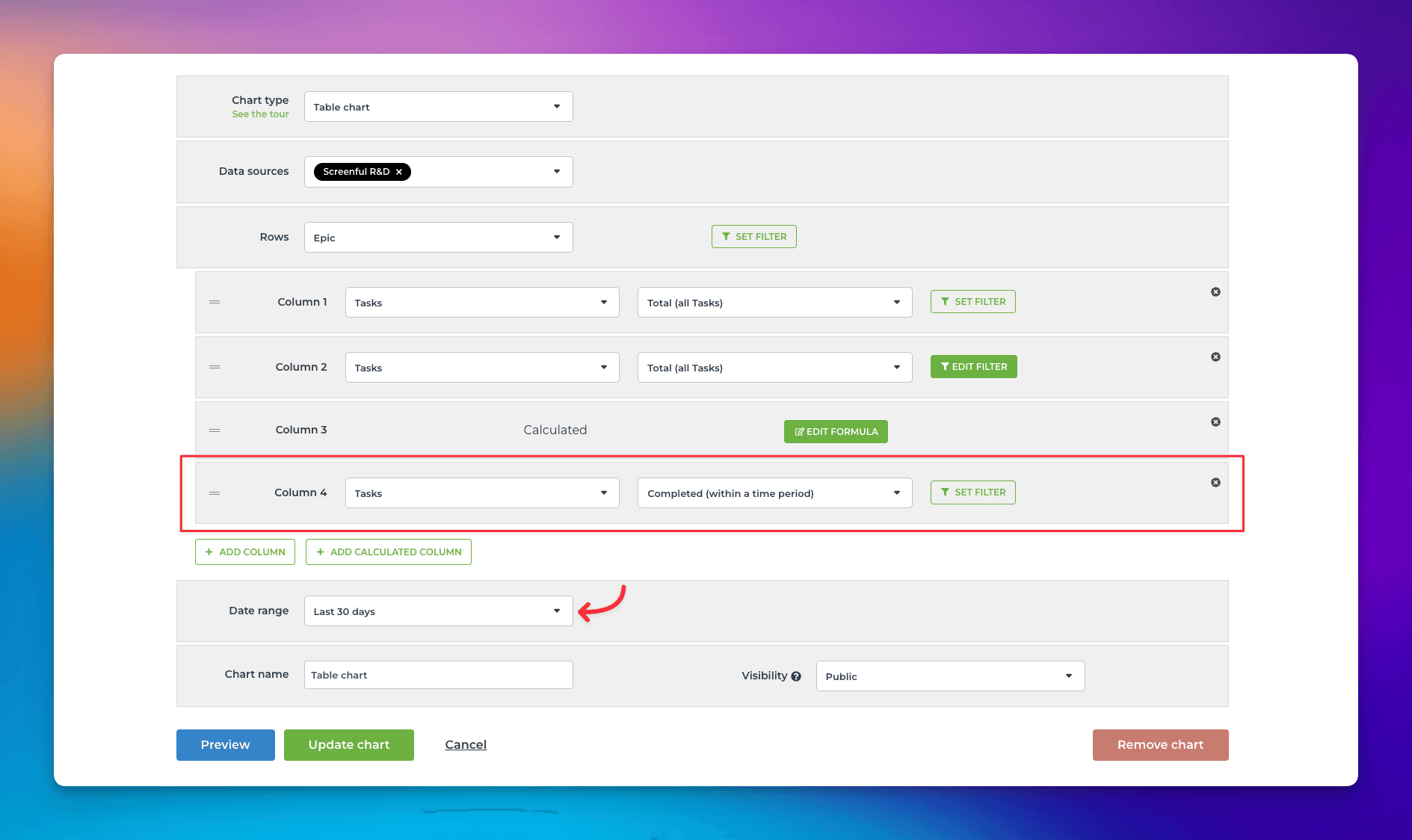
Ideally, the active epics would be shown first. You don't really care about old epics or those that have yet to start. We could certainly use a filter to select the epics to be included, but the filter settings would quickly become outdated. Instead, we add another column to display the number of tasks completed within the last 30 days as a measure of activity in an epic:
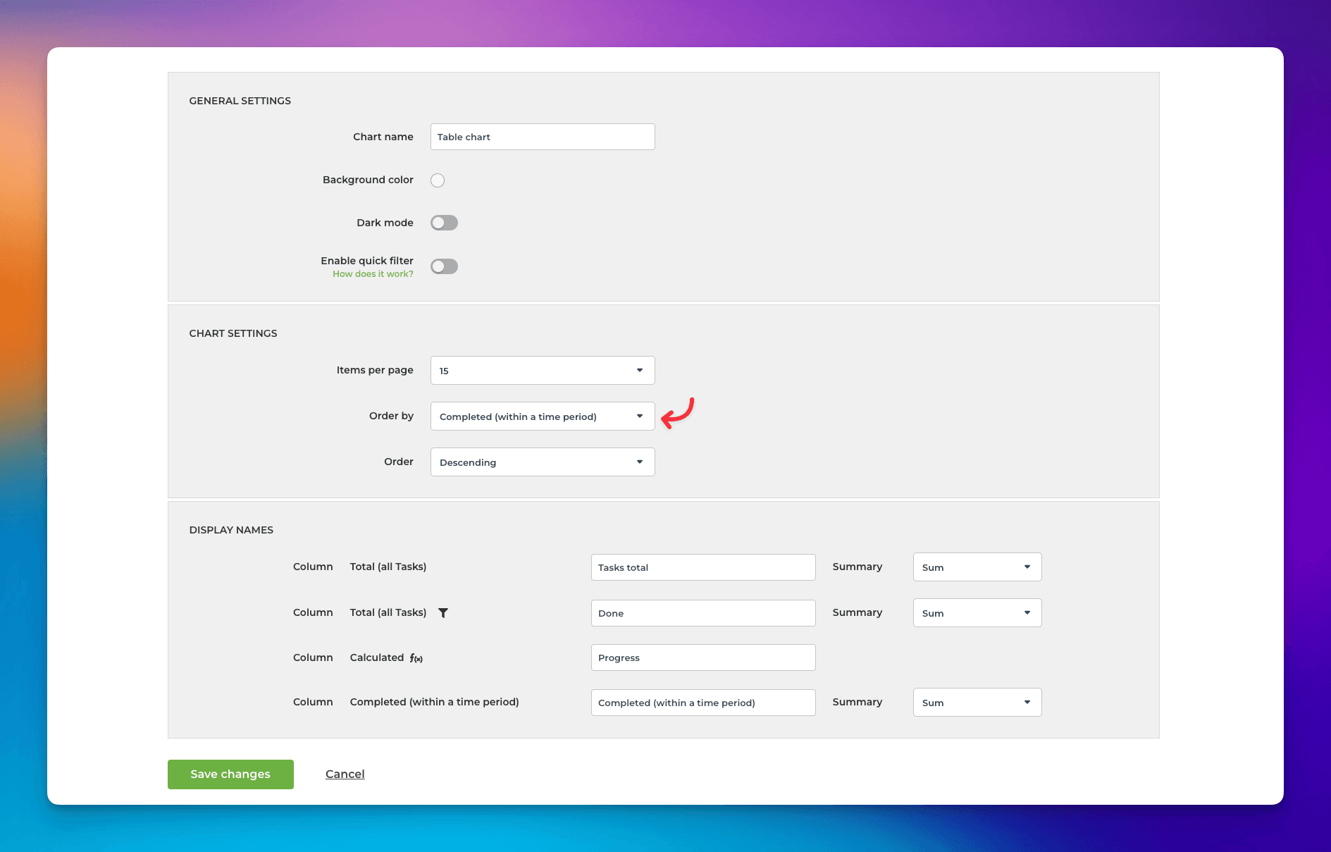
In the chart settings, we can select it as the sorting criteria for the chart:
After reordering the columns, we have arrived at the final chart:
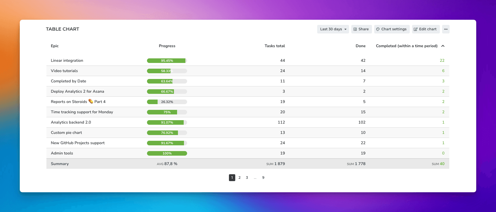
Now the table shows the most active epics and their progress. What's best, it doesn't get outdated as the currently active epics always surface on the top.
Avísanos si tienes preguntas o comentarios contactando hello@screenful.com. Para estar al tanto, lee nuestro blog, o síguenos en LinkedIn.

