Creating charts using different monday.com column types
Creating charts using different monday.com column types
This guide shows how to create advanced charts using data from various column types available on monday.com. All your columns are automatically imported and made available for charts. How you can use them in charts depends on their type. For example, your numbers columns can be used as units, and your dropdown columns can be used for grouping and filtering.
This guide shows how to create advanced charts using data from various column types available on monday.com. All your columns are automatically imported and made available for charts. How you can use them in charts depends on their type. For example, your numbers columns can be used as units, and your dropdown columns can be used for grouping and filtering.
This guide shows how to create advanced charts using data from various column types available on monday.com. All your columns are automatically imported and made available for charts. How you can use them in charts depends on their type. For example, your numbers columns can be used as units, and your dropdown columns can be used for grouping and filtering.
Guide contents:
Guide contents:
Creating charts using Numbers column
Your monday.com Numbers column can be used as a unit of a chart. For example, if you have assigned a Lead value for your items using a Numbers column, you can select it as a unit for a chart.
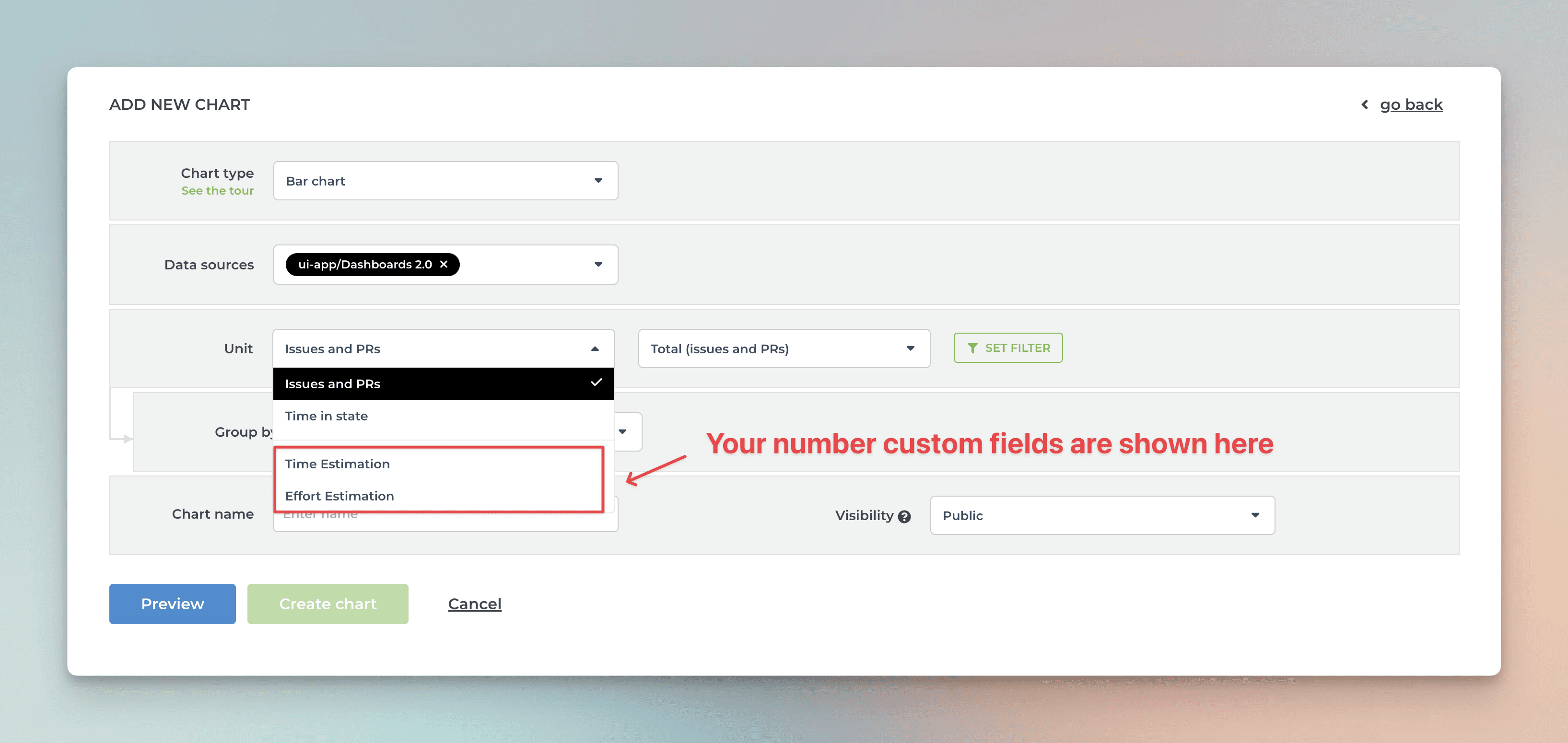
Screenful will automatically make all numbers columns available in the Unit menu in the chart editor.
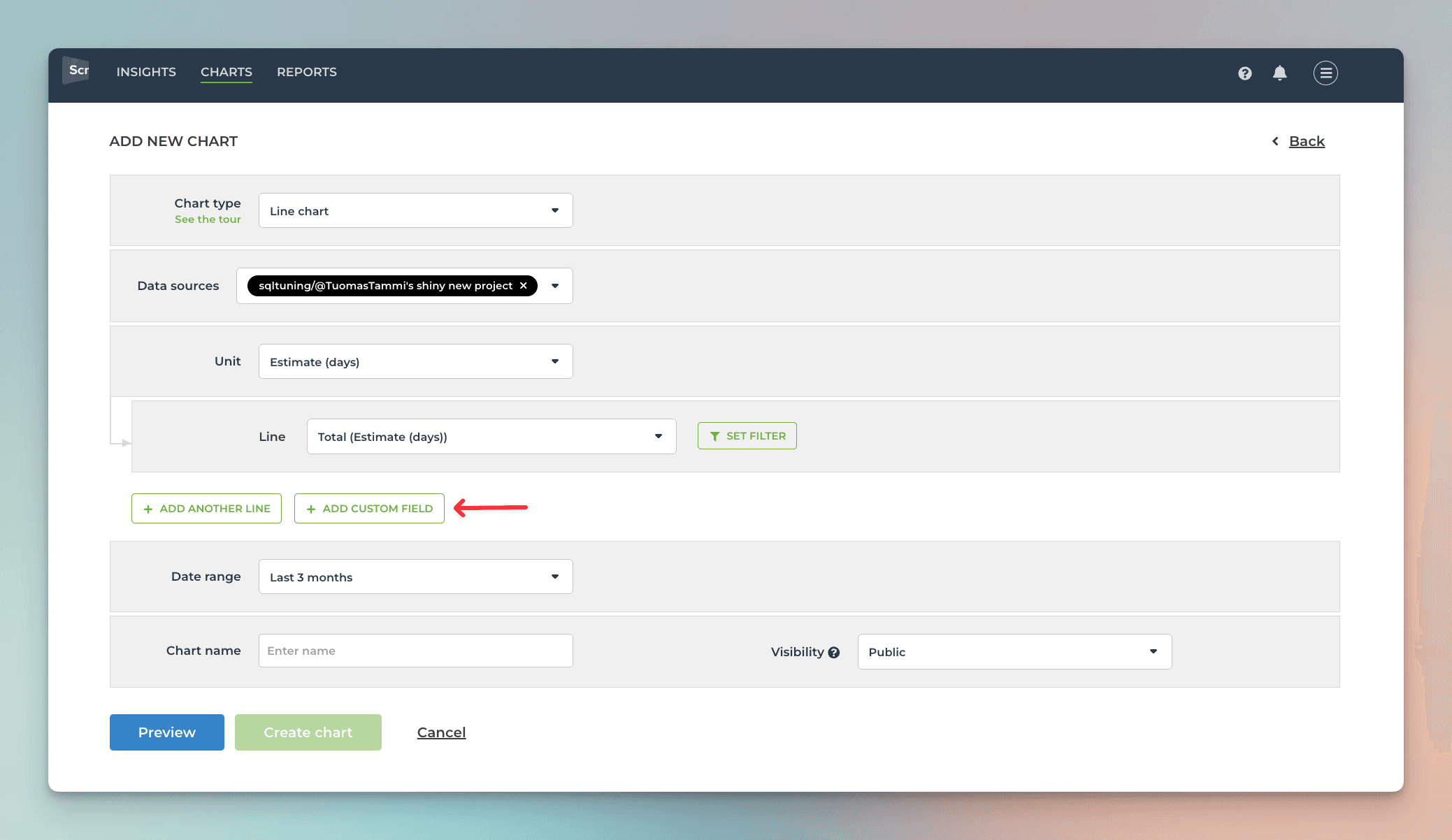
What if you have multiple numbers columns and want to have all of them in one chart? Let’s assume you want to compare the values of three different numbers columns over time. You can do that by adding them one by one into a multibar chart. First, pick one of the custom fields as the unit for the chart. After that, use the Add custom field button to add the other two fields:
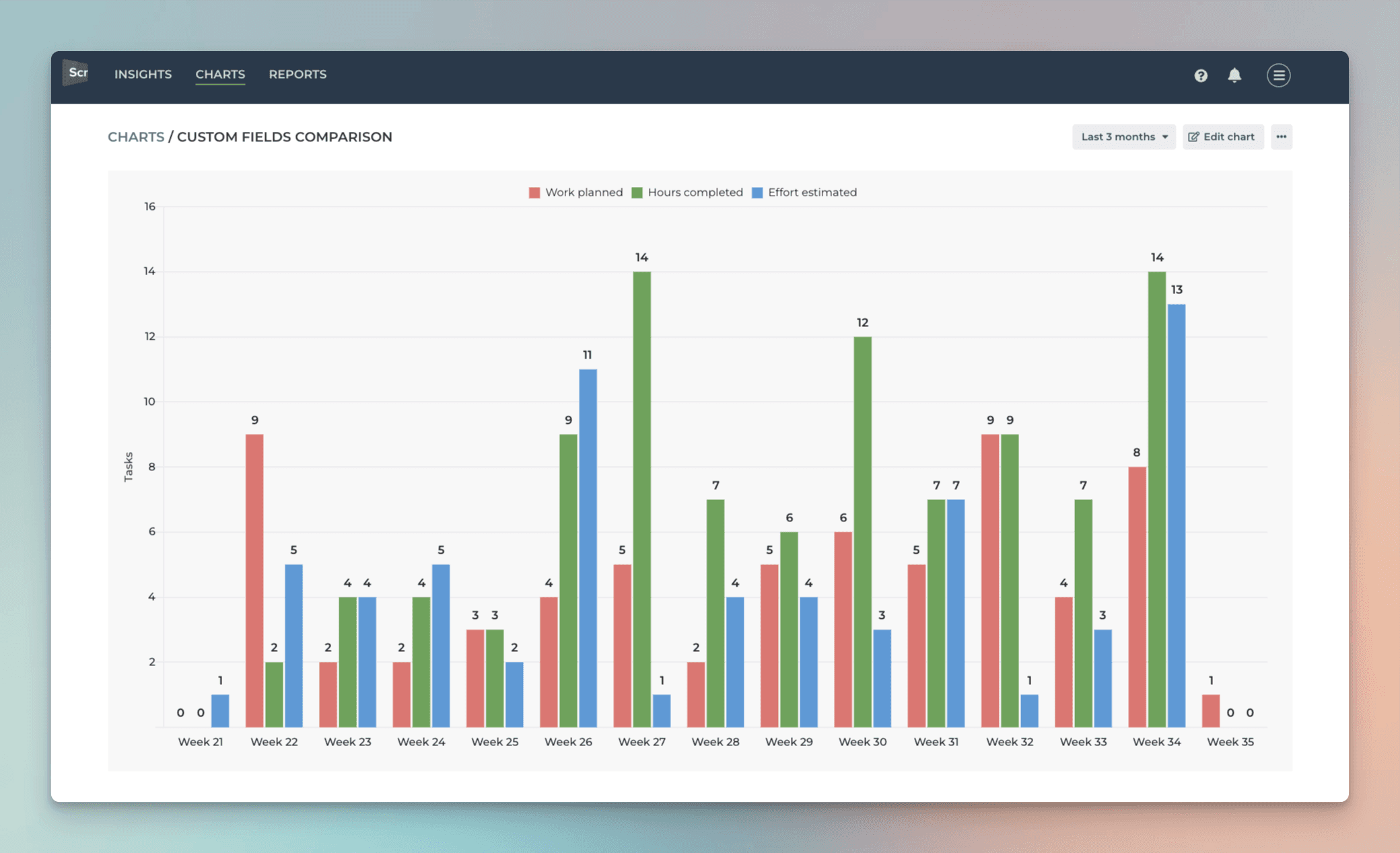
Here’s the final chart with three different numbers columns grouped by week:
Creating charts using Numbers column
Your monday.com Numbers column can be used as a unit of a chart. For example, if you have assigned a Lead value for your items using a Numbers column, you can select it as a unit for a chart.
Screenful will automatically make all numbers columns available in the Unit menu in the chart editor.
What if you have multiple numbers columns and want to have all of them in one chart? Let’s assume you want to compare the values of three different numbers columns over time. You can do that by adding them one by one into a multibar chart. First, pick one of the custom fields as the unit for the chart. After that, use the Add custom field button to add the other two fields:
Here’s the final chart with three different numbers columns grouped by week:
Creating charts using Dropdown column
By default, your monday.com Dropdown columns are available for grouping and filtering. All drop-down columns are automatically available in the grouping and filtering menus.
The instructions here apply to all select or multiselect columns such as Tags, People, Country, or Location
When you are creating a chart that has a grouping option, you'll find your dropdown menus in the Group by menu;
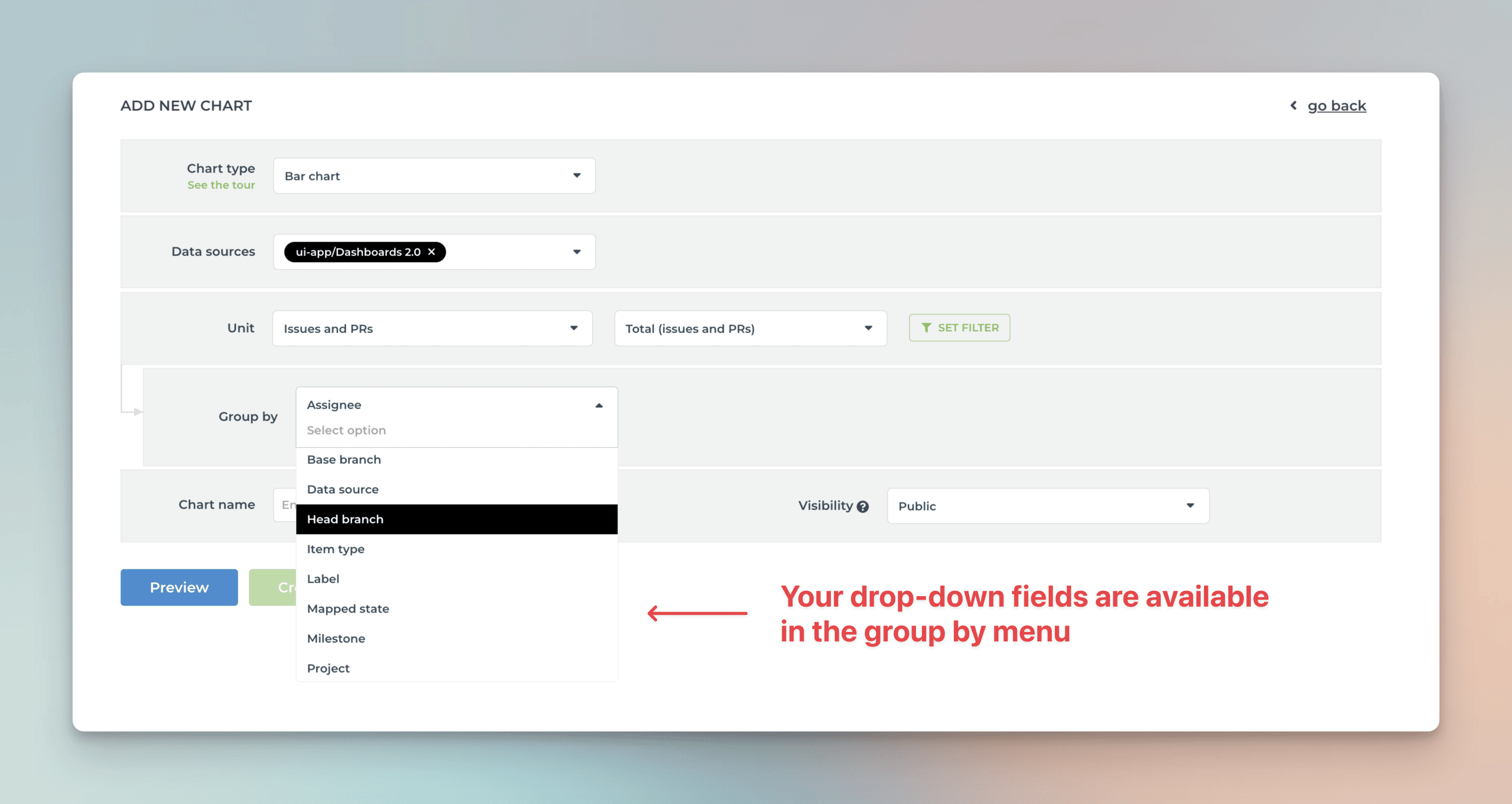
When you pick a dropdown column, the data in the chart is grouped by that column.
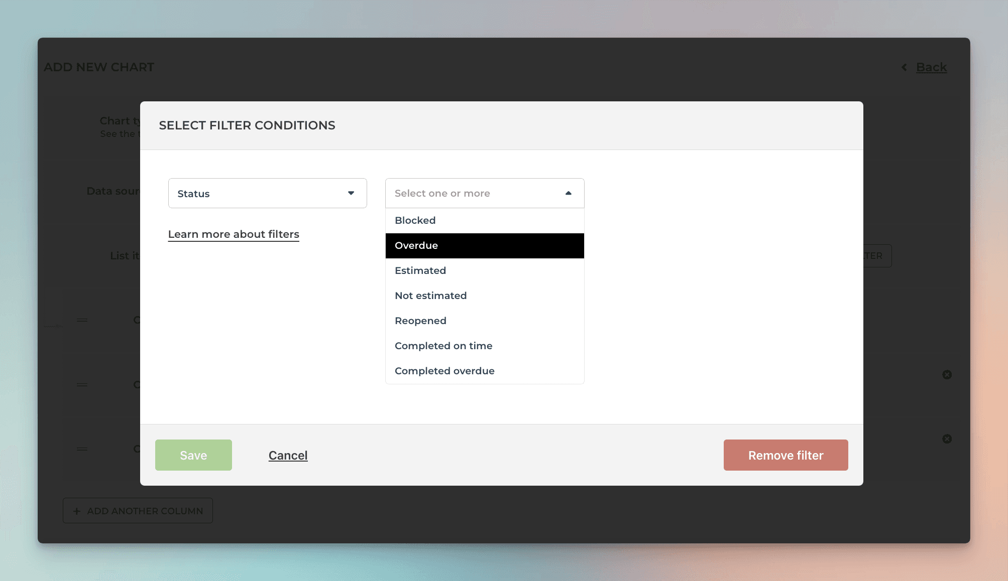
When you want to filter the chart content, you'll find all your dropdown menus in the Filter window:
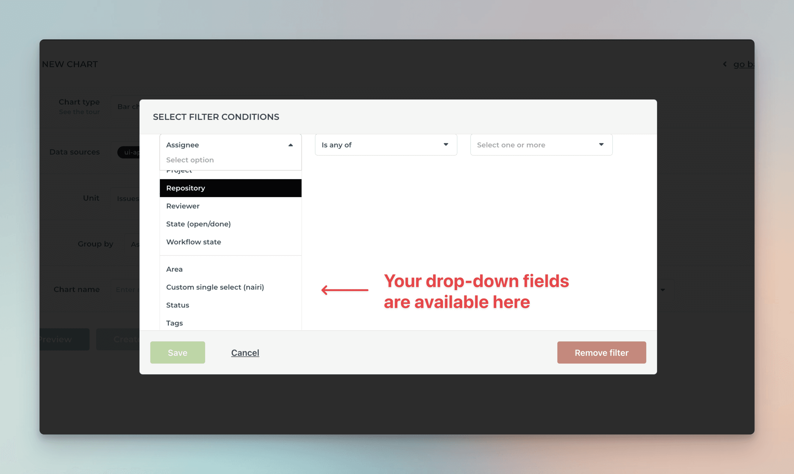
You can include or exclude specific options by setting a filter.
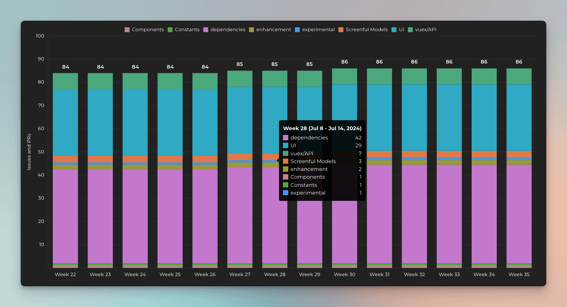
You can also use dropdown fields to stack the bars in the Stacked bar chart. Here's an example Stacked bar chart stacked by a single select field Component:
By default, your Single select fields are available for grouping and filtering. If you want to group & filter by Text fields, you can adjust the default field mapping.
Creating charts using Dropdown column
By default, your monday.com Dropdown columns are available for grouping and filtering. All drop-down columns are automatically available in the grouping and filtering menus.
The instructions here apply to all select or multiselect columns such as Tags, People, Country, or Location
When you are creating a chart that has a grouping option, you'll find your dropdown menus in the Group by menu;
When you pick a dropdown column, the data in the chart is grouped by that column.
When you want to filter the chart content, you'll find all your dropdown menus in the Filter window:
You can include or exclude specific options by setting a filter.
You can also use dropdown fields to stack the bars in the Stacked bar chart. Here's an example Stacked bar chart stacked by a single select field Component:
By default, your Single select fields are available for grouping and filtering. If you want to group & filter by Text fields, you can adjust the default field mapping.
Creating charts using Date column
You can track work based on any of your Date columns. When you create a custom chart, you can pick a date field instead of a workflow state as the primary filter. This lets you track the items completed based on manually set completion dates.
Let's assume you have a column Completion date on your board. You can create a chart that shows how many items have the date in the past by selecting by Completion date as the metric for the chart.
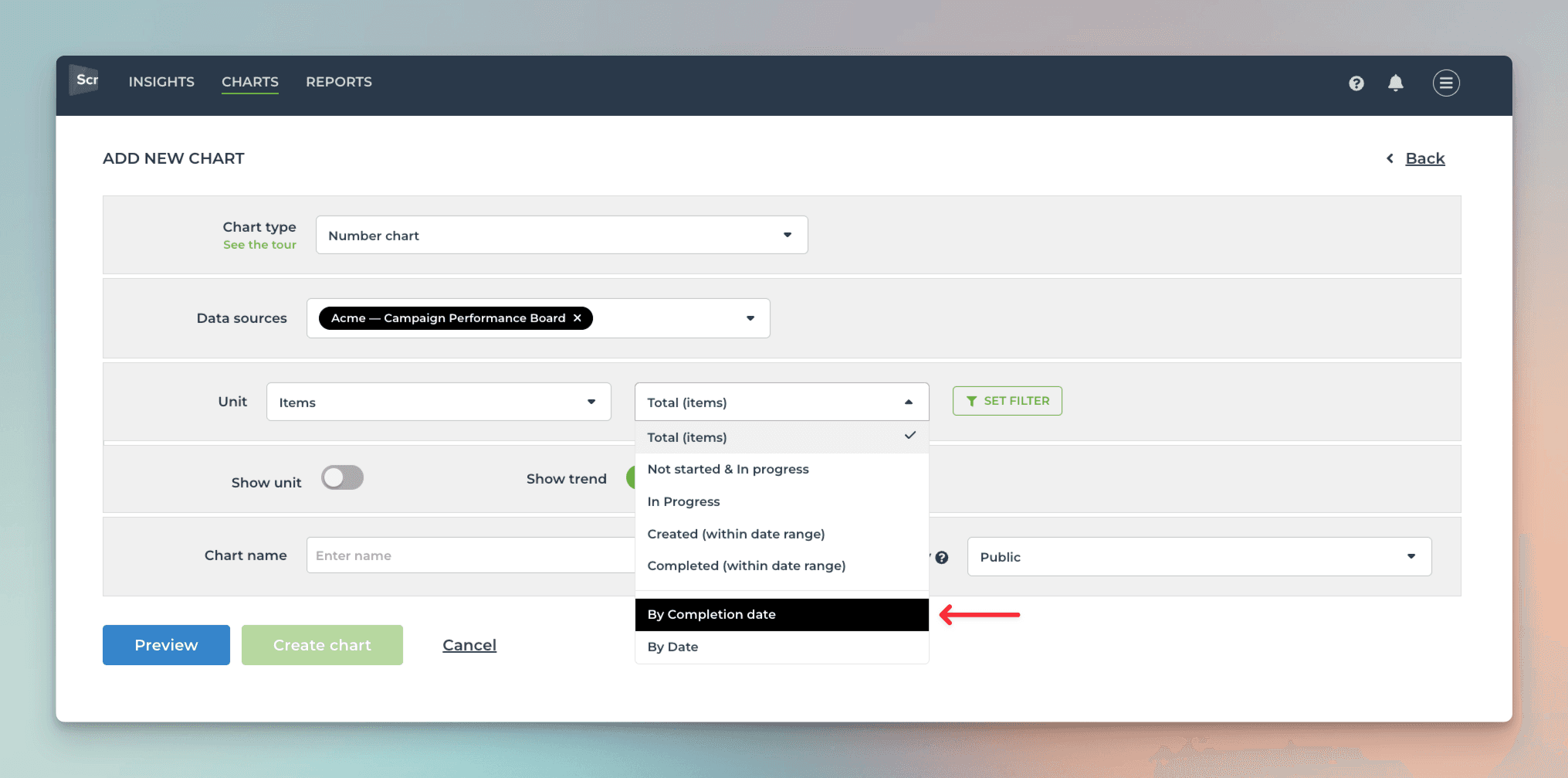
That will work the same way as if you had selected Completed (within date range), except that it will only look at the value in the date column. If the date is in the past, it is considered completed, regardless of the workflow state of that item. It is an alternative way of tracking work completions.
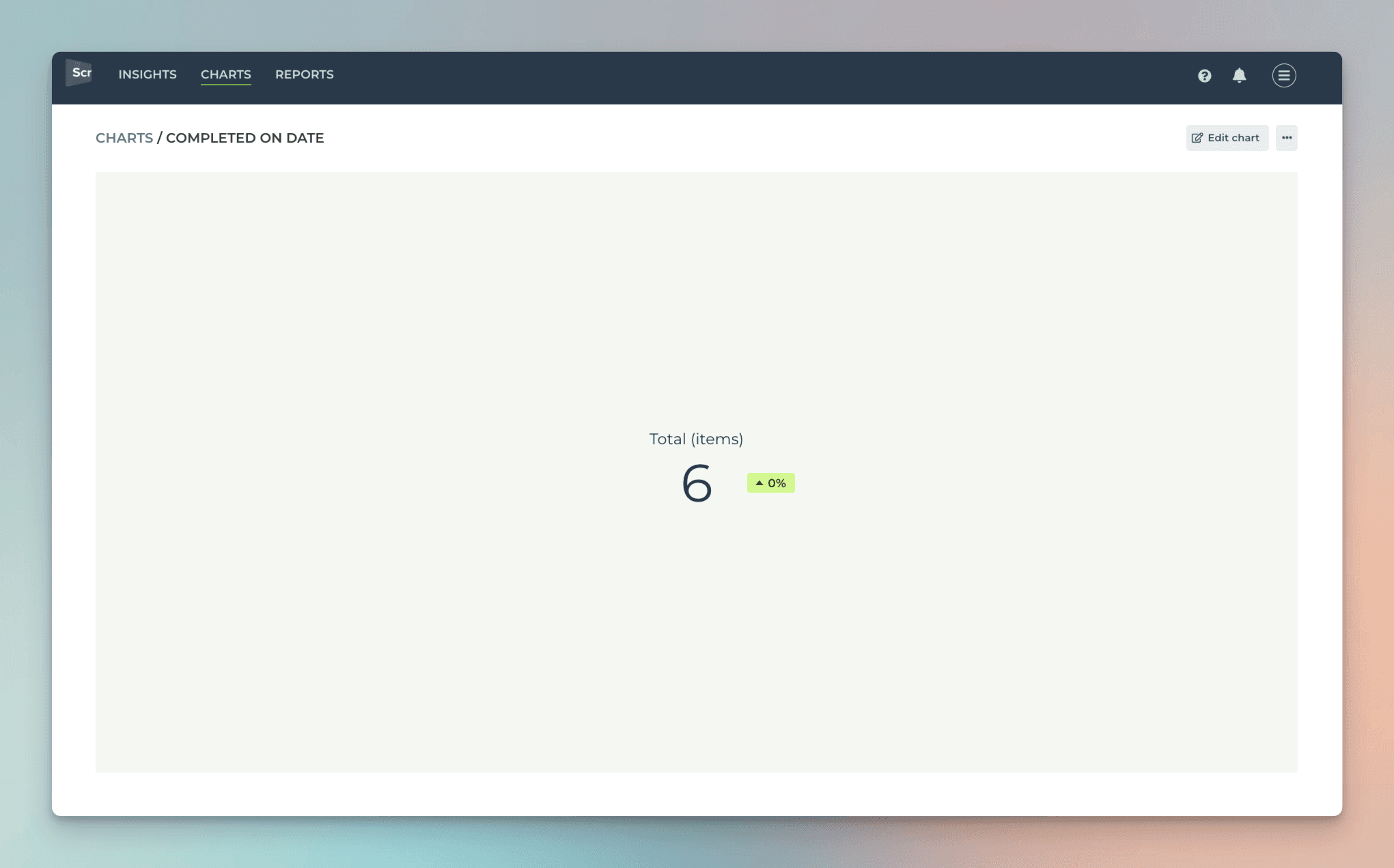
Here's the resulting chart:
You can track any number column by any date column. You can pick a number column from the Unit menu:
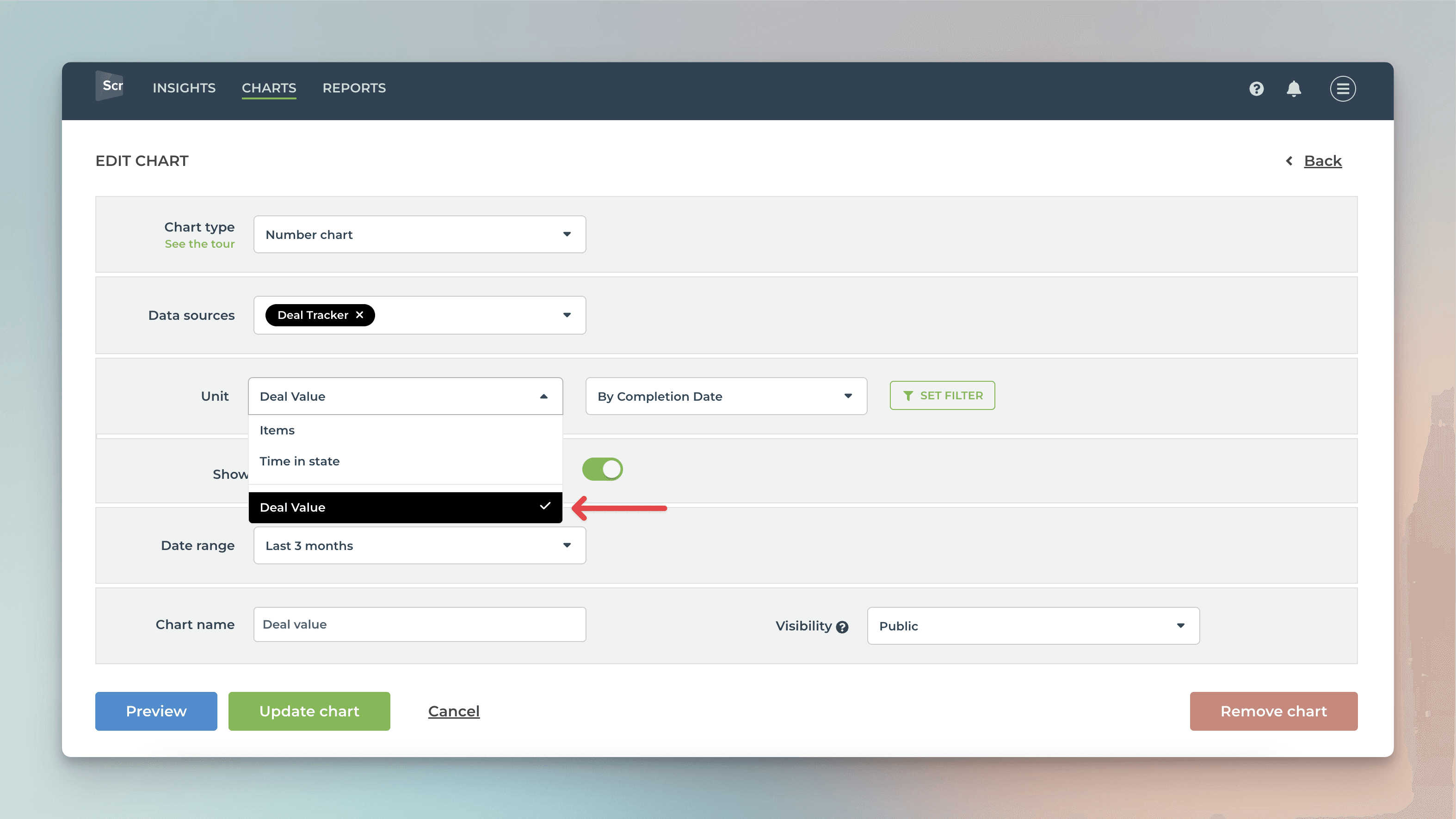
In this example, I have selected Deal value as the unit and by Completion date as the metric for the chart. Here's the resulting chart:
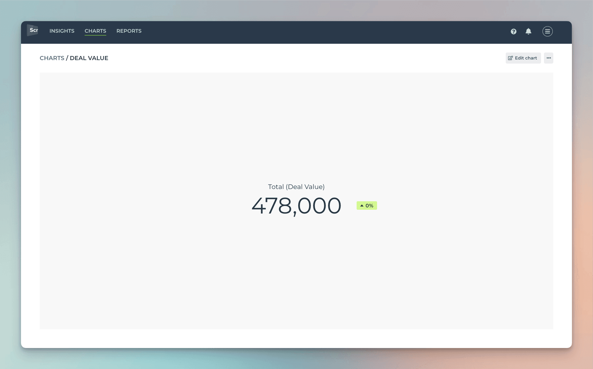
The chart shows the deal value generated during the selected period based on the Completion date column.
Any of your number columns can be used as a unit in the charts. You can also map your dropdown fields as units in the custom fields mapping. You can learn more from this guide.
Creating charts using Date column
You can track work based on any of your Date columns. When you create a custom chart, you can pick a date field instead of a workflow state as the primary filter. This lets you track the items completed based on manually set completion dates.
Let's assume you have a column Completion date on your board. You can create a chart that shows how many items have the date in the past by selecting by Completion date as the metric for the chart.
That will work the same way as if you had selected Completed (within date range), except that it will only look at the value in the date column. If the date is in the past, it is considered completed, regardless of the workflow state of that item. It is an alternative way of tracking work completions.
Here's the resulting chart:
You can track any number column by any date column. You can pick a number column from the Unit menu:
In this example, I have selected Deal value as the unit and by Completion date as the metric for the chart. Here's the resulting chart:
The chart shows the deal value generated during the selected period based on the Completion date column.
Any of your number columns can be used as a unit in the charts. You can also map your dropdown fields as units in the custom fields mapping. You can learn more from this guide.
Creating charts using Timeline column
You can track work based on your Timeline column by mapping the column to the Start date and Due date in the custom field mapping. To access the custom field mapping, select Data Mapping under the main menu and navigate to the Custom Fields tab.
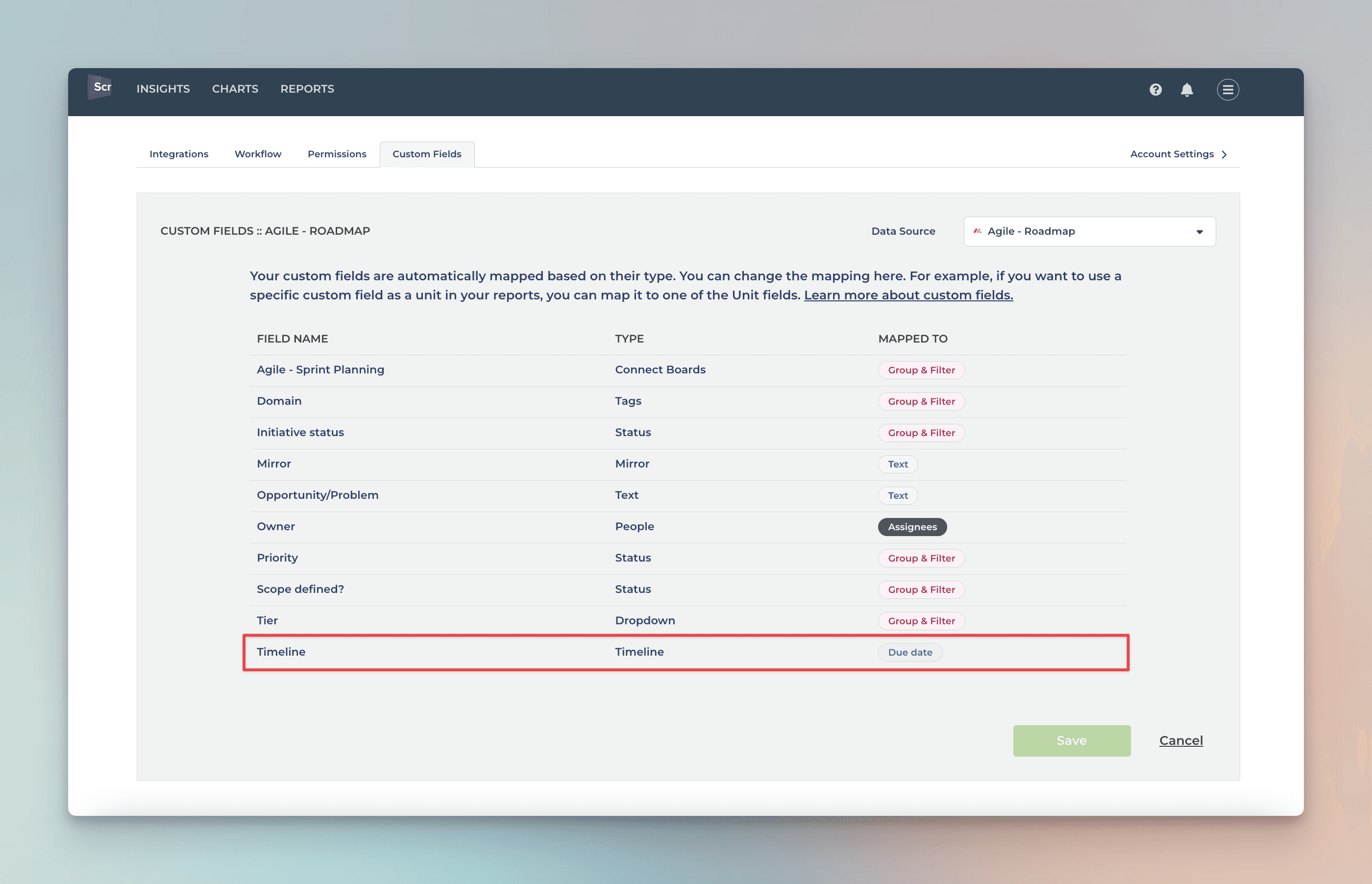
The rightmost column shows the the mapping of the column. You can adjust the mapping by clicking the item from the list:
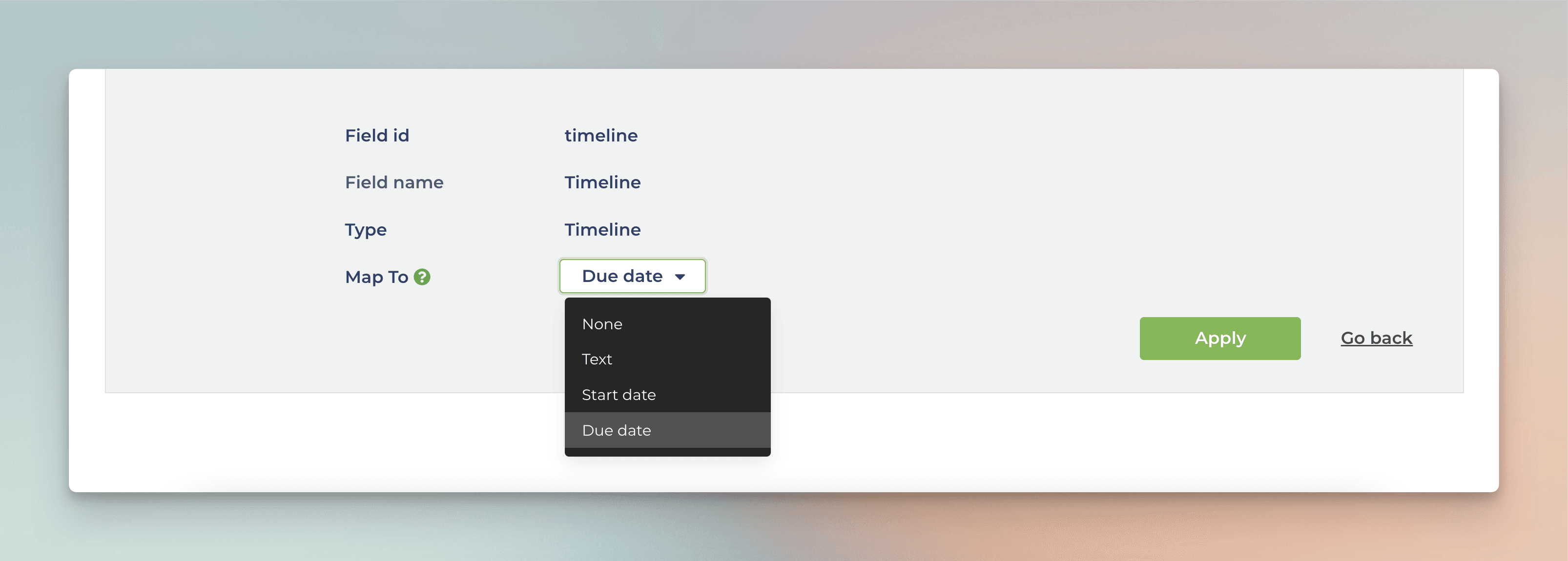
Since Timeline contains both start and end dates, you can map it to either a start date or an end date, and the other date is automatically mapped to the same Timeline field.
Once mapped, you can use the timeline column in the Workload chart, or filter the charts using the start or due dates:
Creating charts using Timeline column
You can track work based on your Timeline column by mapping the column to the Start date and Due date in the custom field mapping. To access the custom field mapping, select Data Mapping under the main menu and navigate to the Custom Fields tab.
The rightmost column shows the the mapping of the column. You can adjust the mapping by clicking the item from the list:
Since Timeline contains both start and end dates, you can map it to either a start date or an end date, and the other date is automatically mapped to the same Timeline field.
Once mapped, you can use the timeline column in the Workload chart, or filter the charts using the start or due dates:
Creating charts using Mirror column
Your Mirror columns are automatically imported and made available for charts. Their handling depends on their type. If a mirror column contains a number, it is mapped to Unit, and can be used as a unit in all charts. All other mirror columns are mapped to Text and can be used as columns in the Task list.
Mirror columns come with an aggregation function. Screenful applies the aggregation function to the values and stores the result as either a number or text, depending on the type of the mirror column. Regardless of their initial mapping, you can always change it afterward by mapping a mirrored column to a Unit or by mapping it to Group & Filter.
Creating charts using Status columm
The Status column is special because it is used as a source of your workflow. When you import a board to Screenful, you are asked to pick the status column that contains your workflow. The stages in your workflow are mapped to Not started, In progress, and Done. That allows Screenful to understand your data better and calculate metrics automatically.
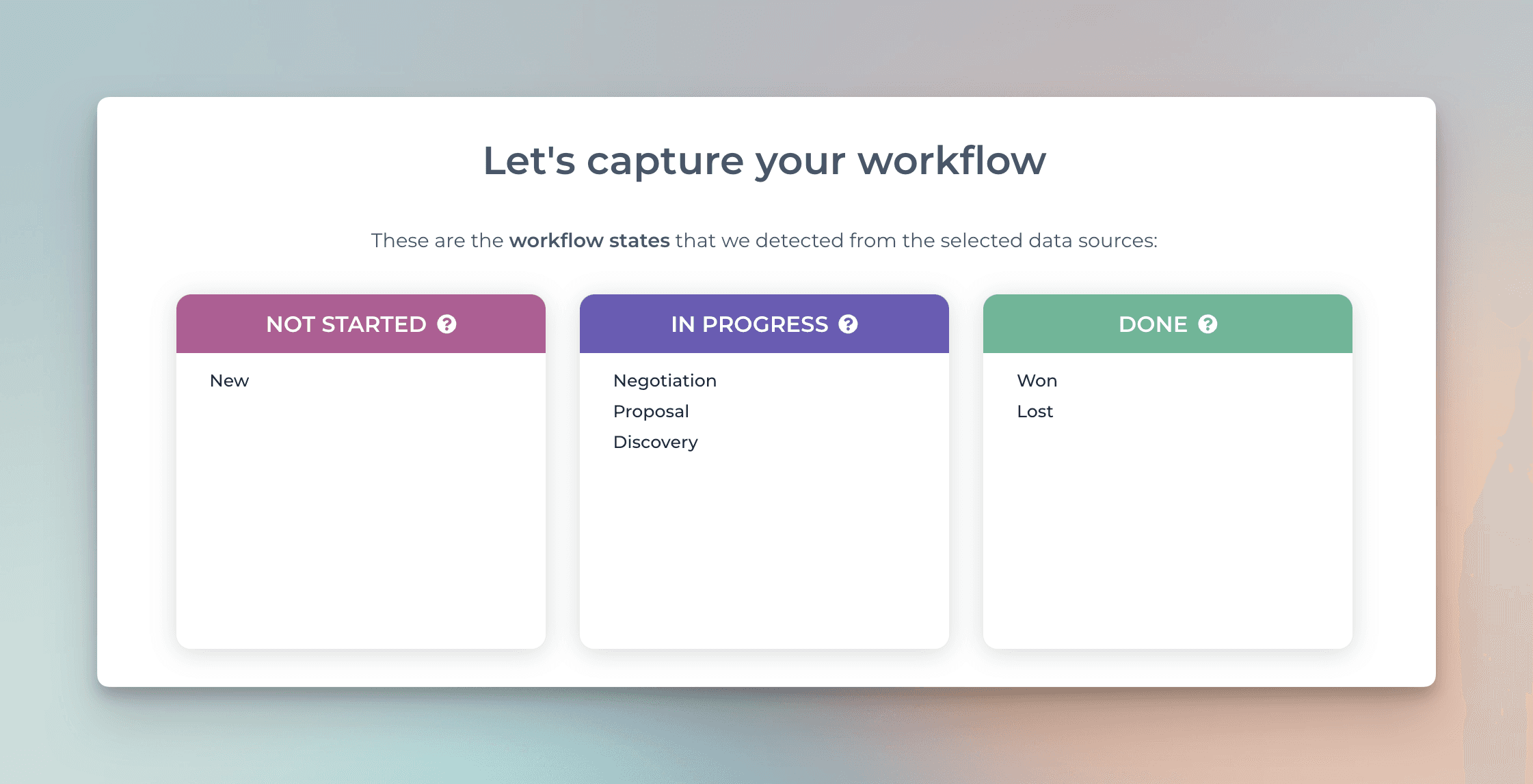
Once you have mapped your delivery pipeline or sales funnel like this, you can create charts using the metrics available in the chart editor:
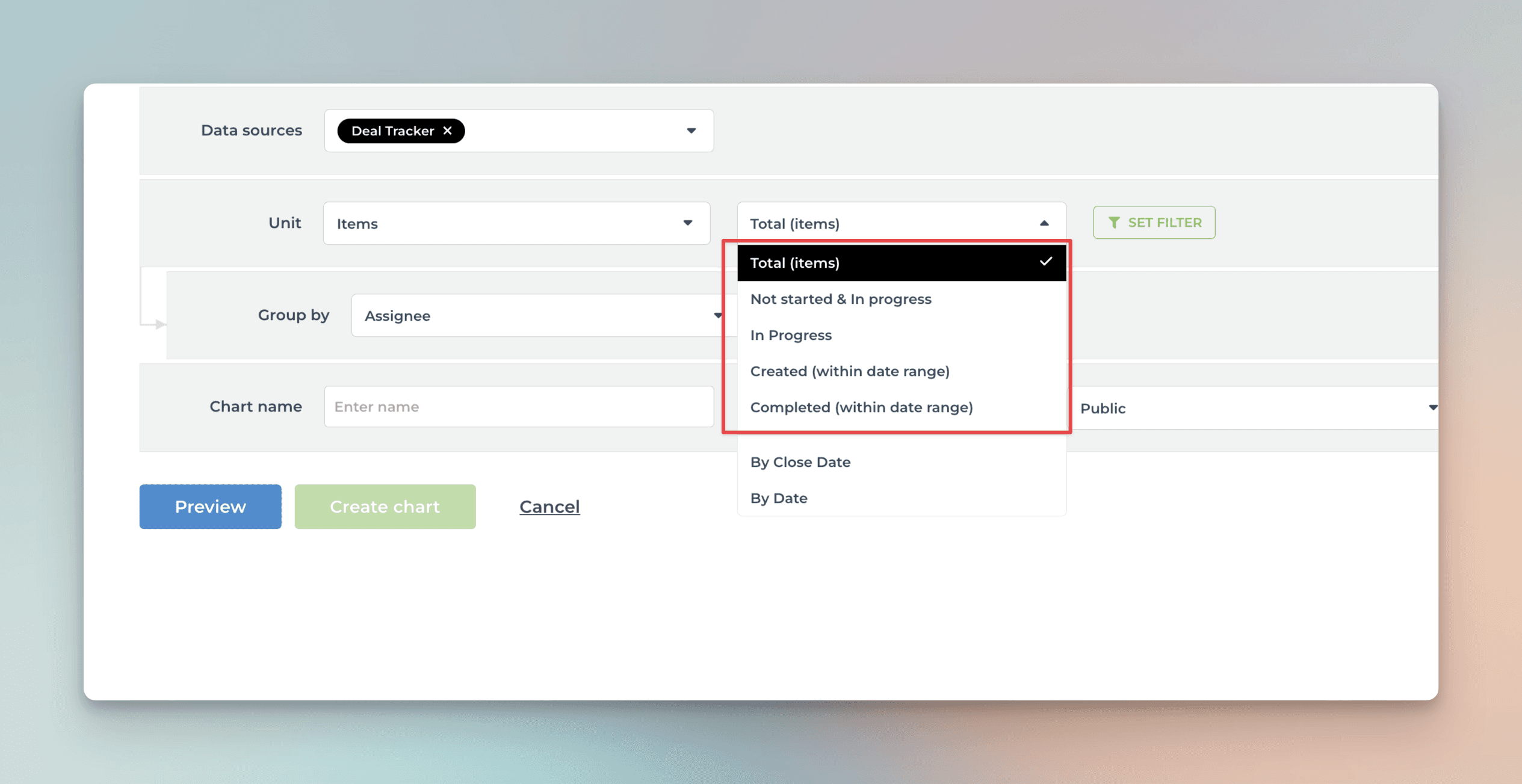
The options in the menu filters the items as follows:
Total (items) -> Include all items
Not started & In progress -> Include items that are in the stages mapped to Not started or In progress
In progress -> Include items that are in the stages mapped to In progress
Created -> Include all items created within a date range, regardless of stage
Completed -> Include all items moved to a stage mapped to Done within a date range.
Learn more about workflow mapping from this guide.
Creating charts using Status columm
The Status column is special because it is used as a source of your workflow. When you import a board to Screenful, you are asked to pick the status column that contains your workflow. The stages in your workflow are mapped to Not started, In progress, and Done. That allows Screenful to understand your data better and calculate metrics automatically.
Once you have mapped your delivery pipeline or sales funnel like this, you can create charts using the metrics available in the chart editor:
The options in the menu filters the items as follows:
Total (items) -> Include all items
Not started & In progress -> Include items that are in the stages mapped to Not started or In progress
In progress -> Include items that are in the stages mapped to In progress
Created -> Include all items created within a date range, regardless of stage
Completed -> Include all items moved to a stage mapped to Done within a date range.
Learn more about workflow mapping from this guide.
Creating charts using Formula column
The Formula column is currently not supported in Screenful analytics due to the lack of support in the monday.com API.
Creating charts using Formula column
The Formula column is currently not supported in Screenful analytics due to the lack of support in the monday.com API.
Creating charts using Time tracking column
If you have added one or more Time tracking columns to your board, they will be automatically imported and made available for charts. You can create charts based on time tracking data in the same way you create charts based on task data. You have all the same grouping and filtering options available.
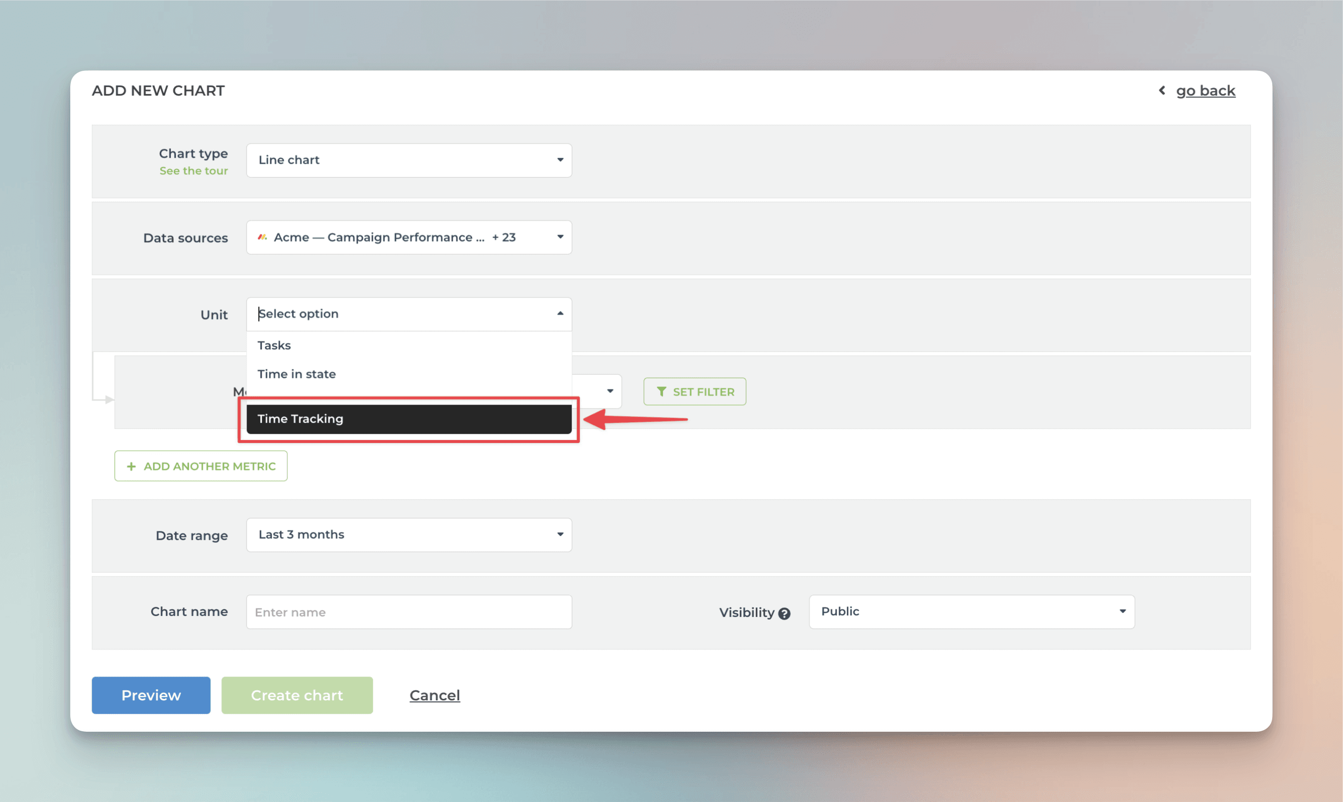
To create a chart using time tracking data, start by clicking Add new chart in the Charts tab. Select the data sources for the chart. If any of those data sources contain time tracking columns, they will be shown in the Unit menu:
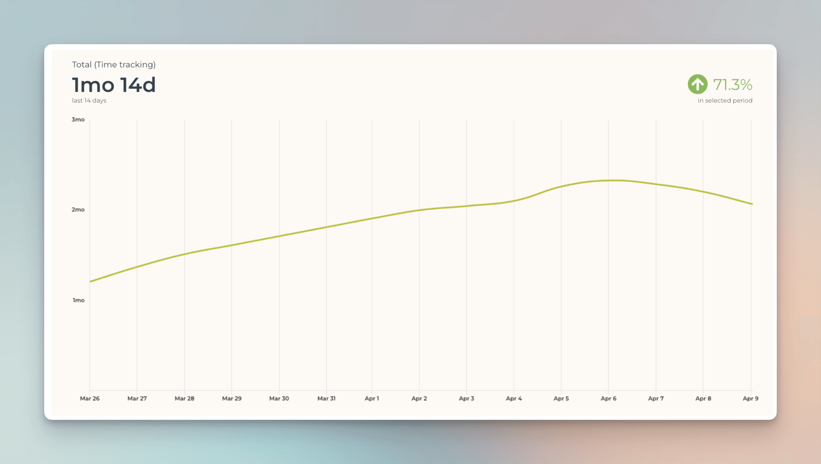
The Date range refers to when the hours were logged. Here’s the resulting chart:
You can create charts from your top-level items, subitems, or both. You can choose between these options by setting a filter (use the filter Item type). Notice that you must import the subitems as a separate data source to make them available.
To see how many hours have been logged by team member by item within a time period, select Time tracking (within date range) from the menu:
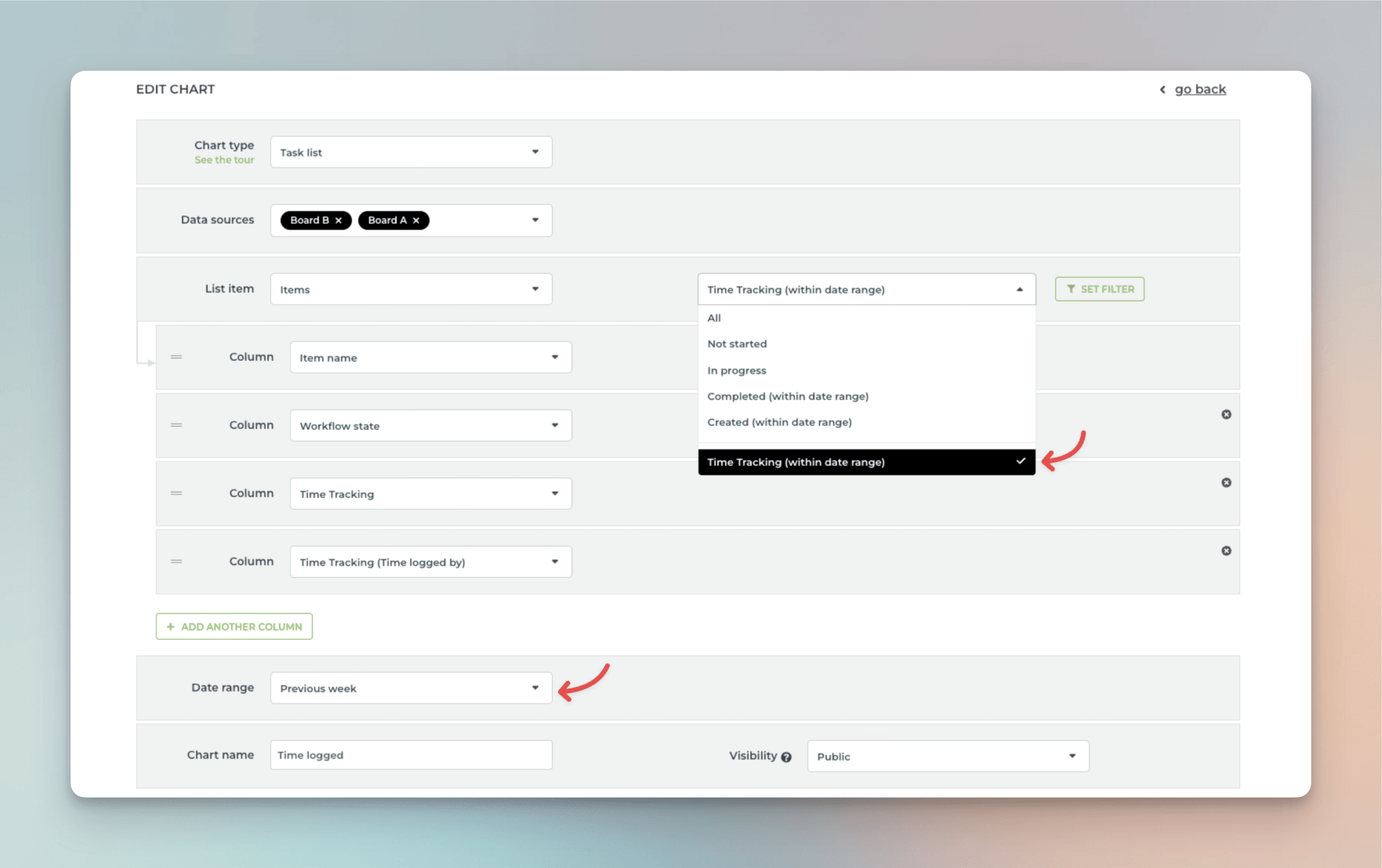
Selecting it reveals a date range menu that allows you to narrow the results to items with time logged within the selected period.
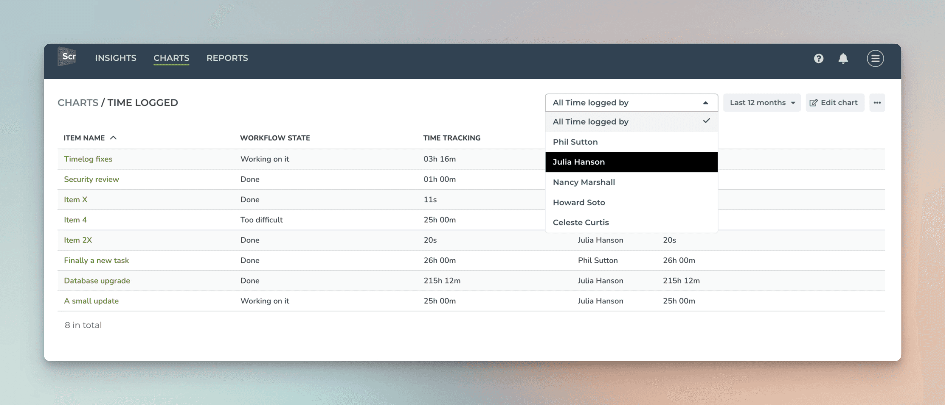
Now the Time tracking and Time tracking (Time logged by) colums show the total time logged to items within the specified date range. You can use the filter feature to further narrow the list to any subset of items.
Learn more: Creating charts based on monday.com time tracking data
Creating charts using Time tracking column
If you have added one or more Time tracking columns to your board, they will be automatically imported and made available for charts. You can create charts based on time tracking data in the same way you create charts based on task data. You have all the same grouping and filtering options available.
To create a chart using time tracking data, start by clicking Add new chart in the Charts tab. Select the data sources for the chart. If any of those data sources contain time tracking columns, they will be shown in the Unit menu:
The Date range refers to when the hours were logged. Here’s the resulting chart:
You can create charts from your top-level items, subitems, or both. You can choose between these options by setting a filter (use the filter Item type). Notice that you must import the subitems as a separate data source to make them available.
To see how many hours have been logged by team member by item within a time period, select Time tracking (within date range) from the menu:
Selecting it reveals a date range menu that allows you to narrow the results to items with time logged within the selected period.
Now the Time tracking and Time tracking (Time logged by) colums show the total time logged to items within the specified date range. You can use the filter feature to further narrow the list to any subset of items.
Learn more: Creating charts based on monday.com time tracking data
Creating charts using Text column
Your Text and Long text columns are automatically imported and mapped to Text. That means they can be used as columns in the Task list.
You can also use text columns grouping and filtering if you map them to Group & Filter in the custom fields mapping.
Creating charts using Text column
Your Text and Long text columns are automatically imported and mapped to Text. That means they can be used as columns in the Task list.
You can also use text columns grouping and filtering if you map them to Group & Filter in the custom fields mapping.