
Create advanced charts with Jira custom fields
Apr 23, 2025
This post shows how to create advanced charts with Screenful using data from any custom fields in Jira. Learn how to make bar charts, number charts, line charts, scatter plot charts, table charts, and more, using data from Jira, including JSM, Work management, and Product Discovery projects.
You can see all available charts on the Tour page. Read on to learn how to create charts using Jira as a data source.
Contents:
Integrating Screenful with Jira
Screenful provides multidimensional analytics of the data in Jira. You can slice & dice data with 15 different chart types, and click through to drill into details.
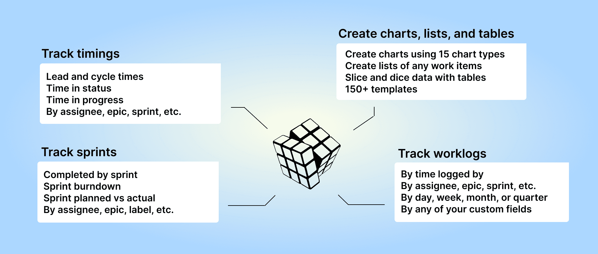
Analytics & Reports by Screenful is available on the Atlassian Marketplace — it’s free for up to 10 users.
For more information, see the guide for setting up Screenful with Jira.
Creating charts using Jira Number fields
Your Jira Number fields can be used as a unit of a chart. For example, if you have assigned estimates for tasks (e.g. hours or story points) using a custom number field, you can select it as a unit for a chart.

Screenful will automatically make numeric fields available in the Unit menu in the chart editor.
What if you have multiple number fields and want to display them all in one chart? Let’s assume you want to compare the values of three different number fields over time. You can do that by adding them into a multibar chart. First, pick one of the custom fields as the unit for the chart. After that, use the Add custom field button to add the other two fields:

Here’s the final chart with three different metrics grouped by week:

Creating charts using Single choice or Multiple choice fields
Your Jira Single choice or Multiple choice fields can be used for grouping and filtering. The available fields are shown in the grouping and filtering menus. When you are creating a chart, you'll find all the grouping options in the Group by menu;

When you want to filter the chart content, you'll find your select menus in the Filter window:

Here's a Stacked bar chart stacked by a single select field Component:

Creating charts using Jira Date fields
Your custom Date fields can be used for selecting issues for a chart. Let's assume you have a custom date field Date completed on your board. You can create a chart that shows how many items have the date within the selected date range by selecting by Date completed as the metric for the chart.

That will work the same way as if you had selected Completed (within date range), except that it will only look at the value in the date field. If the date is within the date range, it is included, regardless of the workflow state of that item.
Here's the resulting chart:

You can also create Task lists and filter them by custom date columns. Here's an example configuration for a Task list:

When you pick a date column from the menu, the resulting task list contains items that have the date within the specified date range:

Creating charts based on work logged (Time tracking)
To create a chart using time tracking data, click Add new chart in the Charts tab. Select the data sources for the chart. To create charts using the time tracking data, select Work logged from the Unit menu:

When a time tracking column is selected as the Unit, the Metric menu contains only one option: Total (all Time Tracking). Here’s an example configuration of a stacked bar chart that shows the total amount of hours logged per week by individual:

The Date range refers to when the hours were logged. Here’s the resulting chart:

You can create charts using time-tracking data from your top-level issues, subtasks, or both. You can choose between these options by setting a filter (use the filter Issue type).
You can create time reports by selecting Task list as the chart type. To see how many hours have been logged by team member by issue within a time period, select Work logged (within date range) from the menu:

Selecting it reveals a date range menu that allows you to narrow the results to items with time logged within the selected period.

Now the Work logged and Work logged (Time logged by) show the total time logged for tasks within the specified date range. You can use the filter feature to narrow the list to any subset of issues.
Learn more: Creating reports using Jira time tracking field
This post provided some examples of how to create charts using data from Jira custom fields. For a complete reference of the supported custom fields, see the Jira custom fields guide.
Let us know if you have questions or feedback by contacting hello@screenful.com. To stay on the loop, read our blog, or follow us on LinkedIn.
