
Create reports using GitHub issue custom fields
May 7, 2026
GitHub recently introduced issue fields to public preview. What it means is you can now add your own custom fields to GitHub issues. There are four types of fields: Single select, Number, Date, and Text. They should not be mixed with GitHub Projects custom fields, which live only inside a project. Issue fields are global for issues, not limited to a specific project. You can use issue fields within projects or without projects.
We have supported project fields for a while already. We've now added support for the new issue fields as well. Read on to learn how to use Issue fields in your reports.
Contents:
How to make issue fields available to Screenful?
When you import a data source to Screenful, you have two options: you can either import GitHub Repositories or GitHub Projects:
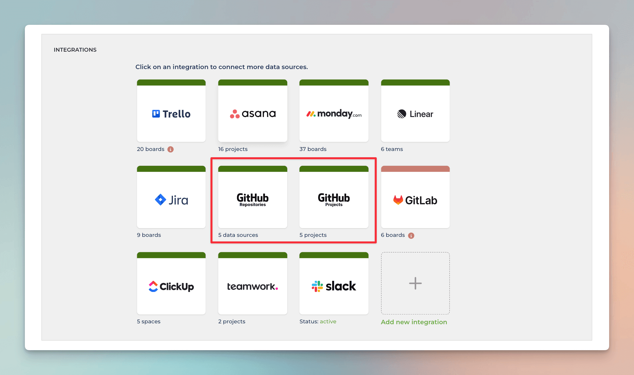
When you import GitHub Repository, issue custom fields are imported along with the issues and the pull requests. When you import a GitHub Project, project custom fields are imported along with the issues and the pull requests.
If you import a GitHub Project, and want both the issue custom fields and the project custom fields to be imported, you first need to add the issue custom fields to the project. Go to your project and select the Table view. Click the + icon at the right edge to add a column:
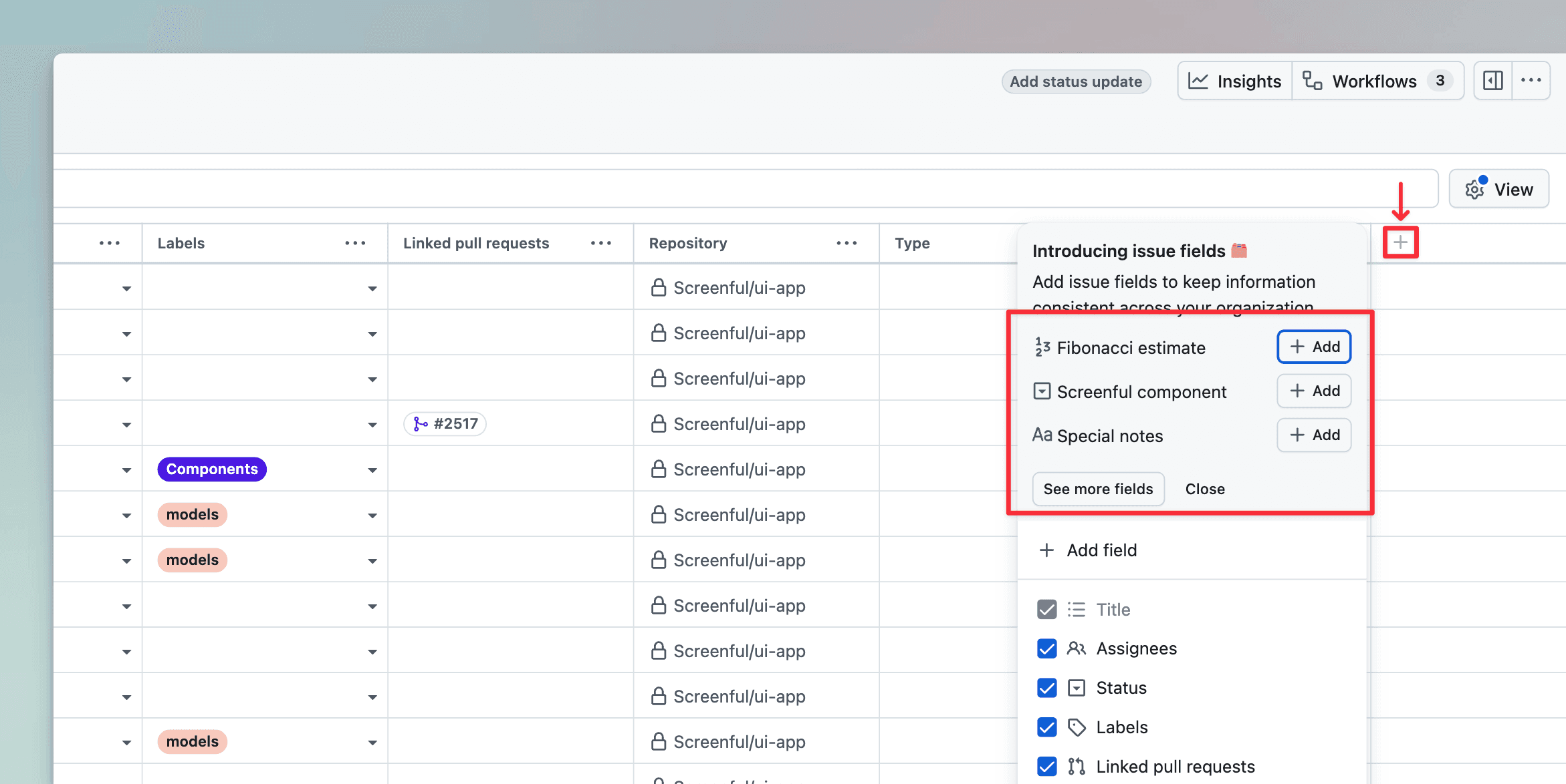
Your issue custom fields are shown on top of the modal, and you can add them to your project. After that, they will be imported to Screenful, and you can use them in your charts and reports.
Creating charts using Number fields
Your GitHub Issue Number fields can be used as a unit of a chart. For example, if you have assigned estimates for tasks (e.g. hours or story points) using a custom numeric field, you can select it as a unit for a chart.
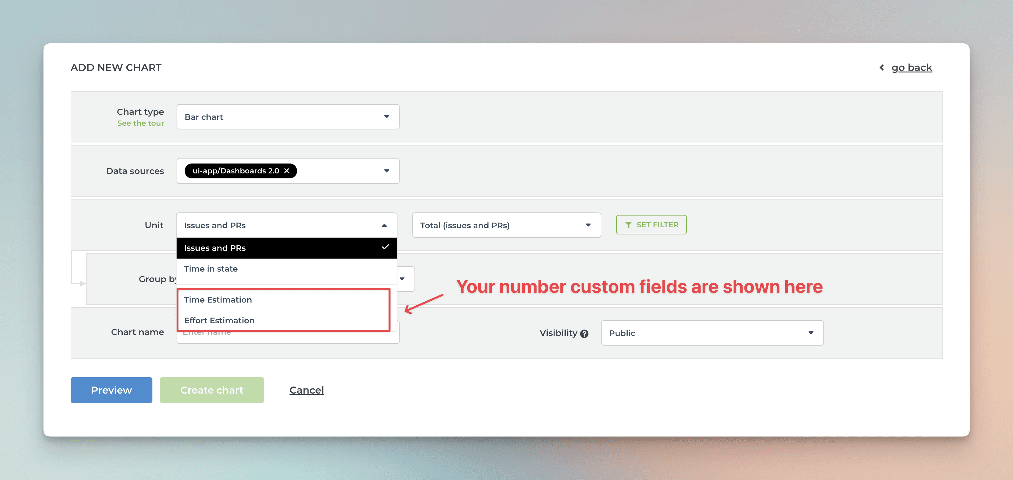
Screenful will automatically make all numeric fields available in the Unit menu in the chart editor.
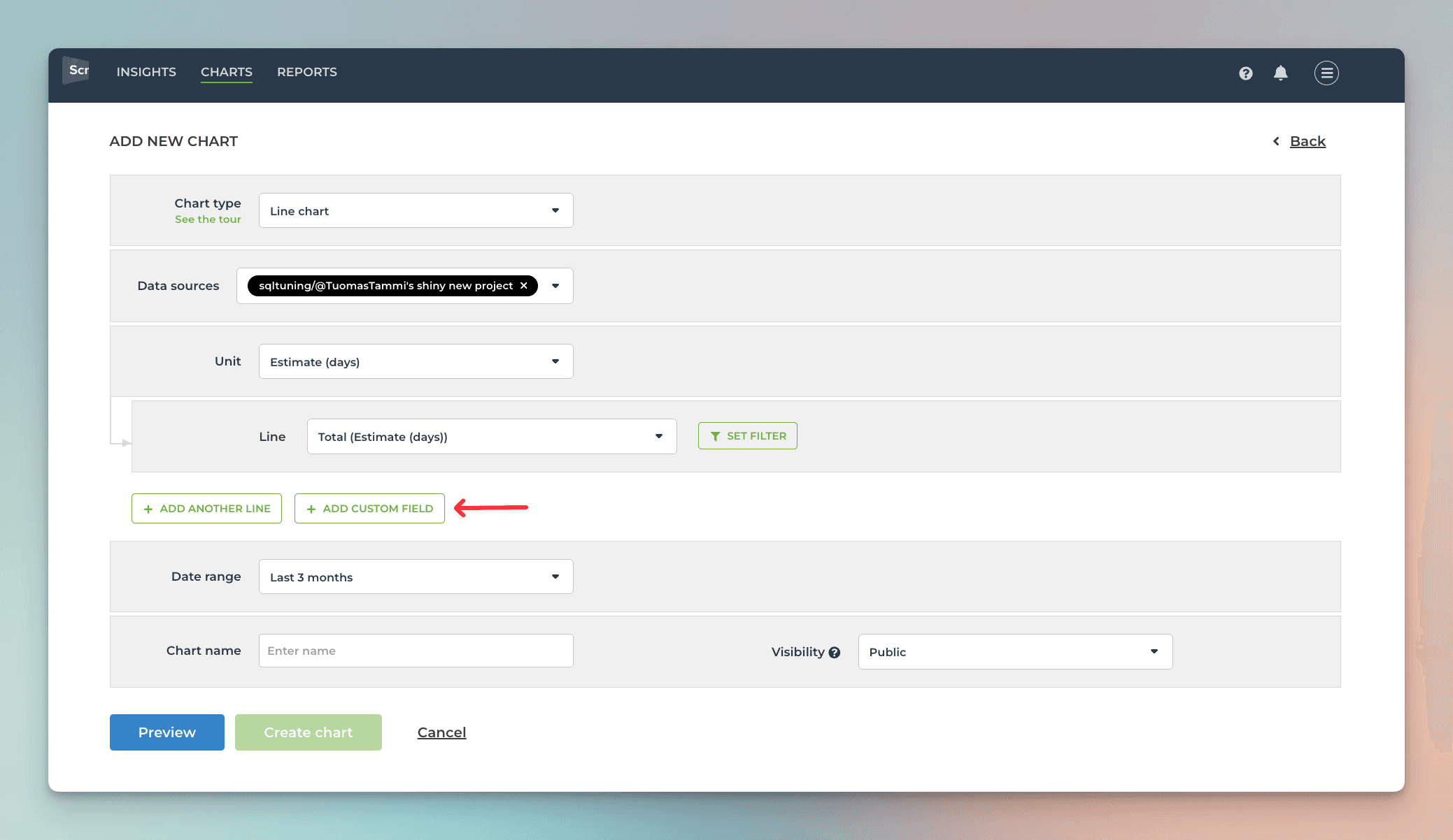
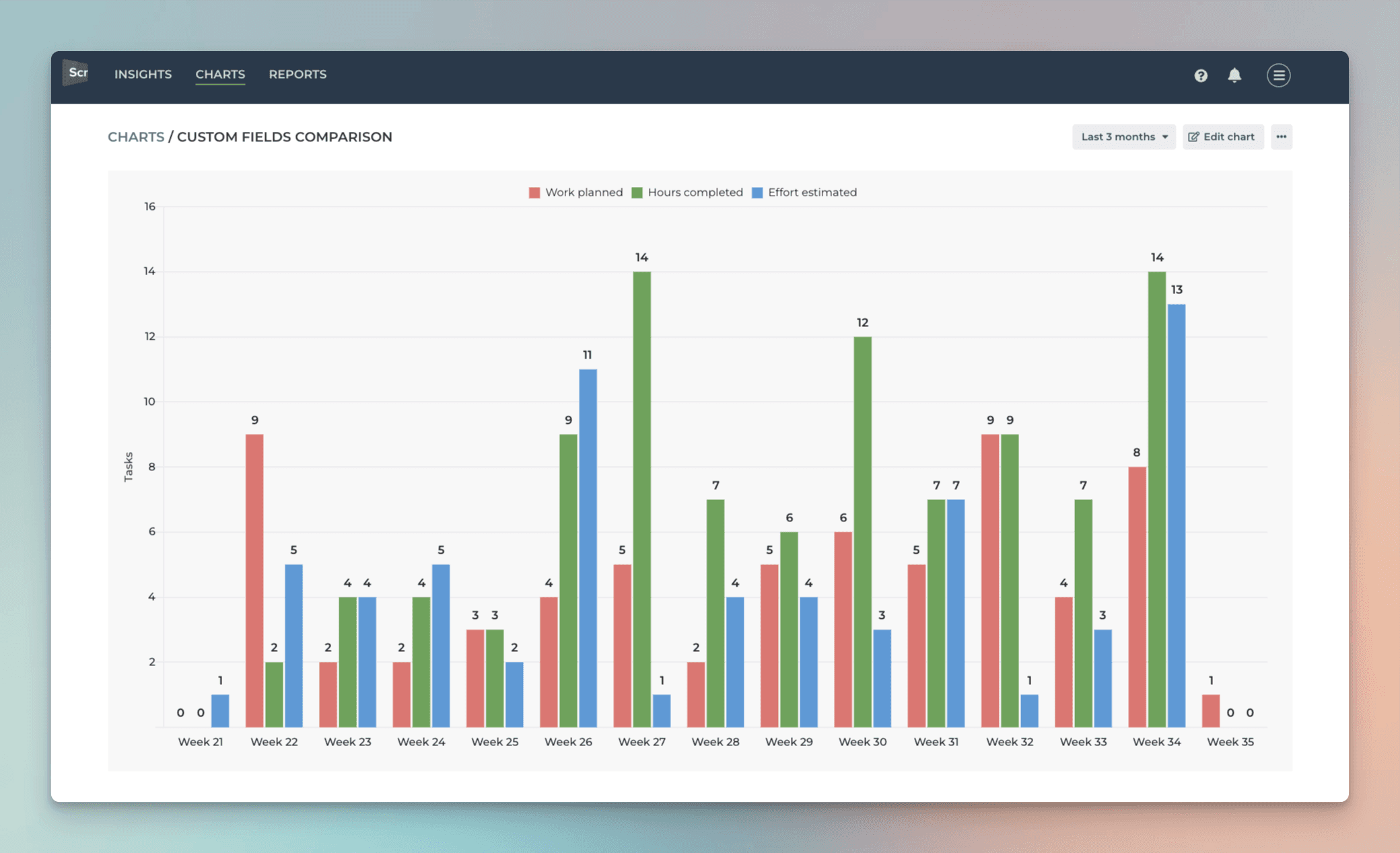
What if you have multiple number fields and want to have all of them in one chart? Let’s assume you want to compare the values of three different number fields over time. You can do that by adding them one by one into a multibar chart. First, pick one of the custom fields as the unit for the chart. After that, use the Add custom field button to add the other two fields:
Here’s the final chart with three different metrics grouped by week:
If you have a single select field that you'd like to use as a unit, you can change the default field mapping.
Creating charts using single select fields
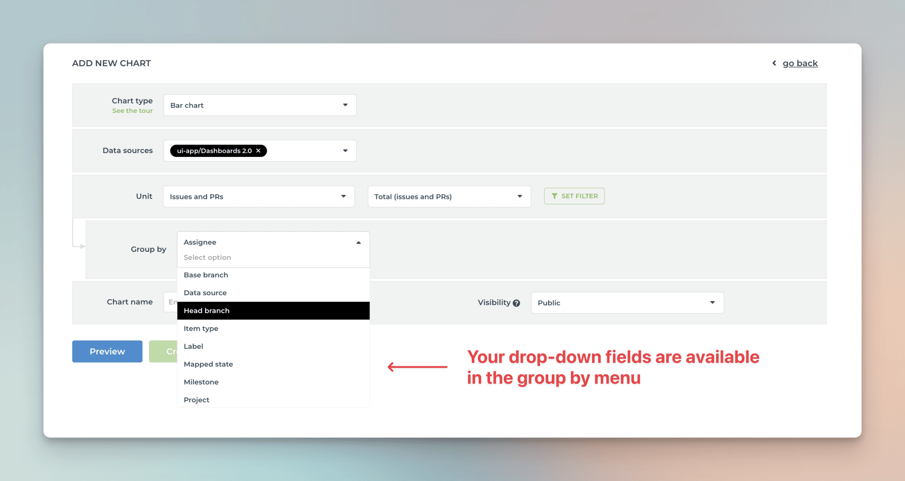
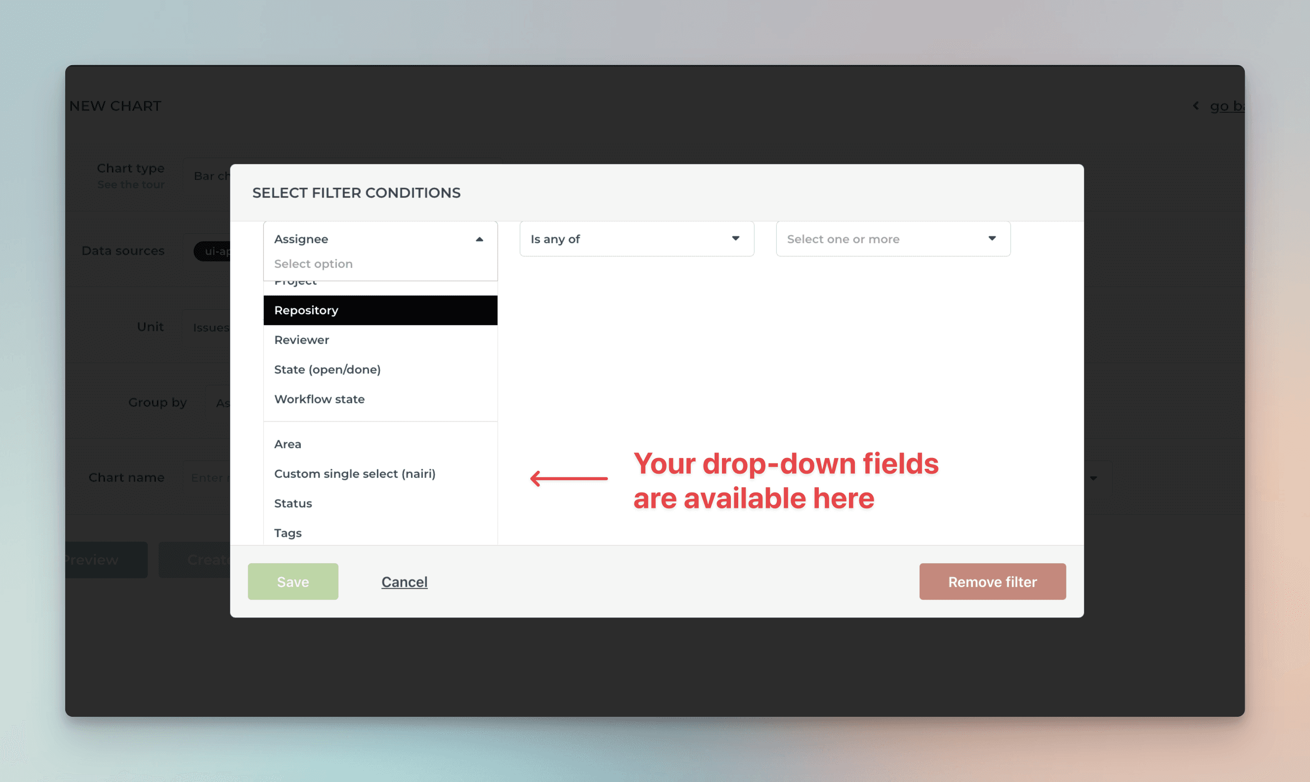
By default, your GitHub issues Single select fields are available for grouping and filtering. All drop-down columns are automatically available in the grouping and filtering menus.
When you are creating a chart that has a grouping option, you'll find all your select menus in the Group by menu;
When you want to filter the chart content, you'll find your select menus in the Filter window:
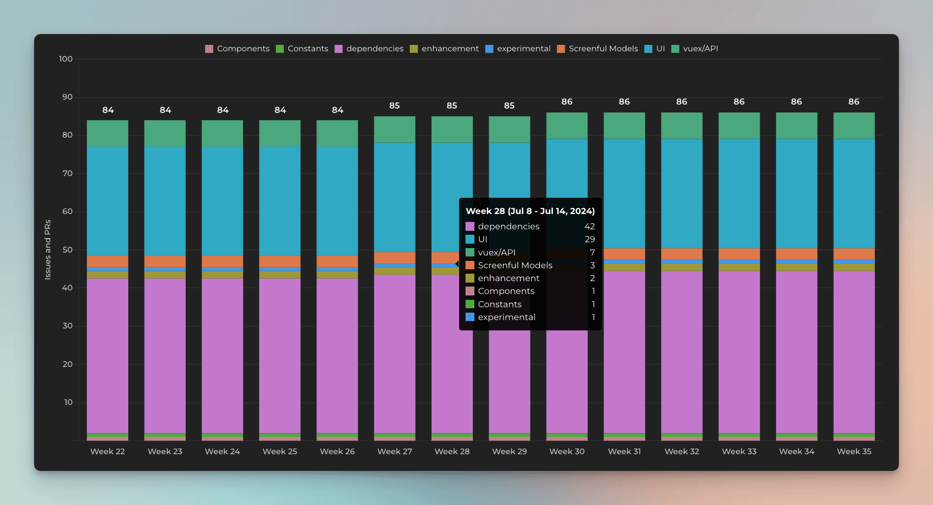
Here's a Stacked bar chart stacked by a single select field Component:
By default, your Single select fields are available for grouping and filtering. If you want to group & filter by Text fields, you can adjust the default field mapping.
Creating charts using Date fields
All your GitHub issues Date fields are automatically imported and made available for charts. Let's assume you have a custom date field Date completed on your board. You can create a chart that shows how many items have the date in the past by selecting by Date completed as the metric for the chart.
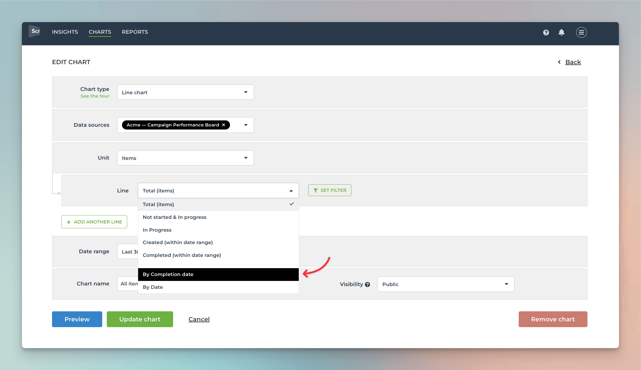
That will work the same way as if you had selected Completed (within date range), except that it will only look at the value in the date field. If the date is in the past, it is considered completed, regardless of the workflow state of that item.
Here's the resulting chart:
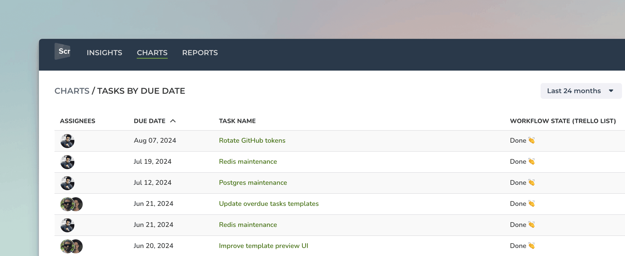
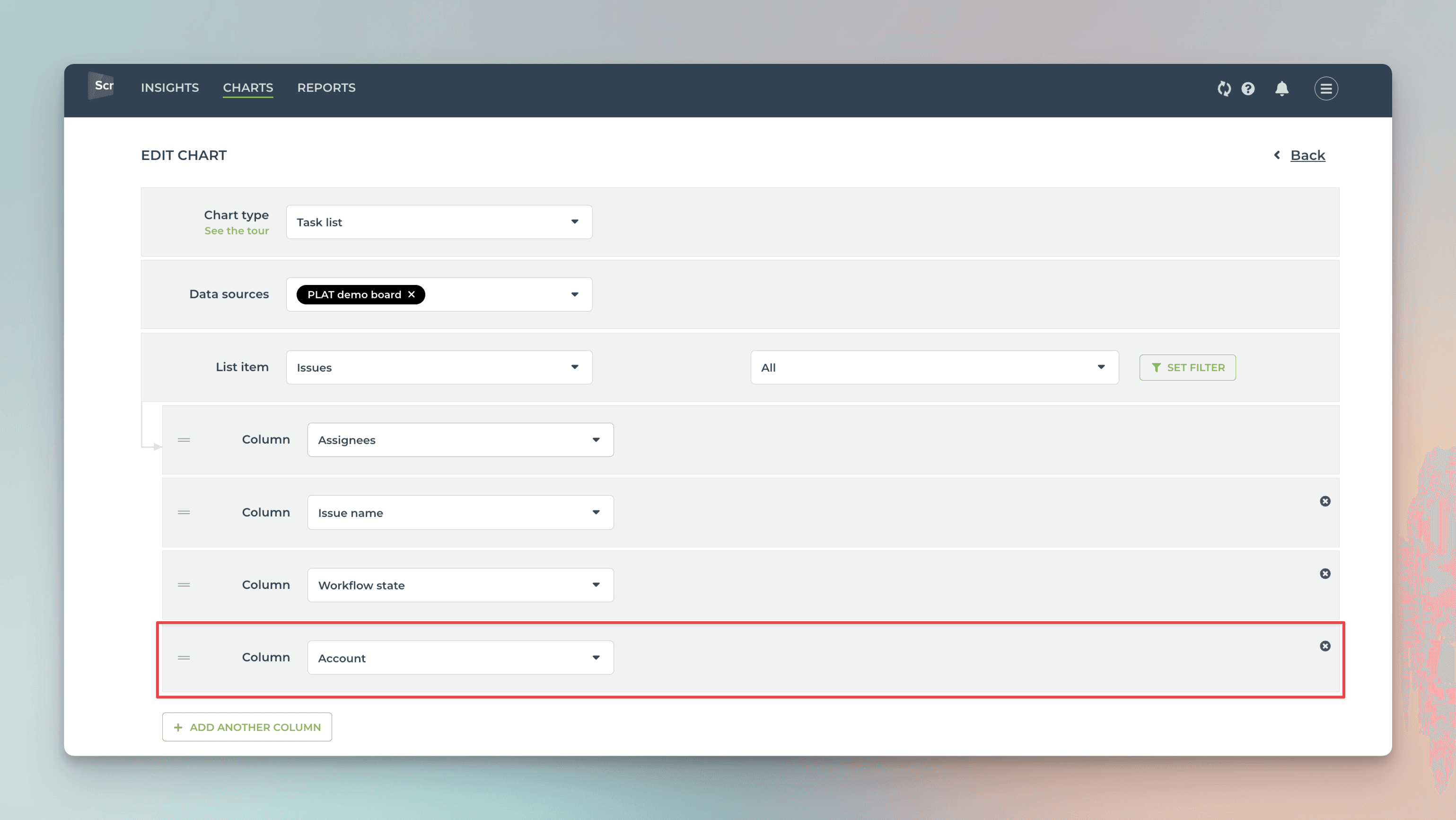
You can also create Task lists and filter them by custom date columns. Here's an example configuration for a Task list:
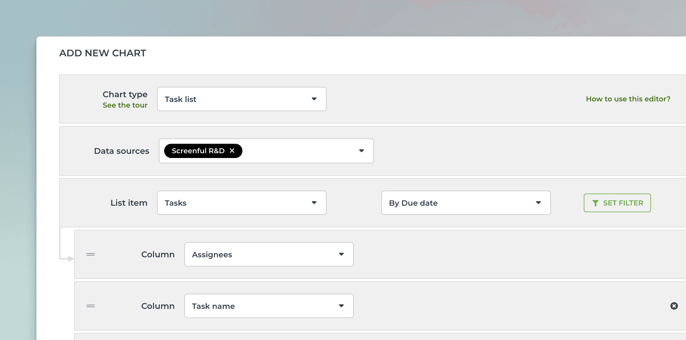
When you pick By Due date from the menu, the resulting task list contains items that have the date within the selected date range:
You can track any number field by any date field. You can pick a number field from the Unit menu:
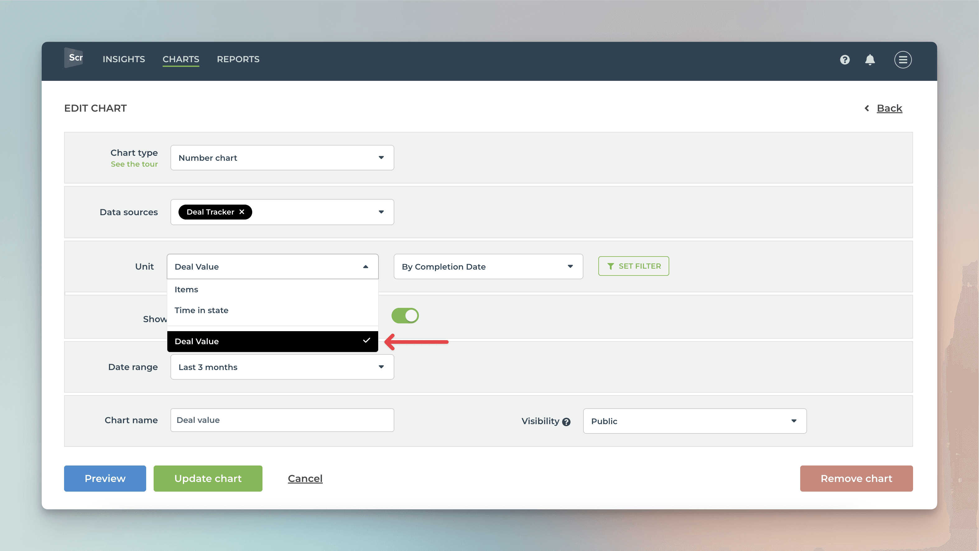
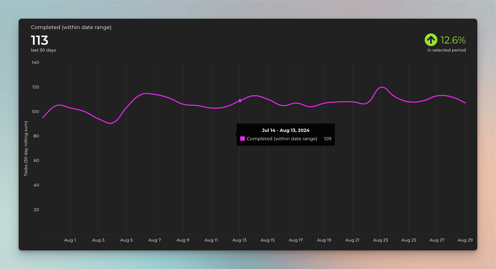
In this example, I have selected Deal value as the unit and by Completion date as the metric for the chart. Here's the resulting chart:
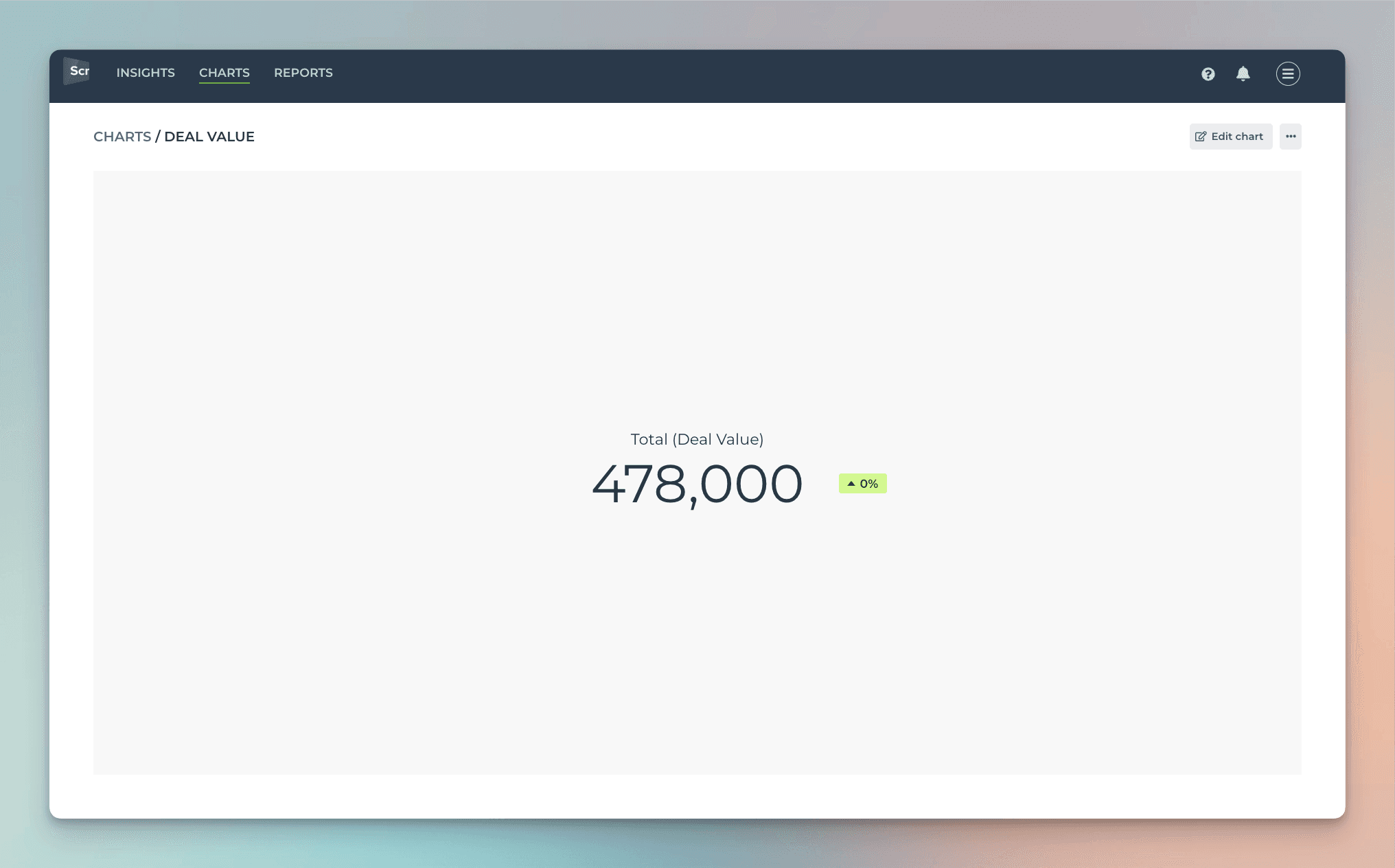
The chart shows the deal value generated during the selected period based on the Completion date column.
Creating charts using Text fields
All your GitHub issues Text fields are automatically imported and available for charts. By default, they are mapped in Screenful to Text type, which means they can be used in filtering and as a column in a Task list.
You can filter charts by any of your Text fields. To filter by text field content, use the Contains option to enter keywords that match the content of the text field.
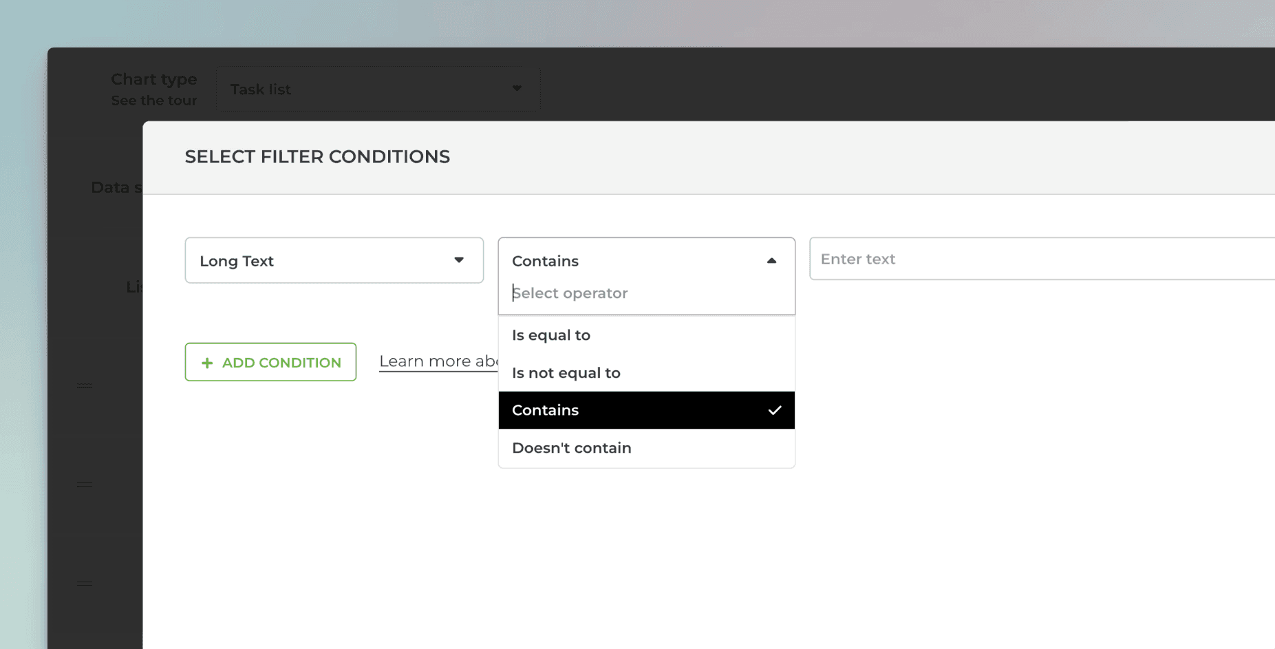
You can enter multiple keywords by using the pipe "|" character as a separator:
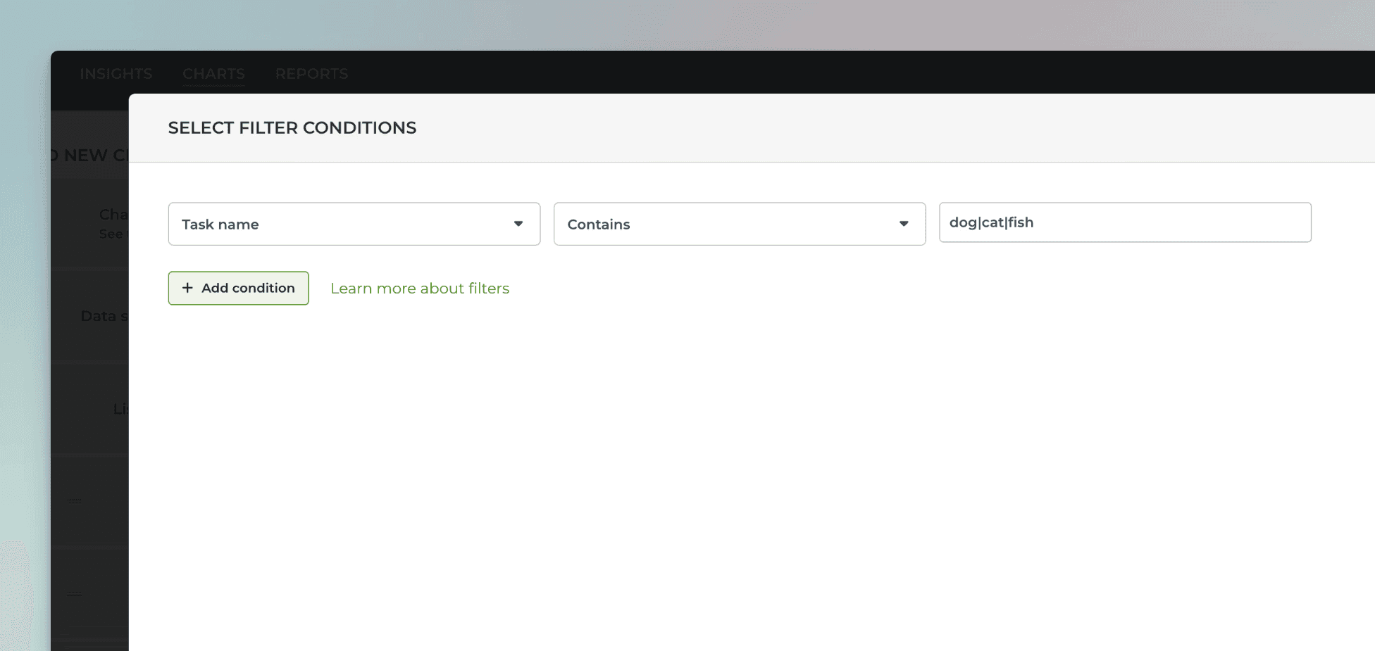
For example, searching "dog|cat|fish" would match all items with the word "dog", "cat", or "fish" in the task name.
If you want to use your GitHub issue custom text fields for segmenting the charts (group by), you can change the default mapping at Data Mapping->Custom Fields:
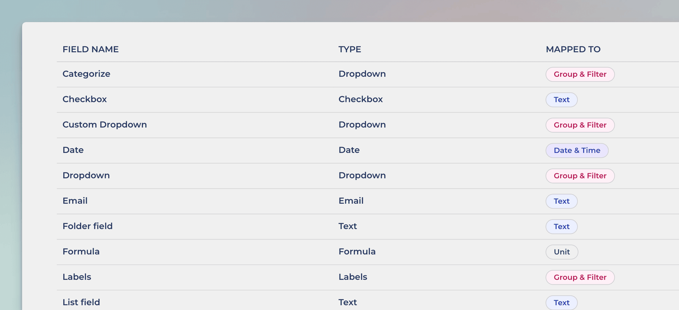
In this example, the Text field Email is mapped to Text. Clicking the row opens it for editing:
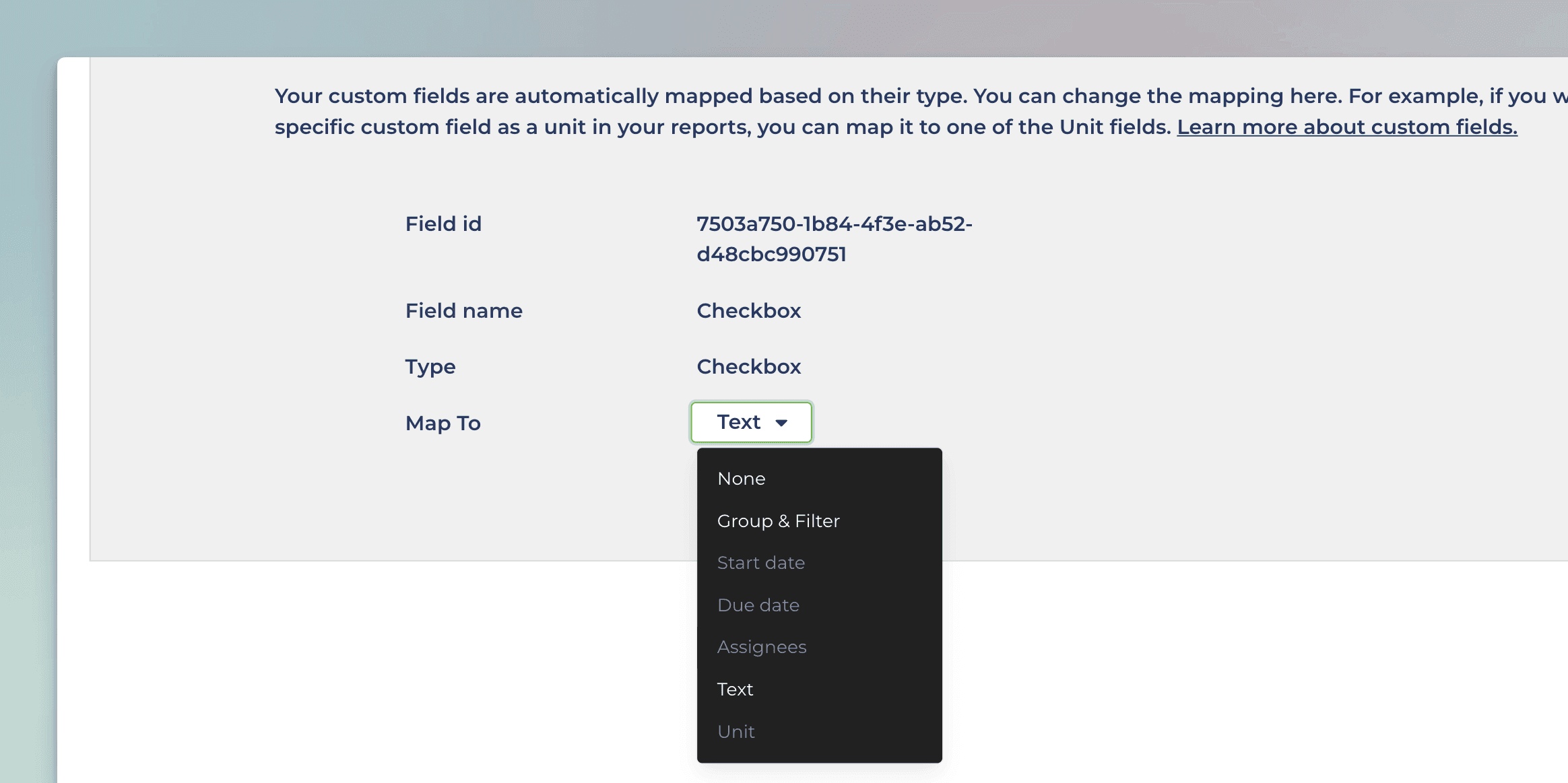
Selecting Group & Filter from the menu enables using the field in group by menu in addition to the filter menu.
Let us know if you have questions or feedback by contacting hello@screenful.com. To stay on the loop, read our blog, or follow us on LinkedIn.
