
Tracking planned work for the future in GitHub Projects
Dec 23, 2025
The Planned work chart shows how much work is planned for the future. It takes all the issues with a set due date and shows a summary per day/week/month/quarter of the total planned work. If you have set start dates, the chart takes those into account too.
Contents:
Tracking workloads
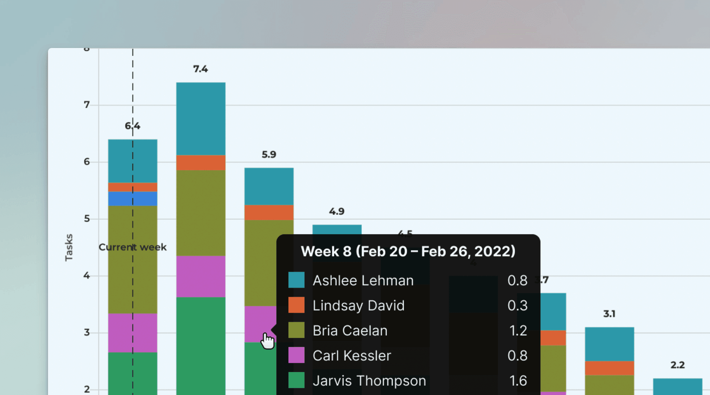
The Planned work chart shows how much work is assigned to each team member for the coming days, weeks, and months. It helps you quickly identify who can take on more work and who is overloaded with too much work.
Here's an exmple chart:
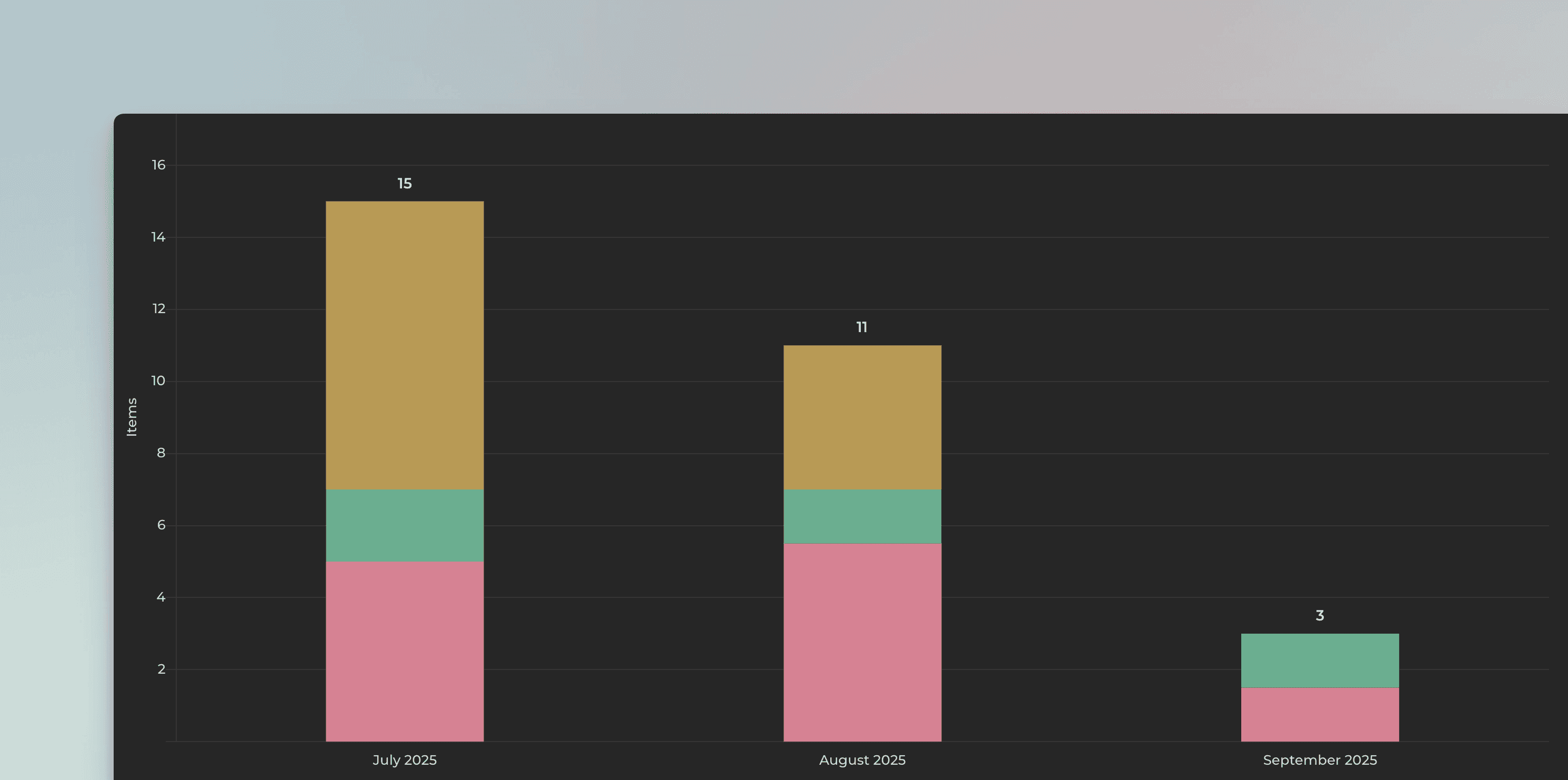
In this example, the chart is grouped by Month and the bar segment is Assignee. The chart shows how much work is allocated per month for each assignee. The leftmost bar is the current month. The bars to the right are the future months.
You can click the bars to see the GitHub issues behind the numbers.
Allocate all work to the due date or evenly between start and end
There are two options for allocating the work. Either it is fully allocated to the close date, or it is allocated evenly between the start and close date. You can choose between these in the chart settings:
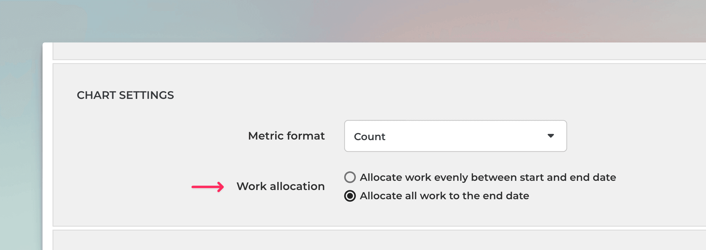
If you have selected Allocate all work to the end date, all work will be contributed to the single date, the close date. With this selection, you don't need start dates at all.
If you select Allocate work evenly between start and end date, work is contributed evenly between the start and the end date.
For example, if you have an item with an estimated effort of 20 story points, and there are 10 days between the start date and the due date, two story points will be allocated for each day. If the start date is not set, the work is allocated from the current date until the due date.
Use any of your number custom field as a unit
You can use any of your number custom fields as the unit. By default, the chart uses the issue count as the unit, but you can change it to any of your custom fields from the unit menu.
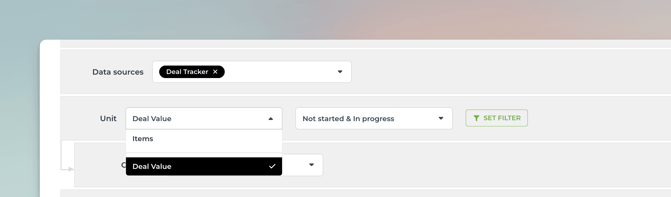
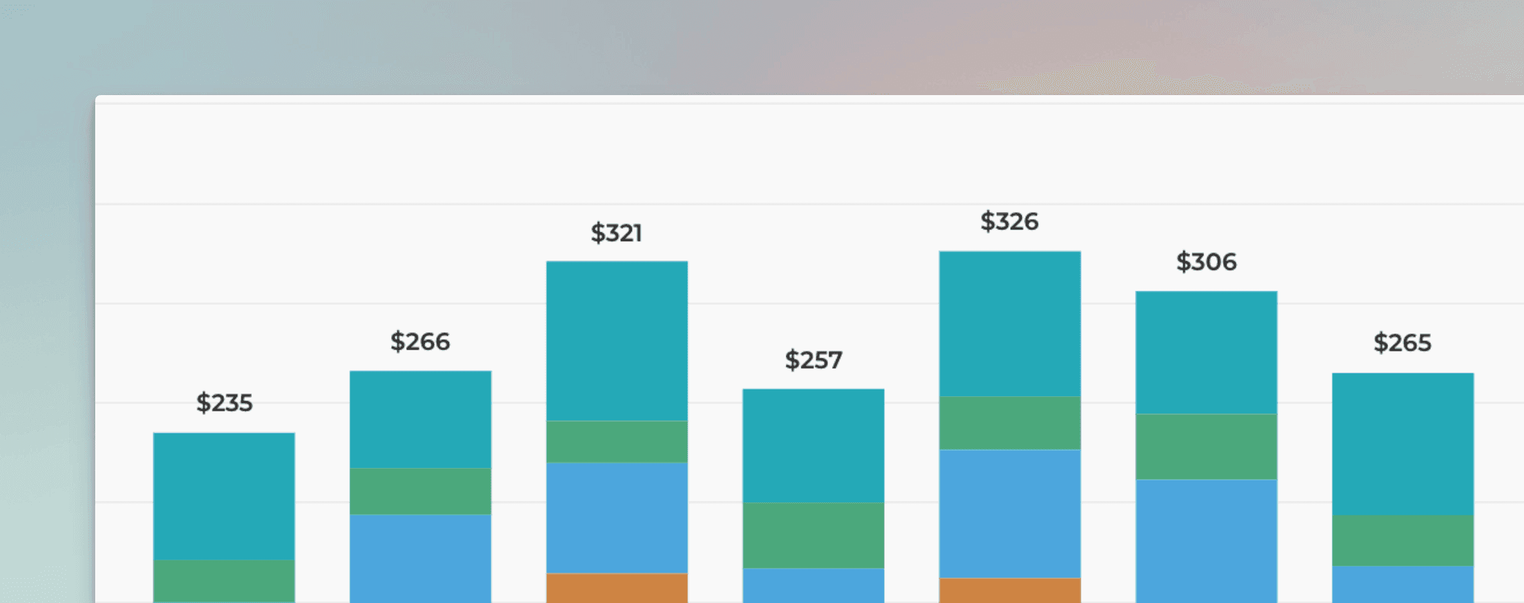
In this example, Deal Value is selected as the unit. In the chart settings, you can specify the currency (e.g. Eur or USD):

Once you save the settings, the chart will display the numbers in the selected currency:
Map your custom Date fields as the Start and End date
You can track planned work based on your custom Date fields by mapping the field to either Start date or Due date in the custom field mapping. To access the custom field mapping, select Data Mapping from the main menu and navigate to the Custom Fields tab.
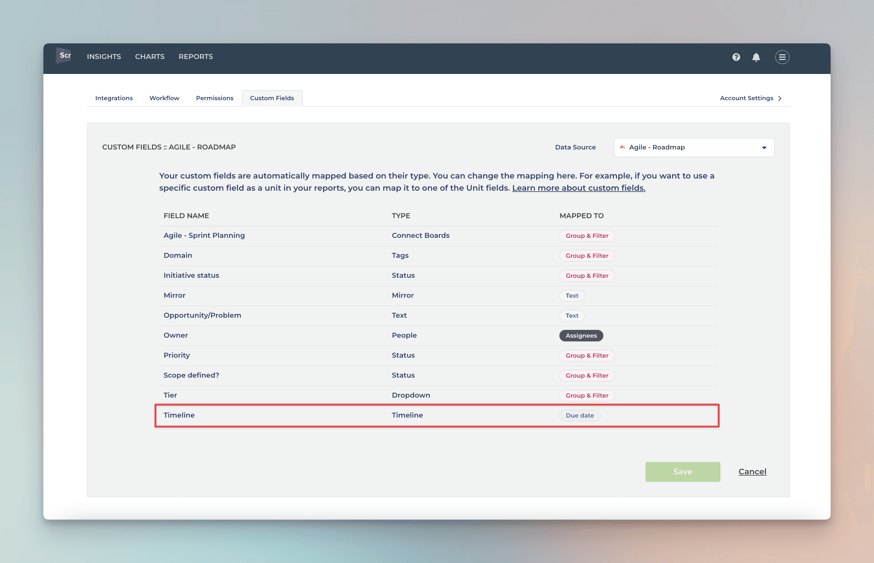
The rightmost column shows the mapping of the column. You can adjust the mapping by clicking the item from the list:
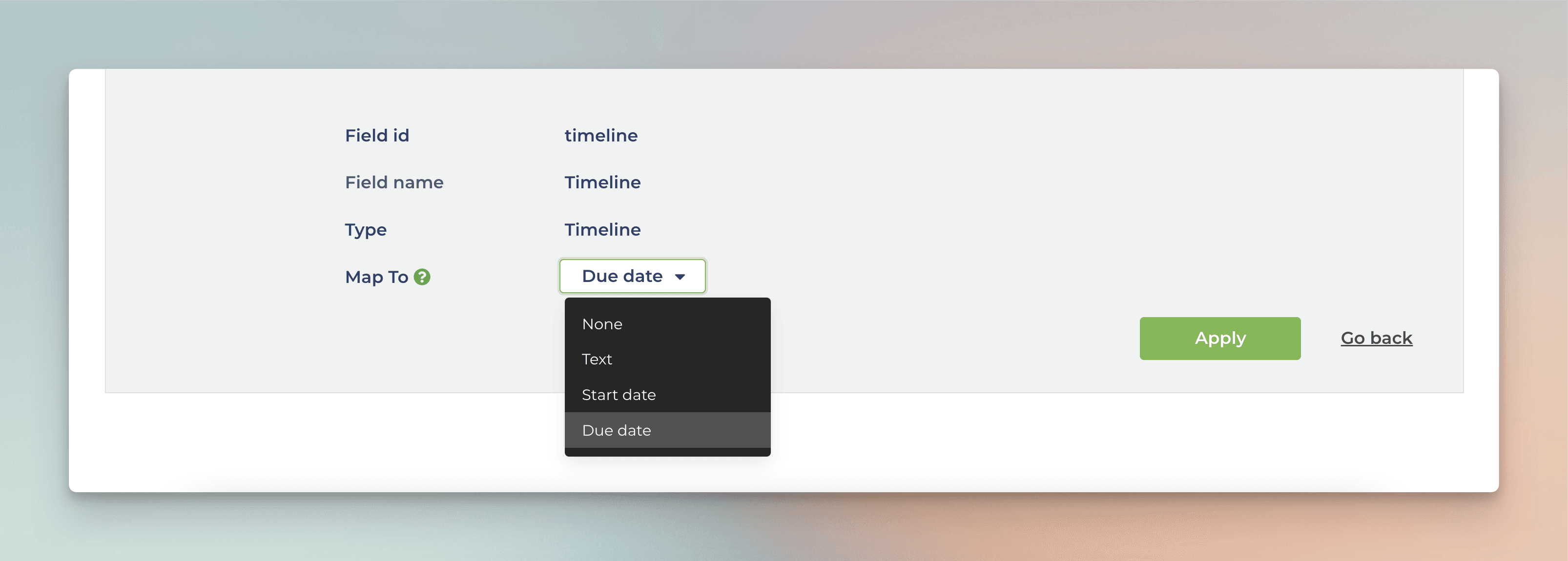
You can map any of your Date fields to either Start date or Due date. Once mapped, the chart will use your custom dates as the timeline.
Creating the Planned Work chart
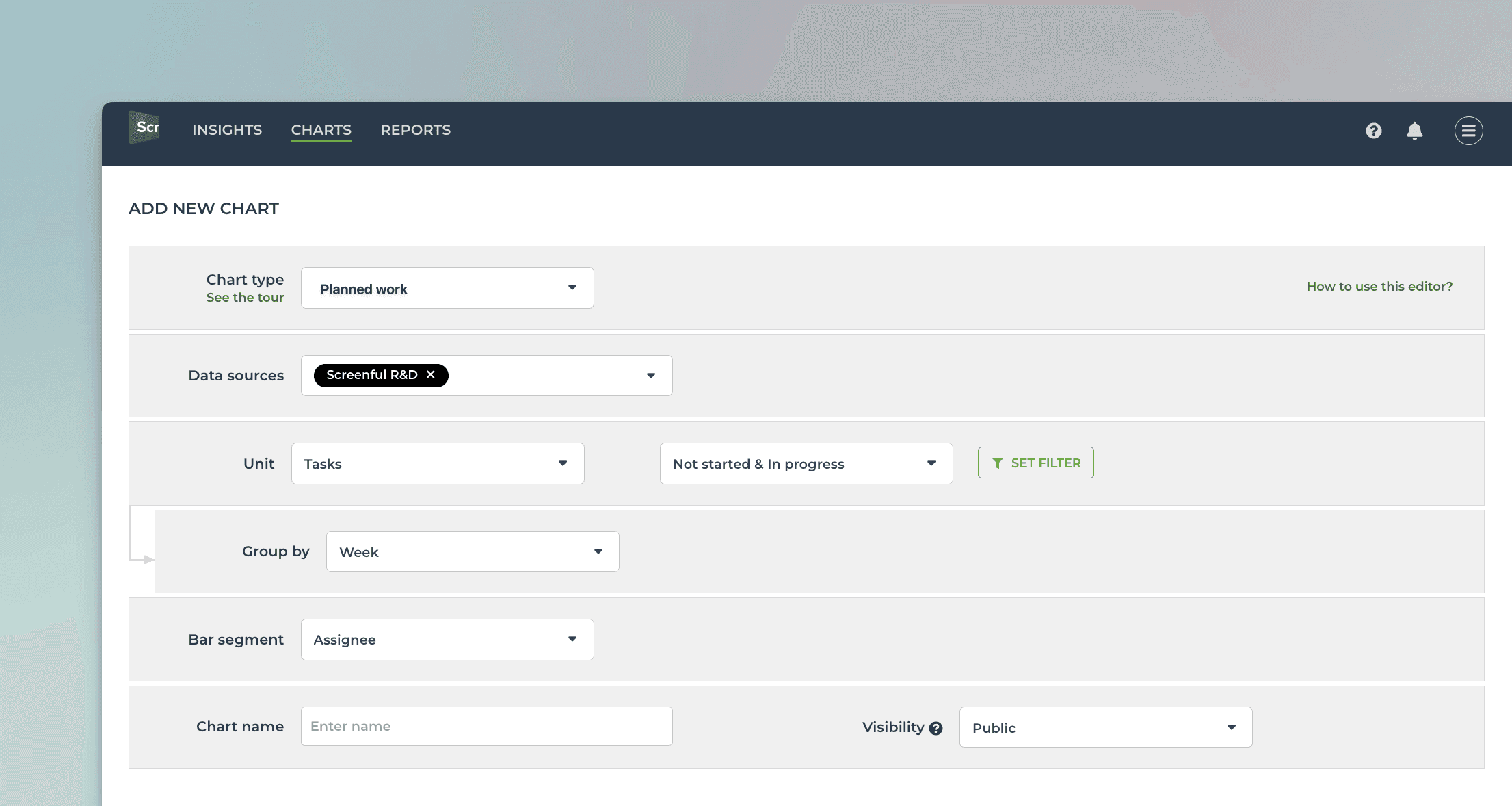
To create a Planned Work chart, go to the Charts tab and click Add new chart.
A modal is opened with a set of chart templates. Select New blank chart to open the chart editor. Select Planned work as the chart type. In this example, we’ve selected grouping to be by Week, and bar segment to be Assignee.
That produces the chart seen at the beginning of this guide:
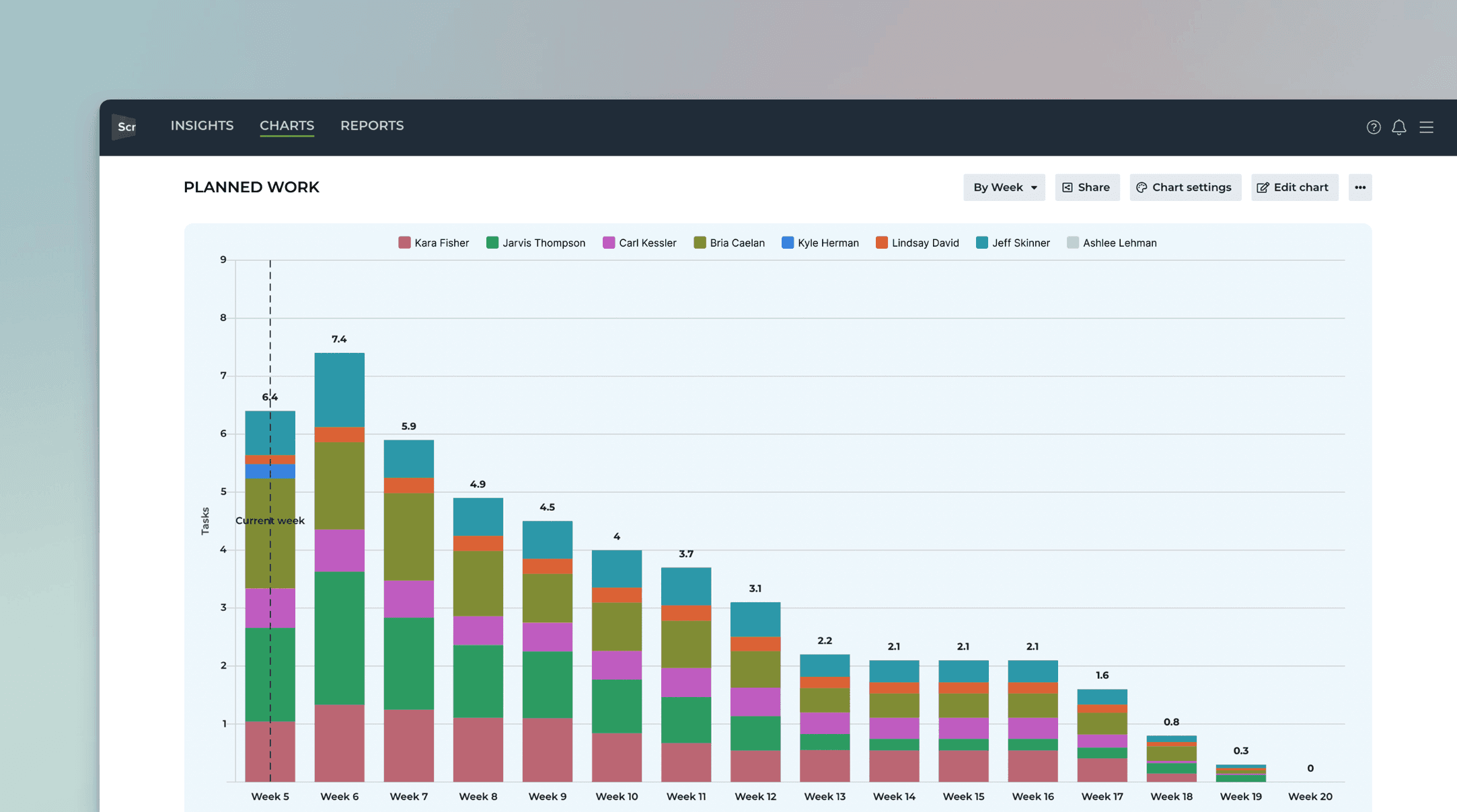
You can mouse-hover the bars to see the work allocated for each individual for each week:
Bars are clickable so you can see the issues behind the numbers.
Once you've created the chart, you can place it in a report and schedule it to be sent via email or Slack.
Let us know if you have questions or feedback by contacting hello@screenful.com. To stay on the loop, read our blog, or follow us on LinkedIn.
