If you have added one or more Time tracking columns to your board, they will be automatically imported and made available for charts. You can create charts based on time tracking data in the same way you create charts based on task data. You have all the same grouping and filtering options available.
Creating a chart with monday.com time tracking data
To create a chart using time tracking data, start by clicking Add new chart in the Charts tab. Select chart type, e.g. Stacked bar chart, and one or more data sources. If any of those data sources contain time tracking columns, they will be shown in the Unit menu:
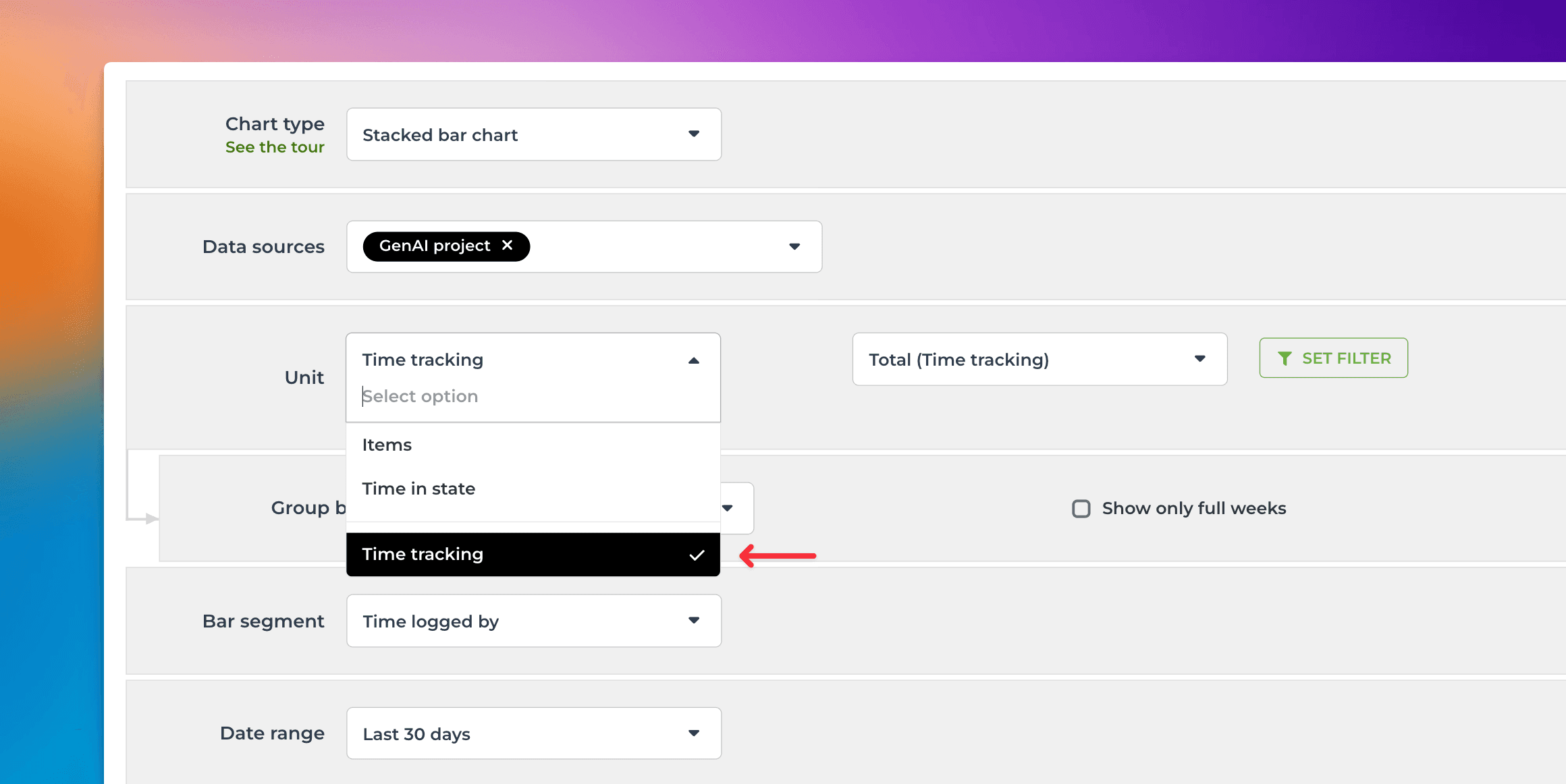
When a time tracking column is selected as the Unit, the Metric menu contains only one option: Total (all Time Tracking). Here’s an example configuration of a stacked bar chart that shows the total amount of hours logged per week by individual:
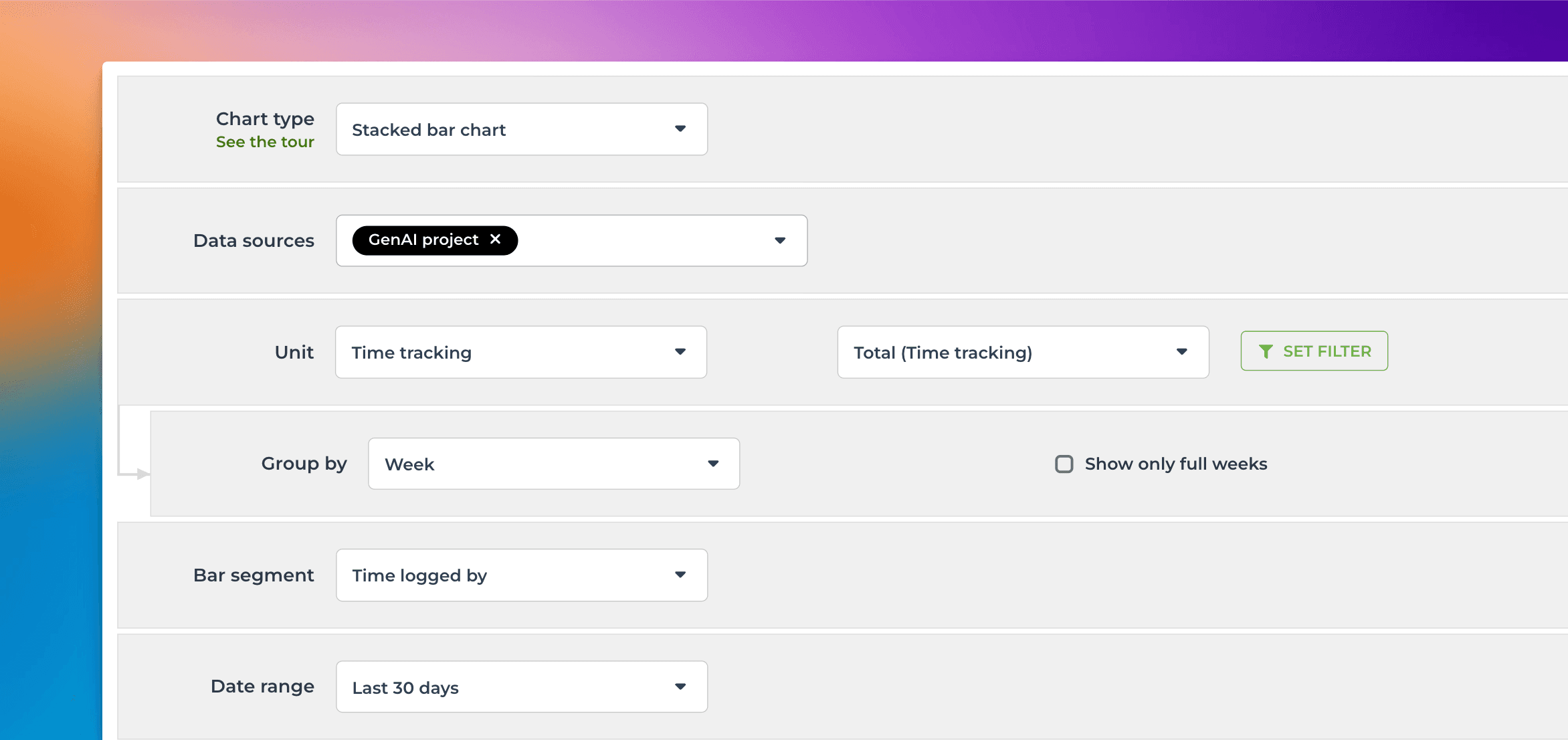
The Date range refers to when the hours were logged. Here’s the resulting chart:
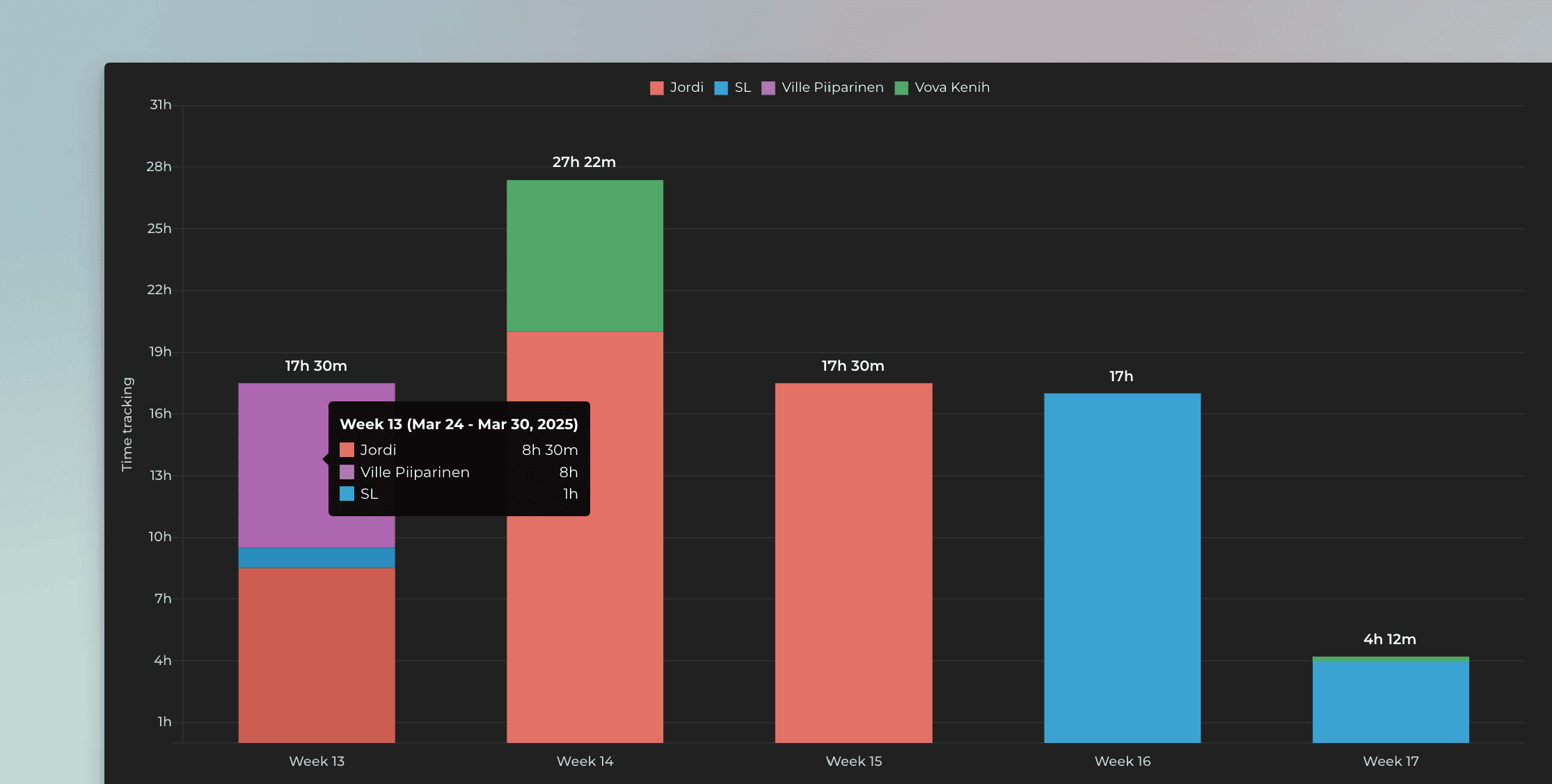
Charts are clickable. When you click a bar, you'll see the individual time entries for each item:
You can create charts from your top-level items, subitems, or both. You can choose between these options by setting a filter (use the filter Item type). Notice that you must import the subitems as a separate data source to make them available.
Grouping and filtering by time logged by
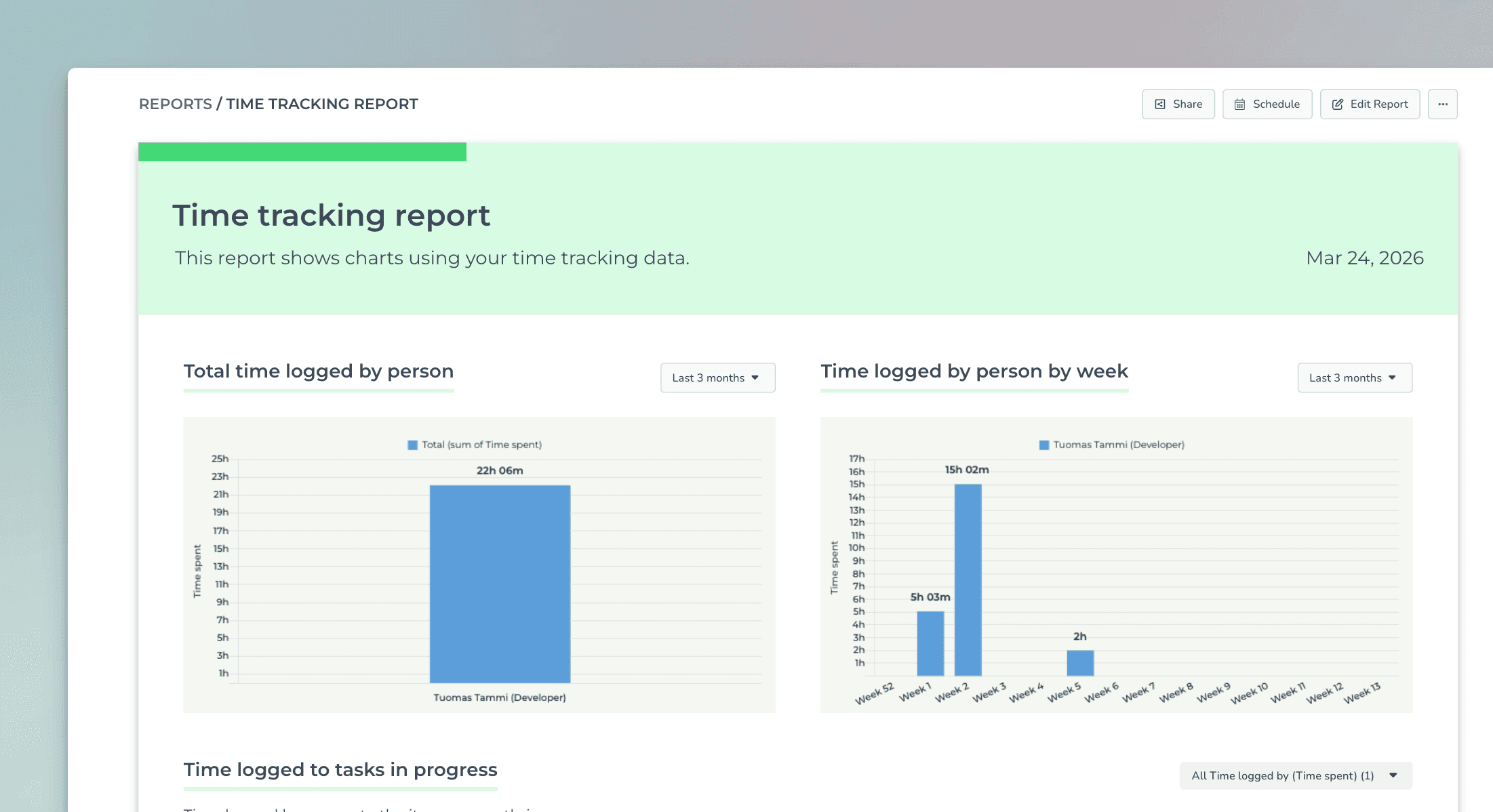
When a time tracking column is selected as a unit, there’s special metric called Time logged by, which allows grouping and filtering based on who logged the hours. Here’s an example chart configuration showing the total amount of hours logged per individual:

And here’s the resulting chart:

You can also filter the chart based on this property. In the filter window, you can find the time logged by option.

When you select individuals, the chart is filtered accordingly.
Time logged by individual by item
You can track time logged by an individual in a Task list by adding Time logged by as a column:

That allows you to see how much time each team member logged for each item:

The numbers are summed so that you can see each team member's total time logged so far.
Time logged by individual by item within a date range
To see how many hours have been logged by team member by item within a time period, select Time tracking (within date range) from the menu:
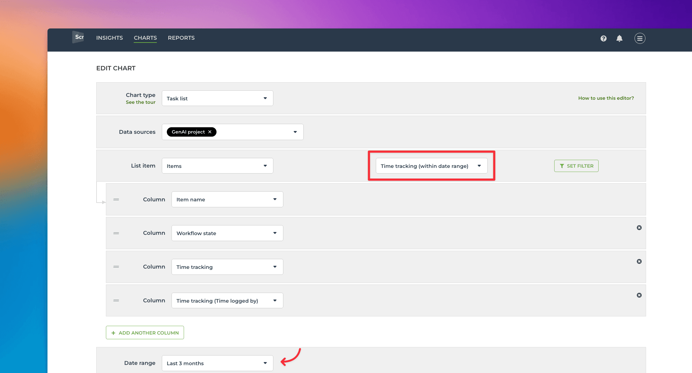
Selecting it reveals a date range menu that allows you to narrow the results to items with time logged within the selected period.
Now the Time spent and Time logged by (Time spent) show the total time logged for tasks within the specified date range. You can use the filter feature to narrow the list to any subset of tasks.
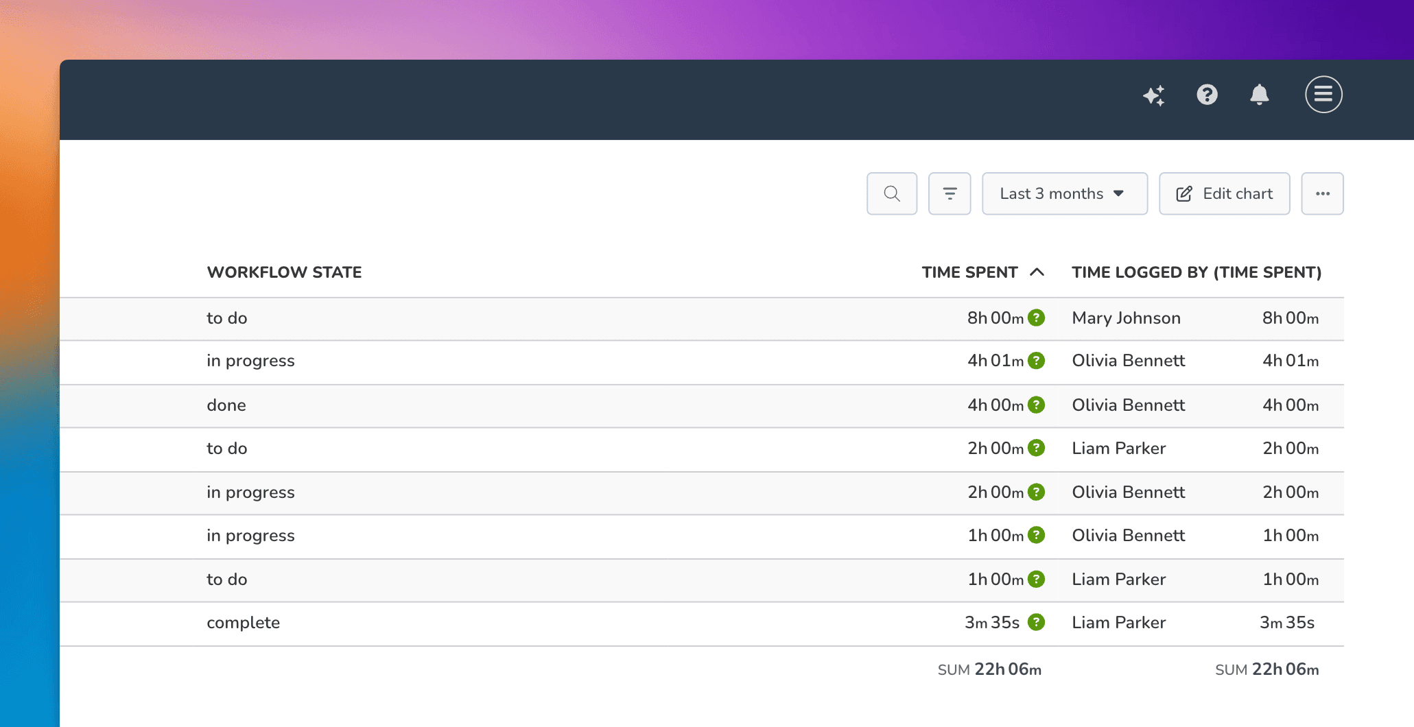
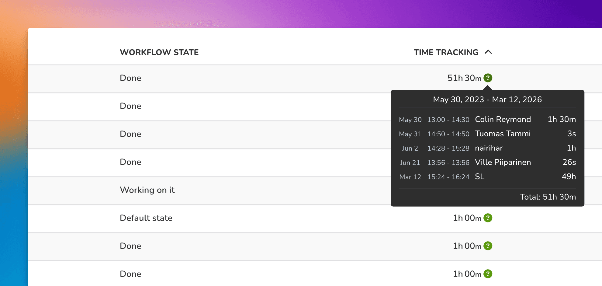
Hovering the mouse over the question mark reveals the individual time entries:
Setting a quick filter for selecting an individual
In the chart settings, you can configure a quick filter that will be shown at the top of the chart. If you set a quick filter for Time logged by (Time tracking), you can easily filter the report to see each individual's timesheet.
In the chart settings, use the toggle to enable the quick filter:

Clicking the toggle reveals the filter options. These are the same options as when setting a filter in the chart editor. Select Time logged by (Time tracking) from the list:

Once a quick filter is enabled, you can filter the content by any individual by picking a name from the menu:

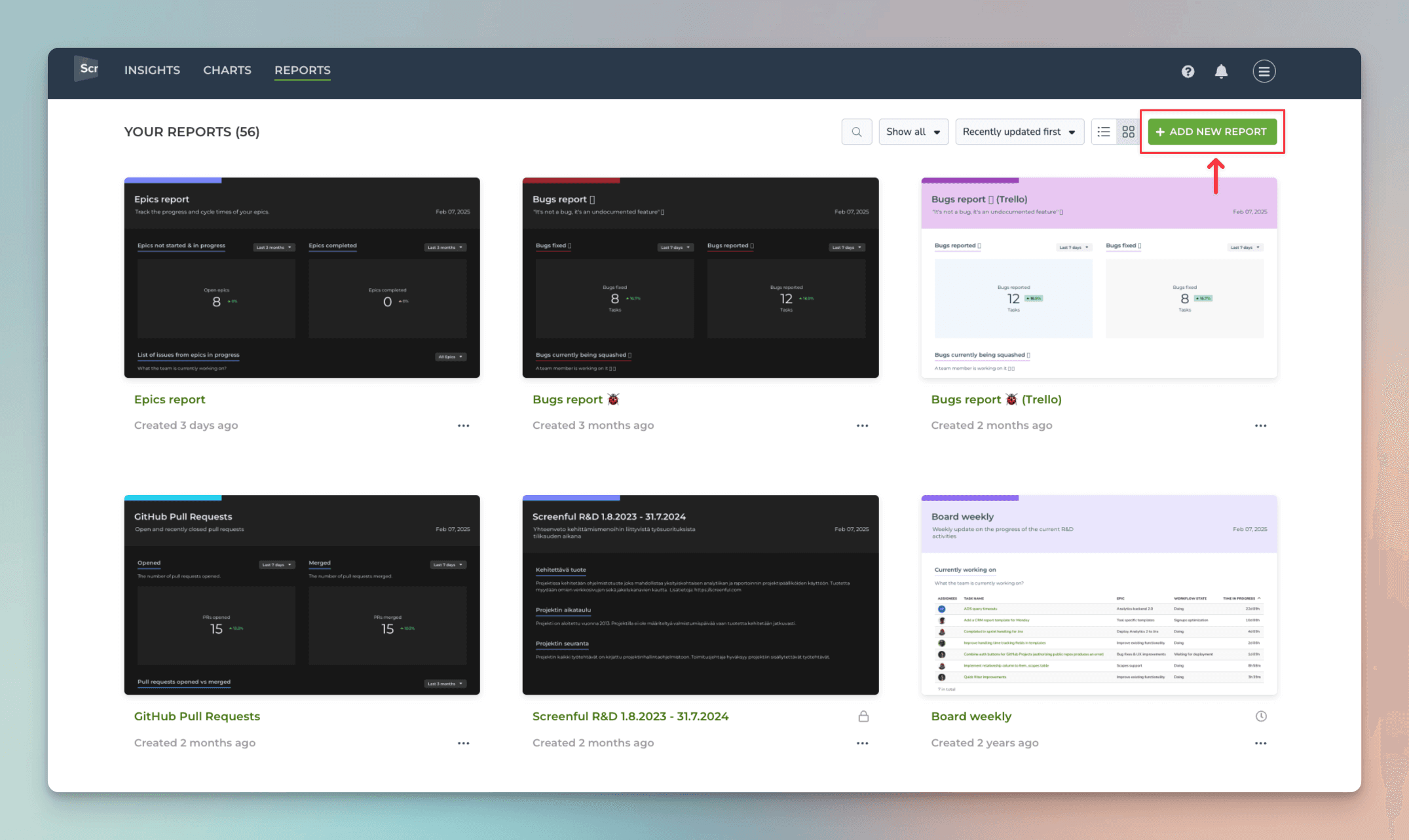
Create time-tracking report from template
You can create a time-tracking report by using a report template. Go to the Reports tab and click Add new report:
A modal opens, showing the available templates. Select Time tracking for monday.com:
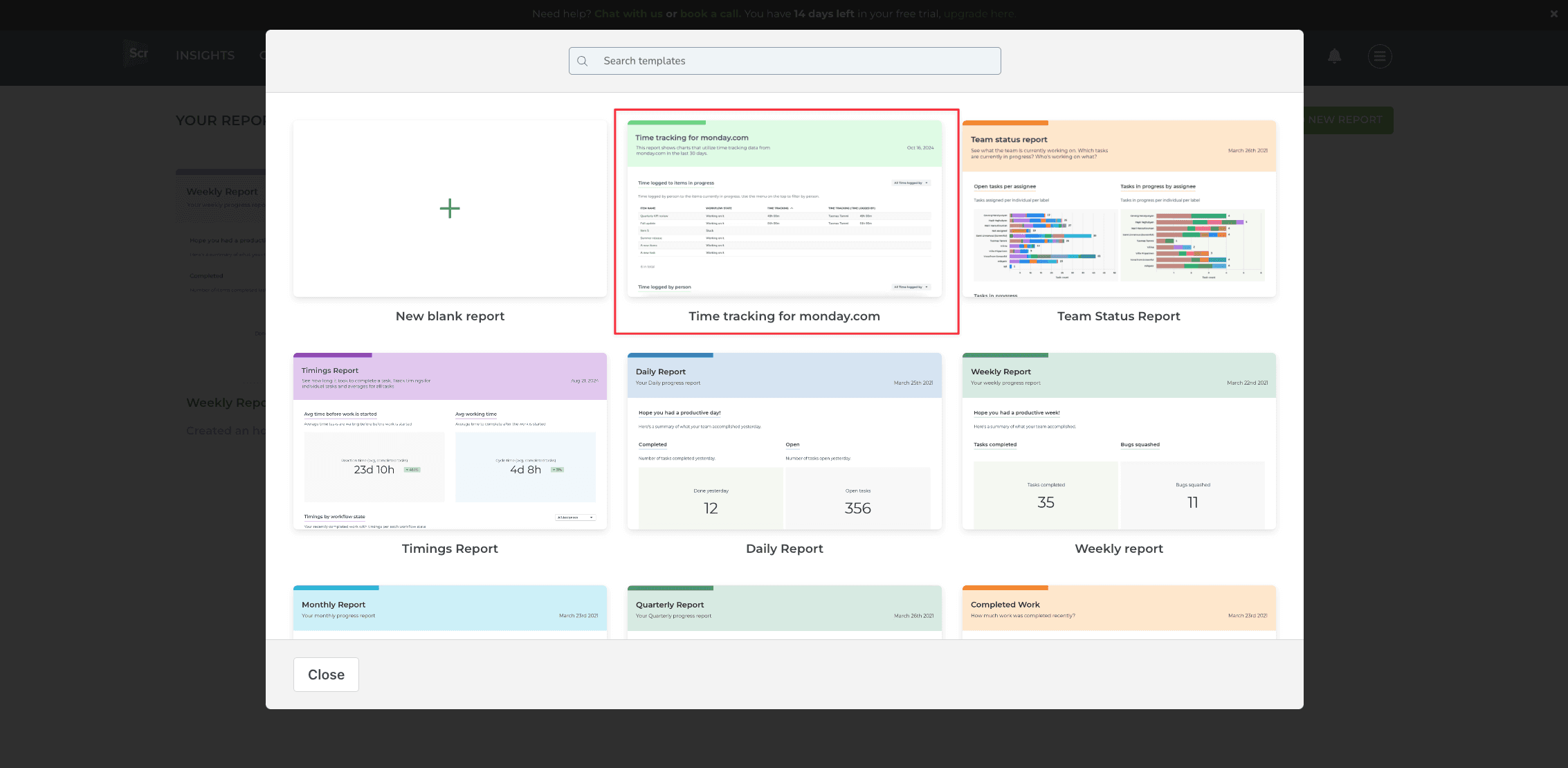
A report containing time-tracking data from the selected Monday boards is created:
Learn more
Book a free onboarding call
Need help with setting up your charts and reports? Don't find a metric you are looking for? Book a call with our expert. We'd love to help you supercharge your reporting!