When working with multiple custom fields, you may want to display them all within a single chart to visualize and track their values. This guide will walk you through three examples of creating charts for comparing various custom fields. Custom fields are displayed below the default fields in the Unit selection dropdown:

Comparing metrics with multi-bar chart
Here's how you can track several custom fields at once with multi-bar chart:
Select one of the fields as the unit for the chart.
Use the Add custom field button to add the other two fields.

Here’s the final chart with three different custom fields, grouped by week:

The unit shown on the left axis will be the field that was selected first. You can rename the units in the Chart settings.
Comparing metrics with line chart
Here's how you can track several custom fields at once with line chart:
Select one of the fields as the unit for the chart.
Use the Add custom field button to add the other two fields.

Here’s the final chart tracking three custom fields over time:

The unit shown on the left axis will be the field that was selected first. You can rename the units in the Chart settings.
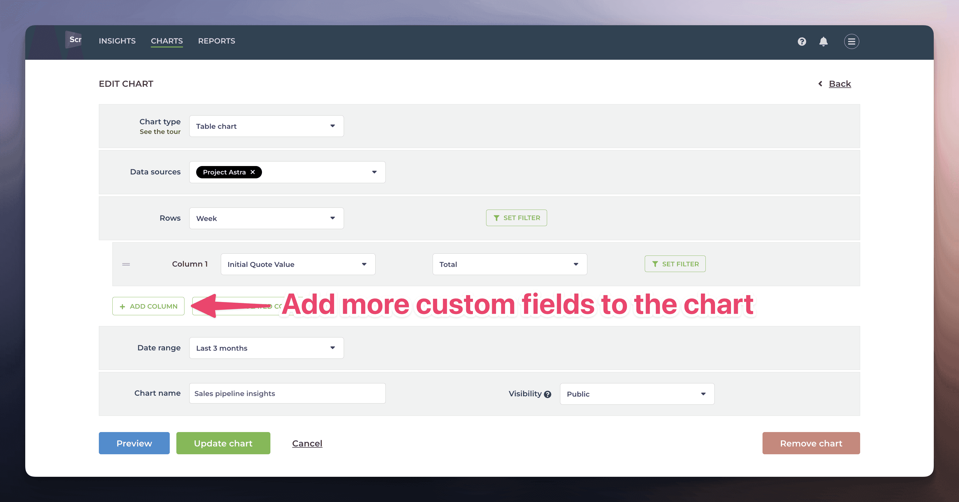
Comparing metrics with table chart
Here's how you can track several custom fields at once with table chart:
Select one of the timing metrics as a row.
Pick one of your custom fields as the first column.
Use the Add column button to add the other two fields.
Here’s the final chart with three custom fields, grouped by week:
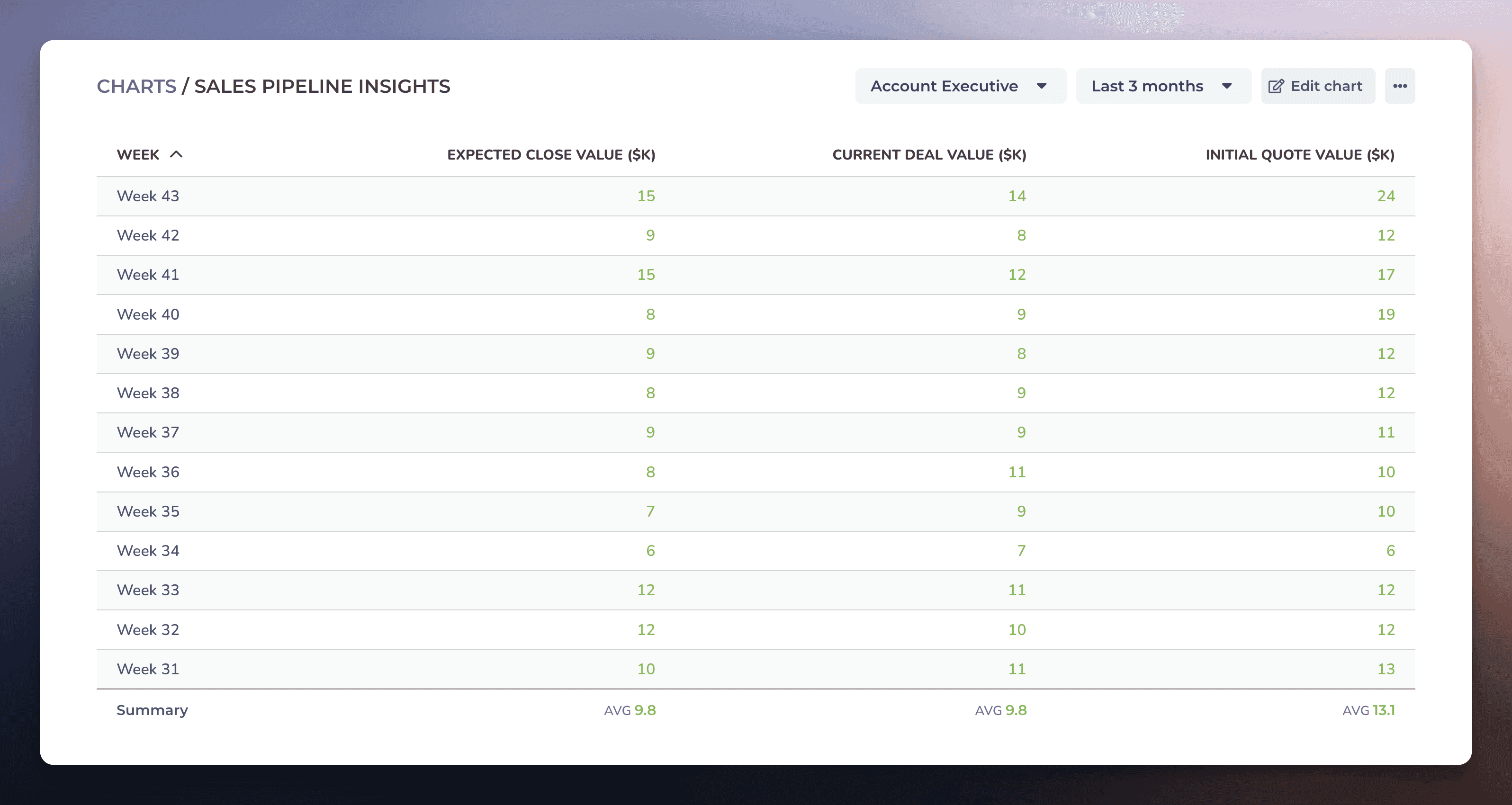
You can rename the units in the Chart settings.
Book a free onboarding call
Need help with setting up your charts and reports? Don't find a metric you are looking for? Book a call with our expert. We'd love to help you supercharge your reporting!