Let's assume you have set two numeric custom fields: Budget and Spent for your tasks. With Screenful, you can create a chart that compares these two fields and shows how much of the budget has been consumed.
Step 1: Create a Table chart
Go to the Charts tab and click Add new chart in the top right corner. From the modal, pick New blank chart:

In the chart editor, select Table chart as the chart type:

Select all the data sources you want to use in the chart from the Data sources menu. Then select what is used as Rows in the table. In this example, I have selected Group as a row.
Step 2: Set columns
Add two columns to the chart, the Budget, and the Spent. Select Total as the metric in the menu on the right:

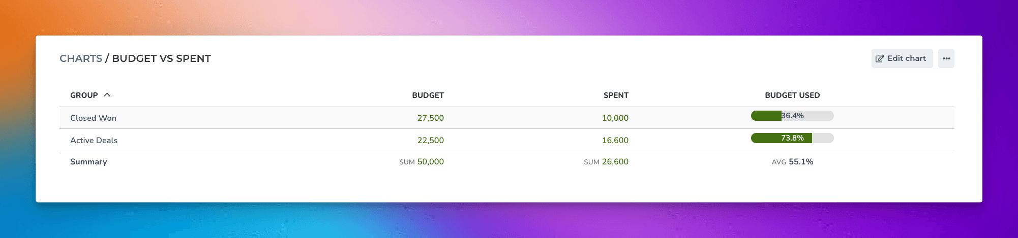
That provides a table that allows comparing the two fields:

However, we want to go a bit further and add a progress bar to show how much of the budget is left. Since it requires a calculation between the first two columns, we'll click Add calculated column:

A modal opens that allows entering a formula:

Enter the following formula:
( { 2 Spent } / { 1 Budget } )*100
It means the value in column 2 (Spent) is divided by the value in column 1 (Budget). The result should show the percentage of work completed. Since we want to display the value as a progress bar, select Progress bar (1-100) from the Format menu.
While it may look complicated, you don’t have to type it; you can click the buttons below the formula field, which provide shortcuts to the most commonly needed formulas. If you’re a power user looking for a more complicated formula, here’s a reference to all the supported formulas.
Once you’ve added the formula and saved the chart, the calculated column is added to the chart:

The chart shows the Budget and Spent and how much of the budget have been used so far.
Step 3: Configure columns
The column headings are named according to the selected metric. In the chart settings, you can change the headings and summariesto your liking:
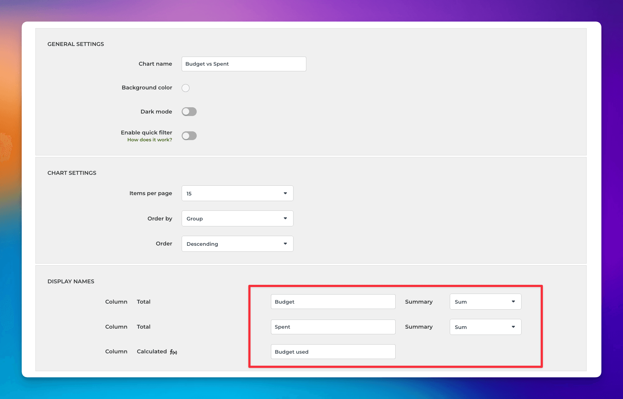
Here's the final chart after renaming the columns to Budget, Spent, and Budget used: