Stacked area chart overview
Here’s an example of stacked area chart when used for showing trends in the Completed Tasks screen (click image to enlarge):

The stacked area shows each of the grouped items, in this case labels, as a separate colour. The horizontal axis shows the totals per day. It’s a time series chart showing your task completion pace over a time period. Grouping can be by any available property in your task data, including custom fields.
You can see the overall trend by looking at the shape of the chart (also shown as a trend line at the overlay above the chart). Is it ascending or descending?
You can adjust the length of the history shown from the drop down menu on the top right. The overlays on top of the chart show totals from the selected time period.

Numbers are clickable so you can drill down to see the individual tasks behind the numbers. That can reveal useful information about the individual tasks completed at a specific point in time in case you want to dig a little bit deeper.
For example, clicking through from the Timing screen shows the cycle times of individual tasks:

That information can be used for analysing quick and slow tasks in the past. In addition to spotting outliers, you may find patterns that can help you plan your work in the future. Lean more about detecting bottlenecks in your workflow
What people sometimes get confused about this chart is by its use of a rolling window, in this case 30 days. It is there so that you can see the overall trend without getting distracted by too much detail.
Adjusting the size of the rolling window
You can change the rolling window length it in the screen settings:

You can choose between 7 days and 30 days rolling window. The default is 30 days. If you set the rolling window to 30 days, the first day of the chart shows the numbers from the 30 days period before the start date of the selected date range.
Exporting the data
If you want to get more data scientific, or mix it with your own data, you can always export your data in CSV of JSON and make your own calculations. The export feature is available in the main menu:
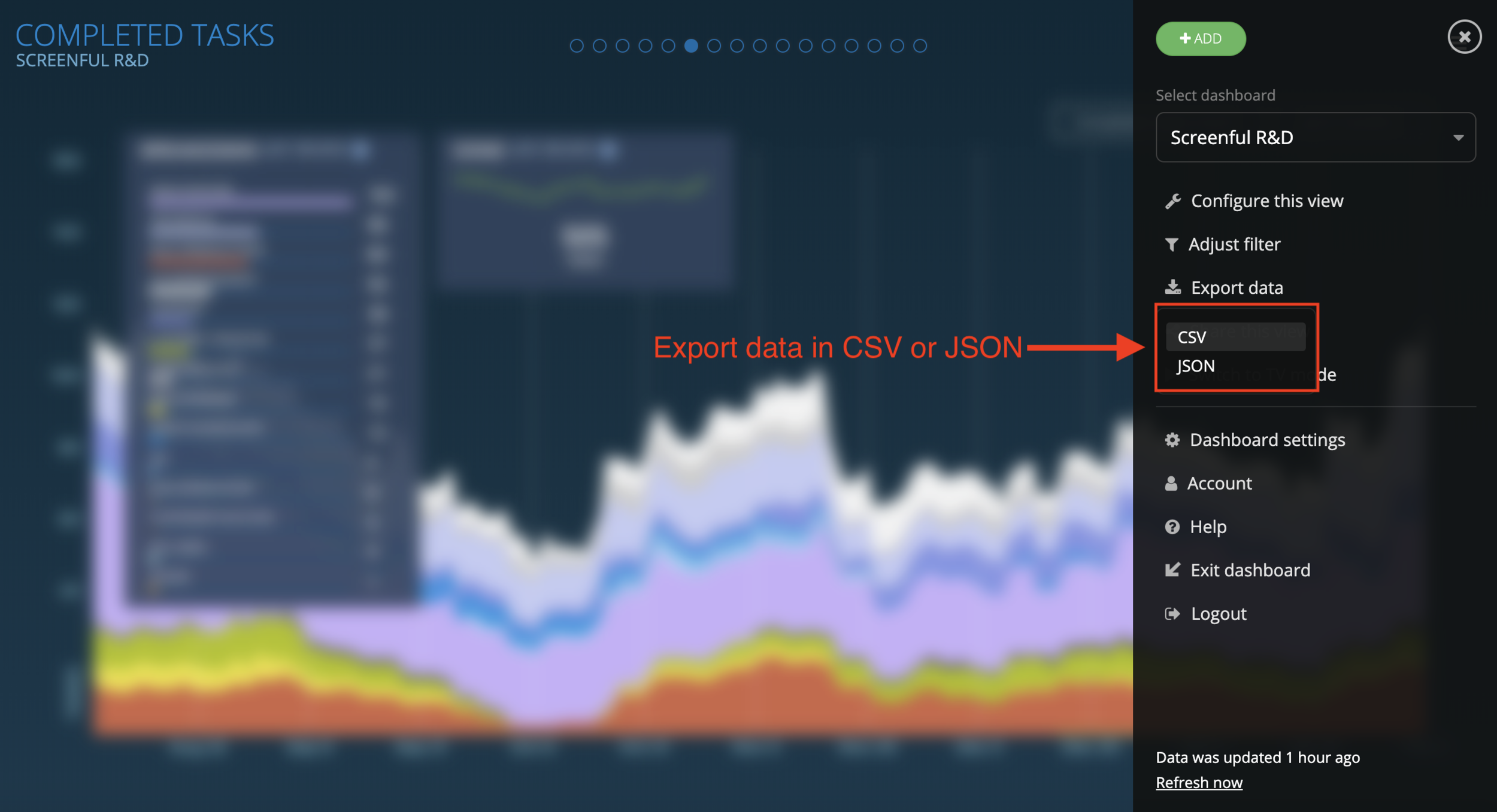
Before exporting, select the grouping of the data and adjust the unit in the settings if needed. You can choose to use estimates (card size, story points etc.), any of your numeric custom fields, or simply a task count as the unit.
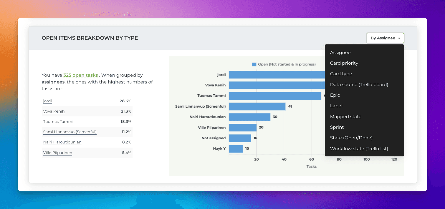
Adjust the charts with quick menus
Some of the charts display grouped data. You can change the grouping by selecting a property from the Group by menu:
If a chart displays time-based data, you can adjust the date range:
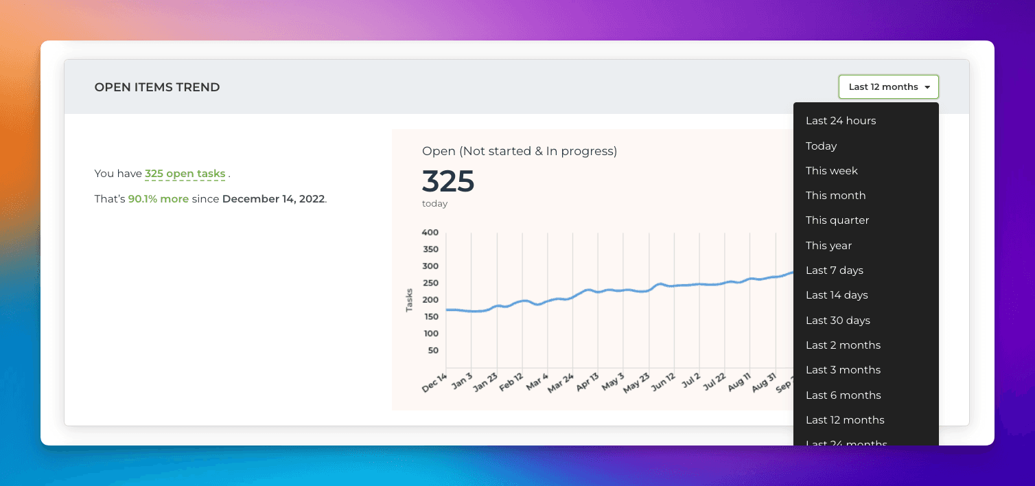
Notice that the length of the available history depends on the plan. For trial accounts, it is six months.