A bottleneck can occur when the resources within a project are lacking or already working to their full capacity and, therefore, cannot handle any additional demand.
Tracking the lead and cycle times of your delivery process help you to identify where those delays happen so that you can proactively address them. The Timing insights can help you spot bottlenecks by providing metrics and facts such as:
What is the average time it takes to complete a task?
Which tasks are slowing down your team?
Which steps in your workflow are fastest, which are slowest?
How long tasks spend on each workflow state?
From the Cycle time per workflow state chart, you can see the timings per individual workflow step. The numbers represent the average time a task has stayed in that specific workflow state over the selected period.
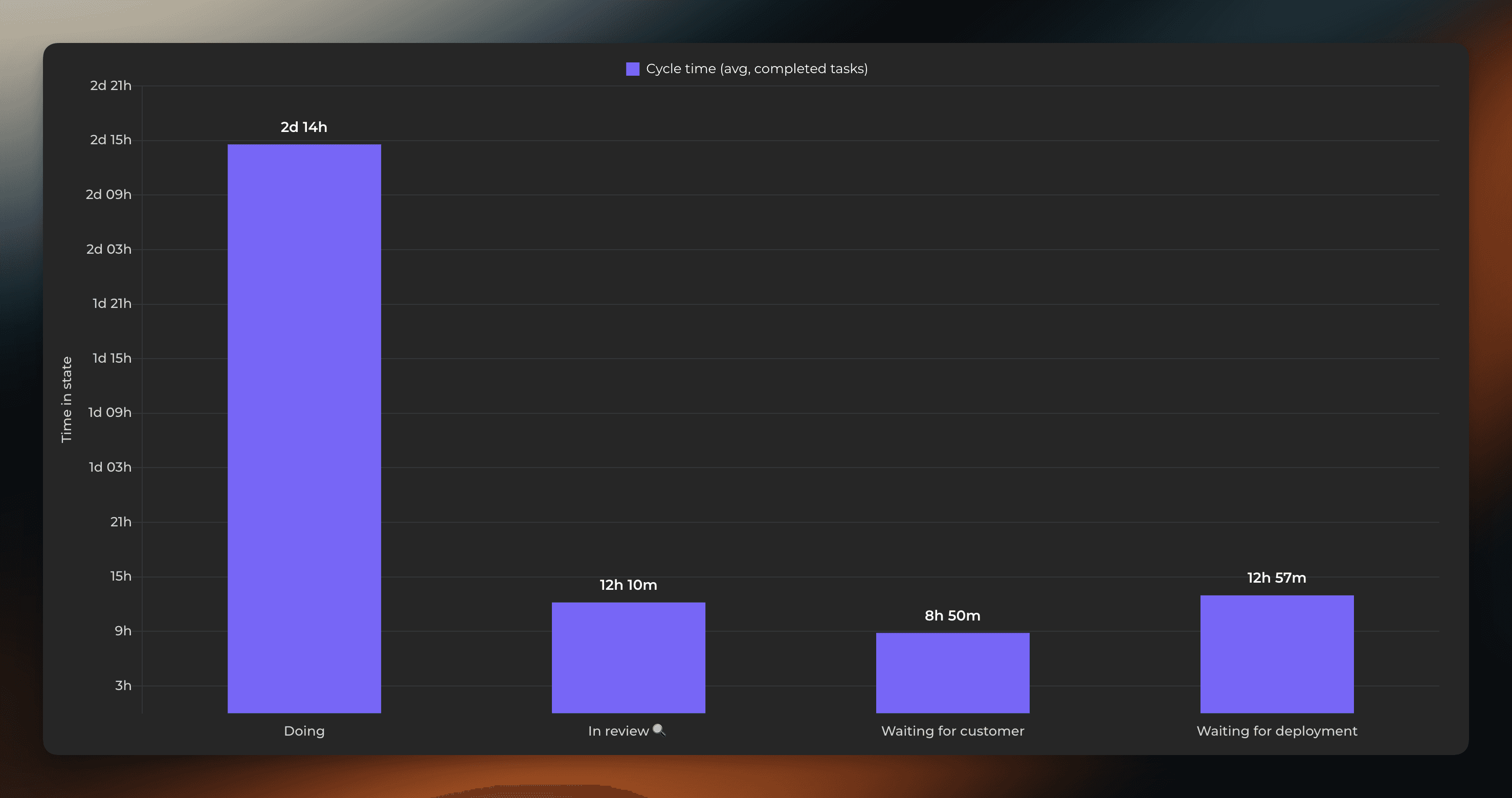
This chart tells you which steps in your workflow are fastest, and which are slowest. For example, if tasks spend a lot of time in waiting in some specific state, removing that delay would increase your throughput, and overall delivery speed.
Which tasks are slowing down your team?
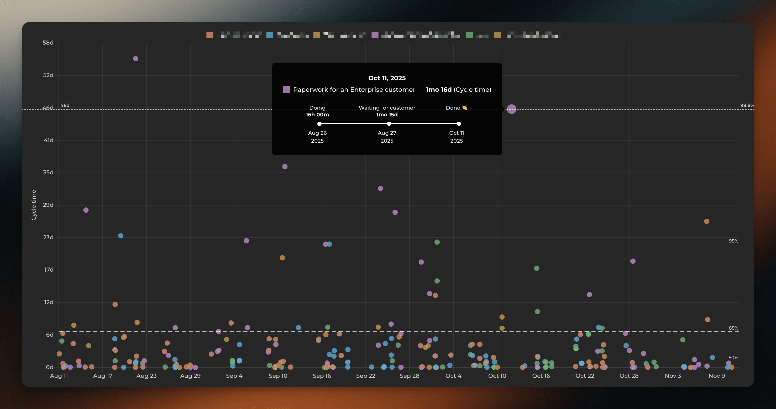
The cycle time scatter plot shows how long it took to complete a task after the work was started, so you can see which types of tasks are slowing you down. You can see how many tasks were completed per a specified time range.
Each circle corresponds to a completed task. The higher the circle, the longer it took to complete the task. The horizontal axis is time. That allows you to visually see the outliers. For example, you can see how many tasks took more than 7 days to complete.
You can hover the mouse to see timings per workflow state for each individual task.
Is the overall execution of the project accelerating or decreasing?
The Cycle time trend shows your cycle time over the selected date range. A shorter cycle time means higher efficiency at a lower cost and hence better productivity. You can filter the data according to task type to track a specific aspect of your work, such as bugs, user stories, or support tickets. Timings are calculated from the completed tasks.
The horizontal axis indicates the time and the vertical axis indicates the number of days.
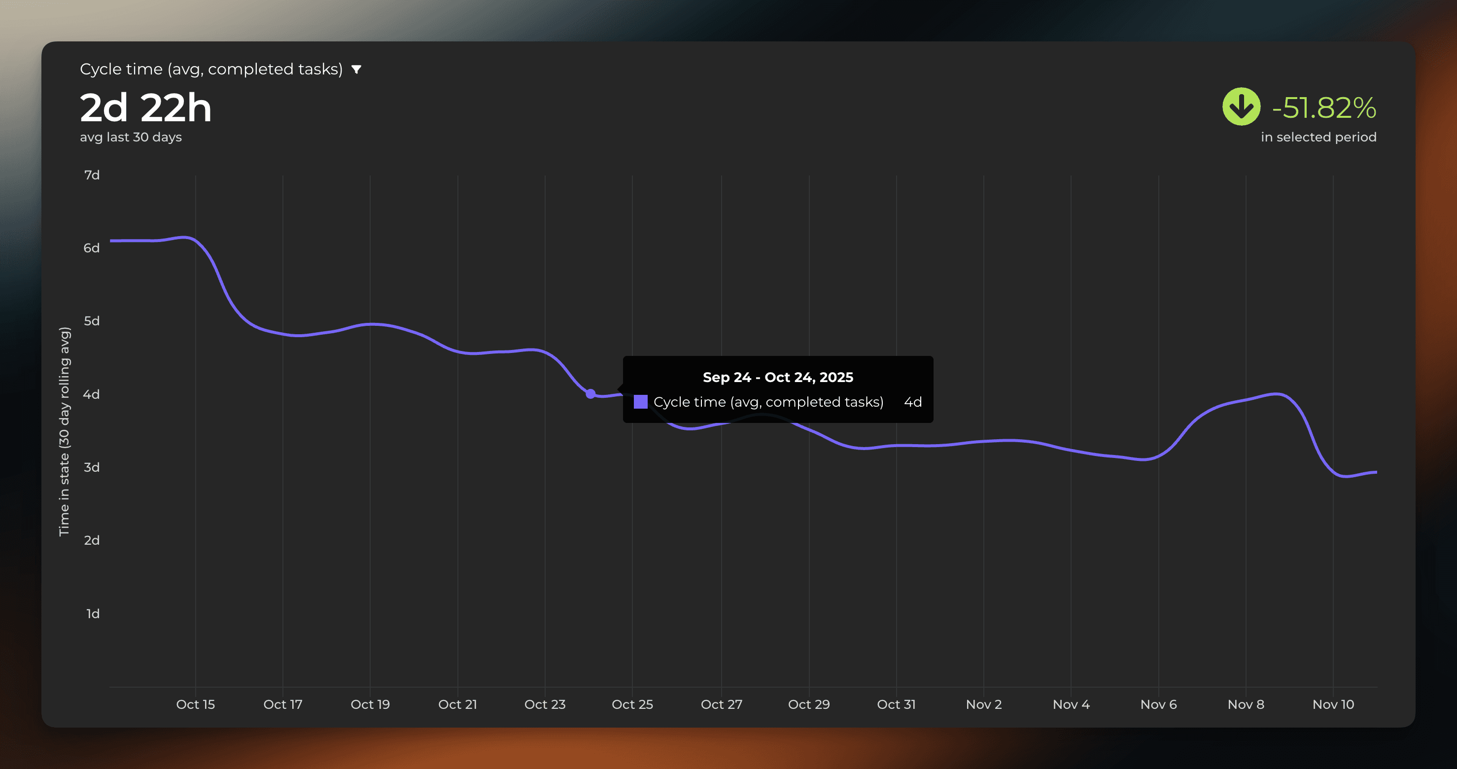
If the trend goes upwards, it means more time is spent to complete tasks on average. You can start figuring out why that happens and if is there something that should be done to address it. For example, if the quality assurance step has been getting slower recently, you might consider adding more QA resources or start looking for other ways to reduce delays in that specific step.