Creating a chart with monday.com time tracking data
To create a chart using time tracking data, start by clicking Add new chart in the Charts tab. Select the data sources for the chart. If any of those data sources contain time tracking columns, they will be shown in the Unit menu:
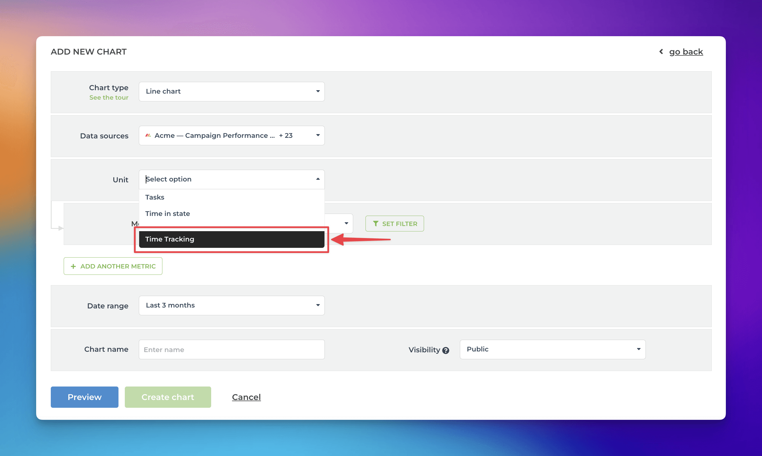
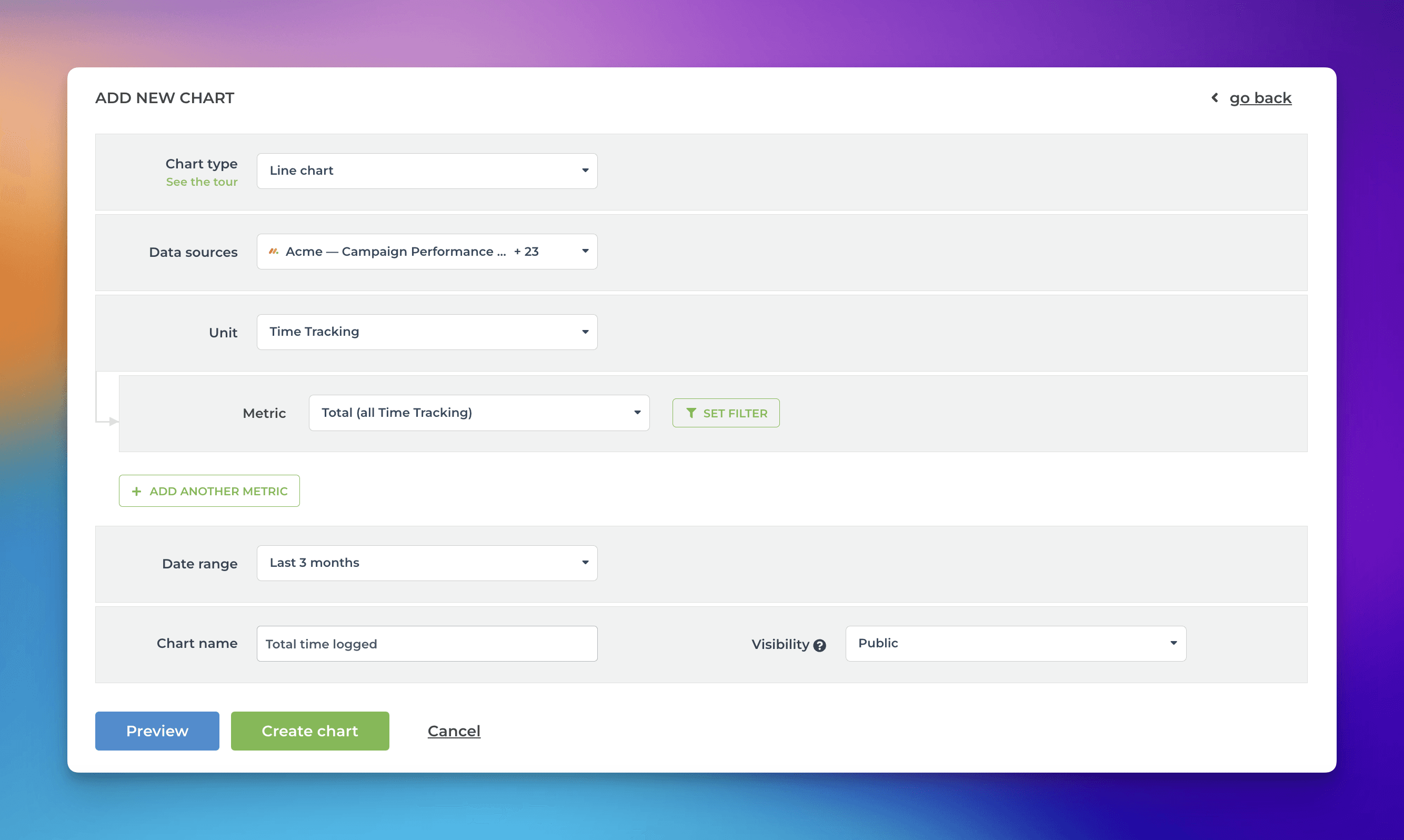
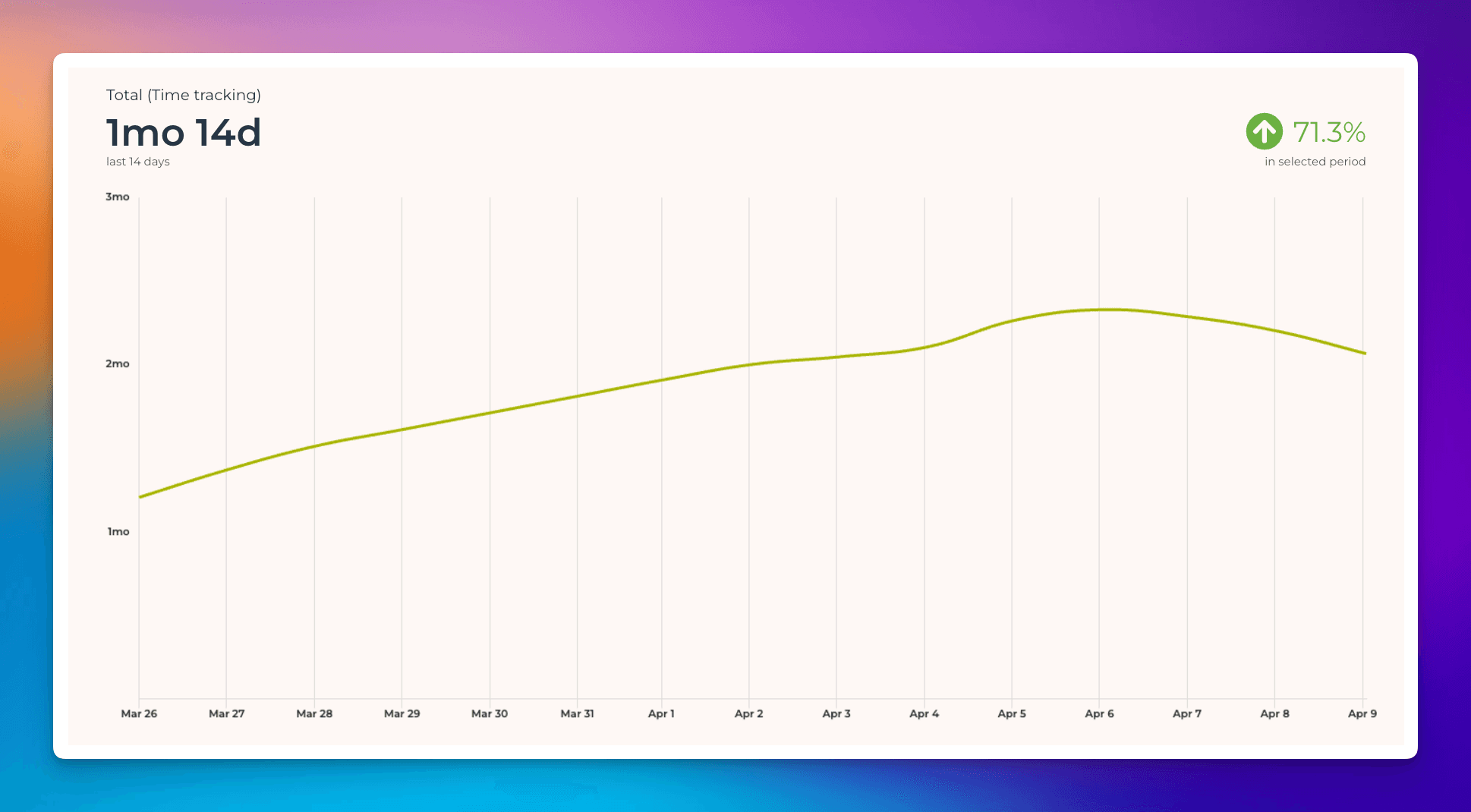
When a time tracking column is selected as the Unit, the Metric menu contains only one option: Total (all Time Tracking). Here’s an example configuration of a line chart that shows the total amount of hours logged over time:
And here’s the resulting chart:
You can create charts from your top-level items, subitems, or both. You can choose between these options by setting a filter (use the filter Item type). Notice that you must import the subitems as a separate data source to make them available.
Grouping and filtering by time logged by
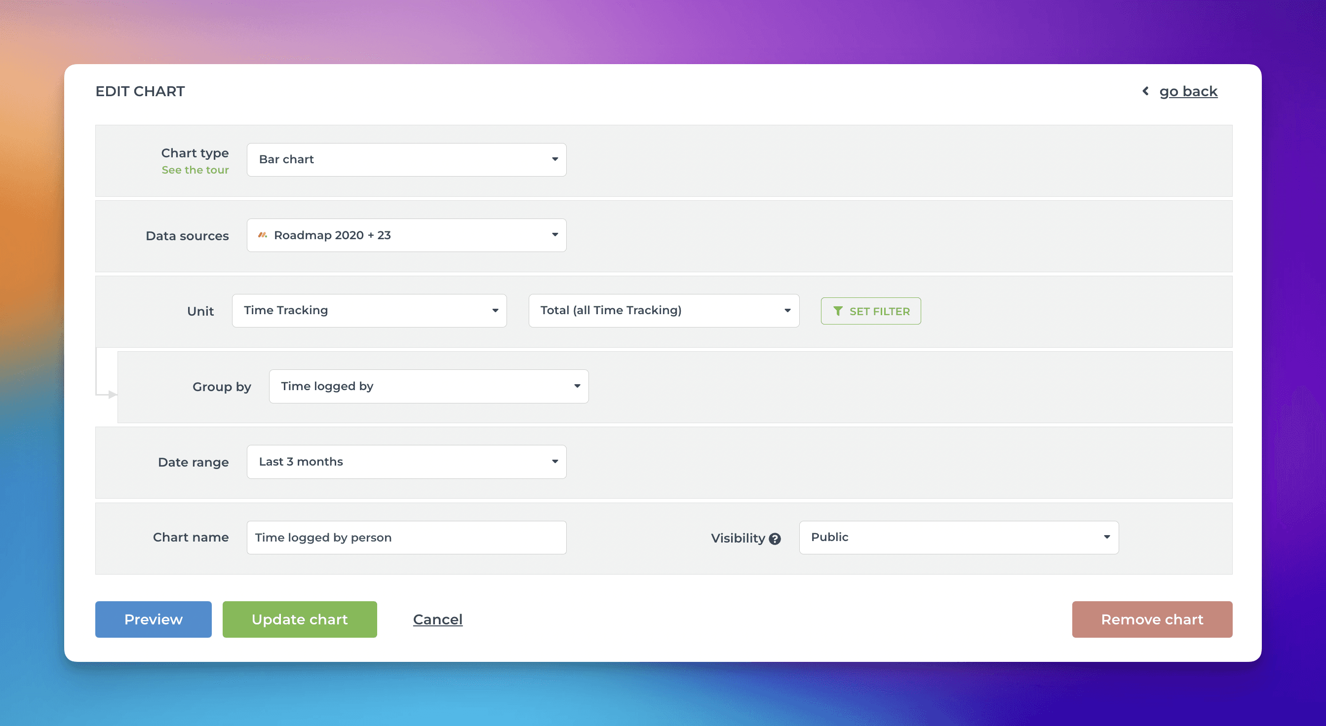
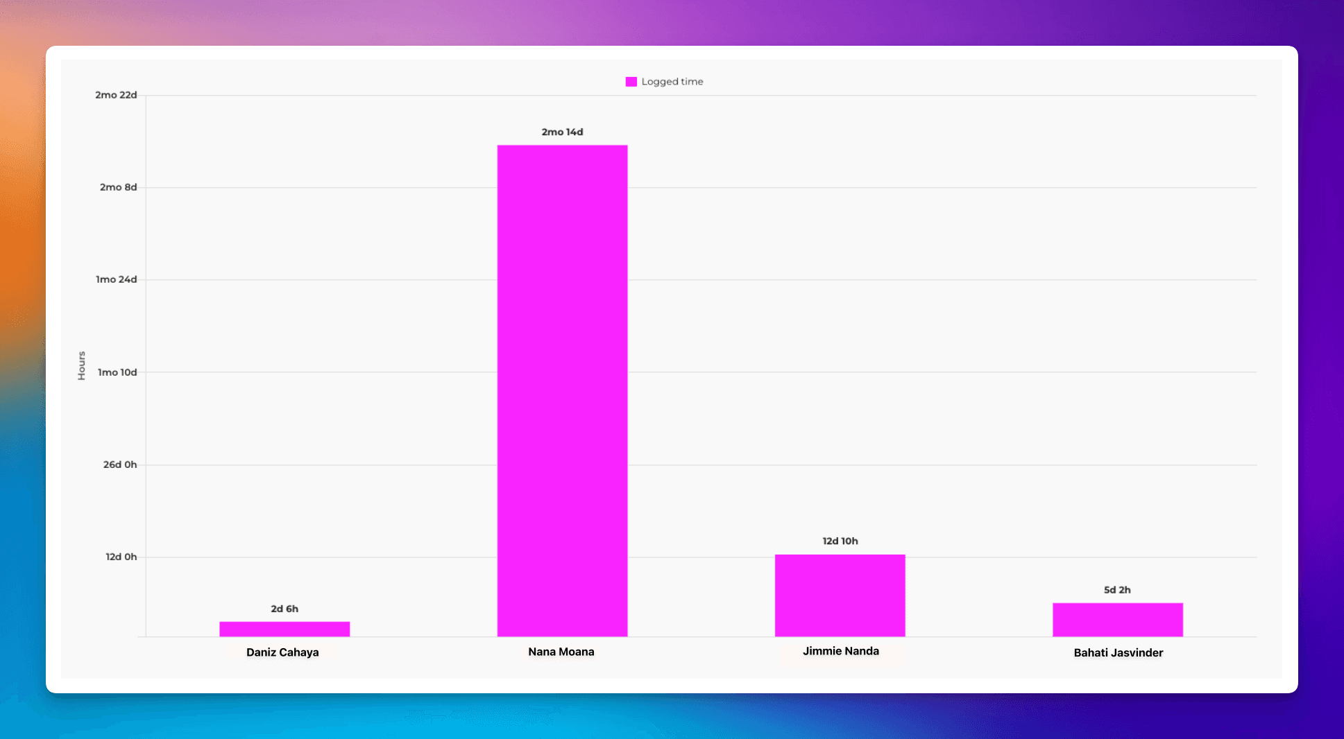
When a time tracking column is selected as a unit, there’s special metric called Time logged by, which allows grouping and filtering based on who logged the hours. Here’s an example chart configuration showing the total amount of hours logged per individual:
And here’s the resulting chart:
You can also filter the chart based on this property. In the filter window, you can find the time logged by option.
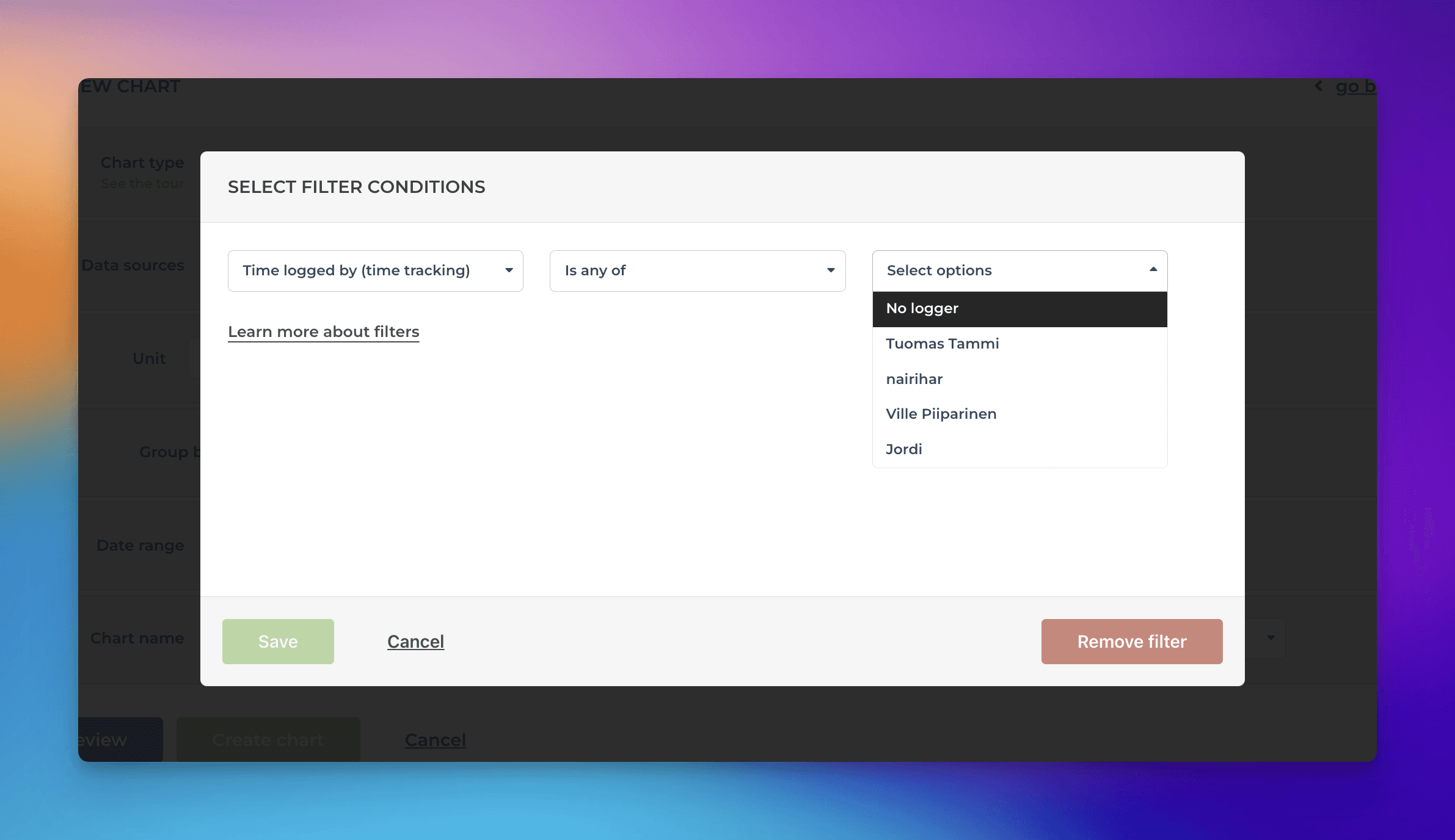
When you select individuals, the chart is filtered accordingly.