Stacked bar chart
The Stacked Bar chart adds one dimension to the bar chart, allowing for the segmentation of the bars. Track work by any property (assignee, label, etc.) or by week/month/quarter.

Segment your data with a stacked bar chart
The Stacked bar chart is a graph that shows one bar per grouped item (assignee, label, project, etc.). It extends the basic bar chart by adding the possibility of segmenting the bars. The stacked bar chart represents a series of bars or columns stacked on one another. You can use any of your number fields as the unit in the chart.

Click through to see details
The Chart click-through lets you see the tasks behind any chart data point. When you click on the number, a window opens showing the task list that makes up that number.
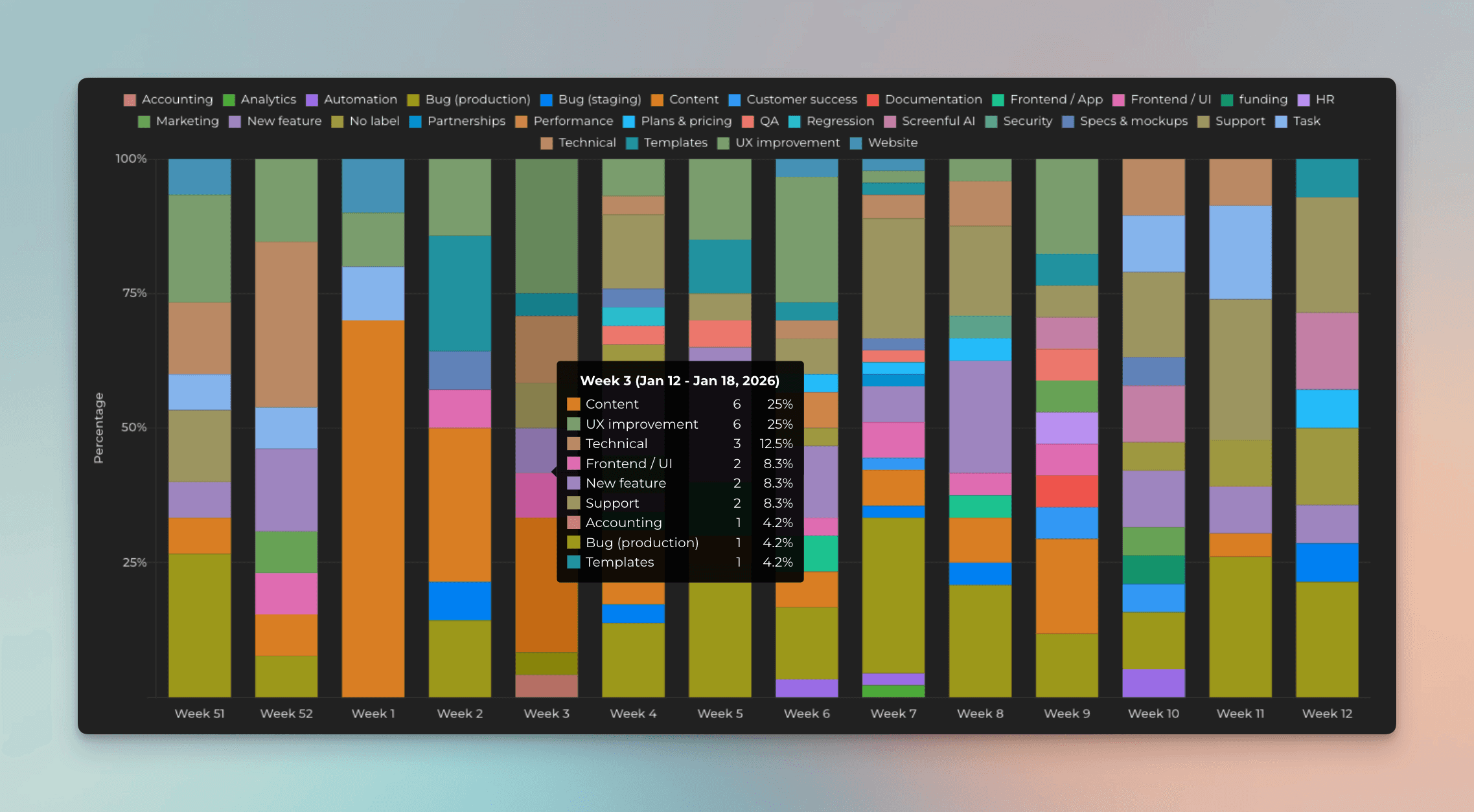
Track percentage distribution
In the chart settings, you can select Scale bars to 100% to see the percentage distribution. With this configuration, each bar is scaled to the same size and the mouse hover tooltip displays the percentages for each segment. This visualization allows seeing the type of work done each week and the variation week to week.
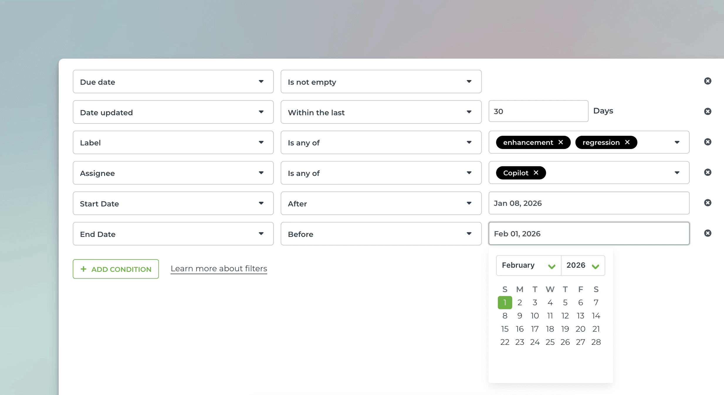
Use advanced filters to select the items for the chart
You can filter by any property, such as task type (bug, user story, new feature), assignee, label, or epic.
You can set comparison filters by any of your number fields or date fields, or filter by keywords with an exact or partial match.

Create from template and customize
You can create this chart with just a few clicks using a template. Customize it to your liking with the chart editor.
Use data from any of your custom fields
Rename labels to your liking
Set the format of the numbers (currency, number format)
Select light mode or dark mode
Export to CSV or JSON