Using custom fields in custom charts

Using custom fields in custom charts

Using custom fields in custom charts

If you have added custom fields to your board, they will be automatically imported and made available for custom charts. When you create a custom chart, you can use the data in your custom field in that chart.

The availability of those fields depends on their type. Your number type custom fields can be used as units, and your drop down fields can be used for grouping and filtering. If the type is other than those, they can be used as columns in the Task list chart.

Using a custom field as a unit

Your number field custom fields can be used as a unit of a chart. For example, if you have assigned estimates for tasks (e.g. hours or story points) using a custom numeric field, you can select it as a unit for a chart.

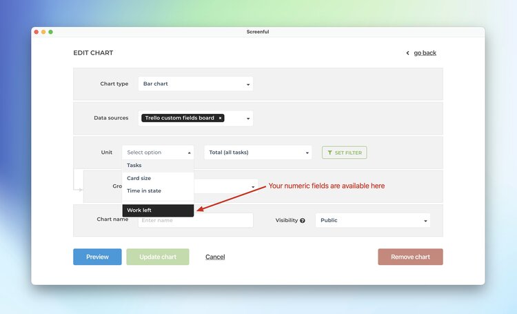
Screenful will automatically make all numeric fields available in the Unit menu in the chart editor. If you have a drop-down field that you'd like to use as a unit, you can change the default field mapping

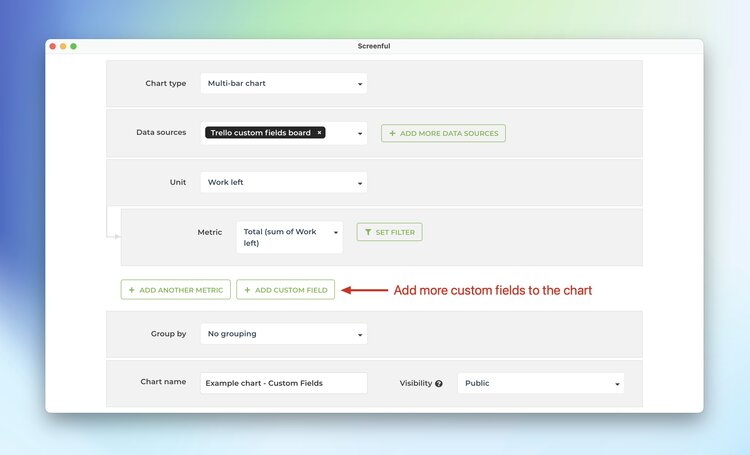
Comparing multiple custom fields

What if you have multiple custom fields and you want to have all of them in one chart? Let’s assume you want to compare the values of three different number fields over time. You can do that by adding them one by one.

In this example, we’ll use the multi-bar chart. Pick one of the custom fields as the unit for the chart. After that, use the Add custom field button to add the other two fields.

tre5.jpg

Here’s the final chart with three custom units, grouped by week:

tre6.jpg

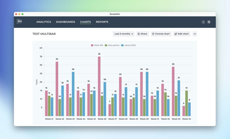
The unit shown on the left axis will be the field that was selected first. You can rename the unit to whatever you like it to be in the Chart format section.

Adjust the charts with quick menus

Some of the charts display grouped data. You can change the grouping by selecting a property from the Group by menu:

If a chart displays time-based data, you can adjust the date range:

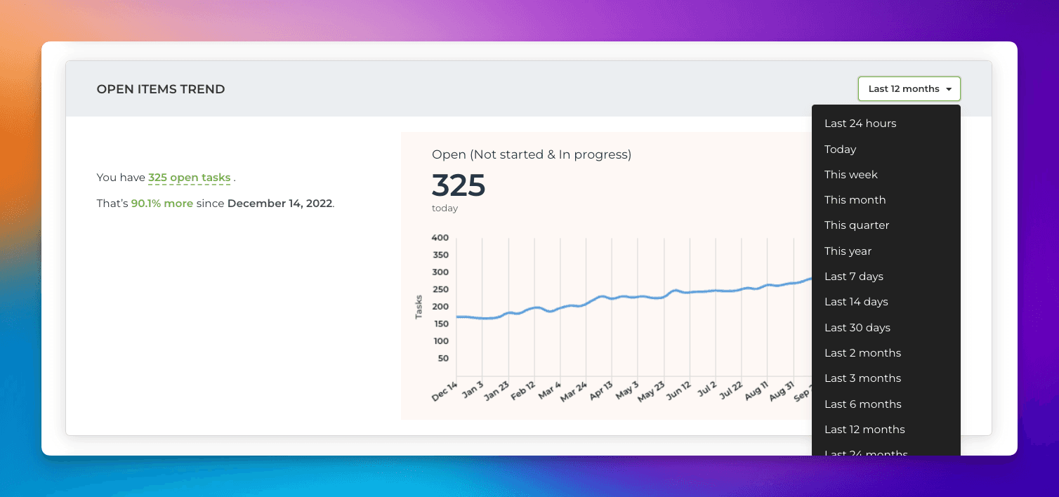
Notice that the length of the available history depends on the plan. For trial accounts, it is six months.