Customize charts with date formats, number formats, currencies, and more!
Customize charts with date formats, number formats, currencies, and more!
Jun 30, 2022
Don't like the default appearance of a chart? We've got you covered since you can now configure almost any visual aspect of a chart such as colors, labels, and date and number formats. You can now tune even the smallest details to make your reports perfect. These adjustments can be found under the Chart settings.
Configuring date formats, number formats, and currencies
Different countries have different standard formats for numbers and dates. You can configure the date and the number format to match your local standards under the Account settings.
The Date Format menu contains the most common date formats
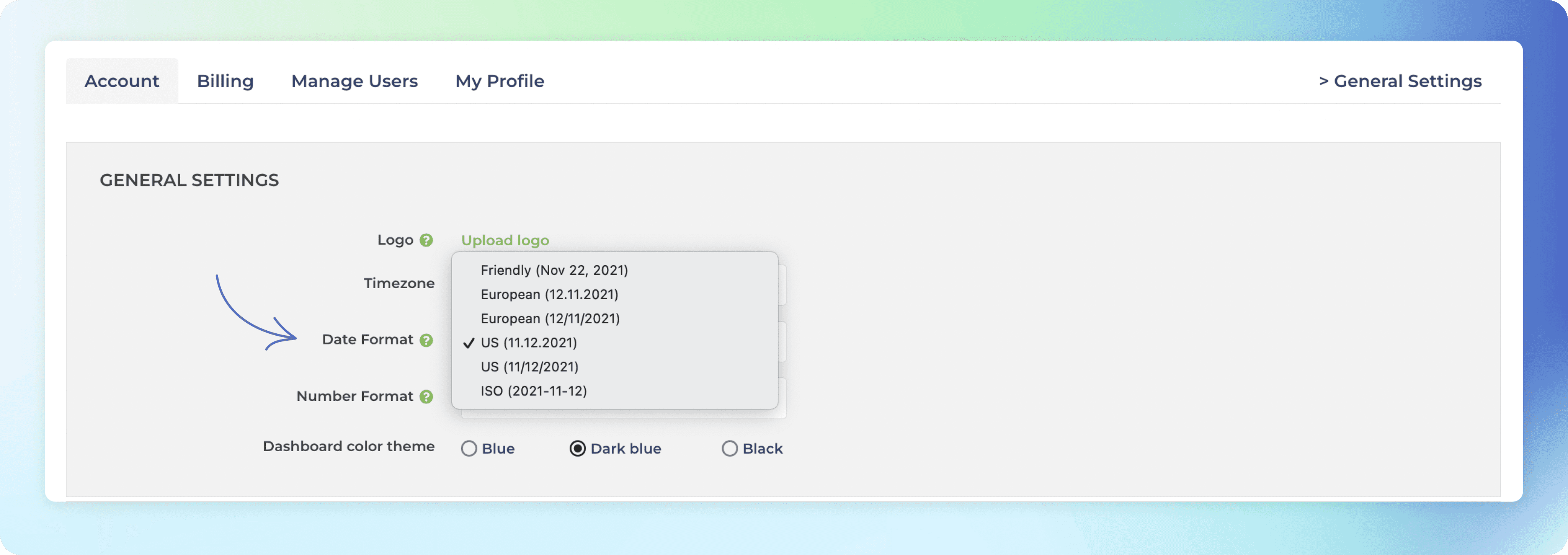
When you pick a date format, the selected format will be applied to all of the charts in the account.
The Number Format menu contains the most common number formats

When you pick a number format, the selected format will be applied to all of the charts in the account.
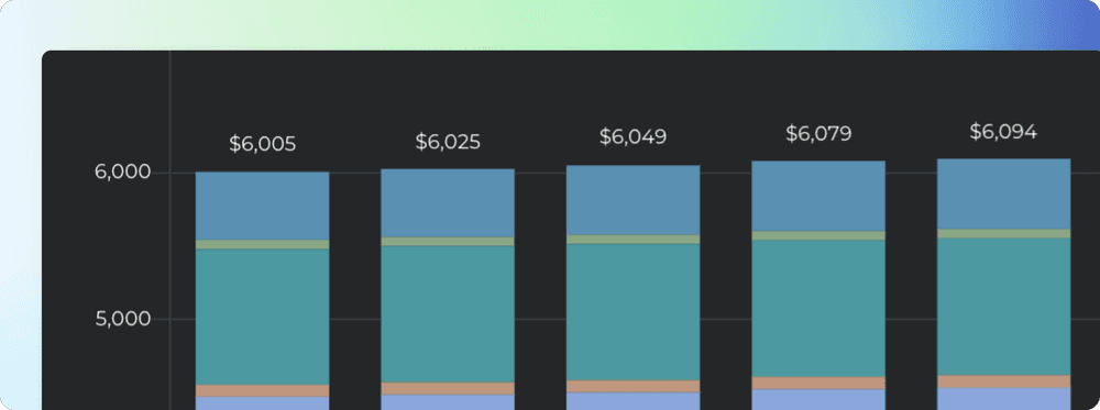
If your data represents monetary values, you can specify a currency under the Chart settings. In the Display Names section, you can select between Number and Currency

When a currency is selected, the associated currency symbol is shown in front of the numbers. Here’s an example line chart with currency set as “$” to represent the amount in USD. Both the Amount earned on the top left, and the tooltip display the selected currency symbol.

The currency setting is a chart specific feature. In the chart settings, you can specify which of the metrics are currencies. If your numbers represent a currency, you can make it more explicit by displaying it as the currency. The default for a numeric field is Number i.e. just a plain number, not a currency.
Adjusting the rolling window size in the line charts
When displaying data as a line chart, a sliding window is used to smooth away the daily fluctuations so that you can see the trend from the noise. The rolling window size is now configurable in the chart settings.
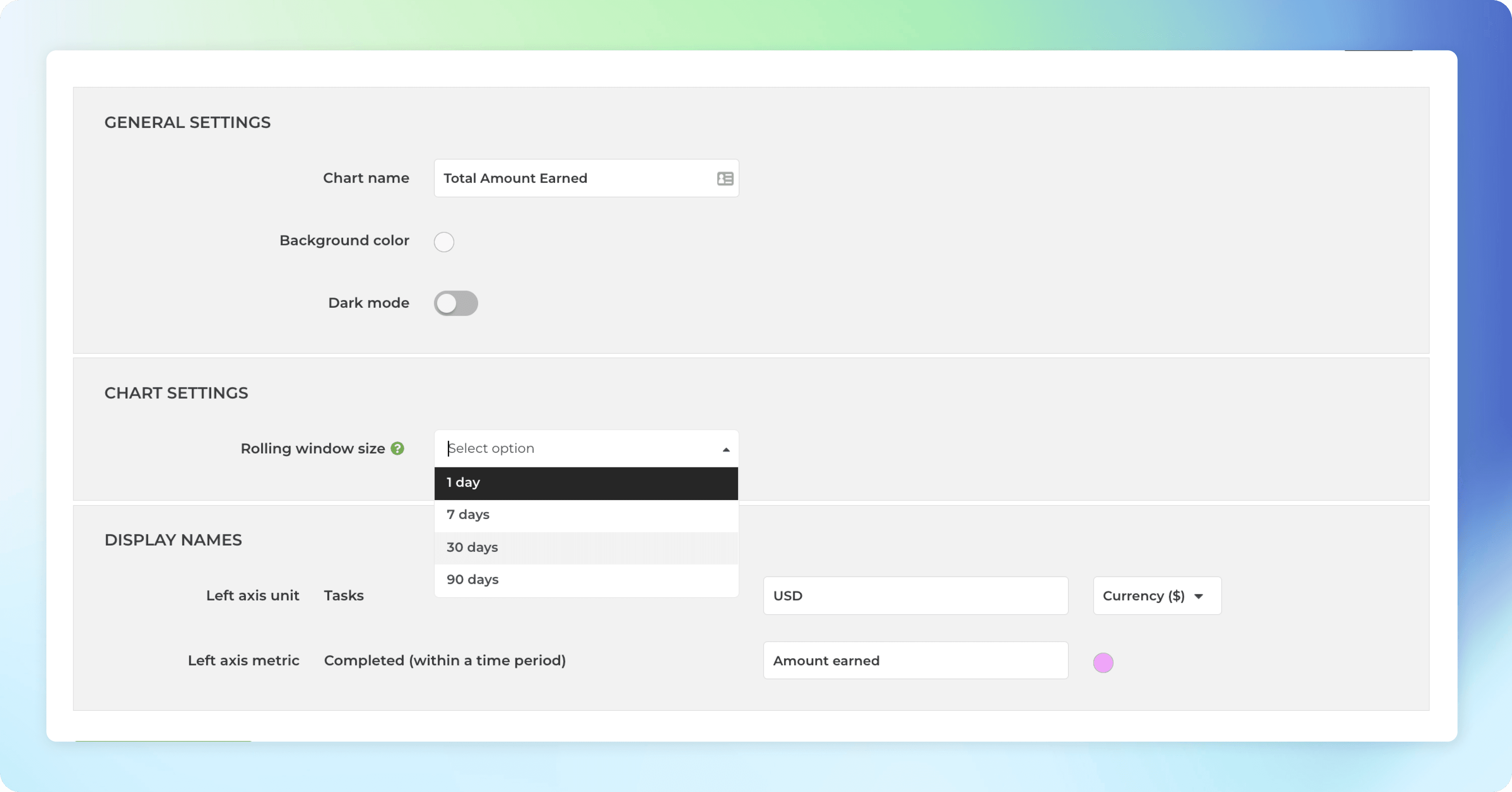
If you select 1 day rolling window, each point in the horizontal axis display the number of items (e.g. tasks created or tasks completed) per day. With 7 day rolling window, each point in the horizontal axis display the sum (or average depending on what metrics was selected) over the previous 7 days period. Here’s an example chart with 30 days rolling window. When you hover the mouse over the chart, the tooltip shows the values for the previous 30 days period.
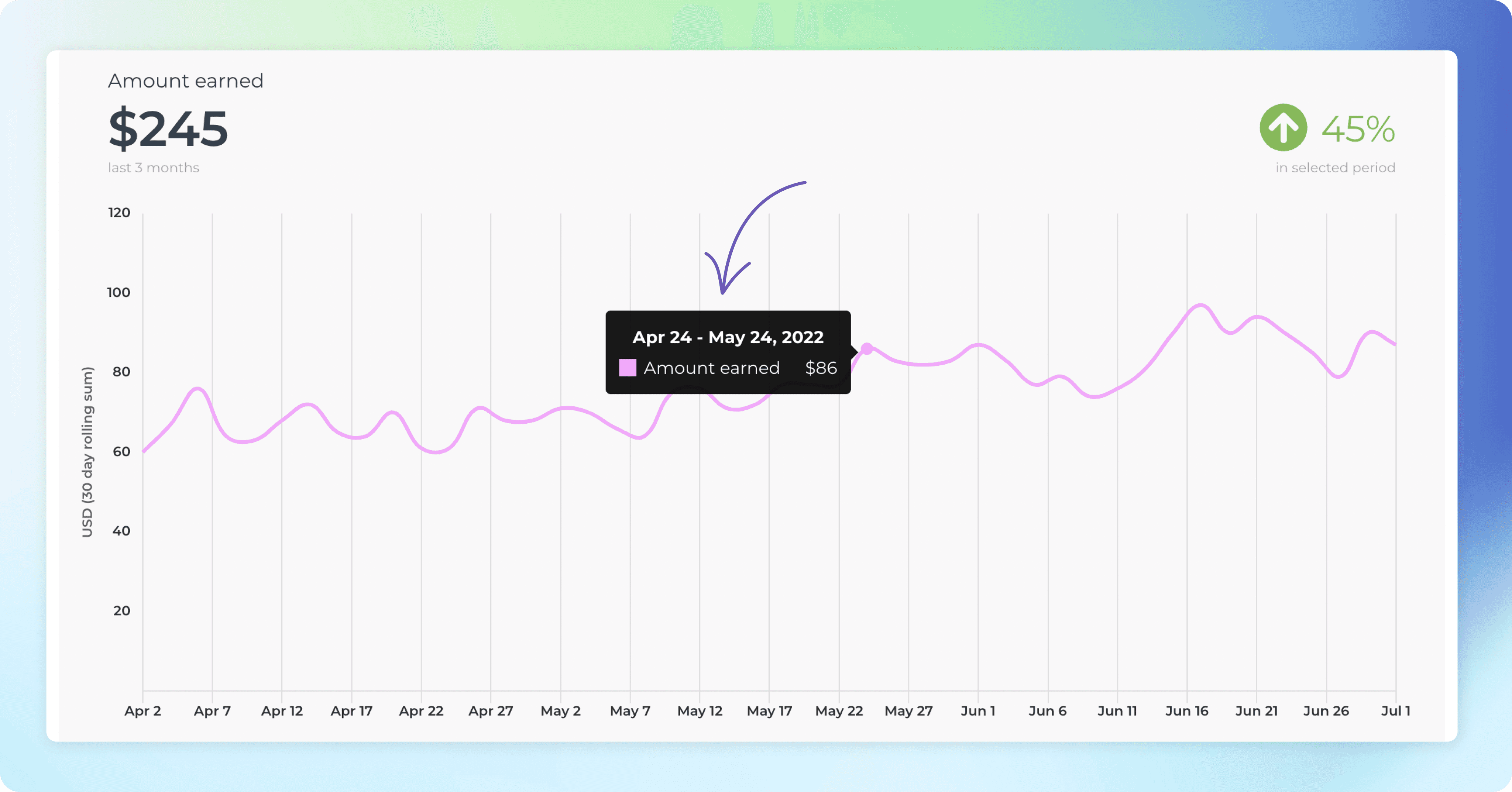
The longer the rolling window, the less variation there is in values, creating a smoother trend line. With smaller window sizes, you can see more details but the overall trend may get distorted by the daily fluctuations.
You can learn more about adjusting the appearance of charts from this guide.
Don't like the default appearance of a chart? We've got you covered since you can now configure almost any visual aspect of a chart such as colors, labels, and date and number formats. You can now tune even the smallest details to make your reports perfect. These adjustments can be found under the Chart settings.
Configuring date formats, number formats, and currencies
Different countries have different standard formats for numbers and dates. You can configure the date and the number format to match your local standards under the Account settings.
The Date Format menu contains the most common date formats
When you pick a date format, the selected format will be applied to all of the charts in the account.
The Number Format menu contains the most common number formats
When you pick a number format, the selected format will be applied to all of the charts in the account.
If your data represents monetary values, you can specify a currency under the Chart settings. In the Display Names section, you can select between Number and Currency
When a currency is selected, the associated currency symbol is shown in front of the numbers. Here’s an example line chart with currency set as “$” to represent the amount in USD. Both the Amount earned on the top left, and the tooltip display the selected currency symbol.
The currency setting is a chart specific feature. In the chart settings, you can specify which of the metrics are currencies. If your numbers represent a currency, you can make it more explicit by displaying it as the currency. The default for a numeric field is Number i.e. just a plain number, not a currency.
Adjusting the rolling window size in the line charts
When displaying data as a line chart, a sliding window is used to smooth away the daily fluctuations so that you can see the trend from the noise. The rolling window size is now configurable in the chart settings.
If you select 1 day rolling window, each point in the horizontal axis display the number of items (e.g. tasks created or tasks completed) per day. With 7 day rolling window, each point in the horizontal axis display the sum (or average depending on what metrics was selected) over the previous 7 days period. Here’s an example chart with 30 days rolling window. When you hover the mouse over the chart, the tooltip shows the values for the previous 30 days period.
The longer the rolling window, the less variation there is in values, creating a smoother trend line. With smaller window sizes, you can see more details but the overall trend may get distorted by the daily fluctuations.
You can learn more about adjusting the appearance of charts from this guide.
That’s it for this release. As always, we’d love to hear from you. Please do not hesitate to contact us anytime if you have questions or feedback.
To give it a try with your own data, sign up for a free 14-day trial
Also, check out recent product updates and follow us on Twitter or Facebook.