Introducing the Insights tab 🚀✨
Introducing the Insights tab 🚀✨
Jun 30, 2021
We’re thrilled to announce that the new Insights tab has progressed from beta and is now available for all users. It provides a quick overview of different aspects of your data so that you can start exploring without having to configure any charts or reports.
While the previously released Report templates made it easy to create content to share with others, the Insights tab provides instant access to the key charts and metrics for your consumption.
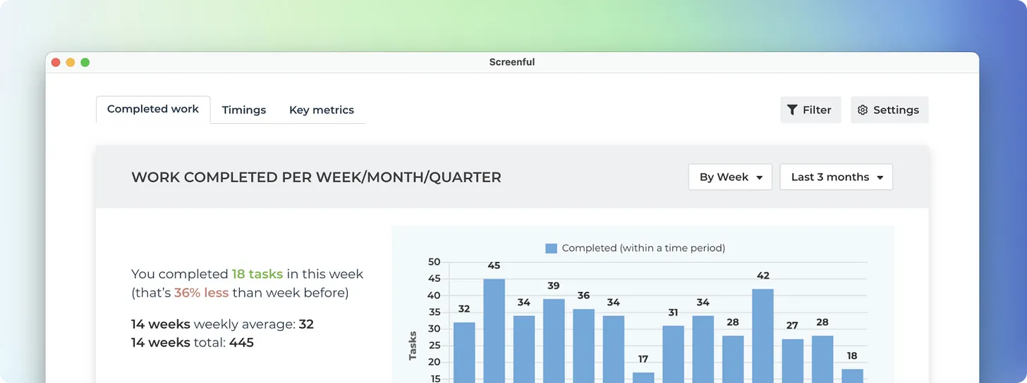
To begin with, the Analytics tab contains three sections, Completed work, Timings, and Key metrics.
Learn from chart summaries
Each chart comes with a summary text shown on the left side of the chart. The summary describes the data shown in the chart. If you are not certain what some number or label in the chart means, check the summary for more detail.
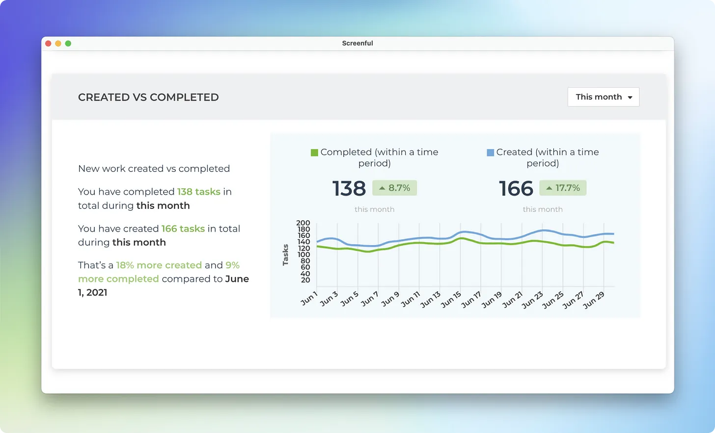
It is not always obvious what different numbers or labels in the chart mean. The chart summary explains it in plain English.
Click through to individual tasks
Summaries contain clickable links.
Clicking a link opens a modal displaying a list of tasks, revealing the data behind the numbers.
This is a great way to explore the data as you can first see the big picture in the chart, understand what the chart represents by reading the summary, and then click through to see the individual items behind the numbers.
Configure your personal view
The Insights tab comes with its own settings and filters. You can access them by clicking the buttons on the top right.
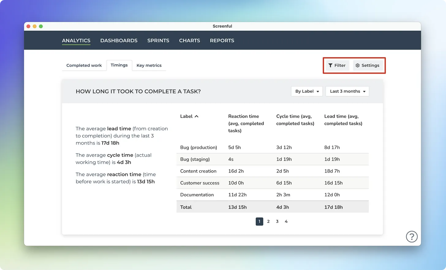
Both the settings and the filters are personal to you only. Whatever you change here won’t affect what others see. Consider the Insights tab as your personal playground!
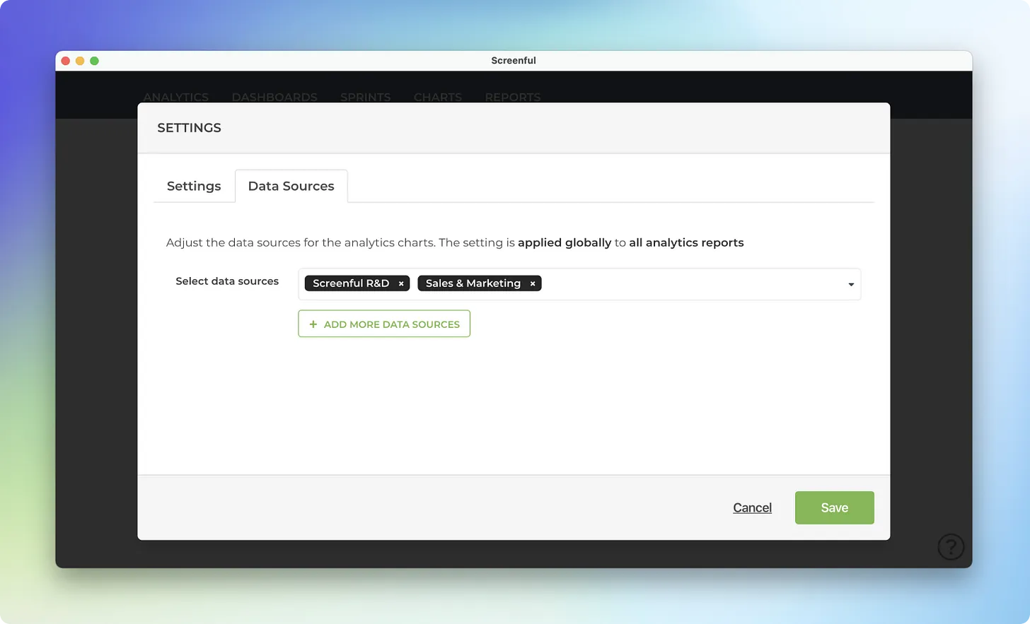
By default, the data is pulled from all of your data sources and you can narrow it down under the Data sources tab.
Summary
The Insights tab contains a selection of charts that provides a quick and easy way to explore your data. It is now available for all users. You can configure and filter the charts, and click through to see the individual items behind the numbers. Go ahead and give it a spin with your data!
We’re thrilled to announce that the new Insights tab has progressed from beta and is now available for all users. It provides a quick overview of different aspects of your data so that you can start exploring without having to configure any charts or reports.
While the previously released Report templates made it easy to create content to share with others, the Insights tab provides instant access to the key charts and metrics for your consumption.
To begin with, the Analytics tab contains three sections, Completed work, Timings, and Key metrics.
Learn from chart summaries
Each chart comes with a summary text shown on the left side of the chart. The summary describes the data shown in the chart. If you are not certain what some number or label in the chart means, check the summary for more detail.
It is not always obvious what different numbers or labels in the chart mean. The chart summary explains it in plain English.
Click through to individual tasks
Summaries contain clickable links.
Clicking a link opens a modal displaying a list of tasks, revealing the data behind the numbers.
This is a great way to explore the data as you can first see the big picture in the chart, understand what the chart represents by reading the summary, and then click through to see the individual items behind the numbers.
Configure your personal view
The Insights tab comes with its own settings and filters. You can access them by clicking the buttons on the top right.
Both the settings and the filters are personal to you only. Whatever you change here won’t affect what others see. Consider the Insights tab as your personal playground!
By default, the data is pulled from all of your data sources and you can narrow it down under the Data sources tab.
Summary
The Insights tab contains a selection of charts that provides a quick and easy way to explore your data. It is now available for all users. You can configure and filter the charts, and click through to see the individual items behind the numbers. Go ahead and give it a spin with your data!
That’s it for this release. As always, we’d love to hear from you. Please do not hesitate to contact us anytime if you have questions or feedback.
To give it a try with your own data, sign up for a free 14-day trial
Also, check out recent product updates and follow us on Twitter or Facebook.