Scatter plot screen and the new Milestone chart
Scatter plot screen and the new Milestone chart
Apr 30, 2021
As a project manager, the question you often hear from stakeholders is when will it be done? It’s an easy question to ask but a much harder one to answer with any level of certainty. However, your task management tool is likely to contain data that can help in answering that question. Why not use it for your benefit?
We have recently added two new tools to your tool belt that can greatly help in figuring out how long a piece of work might take, or when some scope of work is going to be finished.
The new Cycle time scatter plot screen
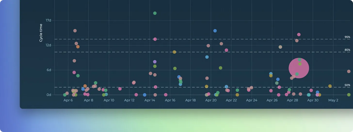
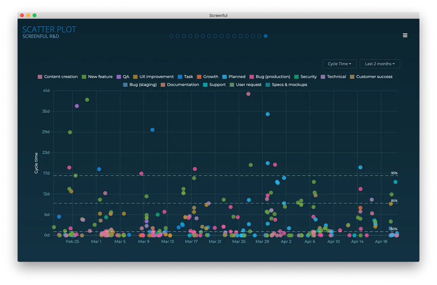
The Cycle Time Scatterplot chart is a representation of how long it takes to work on individual work items. It shows the cycle times of individual work items mapped on a timeline. We’ve made it a native dashboard screen so you no longer need to add it as a custom chart. Here’s an example chart:
Cycle time is the time it takes to complete a task after the work is started. It excludes the time spent waiting on a backlog. The horizontal axis shows the observed date range, the vertical axis shows the cycle time in days. Only completed tasks are included in this chart.
Each data point in the scatter plot corresponds to an individual task. Thе chart shows when tasks have been completed and how long it took to complete them. The horizontal axis shows the observed date range, the vertical axis shows the cycle time in days. The higher the circle, the longer it took to complete the task.
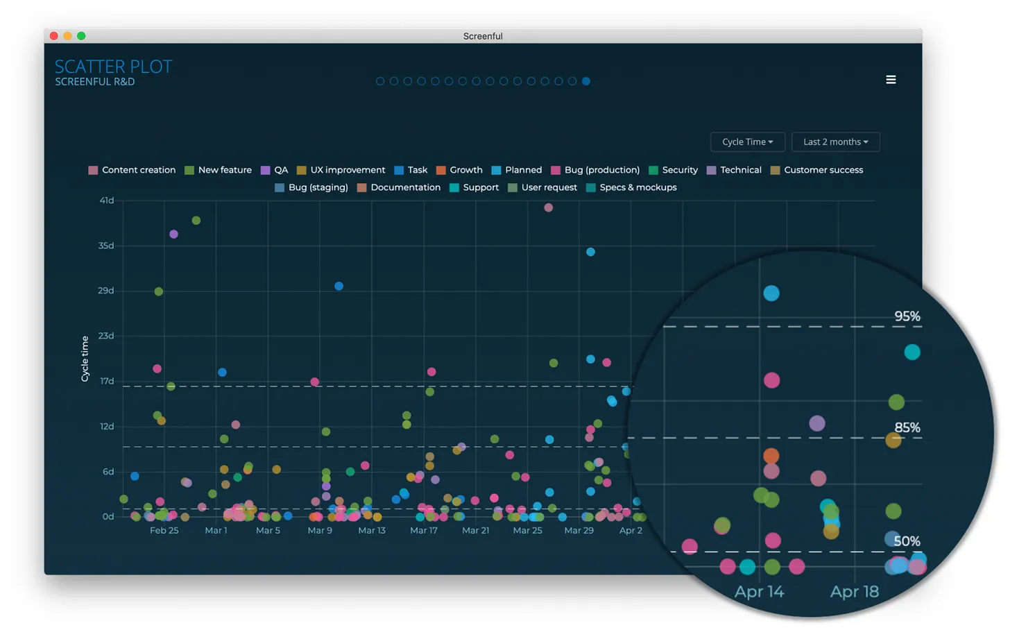
Tracking cycle times with percentiles
If you look closely at the chart, you’ll notice the three horizontal lines represent the percentiles. The default ones shown are 50th, 85th, and 90th percentile. The left edge shows the number of days, and the right edge shows how many percentages of the tasks were completed in less than that time.
What the above chart tells us is:
95% percentile is 17 days
85% percentile is 9 days
50% percentile is 1 day
What it means is that 95% of tasks were completed in less than 17 days, 85% in less than 9 days, and 50% in less than 1 day. The 50th percentile shows the median time to complete a task. It also tells us that there was a 50% probability that a given task was completed within one day, an 85% probability that it was completed within 9 days, and a 95% probability that it was completed within 17 days.
This is the kind of information that helps you to answer the question How long it takes to complete an individual task?
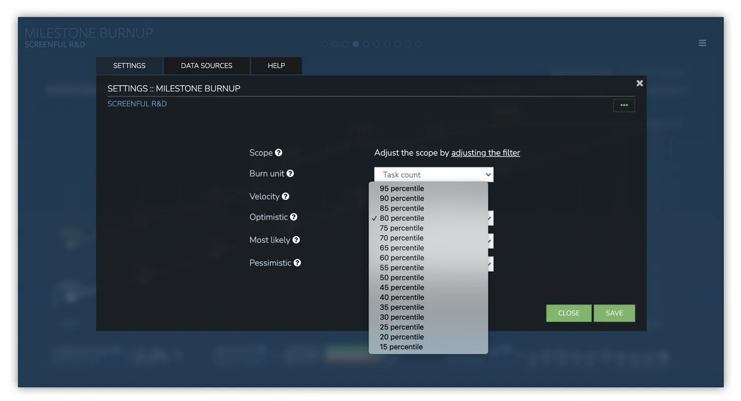
Using percentiles with the Milestone burnup chart
Knowing how long it takes to complete individual tasks is great but it doesn’t yet provide an answer to the question of when can I expect all my remaining work to be completed?
A data-driven approach looks at your historical throughput and makes a prediction based on that. That’s what our Milestone burnup chart does. What is new in this chart is that now you can configure your optimistic, most likely, and pessimistic cases using percentiles.
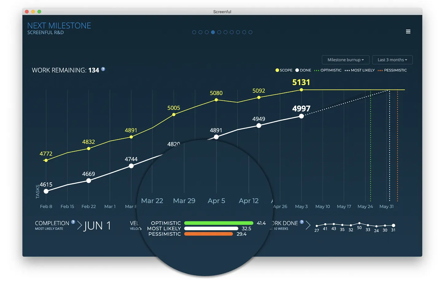
This chart looks at the weekly history of the team’s throughput and creates three scenarios based on the distribution of the work completed per week:
Optimistic: 80th percentile
Most likely: 50th percentile
Pessimistic: 20th percentile
The optimistic scenario expects that your team completes more work than in 80% of the past weeks. In the most likely scenario, your team completes the equal amount as what is the median week. In the pessimistic scenario, the team completes only as much as 20% of the past weeks.
The percentiles are configurable in the chart settings so it’s up to you to decide what you consider optimistic or pessimistic considering your current situation.
As a project manager, the question you often hear from stakeholders is when will it be done? It’s an easy question to ask but a much harder one to answer with any level of certainty. However, your task management tool is likely to contain data that can help in answering that question. Why not use it for your benefit?
We have recently added two new tools to your tool belt that can greatly help in figuring out how long a piece of work might take, or when some scope of work is going to be finished.
The new Cycle time scatter plot screen
The Cycle Time Scatterplot chart is a representation of how long it takes to work on individual work items. It shows the cycle times of individual work items mapped on a timeline. We’ve made it a native dashboard screen so you no longer need to add it as a custom chart. Here’s an example chart:
Cycle time is the time it takes to complete a task after the work is started. It excludes the time spent waiting on a backlog. The horizontal axis shows the observed date range, the vertical axis shows the cycle time in days. Only completed tasks are included in this chart.
Each data point in the scatter plot corresponds to an individual task. Thе chart shows when tasks have been completed and how long it took to complete them. The horizontal axis shows the observed date range, the vertical axis shows the cycle time in days. The higher the circle, the longer it took to complete the task.
Tracking cycle times with percentiles
If you look closely at the chart, you’ll notice the three horizontal lines represent the percentiles. The default ones shown are 50th, 85th, and 90th percentile. The left edge shows the number of days, and the right edge shows how many percentages of the tasks were completed in less than that time.
What the above chart tells us is:
95% percentile is 17 days
85% percentile is 9 days
50% percentile is 1 day
What it means is that 95% of tasks were completed in less than 17 days, 85% in less than 9 days, and 50% in less than 1 day. The 50th percentile shows the median time to complete a task. It also tells us that there was a 50% probability that a given task was completed within one day, an 85% probability that it was completed within 9 days, and a 95% probability that it was completed within 17 days.
This is the kind of information that helps you to answer the question How long it takes to complete an individual task?
Using percentiles with the Milestone burnup chart
Knowing how long it takes to complete individual tasks is great but it doesn’t yet provide an answer to the question of when can I expect all my remaining work to be completed?
A data-driven approach looks at your historical throughput and makes a prediction based on that. That’s what our Milestone burnup chart does. What is new in this chart is that now you can configure your optimistic, most likely, and pessimistic cases using percentiles.
This chart looks at the weekly history of the team’s throughput and creates three scenarios based on the distribution of the work completed per week:
Optimistic: 80th percentile
Most likely: 50th percentile
Pessimistic: 20th percentile
The optimistic scenario expects that your team completes more work than in 80% of the past weeks. In the most likely scenario, your team completes the equal amount as what is the median week. In the pessimistic scenario, the team completes only as much as 20% of the past weeks.
The percentiles are configurable in the chart settings so it’s up to you to decide what you consider optimistic or pessimistic considering your current situation.
That’s it for this release. As always, we’d love to hear from you. Please do not hesitate to contact us anytime if you have questions or feedback.
To give it a try with your own data, sign up for a free 14-day trial
Also, check out recent product updates and follow us on Twitter or Facebook.