Introducing Stacked Area Chart, Cumulative Flow Diagram, dark mode for charts, and more! 📈🌒
Introducing Stacked Area Chart, Cumulative Flow Diagram, dark mode for charts, and more! 📈🌒
Oct 30, 2021

In this October release, we want to highlight some of the recently introduced improvements to our custom charts. We’ve added two new charts to the growing library of our custom charts and made several improvements to the existing ones. These improvements are largely based on the feedback we’ve got from our users and we’d like to thank you all for your ideas and suggestions. Keep them coming 💪
Stacked Area Chart
We’ve had Stacked Area charts in our dashboards for a while already but now you can also create them as custom charts. They are great for visualizing trends of multiple grouped metrics such as task completions or cycle times per assignee, label, or any of your custom fields. Here’s an example chart:
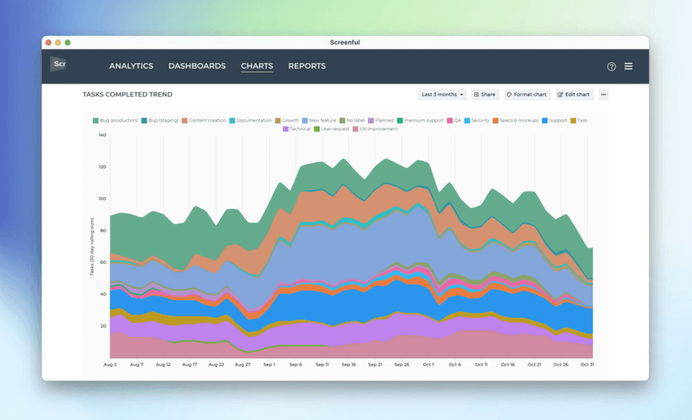
In a stacked area chart, each area of color represents one part of the whole. As the name suggests, the parts are stacked up. The height of each colored stack represents the proportion of that grouped item at a given point in time. The colored areas are growing or shrinking as they move along the time axis, allowing you to see which color areas take up the largest and smallest slices of the overall total.
Cumulative Flow Diagram
The Cumulative Flow Diagram shows the amount of work in different stages of your workflow during the lifetime of your selected work scope. It allows to see the if work is piling up, or causing bottlenecks. Here’s an example chart:
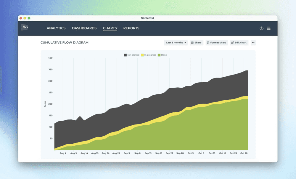
The chart shows the amount of work completed vs work still in other states. Each colored area represents the number of tasks (or story points) in a specific workflow state at a given moment. The horizontal axis indicates time, and the vertical axis indicates the number of tasks. You can identify bottlenecks by looking at the widening areas in the chart. Here’s how to read this chart:
The chart is trending upwards because the done state (green color) is accumulating tasks over time. This is desirable. If it were flat, it would mean that the progress has stalled.
The other colored areas have roughly the same amount of work from day to day. This means that the throughput is stable and new tasks are entering the workflow in parallel to those that are leaving it.
The Cumulative Flow Diagram allows teams to visualize their effort and project progress, and to see if work is piling up or causing bottlenecks. It is an essential tool for assessing the health of a Kanban process.
Track multiple custom fields in a single chart
What if you have multiple custom fields and you want to have all of them in one chart? Let’s assume you want to compare the values of three different number fields over time. You can do that by adding them one by one.
In this example, we’ll use the multi-bar chart. Pick one of the custom fields as the unit for the chart. After that, use the Add custom field button to add the other two fields.
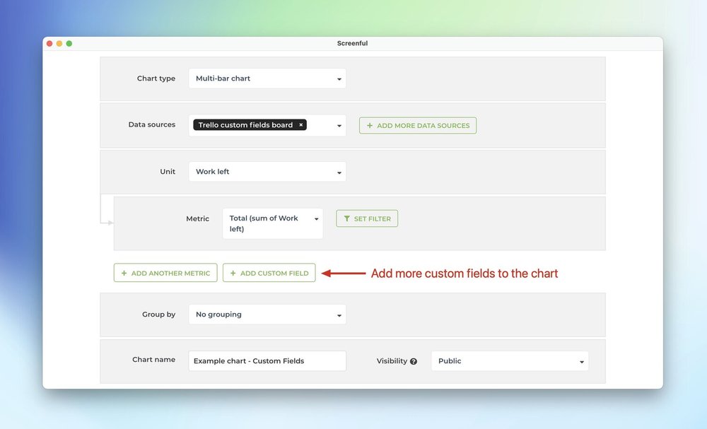
Here’s the final chart with three custom units, grouped by week:
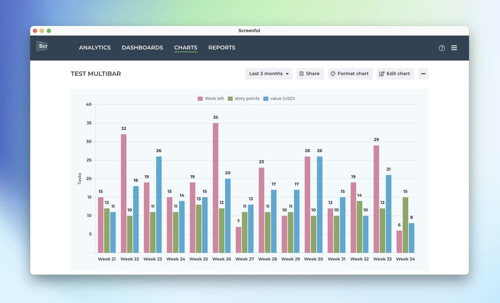
The unit shown on the left axis will be the field that was selected first. You can rename the unit to whatever you like it to be in the Chart format section.
See the whole journey of a task in the Task List chart
If you add any of the timing metrics to the Task List chart, you can now get more details of the whole journey of that task through your workflow. We have added a question mark after each timing column. When you hover a mouse over the question mark, a tooltip opens showing all the steps that the task took during its journey through the workflow, and how long it stayed in each individual workflow state:
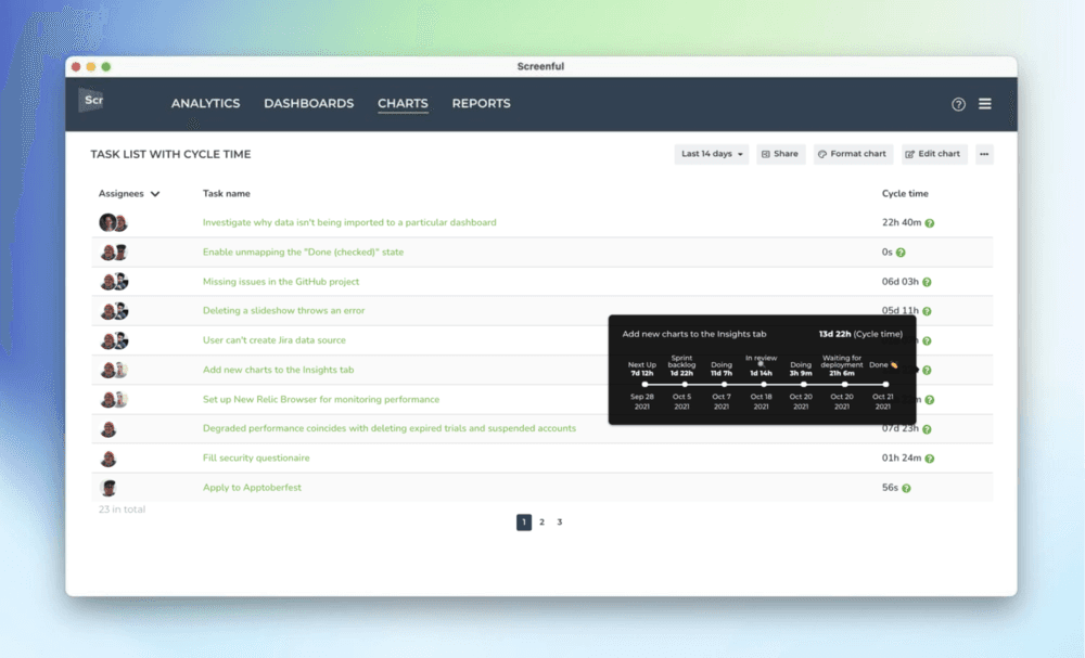
These tooltips are now available when you add any timing metric as a column in in a Task List chart.
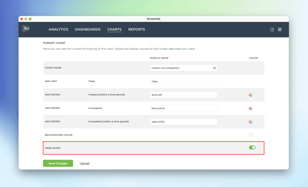
Dark mode in custom charts
Last but not least, we’ve introduced a dark mode for the custom charts. When you select Format chart for any custom chart, you’ll notice the new option Dark mode:
When you enable it, the chart switches to using a dark background:
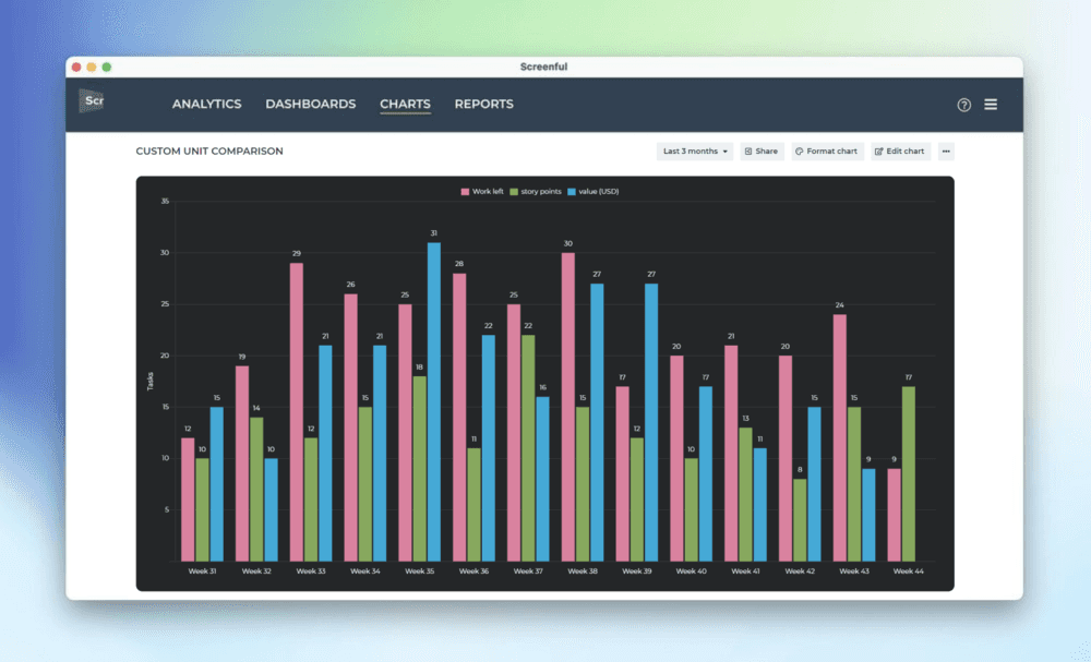
Now you can have matching colors when embedding charts to a page with a dark background!
In this October release, we want to highlight some of the recently introduced improvements to our custom charts. We’ve added two new charts to the growing library of our custom charts and made several improvements to the existing ones. These improvements are largely based on the feedback we’ve got from our users and we’d like to thank you all for your ideas and suggestions. Keep them coming 💪
Stacked Area Chart
We’ve had Stacked Area charts in our dashboards for a while already but now you can also create them as custom charts. They are great for visualizing trends of multiple grouped metrics such as task completions or cycle times per assignee, label, or any of your custom fields. Here’s an example chart:
In a stacked area chart, each area of color represents one part of the whole. As the name suggests, the parts are stacked up. The height of each colored stack represents the proportion of that grouped item at a given point in time. The colored areas are growing or shrinking as they move along the time axis, allowing you to see which color areas take up the largest and smallest slices of the overall total.
Cumulative Flow Diagram
The Cumulative Flow Diagram shows the amount of work in different stages of your workflow during the lifetime of your selected work scope. It allows to see the if work is piling up, or causing bottlenecks. Here’s an example chart:
The chart shows the amount of work completed vs work still in other states. Each colored area represents the number of tasks (or story points) in a specific workflow state at a given moment. The horizontal axis indicates time, and the vertical axis indicates the number of tasks. You can identify bottlenecks by looking at the widening areas in the chart. Here’s how to read this chart:
The chart is trending upwards because the done state (green color) is accumulating tasks over time. This is desirable. If it were flat, it would mean that the progress has stalled.
The other colored areas have roughly the same amount of work from day to day. This means that the throughput is stable and new tasks are entering the workflow in parallel to those that are leaving it.
The Cumulative Flow Diagram allows teams to visualize their effort and project progress, and to see if work is piling up or causing bottlenecks. It is an essential tool for assessing the health of a Kanban process.
Track multiple custom fields in a single chart
What if you have multiple custom fields and you want to have all of them in one chart? Let’s assume you want to compare the values of three different number fields over time. You can do that by adding them one by one.
In this example, we’ll use the multi-bar chart. Pick one of the custom fields as the unit for the chart. After that, use the Add custom field button to add the other two fields.
Here’s the final chart with three custom units, grouped by week:
The unit shown on the left axis will be the field that was selected first. You can rename the unit to whatever you like it to be in the Chart format section.
See the whole journey of a task in the Task List chart
If you add any of the timing metrics to the Task List chart, you can now get more details of the whole journey of that task through your workflow. We have added a question mark after each timing column. When you hover a mouse over the question mark, a tooltip opens showing all the steps that the task took during its journey through the workflow, and how long it stayed in each individual workflow state:
These tooltips are now available when you add any timing metric as a column in in a Task List chart.
Dark mode in custom charts
Last but not least, we’ve introduced a dark mode for the custom charts. When you select Format chart for any custom chart, you’ll notice the new option Dark mode:
When you enable it, the chart switches to using a dark background:
Now you can have matching colors when embedding charts to a page with a dark background!
That’s it for this release. As always, we’d love to hear from you. Please do not hesitate to contact us anytime if you have questions or feedback.
To give it a try with your own data, sign up for a free 14-day trial
Also, check out recent product updates and follow us on Twitter or Facebook.