
Create advanced charts using Asana custom fields
Feb 7, 2025
Custom fields allow extending Asana's standard fields with your own fields. A typical use case is to add a number field for work estimate for the task (e.g. in hours or story points) but it doesn't have to stop there as you can add multiple fields to capture different types of information.
There are several custom field types in Asana, including Number, Date, Single-select, Multi-select, Text, Formula, and Text. There is also the native time tracking field Actual time. Read on to learn how to create charts using data in your Asana custom fields.
Contents:
Integrating Screenful with Asana
Screenful provides multidimensional analytics of the data in Asana. You can slice & dice your data with 15 different chart types, and click-through to drill into details.
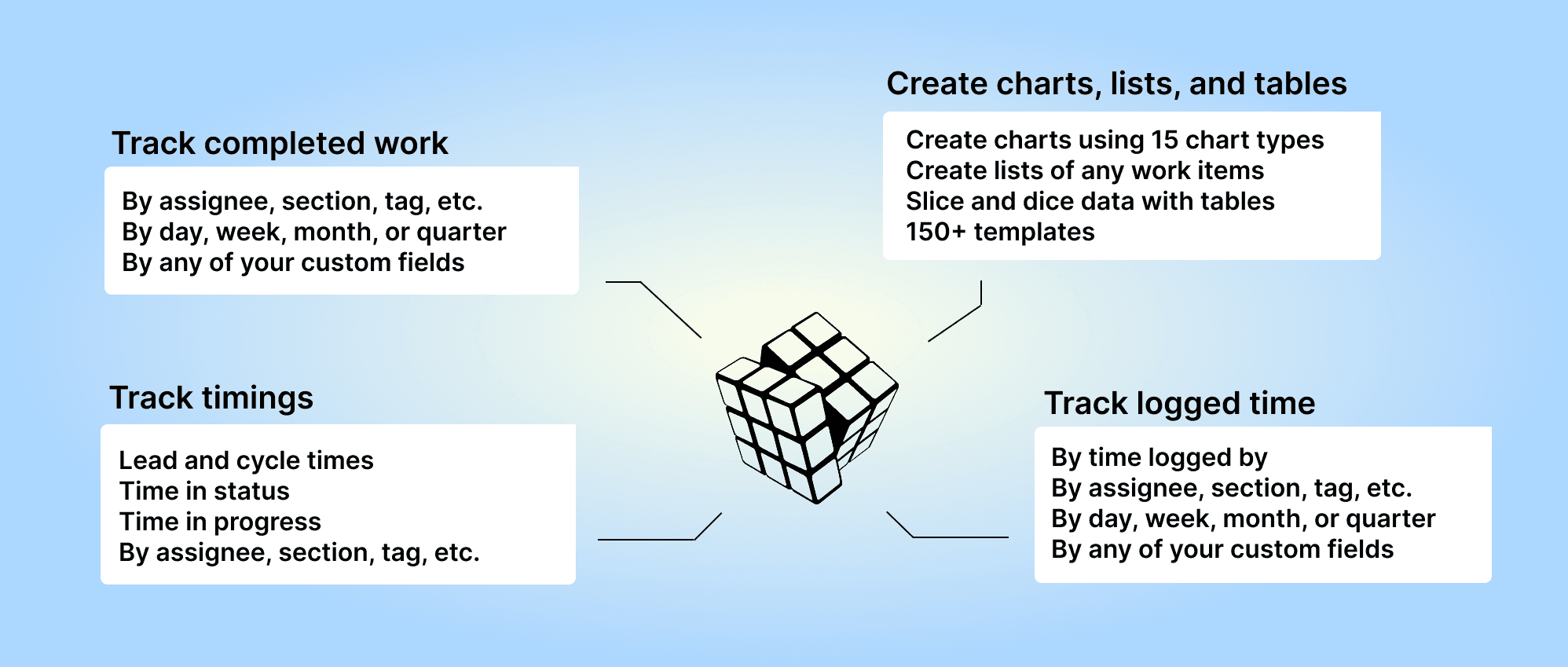
Analytics & Reports by Screenful is available on Asana Apps and Integrations.
You need to authorize Screenful to access the Asana API to get started. Once done, you will be shown a list of projects:
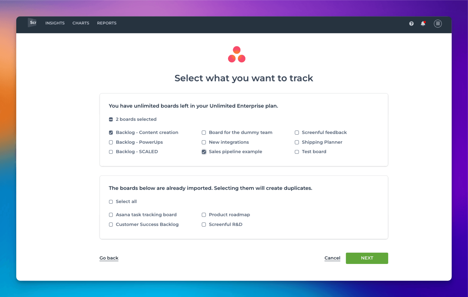
Select one or more projects to be imported to Screenful. After that, you can start creating charts and reports using data from Asana.
For more information, see the guide for setting up Screenful with Asana.
Creating charts using Asana Number fields
Your Asana Number fields can be used as a unit of a chart. For example, if you have assigned estimates for tasks (e.g. hours or story points) using a custom numeric field, you can select it as a unit for a chart.

Screenful will automatically make all numeric fields available in the Unit menu in the chart editor.
What if you have multiple number fields and want to have all of them in one chart? Let’s assume you want to compare the values of three different number fields over time. You can do that by adding them to a multibar chart. First, pick one of the custom fields as the unit for the chart. After that, use the Add custom field button to add the other two fields:

Here’s the final chart with three different metrics grouped by week:

Creating charts using Asana Select fields
By default, your Asana Single-select or Multi-select fields are available for grouping and filtering. When you are creating a chart that has a grouping option, you'll find all your select menus in the Group by menu:

When you want to filter the chart content, you'll find your select menus in the Filter window:

Here's a Stacked bar chart stacked by a single select field Component:

By default, your Single-select and Multi-select fields are available for grouping and filtering. If you want to group & filter by Text fields, you can adjust the default field mapping.
Creating charts using Asana Date field
All your Asana Date fields are automatically imported and made available for charts. Let's assume you have a custom date field, Date completed, on your board. By selecting Date completed as the metric for the chart, you can create a chart that shows how many items have the date in the past.

That will work the same way as if you had selected Completed (within date range), except that it will only look at the value in the date field. If the date is in the past, it is considered completed, regardless of the workflow state of that item.
Here's the resulting chart:

You can also create Task lists and filter them by custom date columns. Here's an example configuration for a Task list:

When you pick a date column from the menu, the resulting task list contains items that have the date within the specified date range:

You can track any number field by any date field. You can pick a number field from the Unit menu:

In this example, I have selected Deal value as the unit and by Completion date as the metric for the chart. Here's the resulting chart:

The chart shows the deal value generated during the selected period based on the Completion date column.
Creating charts using Asana Formula field
When creating a chart, formula fields are selectable in the unit menu:

In this example, the unit menu contains two Number fields: Budget and Spent. There is also a formula field Remaining, that shows the difference between the budget and spent. When you select Remaining as the unit for the chart, you'll see the sum of Remaining:

When you click through the number, you'll see the individual items and how much is Remaining per each item:

Formula custom fields are automatically imported and treated according to their type. If the value is a number, it can be used as a unit like the Number fields. If the value is a date, it can be used similarly to the Date fields.
Creating charts using Asana Actual time field
To create a chart using time tracking data, click Add new chart in the Charts tab. Select the data sources for the chart. If any of those data sources contain the Actual time field, it can be selected in the Unit menu:

When Actual time is selected as the Unit, the Metric menu contains only one option: Total (sum of Actual time). Here’s an example configuration of a line chart that shows the total amount of hours logged over time:

The Date range refers to when the hours were logged. Here’s the resulting chart:

You can create charts from your top-level tasks, subtasks, or both. You can choose between these options by setting a filter (use the filter Item type).
To see how many hours have been logged by team member by task within a time period, select Actual time (within date range) from the menu:

Selecting it reveals a date range menu that allows you to narrow the results to tasks with time logged within the selected period.

Now the Actual time and Actual time (Time logged by) show the total time logged to tasks within the specified date range. You can use the filter feature to narrow the list to any subset of tasks.
Let us know if you have questions or feedback by contacting hello@screenful.com. To stay on the loop, read our blog, or follow us on LinkedIn.
