Don't like the default appearance of a chart? We've got you covered since you can configure almost any visual aspect of a chart such as colors, labels, and date and number formats. These adjustments can be found under the Chart settings.
Guide contents:
How to find the chart settings?
You can access the chart settings by clicking the three dots menu and selecting Chart settings:

You'll also find the same option in the chart context menu:

Renaming the text labels
When you create a custom chart, you only need to provide the name of the chart. All other labels are automatically generated based on the units and metrics selected for the chart. However, you don’t have to stick with the auto-generated names as you can rename them.
To rename the text labels, click Chart settings behind the three dots menu, and scroll to the bottom of the page:

In the Display names section, you’ll see a list of units and metrics selected for the chart. You'll see the given name in the input field on the right. By default, it is the name of selected unit or metric, but you can rename it to represent your data best. In this example, Tasks is renamed to Tickets, and Completed (within date range) is renamed to Work completed.
Here’s the chart with the updated names:

Configuring the quick menus
In the chart settings, you can configure a quick filter that will be shown on top of the chart. It allows adjusting the chart's content without accessing the chart editor.
In the chart settings, use the toggle to enable the quick filter:

Clicking the toggle reveals the filter options. For example, selecting Assignee from the menu creates a quick filter for the assignee shown above the chart:

When you select and assignee from the menu, the chart content is filtered accordingly. It allows quick comparisons between labels, iterations, departments, customers, or any other property you have in your data.
You can also display a date range menu at the top of the chart. Use the toggle to enable the date range menu:

Once enabled, the user can adjust the date range without having to go to the editor:

When you enable a quick filter or a date range menu, it will be present when the chart is shared with a public share link, embedded in a website, or added to a report.
Configuring date formats, number formats, and currencies
Different countries have different standard formats for numbers and dates. Under the Account settings, you can configure the date and number format to match your local standards.
The Date Format menu contains the most common date formats:

When you pick a date format, the selected format will be applied to all the charts in the account. The Number Format menu contains the most common number formats:

When you choose a number format, it will be applied to all the charts in the account.
You can specify a currency under the Chart settings if your data represents monetary values:

When a currency is selected, the associated currency symbol is shown in front of the numbers. Here’s an example line chart with the currency set to US Dollar ($) to represent the amount in USD. Both the number at the top left and the tooltip display the selected currency symbol.

The currency setting is a chart-specific feature. In the chart settings, you can specify which metrics are currencies. If your numbers represent a currency, you can make it more explicit by displaying it as the currency. The default for a numeric field is Number i.e. just a plain number, not a currency.
Adjusting the rolling window size in the line charts
When displaying data as a line chart, a sliding window is used to smooth away the daily fluctuations so that you can see the trend from the noise. The rolling window size is configurable in the chart settings:

If you select 1 day rolling window, each point in the horizontal axis displays the number of items (e.g., tasks created or tasks completed) per day. With 7 day rolling window, each point in the horizontal axis displays the sum (or average, depending on what metrics were selected) over the previous seven day period.
Here’s an example chart with 30 days rolling window. When you hover the mouse over the chart, the tooltip shows the values for the previous 30 days period.

The longer the rolling window, the less variation there is in values, creating a smoother trend line. With smaller window sizes, you can see more details, but the overall trend may get distorted by the daily fluctuations.
Configuring summaries in tables and lists
The Table chart aggregates the task data into sums, averages, and other statistics. Each row in a table chart is a segment such as label, epic, assignee, or a project. The Task list chart allows for creating lists. Each row in the Task list is an item (task, ticket, issue). You can select any item properties to be shown in the columns. Both of these chart types come with a configurable summary row.
By default, the Task list chart does not include a summary. To enable the summary row, visit Chart settings (behind the three dots menu) and use the toggle Show summary row to enable the summary row for the chart:

In the Chart settings, you can configure the type of summary for each column to be either sum, average, or median. If you select None, no summary is displayed.
The summary menus are shown for each column that contains numerical or timing data.

Once you have saved the settings, the chart starts displaying a summary row at the bottom:

If you have added numerical columns to your reports, such as estimates or story points, or financial data, like budgets and costs, you can use the summary row to display the totals for the selected columns.
The Table chart also comes with a summary row that displays the sum, average, or median for each column. You can configure the summary type in the chart settings:

Here’s an example Table chart with the summary row:

Unlike in the Task list chart, the summary row in the Table chart is fixed, and there is no setting to toggle it on or off. However, you can configure each column separately. if you select None, no summary is displayed for that column.
Adjusting the colors of the chart
Go to the Chart settings and scroll to the bottom of the page. In the Display names section, you’ll see a colored circle next to each metric, displaying the currently selected color for that metric. When you click the circle, a modal window opens, allowing you to pick a color from a palette.

Notice that some charts (such as the stacked bar chart) have auto-generated colors based on the selected grouping, and therefore, the color selection is not available for them.
Switching to the dark mode
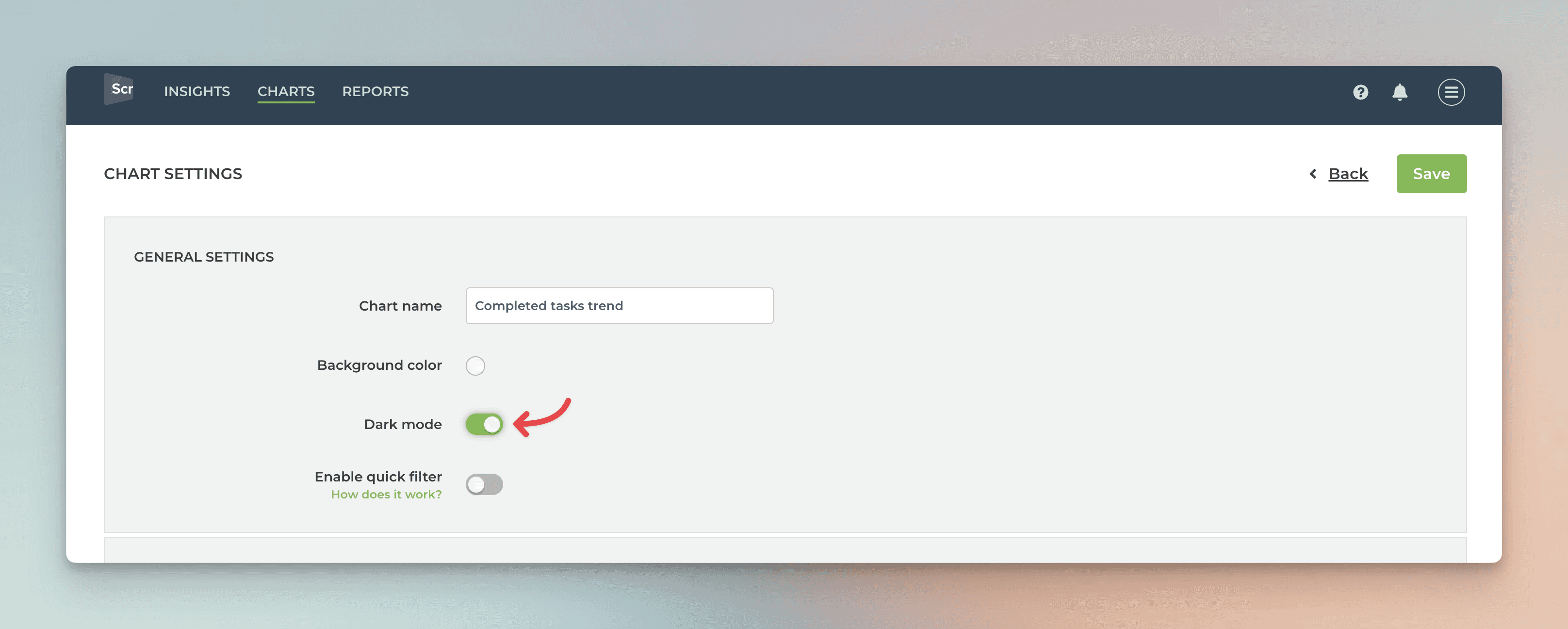
If you need to place a chart into a dark background, or you just prefer your UI as dark, we’ve got you covered! In the chart settings, you’ll find the Dark mode slider

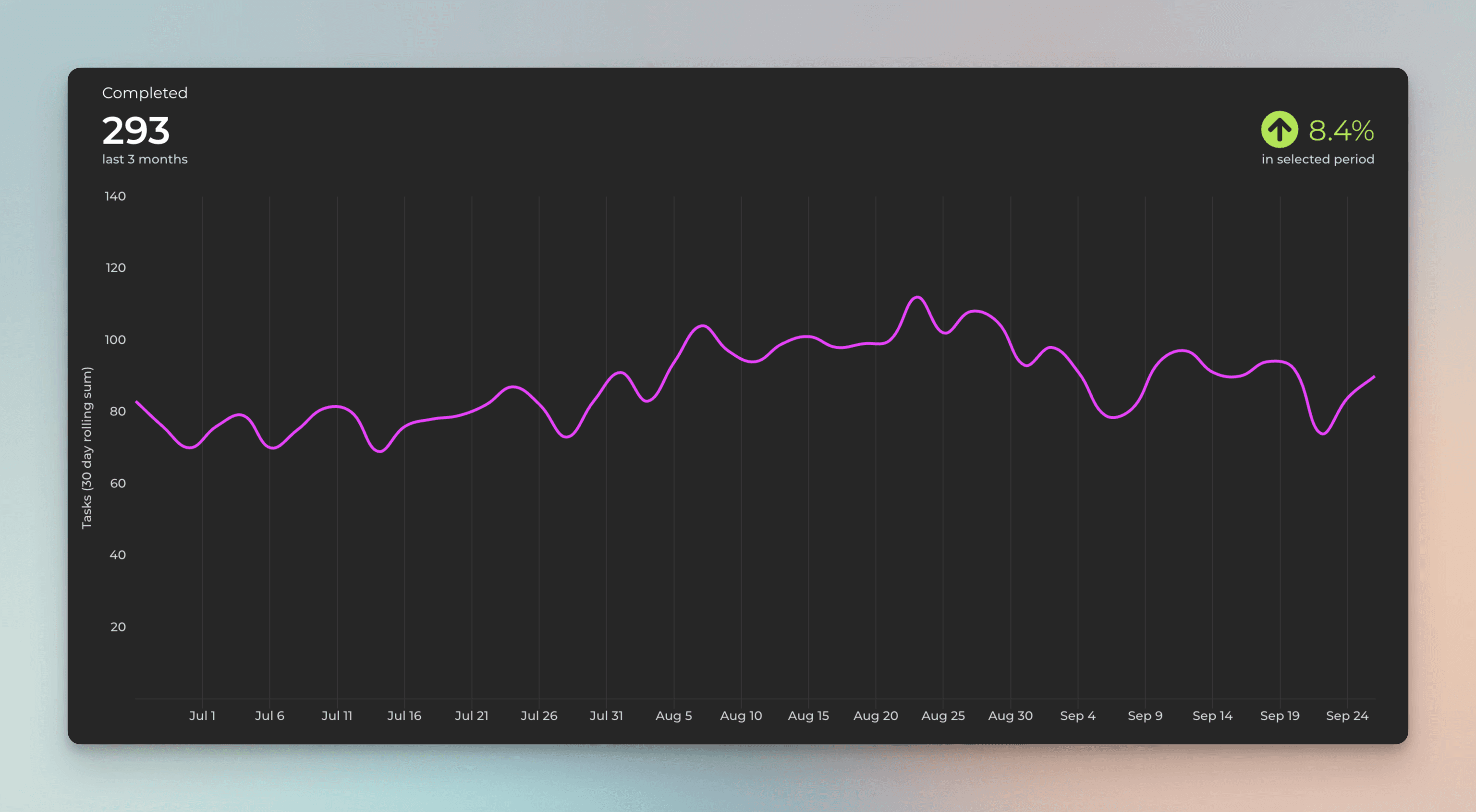
When you click the slider, the chart switches to the dark mode:

Learn more
Book a free onboarding call
Need help with setting up your charts and reports? Don't find a metric you are looking for? Book a call with our expert. We'd love to help you supercharge your reporting!


