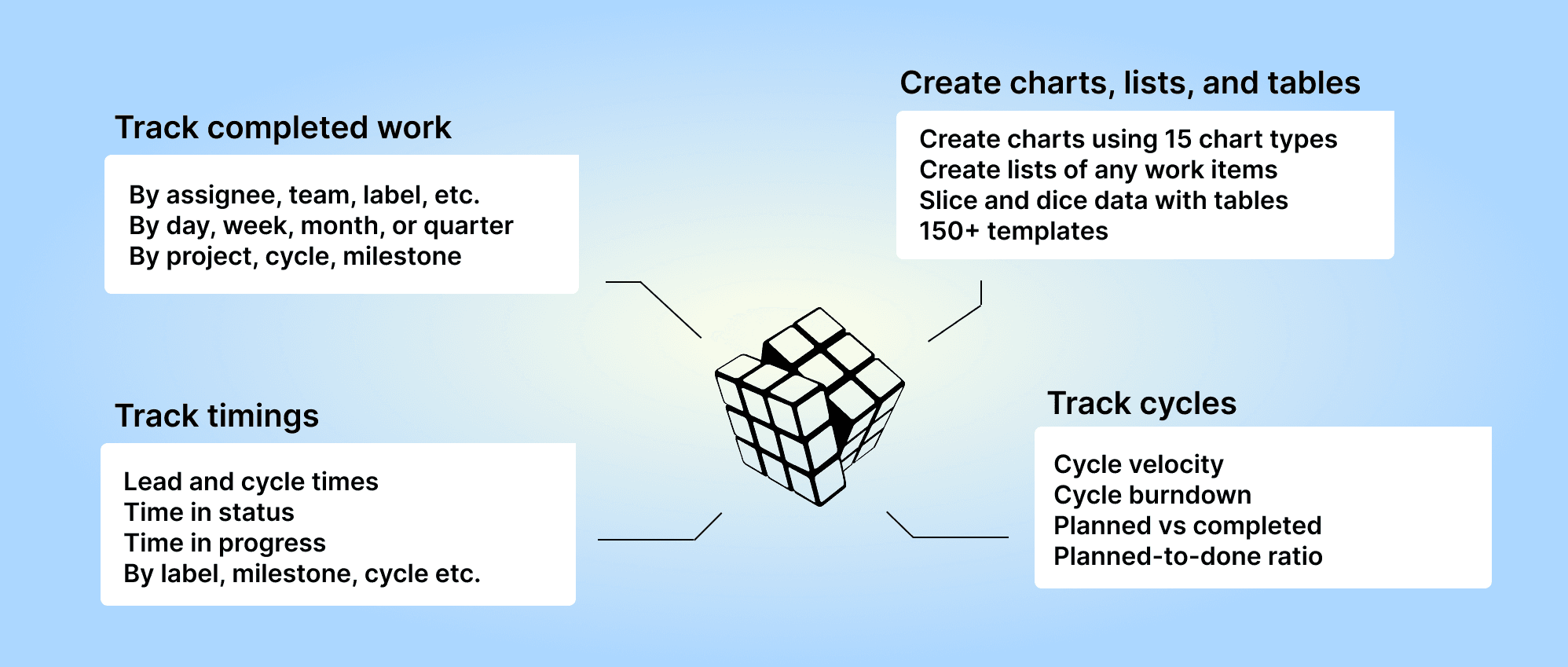
With Screenful, you can get reports of the current cycle or any of your previous cycles in Linear. You can aggregate cycle data across multiple teams into one chart. Create custom charts, including burndown charts, cumulative flow, and more.

Track Linear cycle with a burndown chart
With the burndown chart, you can quickly see whether you are on time or behind in the cycle. To create a burndown chart, navigate to the Charts tab and click 'Add new chart'. Search for "Burndown" to find the burndown template. Open the template and click Configure.
In the chart editor, you can pick Current cycle, Last completed cycle, or any of your past cycles from the Scope menu:

Complete the process by clicking Update chart. You'll see the burndown of the selected cycle:

The burndown chart shows the amount planned for the cycle and the amount completed so far. The horizontal axis represents time, and the vertical axis shows the amount of work left. The numbers represent the selected unit (task count, estimates, story points).
The chart has start date and end date. The burndown line starts from the left and progresses to the right. The goal is that the burndown reaches zero by the end of the cycle.
If you select Current cycle as the filter for the chart, it will always reflect the currently running cycle.
Group and filter by cycle
You can filter the charts by Cycle (assigned to). This will include all issues assigned to the selected cycle. Once the cycle ends, all or a subset of the issues are completed during the cycle. You can then use Cycle (Completed in) to see which tasks were completed during the cycle.

Once a cycle ends, all or a subset of the issues are completed during the cycle. You can filter the chart by Cycle (Completed in) to see which tasks were completed during the cycle.

You can group and filter charts with either Sprint (assigned to) or Sprint (Completed in), depending on whether you are interested in tracking assignments or completions during the sprint. In either case, you can pick Current sprint, Last completed sprint, or any of your past sprints to pinpoint the exact set of issues you want to include in the chart.
Cumulative flow of a cycle
The Cumulative Flow Diagram (CFD) shows the amount of work in different stages of your workflow during one or more cycles. This chart helps you to see trends and spot bottlenecks in your workflow.
Each coloured area of the chart represents the number of issues (or story points) in a specific workflow state on a given day during the cycle. The horizontal axis indicates time, and the vertical axis shows the number of tasks. You can identify bottlenecks by looking at the widening areas in the chart. Are tasks piling up in a specific workflow state or assignee?

Use the Cumulative flow chart for spotting bottlenecks during the cycle. An upward trend indicates progress towards the goal, and a flat trend indicates stalled progress.
Learn more about the Cumulative Flow chart for Linear
Track cycles across multiple Linear teams
With Screenful, you can get reports of the current cycle or any of your previous cycles. You can aggregate cycle data across multiple teams into one chart. Here's an example chart showing the number of story points completed by cycle:

You can get this chart by going to the Charts tab and searching Estimates by cycle from templates.
All charts can be filtered by any of your cycles. There are also special filters for the Current cycle, and the Last completed cycle, that help you to set the filter once and let it work for you for all your future cycles!

When your active cycle changes, the filter will automatically adjust to display the correct cycle.
Create a cycle report from a template
You can create a cycle report for Linear using a report template. Go to the Reports tab and click Add new report:
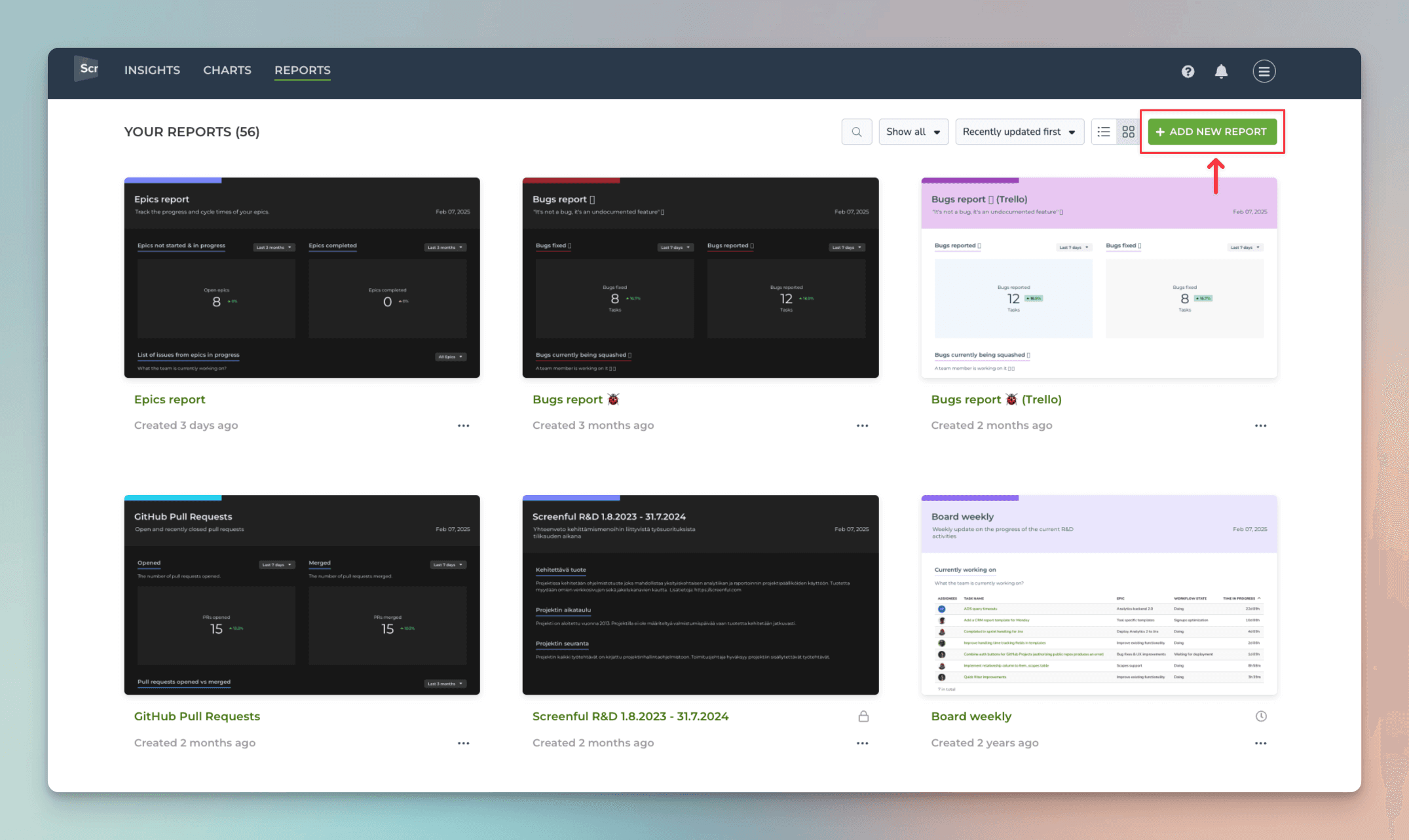
A modal opens, showing the available templates. Select Current cycle as the template (use a keyword search if needed). A report containing key metrics from the current running cycle is created:

The Current cycle report for Linear shows the status of the current cycle - what is completed or in progress, the cycle burndown, cumulative flow, and more. You can also compare the velocity across multiple cycles and how much was allocated vs completed per cycle.
About Screenful
Screenful provides AI-assisted analytics for data in Linear. You can slice & dice your data with 15 different chart types and click through to drill into details.
Analytics & Reports by Screenful is available in Linear integrations. For more information, see the guide for setting up Screenful with Linear.
Learn more
Book a free onboarding call
Need help with setting up your charts and reports? Don't find a metric you are looking for? Book a call with our expert. We'd love to help you supercharge your reporting!