In addition to labels, you can also group and filter by Linear label groups. Your label groups are automatically imported and made available for charts, so that you can pick a label group instead of selecting individual labels one by one.
See also these related resources
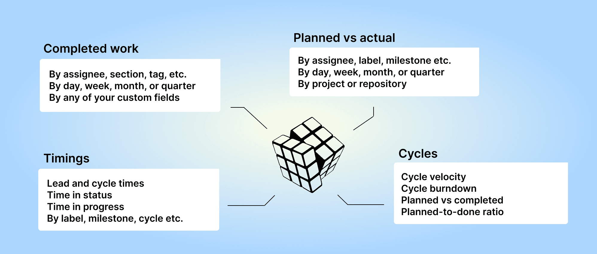
Chart editor guide
Linear units, metrics, and properties
Screenful Knowledge base
You can add label groups as columns to a Task list or group and filter by a label group. Segment a label group by another label group with a stacked bar chart. Unlock advanced reporting capabilities by custom mapping of label groups.
Filter by label groups
When you want to filter a chart by label, you can either pick labels from any of your labels by selecting Label as the filter condition:

Alternatively, you can pick a Label group and select labels within that group only:

Slice and dice your Linear data with label groups
When you create a chart that supports grouping (bar, stacked bar, multibar, pie, etc.), you find your label groups at the bottom of the Group by menu:

Picking a label group shows the data segmented by labels in the group:

You can use the Stacked bar chart to add another dimension to the chart. In addition to picking a label group from the Group by menu, you can pick another label group as the bar segment:

The resulting chart shows the number of issues (or estimates) grouped by a label group A-labels, with each bar segmented by another label group Development.

You can click through the bars to drill into individual issues behind the numbers.
Add label group value as a column in a Task list
When creating a Task list, you can add any of your label groups as columns to the chart:

That allows you to see and compare values of each label group per individual issue.
Map label groups according to their type
While Linear doesn't have typed custom fields such as number, date, etc., you can map Linear label groups to a specific type in Screenful to use them according to a specific type.
In the Data Mapping -> Custom Fields tab, you see all your label groups and how they are mapped:

Here's how the mapping affects the usage of the label groups:
By default, a label group is mapped as Group & Filter, which allows using it for grouping and filtering.
A label group that is mapped as Unit can be used as a numerical value in a chart.
A label group that is mapped as Date, can be used in date comparisons.
When a mapping is adjusted, Screenful treats the label group according to its type: numbers as units, categories for grouping, and dates for date comparison.
About Screenful
Screenful provides AI-assisted analytics for data in in Linear. You can slice & dice your data with 15 different chart types, and click through to drill into details.
Analytics & Reports by Screenful is available in Linear integrations. For more information, see the guide for setting up Screenful with Linear.
Learn more
Book a free onboarding call
Need help with setting up your charts and reports? Don't find a metric you are looking for? Book a call with our expert. We'd love to help you supercharge your reporting!