Timing metrics provide insight into how long tasks take to complete on average. They help you to identify where the delays are so that you can proactively address them proactively:
What is the average time it takes to complete a task?
Which tasks are slowing down your team?
Which steps in your workflow are fastest, which are slowest?
In addition to the completion times, you can view average durations for each workflow state separately. The charts are interactive, allowing you to drill down into individual tasks and see how long each one spent in each workflow state.
See the trend of your cycle time
The Cycle time trend shows your cycle time over the selected date range. You can filter the data according to the task type to track a specific aspect of your work, such as bugs, features, or support tickets. Timings are calculated from the completed items.

Cycle time measures the elapsed time from the start of work on an item (story, task, bug, etc.) until it is ready for delivery.
What can you do with that data? Let's consider a situation where your team is asked by business owners how long it takes to implement a certain functionality. Instead of just making a guess, the team can look at the data to see how long it has taken in the past to complete similar tasks and provide a data-driven estimate.
Another good way of visualising cycle times is by using a scatter plot, which presents data points in two dimensions according to the selected variables - cycle time and completion date.

Each circle corresponds to a completed issue. The higher the circle, the longer it took to complete it. The horizontal axis is time. That allows you to visually see the outliers. For example, you can see how many issues took more than 7 days to complete.
The dotted horizontal lines represent the percentiles. The default ones shown are 50th, 85th, and 90th percentile. The left edge shows the number of days, and the right edge shows how many percentages of the issues were completed in less than that time.

See how long each workflow step takes
While it is helpful to know your overall cycle time and its trend, you may want to dig in deeper. The Cycle time per workflow state chart shows the average cycle time per workflow step. The numbers represent the average time an issue has stayed in that specific workflow state over the selected period.
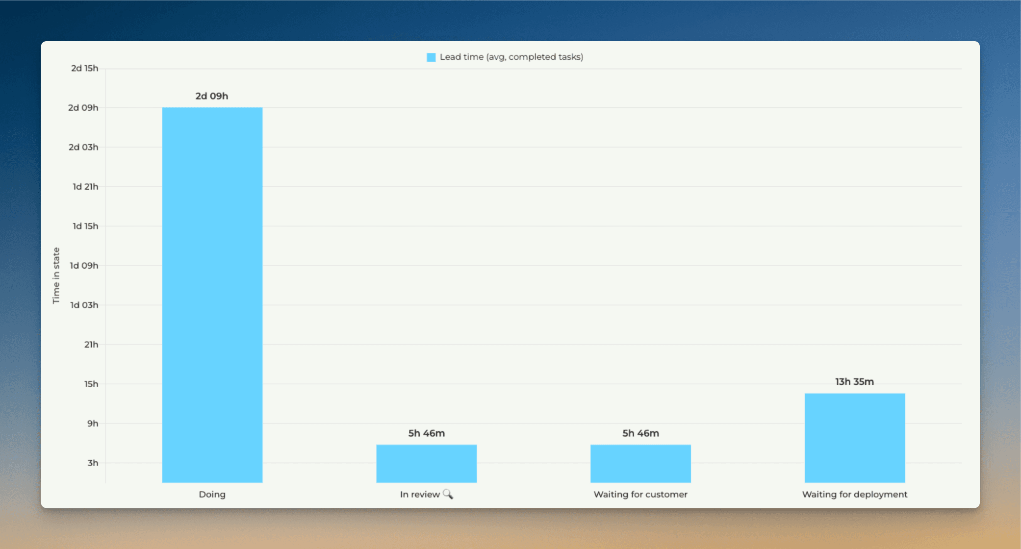
This chart tells you which steps in your workflow are the quickest, and which are the slowest. For example, if tasks spend a lot of time waiting in some specific state, removing that delay would increase your throughput and overall delivery speed.
If you want to know which tasks are the slowest ones for each workflow state, you can analyse the timings of individual tasks.
You can track the cycle time trend of any individual workflow state by setting a filter. Here's a line chart showing the trend for the In review state:
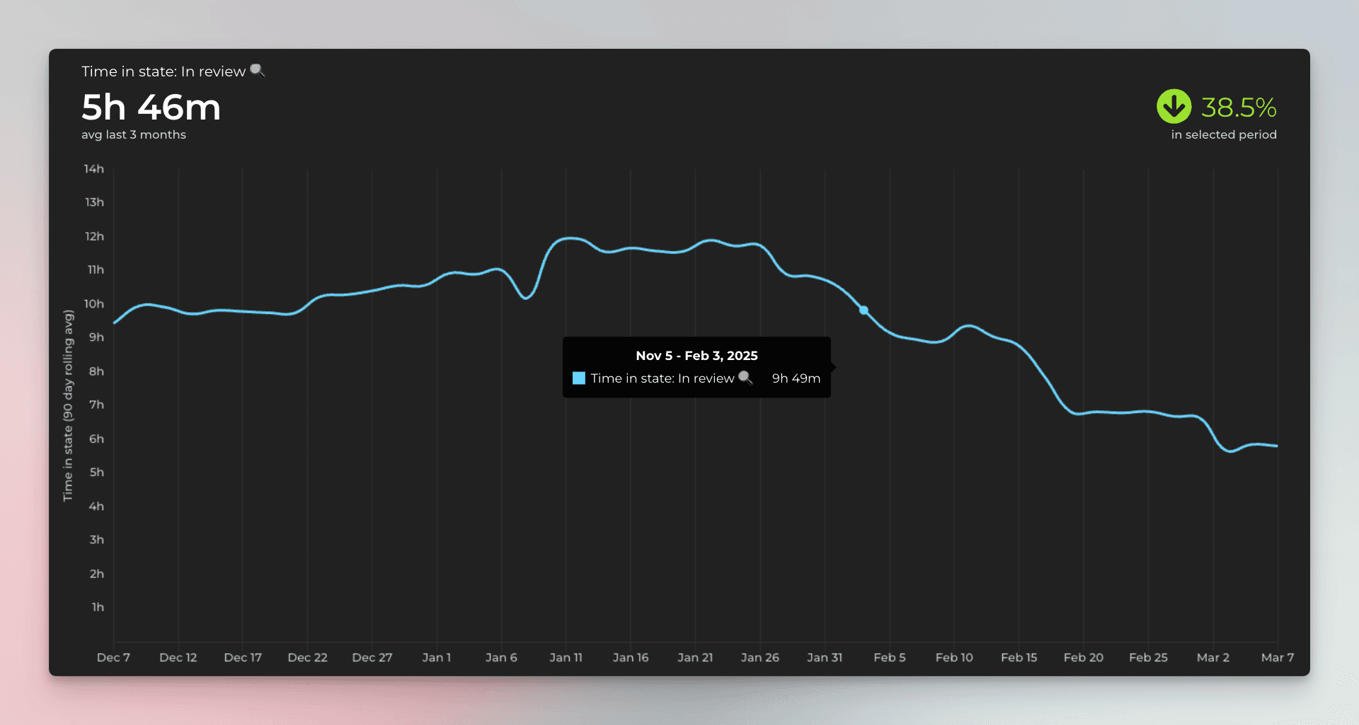
In this example, the review time has decreased by 38,5% during the selected time period, which is a positive trend. If the trend turns, and the review step starts getting slower, you might consider adding more QA resources or start looking for other ways to reduce delays in that specific step.
Filtering by timings
You can filter by timings such as total time in progress (cycle time) or time in a workflow state.
To find items that have been in progress for longer than a certain number of hours, select Time in progress from the filter menu:
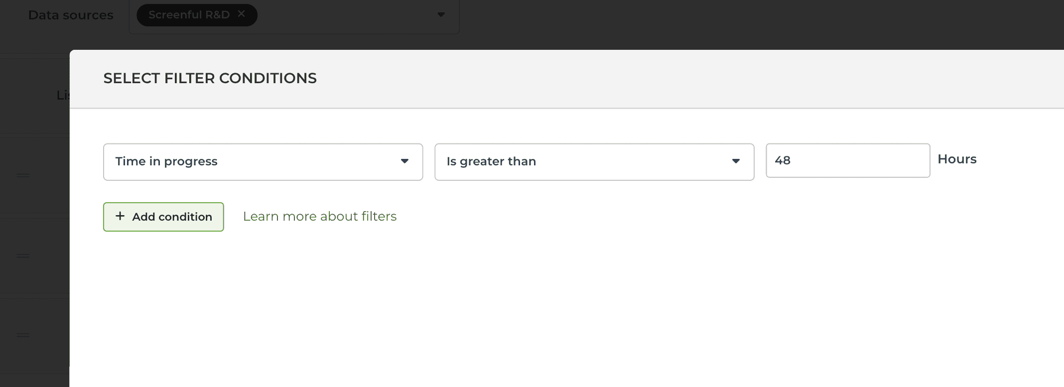
Select Is greater than from the second menu and enter the number of hours in the input field.
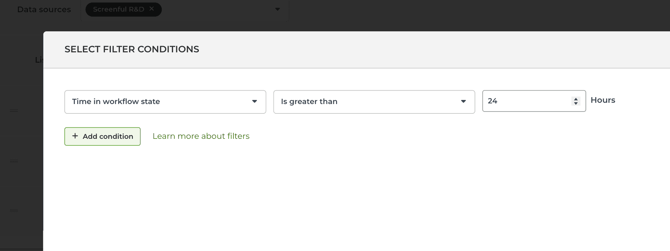
To find items that have been in their current workflow state for longer than a certain number of hours, select Time in workflow state:
To find items that have spent longer than a certain number of hours in a specified workflow state (in the past), you can set a filter like this in the Scatter plot chart:
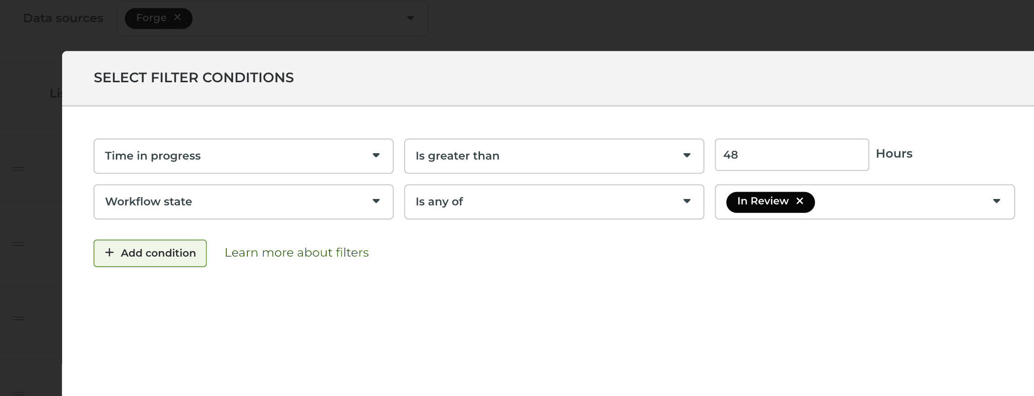
Setting a filter to both Time in progress and Workflow state includes all items that have spent more than 48 hours in the In review state.
Learn more
Book a free onboarding call
Need help with setting up your charts and reports? Don't find a metric you are looking for? Book a call with our expert. We'd love to help you supercharge your reporting!