The timing metrics help you to understand how long it takes to complete a task. In this guide, we'll explore the different ways you can analyse the timings of individual tasks per individual workflow states.
Which workflow states tend to take the longest?
Which tasks are contributing to those underperforming workflow states?
There are some good ways to visualize that data and find answers to those questions. In this guide we show how to do that with a bar chart and a scatter plot chart using Screenful.
Specifically, we want to provide an answer to the question which of you tasks spent the most time in a workflow state?
Use a bar chart to segment by workflow state
To see which tasks took the longest time in some specific workflow state, you can create a bar chart in which each bar represents the average time the tasks spend in that state.
To create such a chart, go to the Charts tab and click Add new chart on the top right. A model is opened, showing the chart templates:

Scroll down to the Cycle time per workflow state chart. The chart shows the average times per workflow state for the selected date range:

In this example, the average time in In Review 🔍 was 3h 30m. You can click the bar to drill into the task level:

In the click-through list, the Cycle time column shows the time the task stayed in In Review 🔍. To see which ones took the longest to review, click the column heading to sort by that column:

In addition to a simple bar chart, you can alternatively use stacked bar charts and multi-bar charts with your timing data.
Use the Scatter plot to see the outliers
The scatter plot chart shows how long it takes to work on individual tasks. Each circle is a completed work item. The higher the circle, the longer it took to complete.

When you hover the mouse over the circle, you'll see more details:

The tooltip shows each workflow step in chronological order and how long the item spent in that specific workflow step.

The task started from the Sprint backlog and progressed from Doing to Done. For each step, the time that the task stayed in that specific state is shown above the timeline, and the date when it arrived in that state is shown below.
Here’s an example of a slightly more complex workflow:

The timeline reveals that the task has visited the same states multiple times since it has bounced from Doing back to Sprint backlog.
What if you want to know which tasks were slowest for each workflow step? You can see that by setting a filter for the workflow state.

Selecting a workflow state shows the tasks that spent the most time on that specific workflow state:

The chart is filtered so that each circle shows the amount of time an individual item spent on the selected workflow state. That allows you to see the slowest tasks per workflow state. Which tasks spent the most time waiting? Which tasks were slowest to review?
Filtering by timings
You can filter by timings such as total time in progress (cycle time) or time in a workflow state.
To find items that have been in progress for longer than a certain number of hours, select Time in progress from the filter menu:
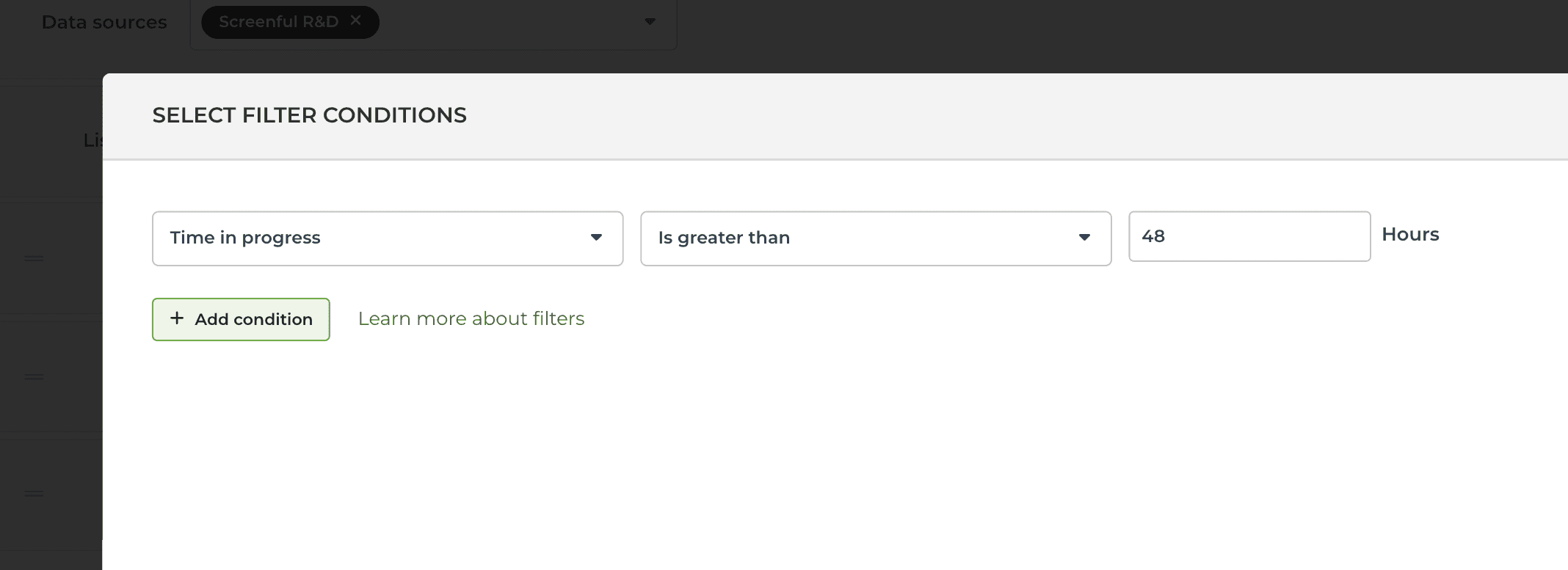
Select Is greater than from the second menu and enter the number of hours in the input field.
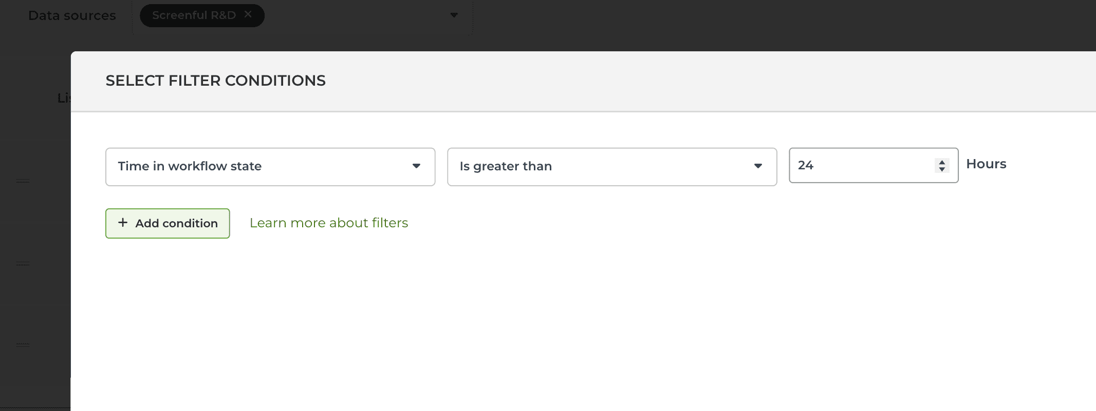
To find items that have been in their current workflow state for longer than a certain number of hours, select Time in workflow state:
To find items that have spent longer than a certain number of hours in a specified workflow state (in the past), you can set a filter like this in the Scatter plot chart:
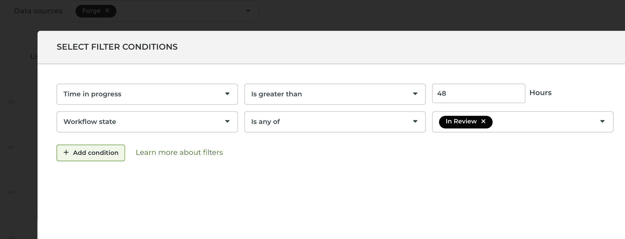
Setting a filter to both Time in progress and Workflow state includes all items that have spent more than 48 hours in the In review state.
Setting a quick filter for workflow state
In the chart settings, you can configure a quick filter that will be shown on top of the chart. It allows adjusting the chart's content without accessing the chart editor.
In the chart settings, use the toggle to enable the quick filter for the Workflow state:

With the quick filter enabled, you can quickly switch between the states.
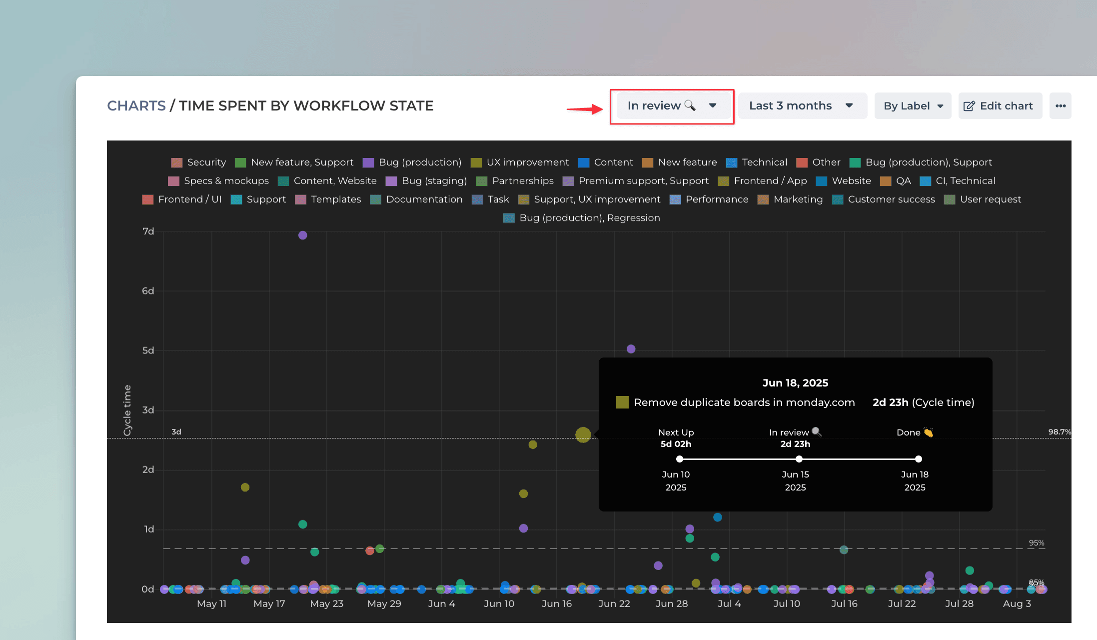
When you select a workflow state from the menu above the chart, the scatter plot shows the charts that spent the most time on the selected workflow state. For example, if you want to see which tasks spent the most time in the Review state, you can just select In review from the menu.
See also:
Learn more
Book a free onboarding call
Need help with setting up your charts and reports? Don't find a metric you are looking for? Book a call with our expert. We'd love to help you supercharge your reporting!