See how long it took to complete a task
When you open the Timing insights tab, the first thing you’ll see is the Work in Progress chart that shows the tasks that your team is working on right now. The list is sorted so that the items that have been the longest in progress are shown on top.

Hover the cursor over the question mark to see all the steps that a task has taken so far, and how long it stayed in each workflow state:

The cycle time scatter plot shows how long it took to complete a task after the work was started. Each circle corresponds to a completed task. The higher the circle, the longer it took to complete the task. That allows you to visually see the outliers.

Let’s take a closer look at that tooltip:

The task started from the Sprint backlog and progressed from Doing to Done. For each step, the time that the task stayed in that specific state is shown above the timeline, and the date when it arrived in that state is shown below.
Here’s an example of a slightly more complex workflow:

The timeline reveals that the task has visited the same states multiple times since it has bounced from Doing back to Sprint backlog. What could be the reason for that? Perhaps the requirements were unclear, and the developer couldn't proceed with the task.
Having this kind of information available helps you to see the problem areas and to take action proactively.
Which tasks took longest to review?
To see which tasks took the longest time in some specific workflow state, scroll down to the Cycle time per workflow state chart. The chart shows the average times per workflow states for the completed tasks within the selected date range:
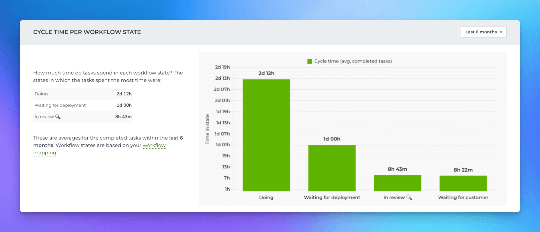
In this example, the average time in In Review 🔍 was 8h 43m. You can click the bar to drill into the task level:
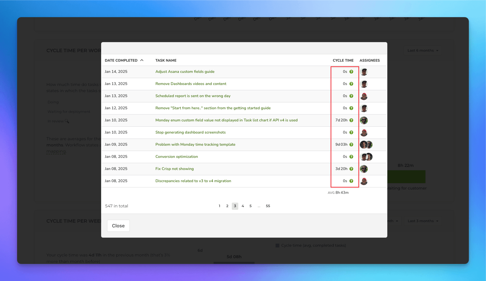
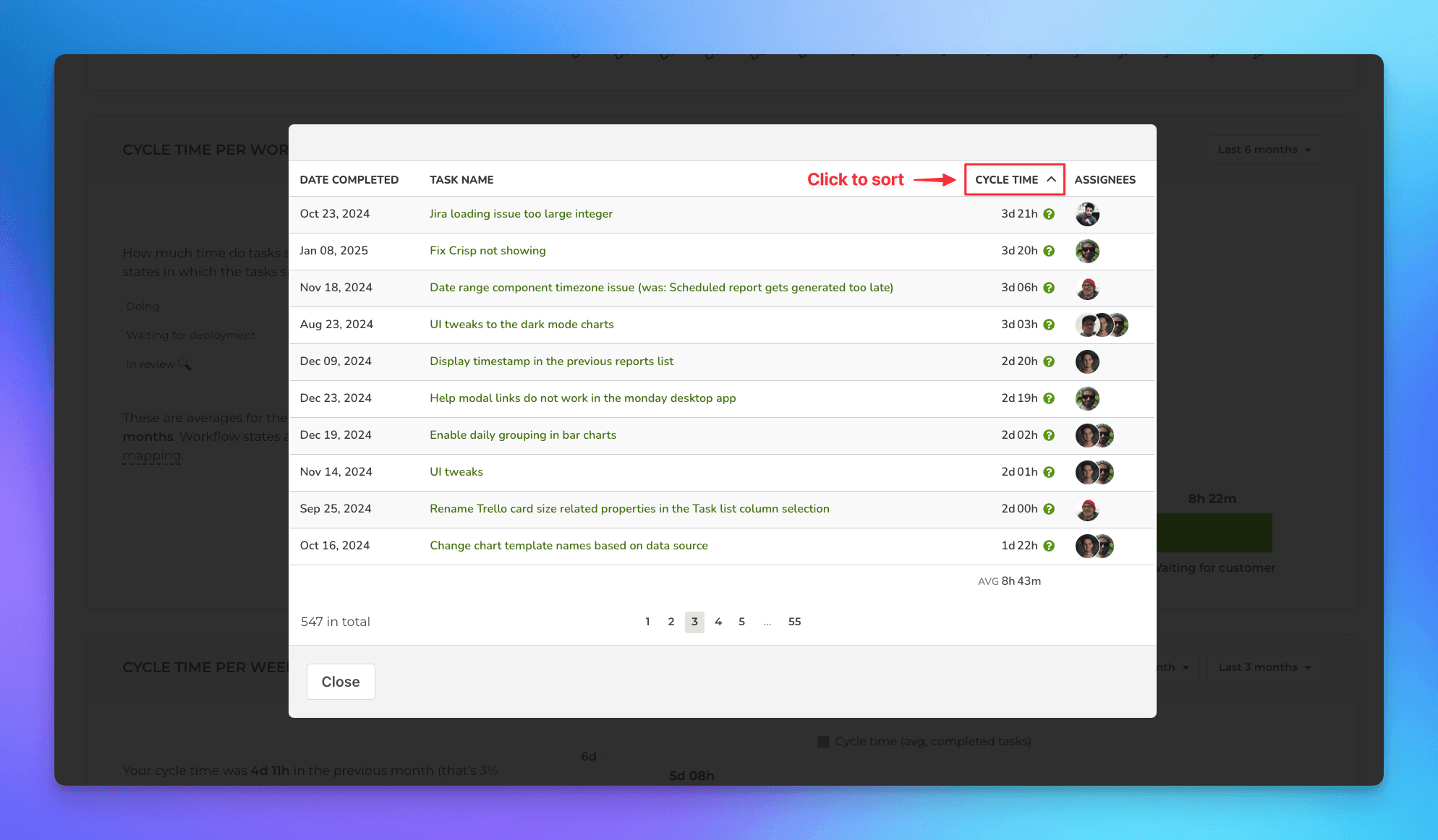
In the click-through list, the Cycle time column shows the time the task stayed in In Review 🔍. To see which ones took the longest to review, click the column heading to sort by that column:
To learn more about tracking timings per individual task per workflow state, see this guide.
Book a free onboarding call
Need help with setting up your charts and reports? Don't find a metric you are looking for? Book a call with our expert. We'd love to help you supercharge your reporting!