How to read the Forecasting chart?
The Forecasting chart provides data-driven forecasts for the completion of any work scope, such as a customer project or a new product release. It doesn’t expect you to use any specific methodology such as agile, scrum, or kanban, and it works with or without time estimates.
You can find the overall introduction of the chart on the Tour page.
What do the numbers in this chart tell me?
The chart consists of two lines, a yellow line representing the total work scope and a white line representing the work done. The middle point of the chart is the current day. Left to it is history, and to the right is the forecasted future, represented as the dotted lines. The lines may extend beyond the borders of the chart, both on the left and right. There is a date range menu on top of the chart that allows you to zoom in and out in the timeline.
As time progresses the white line approaches the yellow line helping you to gauge when the remaining work might be completed. The numbers can represent estimations, if available, or simply task counts.
The overlays on the top show the amount of work remaining, the estimated team velocity, and the estimated completion date
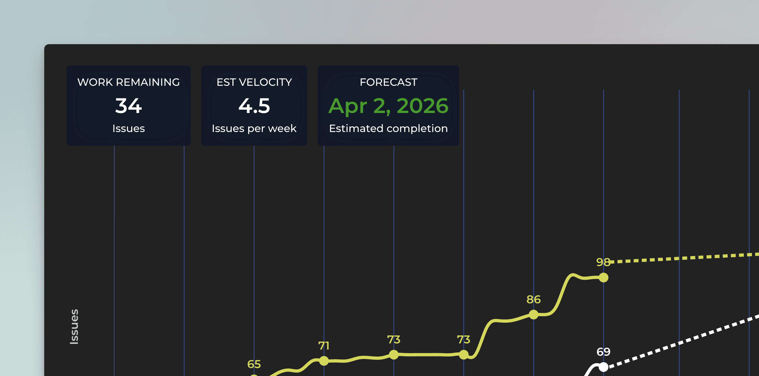
The work remaining is the difference between the work done and the total scope of work. The estimated velocity shows how much work you are expected to complete per week. The estimated completion date is when the two lines are expected to meet (if ever).
What exactly are the forecasts based on?
The forecasts are based on the historical velocity i.e. the number of work items completed within a time period. The chart looks at how much was completed in the past, and creates three scenarios: most likely, optimistic, and pessimistic. You can use the dropdown menu above the chart to switch between the scenarios.
The optimistic scenario expects that you complete more work than in 80% of the past weeks. In the most likely scenario, you complete the equal amount of work as in the median week. In the pessimistic scenario you are expected to complete only as much as in 20% of the past weeks.
The percentiles are configurable in the chart settings. it’s up to you to decide what you consider optimistic or pessimistic in your current situation. What is important is that the forecast is now based on actual data instead of guesswork.
The traditional approach to forecasting is to provide an estimate for each task in a project. Once you have the estimates in place, you can place them into a timeline and come up with an estimated delivery date. However, this is time-consuming and unreliable as estimating future work is hard. A data-driven approach looks at your historical data and uses that as a basis for the forecast.
Will this work if my tasks aren’t all the same size?
Your work items don’t have to be the same size for this approach to work. The chances are that If you take 100 tasks in the past and compare those to a sample of 100 tasks in your current backlog, they will be the same size on average. Also, they are likely to be the same size on average regardless of how you measure (e.g. in story points or by some other estimate) or simply by task count.
More important than the size of work items, is the variation in your historical throughput. The more stable the throughput, the more reliable the estimate. Completing approximately the same amount of work each week makes your process predictable!
Notice, however, that If the conditions in your team change significantly (e.g. if a team member leaves), you’ll have to adjust your scenarios (percentiles) in the chart settings to accommodate that.
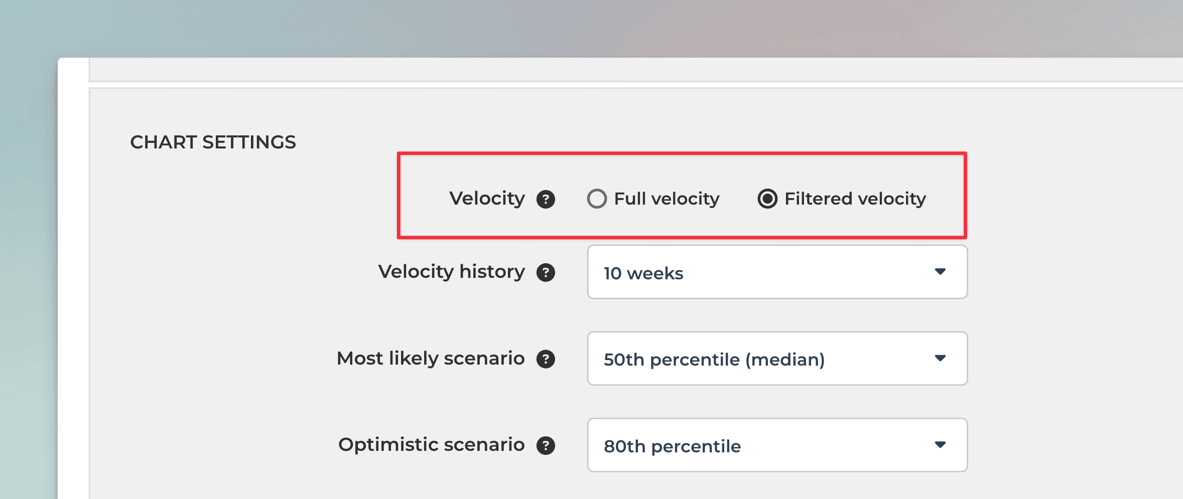
What is the difference between full velocity and filtered velocity?
Since the work scope can be narrowed down to any subset of tasks, you may want to narrow down the estimated velocity accordingly, depending on whether you expect the whole velocity to be applied to the narrowed down scope or not. For example, if you filter the forecasting chart with a certain label, the filtered velocity is the velocity of the work associated with that specific label.Here’s an example when you should use the filtered velocity:
“As a Manager, I want to see how much work is allocated for John Smith, and how long it might take him to complete all of his tasks"
In that example, user has narrowed the work scope down to an individual team member, and since that individual does the work alone, a filtered velocity should be used. Here’s an example when you should use the full velocity:
“As a Manager, I want to see how long it takes to complete all the work assigned to the next milestone"
In that example, user has filtered the scope to contain a future milestone. However, since there is no velocity available yet associated with that work scope, a full velocity can be used instead. The chart uses filtered velocity by default i.e. if you have set a filter it is applied to both work scope and the historical velocity.
What does the growth of the work scope mean?
While you can expect to complete work in the future, it is quite likely that the amount of work to be completed increases as well. The expected growth in the work scope can be taken into account in the forecast. The forecast for the work scope is based on the same principles as the forecast of the work completed i.e. percentiles. In the chart settings Total work growth, you can specify how much you expect the work scope to grow in the future.
When Assume no new work added is selected, the forecast for the total work is flat:
With this setting, the chart provides an answer to the question “how long does it take to complete the current backlog of work?”.
When 50th percentile is selected, the chart assumes that there will be new work added to the scope at the same pace as in a median week in the past. Now the forecast for the total work is trending upwards and the estimated completion date is pushed further.
It is possible that total work grows faster than the work done. For example, at the beginning of a project, new tasks may be added faster than they are completed. That is perfectly fine, even expected. In such a situation, an infinity symbol, instead of a date, is shown on the right overlay.
As your project progresses, less new work is introduced, and the amount of remaining work starts diminishing. As soon as the lines are forecasted to meet, the right overlay switches to display the date again.
What does the growth of the work scope mean?
While you can expect to complete work in the future, it is quite likely that the amount of work to be completed increases as well. The expected growth in the work scope can be taken into account in the forecast. The forecast for the work scope is based on the same principles as the forecast of the work completed i.e. percentiles. In the chart settings Total work growth, you can specify how much you expect the work scope to grow in the future.
When Assume no new work added is selected, the forecast for the total work is flat:
With this setting, the chart provides an answer to the question “how long does it take to complete the current backlog of work?”.
When 50th percentile is selected, the chart assumes that there will be new work added to the scope at the same pace as in a median week in the past. Now the forecast for the total work is trending upwards and the estimated completion date is pushed further.
It is possible that total work grows faster than the work done. For example, at the beginning of a project, new tasks may be added faster than they are completed. That is perfectly fine, even expected. In such a situation, an infinity symbol, instead of a date, is shown on the right overlay.
As your project progresses, less new work is introduced, and the amount of remaining work starts diminishing. As soon as the lines are forecasted to meet, the right overlay switches to display the date again.