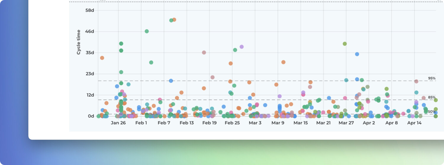
How to read the Cycle Time Scatterplot?
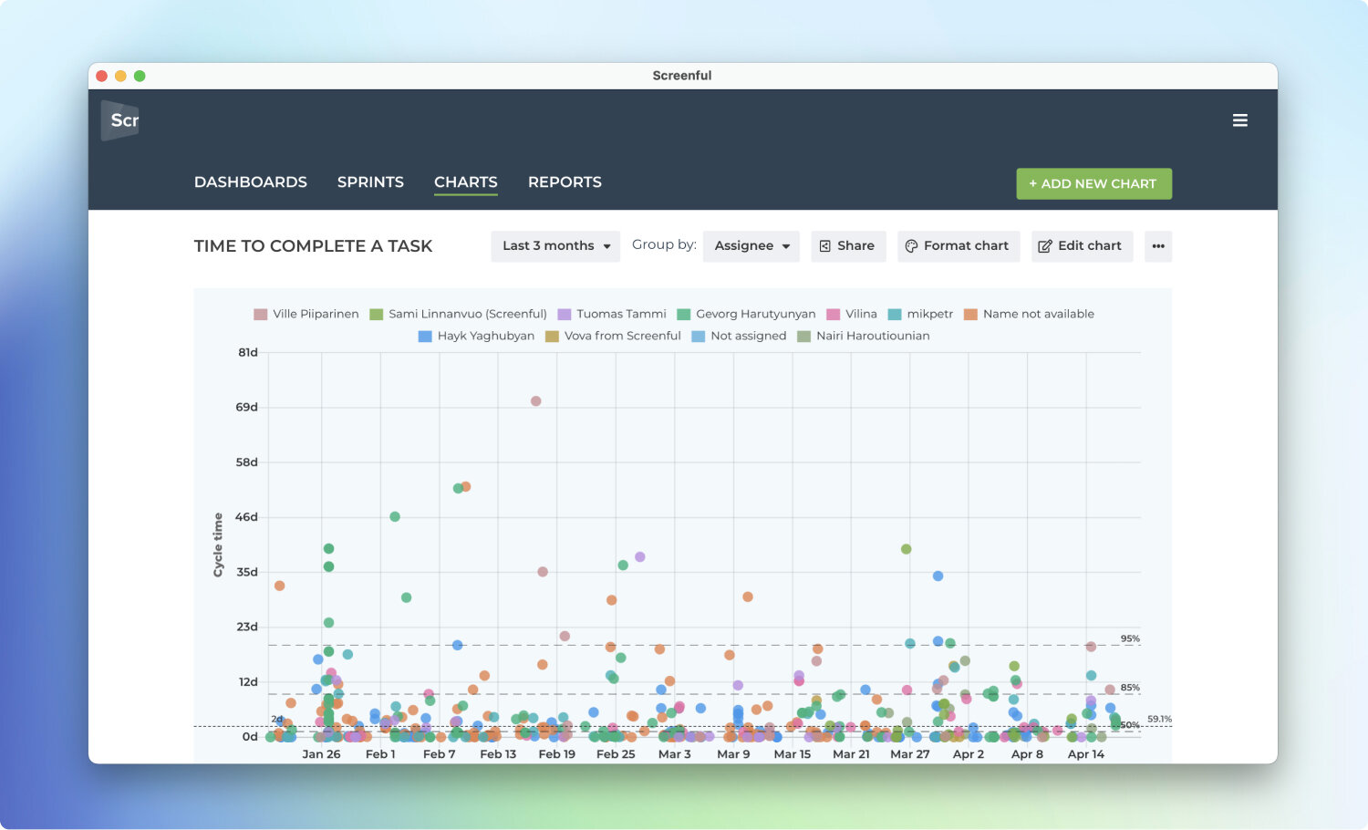
The Cycle Time Scatterplot chart is a representation of how long it takes to work on individual work items. It shows the cycle times of individual work items mapped on a timeline. Here’s an example chart (click to enlarge):
Cycle time is the time it takes to complete a task after the work is started. It excludes the time spent waiting on a backlog. The horizontal axis shows the observed date range, the vertical axis shows the cycle time in days. Only completed tasks are included in this chart.
In addition, the chart shows percentiles (dashed lines) that provide additional information about the distribution of the cycle times. The right edge of the line shows the percentile, and the left edge shows the value in days. By default, the chart displays 50, 85, and 95 percentiles. What they tell us in the above chart is:
95% percentile is 20 days
85% percentile is 9 days
50% percentile is 1 day
What it means is that 95% of tasks were completed in less than 20 days, 85% in less than 9 days, and 50% in less than 1 day. That also means that there was a 50% probability that a given task was completed within one day, 85% probability that it was completed within 9 days, and 95% probability that it was completed within 20 days.
This is exactly the kind of information that helps you to answer the question When will it be done?
Will this work if my tasks aren’t all the same size?
Your work items don’t have to be the same size for this approach to work. The chances are that If you take 100 tasks in the past and compare those to a sample of 100 tasks in your backlog, they will be the same size on average.
The variation in your historical throughput is more important than the size of individual tasks—the more stable the throughput, the more reliable the estimate. Intuitively, completing approximately the same amount of work each week makes your process more predictable.
Summary
Analyzing your historical task data can help you understand how long it takes to complete a piece of work and use it to forecast future outcomes.
A cycle time scatterplot shows how long each work item in the past took to complete. That same data can also be used to forecast the completion of bigger scopes of work, such as projects, milestones, or epics.
Looking at your team’s historical data can provide more reliable forecasts with less effort than traditional manual estimation techniques. That information can be used to answer the question: when will it be done?
When can I expect to complete the whole project?
Knowing how long it takes to complete individual tasks is great but it doesn’t yet provide an answer to the question of when can you expect all your remaining work to be completed?
If you want to know how long it will take to finish all the remaining work in the backlog, the traditional approach is to break it down into stories, and provide an estimate for each story. Once you have the estimates in place, you can count the total time and come up with an estimated delivery date.
However, this is time-consuming and unreliable as estimating future work is hard. A data-driven approach looks at your historical data and uses that as a basis for the forecast.
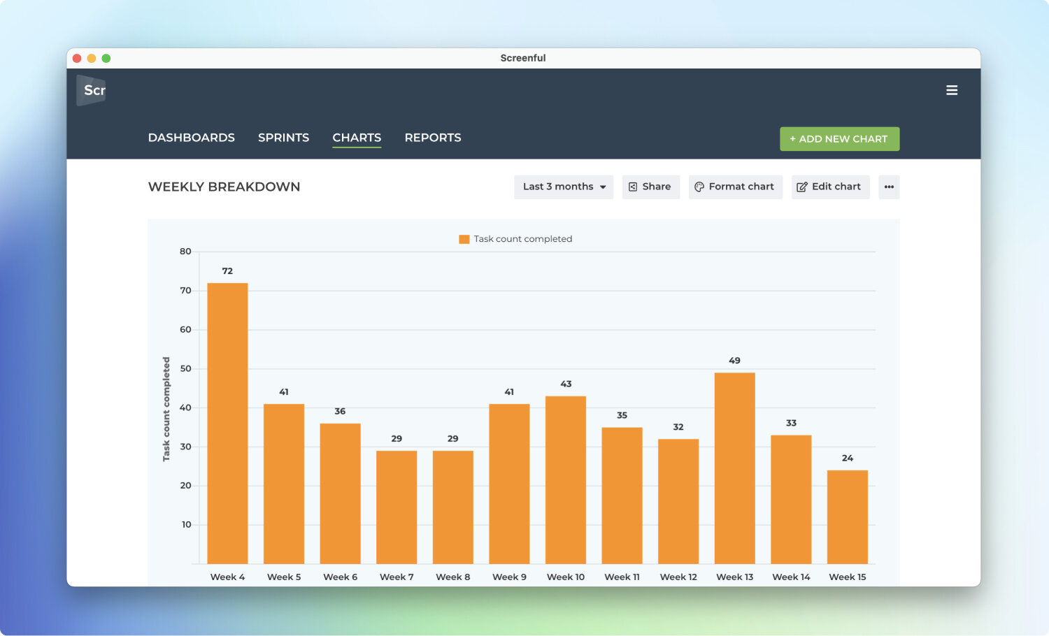
Here’s a chart which shows how much work a team has completed per week during the last 3 months:
If team composition is the same for the remainder of the project, wouldn’t it be useful to use this information for estimating how long it takes to complete the remaining work? Wouldn’t that produce a more reliable (not to mention more effortless) estimate than trying to estimate each task separately?
A data-driven approach looks at your historical throughput and makes a prediction based on that. Here’s an example of such a forecast using the Forecasting chart (click to enlarge):
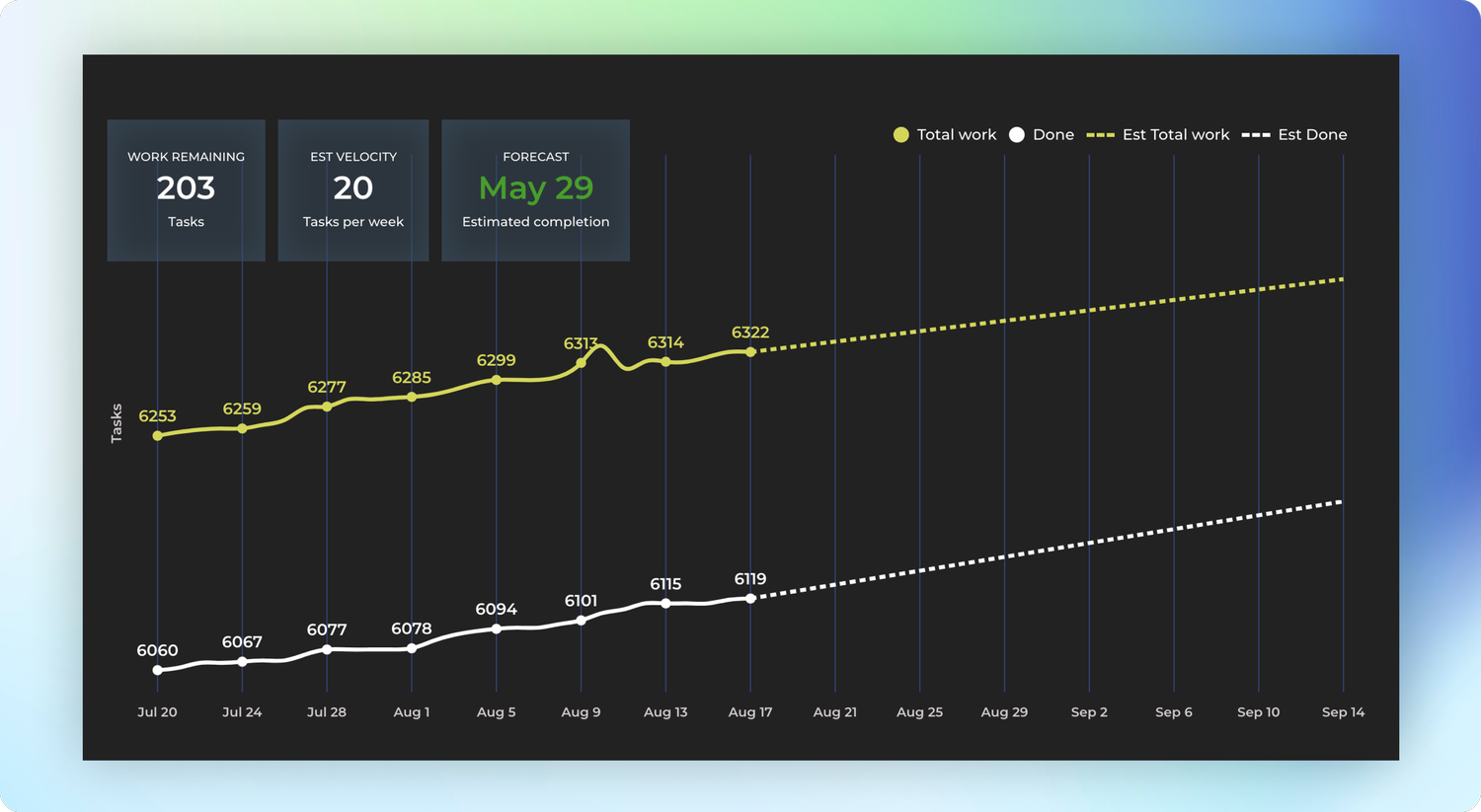
This chart looks at the weekly history of the team’s throughput and creates three scenarios based on the distribution of the work completed per week:
Optimistic: 80th percentile
Most likely: 50th percentile
Pessimistic: 20th percentile
The optimistic scenario expects that your team completes more work than in 80% of the past weeks. In the most likely scenario, your team completes the equal amount as what is the median week. In the pessimistic scenario, the team completes only as much as 20% of the past weeks.
The percentiles are configurable so it’s up to you to decide what you consider optimistic or pessimistic considering your current situation. What is important is that the forecast is now based on actual data instead of pure guesswork. More information about this chart can be found from the how-to article.