Step 1: Create the data sources
The challenge with the chart we are creating is that there is no metric that would allow tracking arrivals to any workflow state. Instead, you can select which states are mapped to Done in the workflow settings and then use the Completed (within a time period) metric to see how many items were moved to those states. However, that same metric will also provide a solution if you get creative with those mappings.
The trick is to create as many data sources as there are workflow states to track. Each data source will have different workflow mapping, thus enabling to track arrivals to different workflow states. So, let's get started by creating some data sources. In this example, I will use Jira as an example, but the same approach works for all the tools we support.
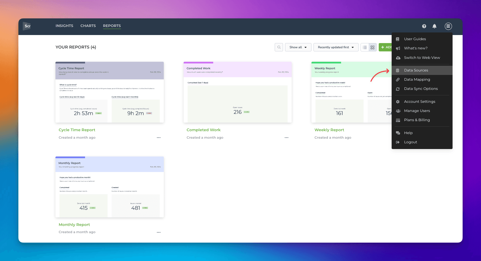
Select Data Sources from the main menu:
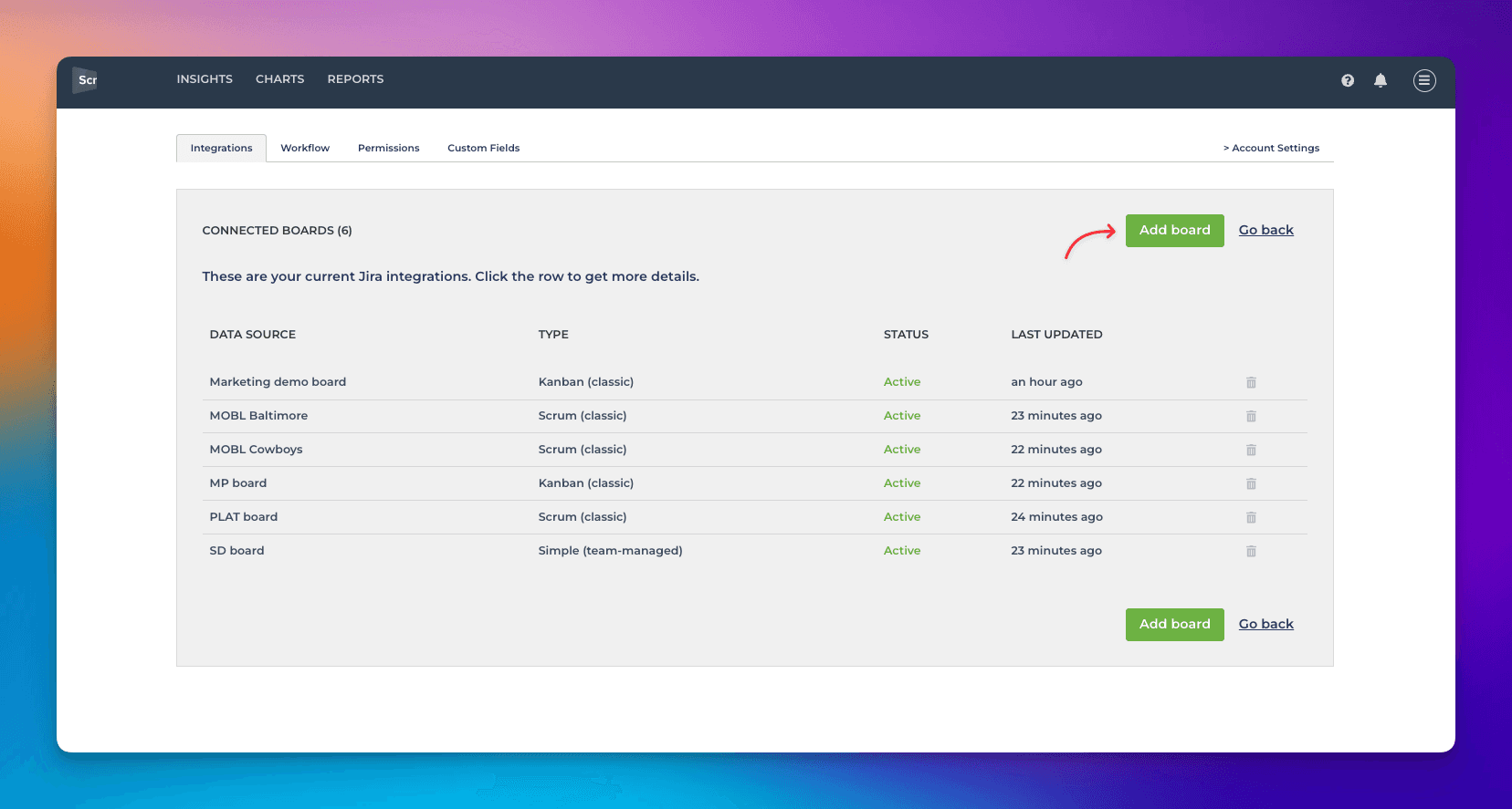
Click Add new board:
Once you have selected the board and authorized it, you are shown the suggested workflow mapping:

In this example, we have the following states in our workflow:
Backlog
Doing
In review
Waiting for deployment
Done
This will work as our main data source, which we can use in most charts to track how many items go to the Done state. We can complete the workflow creation by clicking Looks good to me.
The next step is to create another data source from the same board but with a different workflow state mapped as done. I've repeated the steps and arrived at this same view. This time, I would click Adjust mapping. The boxes are now in edit mode, and I can drag & drop items between them.
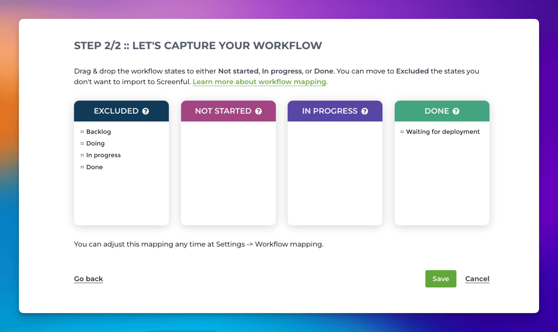
I will use this data source to track how many items moved to the Waiting for deployment step. Therefore I have mapped that state as done. Since I'm not going to use this data source for anything else, I have mapped other states to Excluded. Clicking Save will create the data source.
Repeat the steps to create one data source for each state you want to track. Map one of the states to done and others to excluded.
Step 3: Create the chart
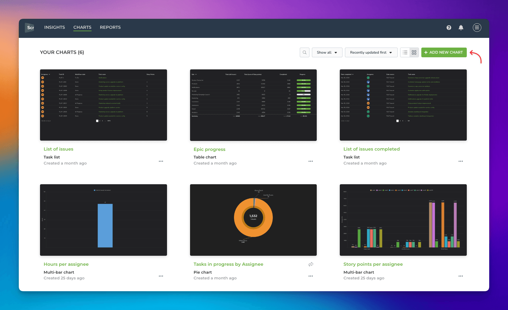
Now that we've done the preparations, we are ready to create our chart. Go to the Charts tab and click Add new chart in the top right corner:
A modal is opened, showing chart templates. Click New blank chart to open the editor.
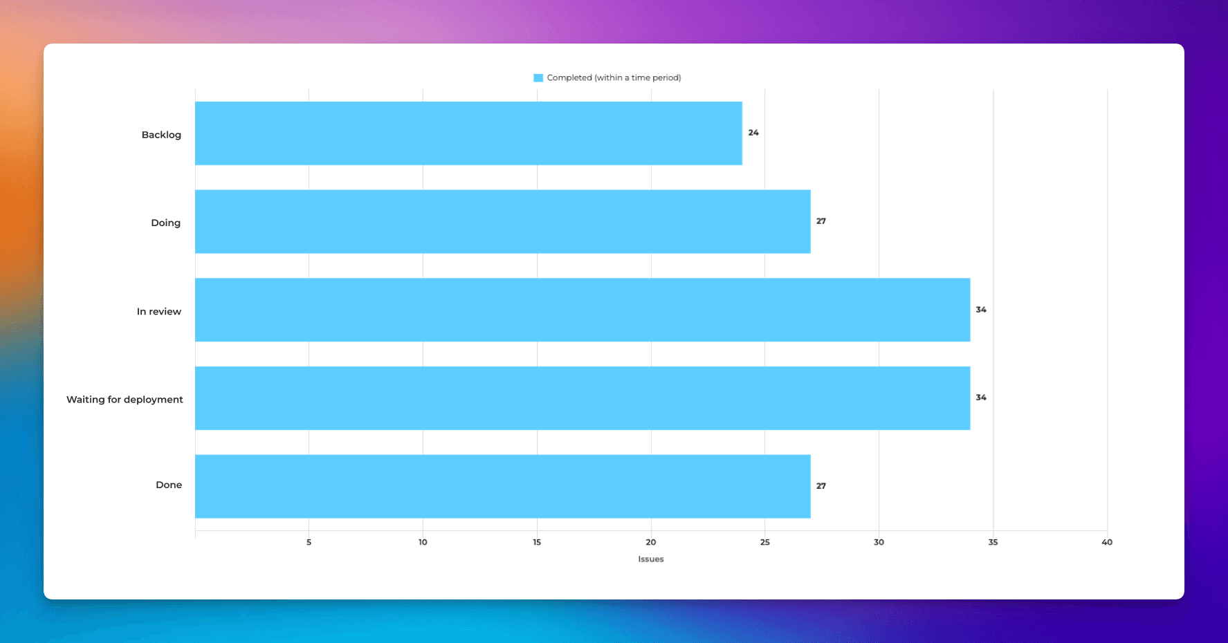
In this example, we want to create a bar chart showing how many items arrived at each state. Here's the chart configuration:
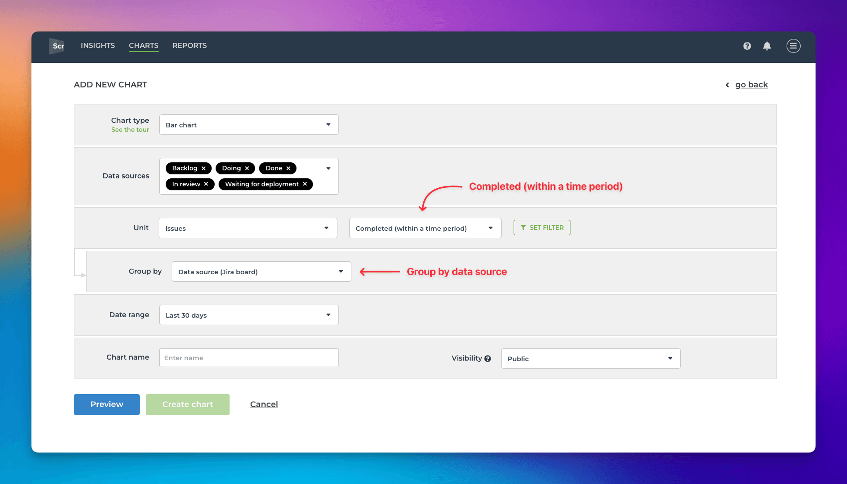
Select all the data sources you just created as the data sources for the tab. We are interested in completions, so the selected metric should be Completed (within a time period). When the chart is grouped by a Data Source, we'll get individual bars to display the numbers we wanted to see:
You can make further adjustments to the chart's appearance. In the Chart Settings, you can adjust the chart orientation (horizontal vs vertical) and the colors.
You can also switch the unit from issues to any custom number field in your data. If you have monetary values associated with the individual items, you can change the unit to display the sum of the value in USD/EUR.
Step 2: Rename the data sources
The next step is to rename the data sources so that you can see from the name which state is mapped to the done state. Click Data Sources from the main menu to see the list of data sources, then click open one of the data sources. Click the edit icon next to the data source name to open it for editing.
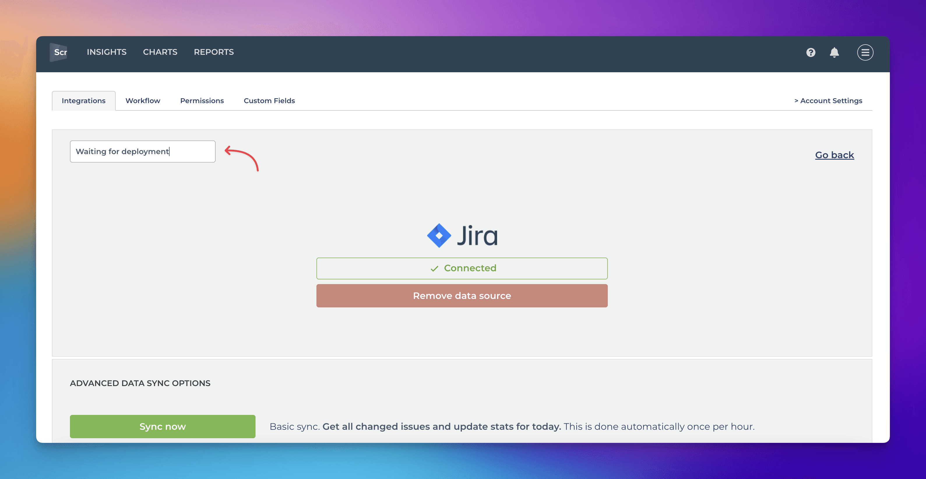
Give it a name that is the same as the name of the workflow state that was mapped to one. In this case, I've renamed it to Waiting for deployment.
Repeat the steps for all the data sources. Renaming the data sources not only ensures that you know which data sources to include in a chart but also enables the chart to display labels that make sense.