
Analytics 2 is now available to Linear users 🚀
Nov 21, 2025
Our new analytics engine, Analytics 2, is now available to all our Linear users. It is a complete rewrite of our data warehouse, data model, data retrieval algorithms, and APIs. With Analytics 2, we are bringing you the most flexible and scalable analytics for Linear data. That means faster loading of charts and the ability to tackle the more advanced analytics cases that weren't possible with our previous analytics engine.
With our new AI assistant, you can combine the leading LLMs with advanced multidimensional analytics to bring your Linear data analytics to the next level!
Contents:
Track issues and sub-issues
You can use the Task list chart to display any issue property in a list of issues:

The columns in the list are configurable and you can add any property of na issue as a column. You can add any of your issue properties or label groups as columns. Task lists are great when you need to report a specific subset of tasks based on a property such as assignee, project, or due date.
Here's a guide for creating project status reports using data from Linear.
Track how much work was completed
The velocity metric measures the amount of work a team completes during a specific period of time. You can filter the data by label, project, cycle, etc.
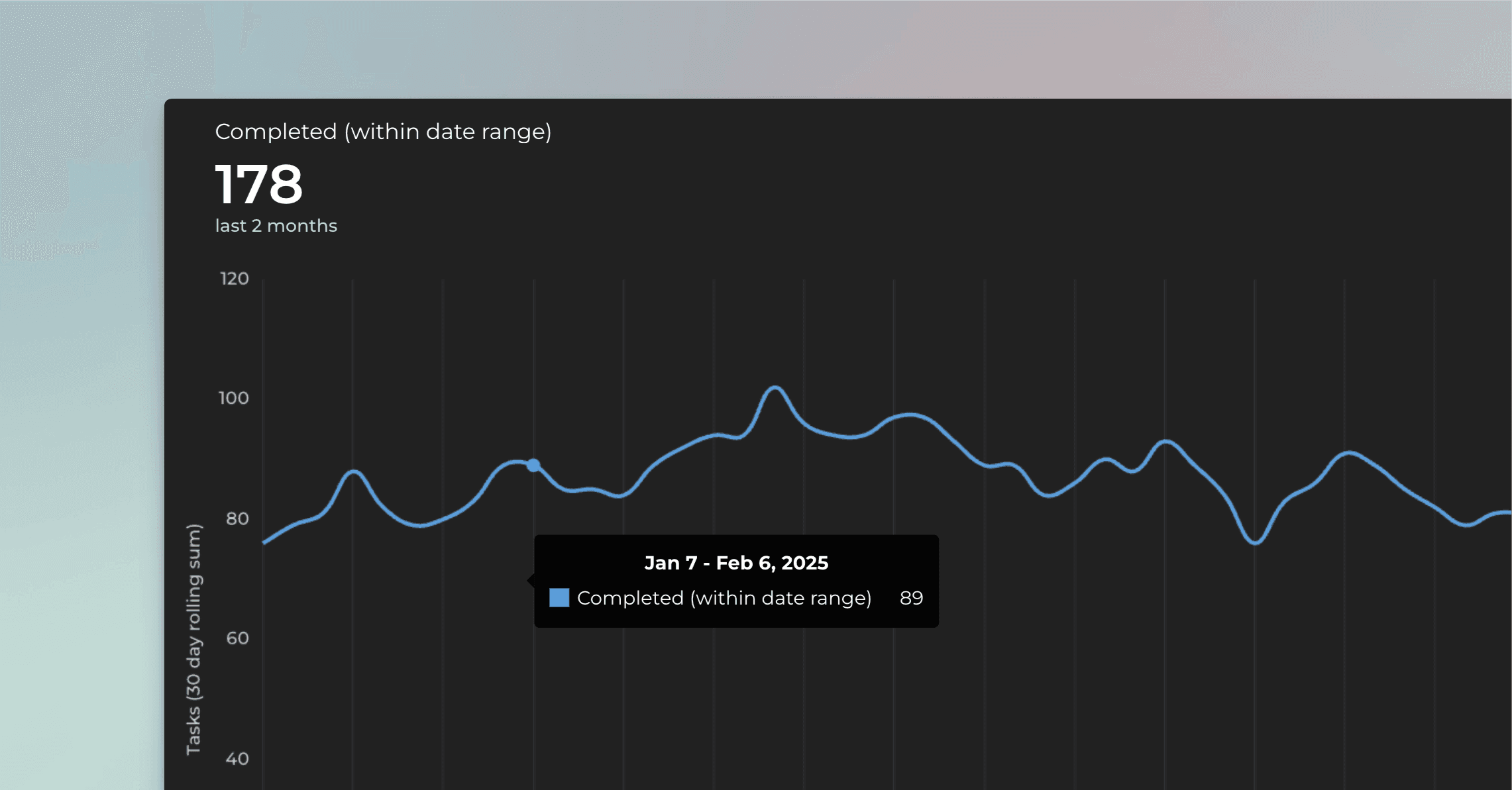
Gain insight into your velocity metrics. Are you dedicating more time to high-value work and less to rework or bug fixing?
Learn more about tracking your completed work.
Track timings: how long it took to complete a task?
See how long it takes to complete an issue on average. Track your lead, reaction, and cycle times. See how long issues stay in each workflow state.

You can see how long an issue spent on each state before completion.
Track timing metrics for board columns. Find the bottlenecks in your process to pinpoint areas for improvement. Learn more about the timing metrics.
Track label groups
When you create a chart that supports grouping (bar, stacked bar, multibar, pie, etc.), you find your label groups at the bottom of the Group by menu:

Picking a label group shows the data segmented by labels in the group:

You can use the Stacked bar chart to add another dimension to the chart. In addition to picking a label group from the Group by menu, you can pick another label group as the bar segment:

The resulting chart shows the number of issues (or estimates) grouped by a label group A-labels, with each bar segmented by another label group Development.

You can click through the bars to drill into individual issues behind the numbers.
Learn more about grouping and filtering by label groups.
Get automated cycle reports for Linear
With Screenful, you can get reports of the current cycle or any of your previous cycles.
See the burndown for any of your past cycles with a burndown chart
Aggregate cycle data across multiple teams into one chart
Include story points from both top-level issues and subissues
Here's an example chart showing the number of story points completed by cycle:

You can get this chart by going to the Charts tab and searching Estimates by cycle from templates.
All charts can be filtered by any of your cycles. There is also a special filter called Current cycle, which filters by your currently active cycle:

When your active cycle changes, the filter will automatically adjust to display the correct cycle.
Learn more about the Cycle reports for Linear.
Smart chart click-throughs
We've added more click-throughs to our charts. When you click a chart, a modal is shown listing the items that were used to calculate the number. The columns in the list are automatically selected based on the selections you've made in the chart editor so that you'll see the most relevant details for each item.
As an example, if you have selected a custom field as the unit for the chart, the click-through list will also show the same unit:

No more guessing why the numbers are as they are since you can click through to see the underlying data 🙌
About Screenful
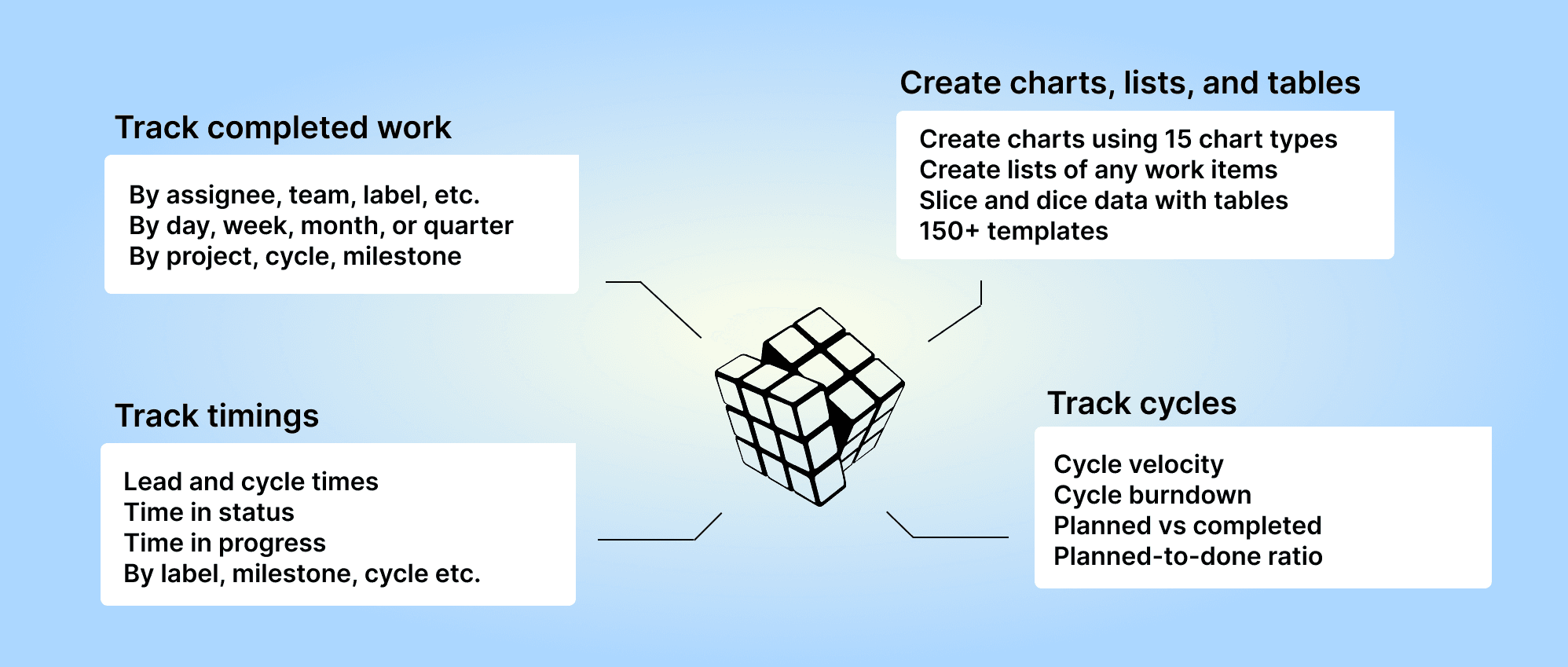
Screenful provides multidimensional analytics of the data in Linear. You can slice & dice your data with 15 different chart types, and click through to drill into details.
Analytics & Reports by Screenful is available in Linear integrations. For more information, see the guide for setting up Screenful with Linear.
Let us know if you have questions or feedback by contacting hello@screenful.com. To stay on the loop, read our blog, or follow us on LinkedIn.
