
Analytics 2 is now available to GitHub Projects 🚀
Dec 9, 2025
Our new analytics engine, Analytics 2, is now available GitHub Projects. It is a complete rewrite of our data warehouse, data model, data retrieval algorithms, and APIs. With Analytics 2, we are bringing you the most flexible and scalable analytics for GitHub data. That means faster loading of charts and the ability to tackle more advanced analytics cases that weren't possible with our previous analytics engine.
With our new AI assistant, you can combine the leading LLMs with advanced multidimensional analytics to bring your GitHub data analytics to the next level!
Contents:
Track issues and sub-issues
You can use the Task list chart to display any issue property in a list of issues:
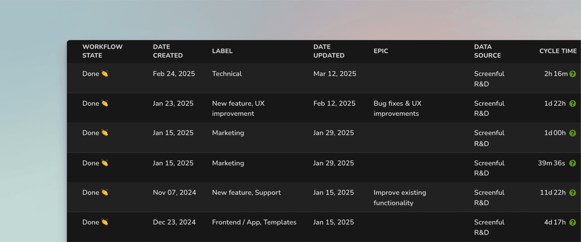
The columns in the list are configurable, and you can add any property of an issue as a column. You can add any of your issue properties or custom fields as columns. Task lists are great when you need to report a specific subset of tasks based on a property such as assignee, project, or due date.
Here's a guide for creating project status reports using data from GitHub Projects.
Track how much work was completed
The velocity metric measures the amount of work a team completes during a specific period of time. You can filter the data by label, project, milestone, iteration, etc.
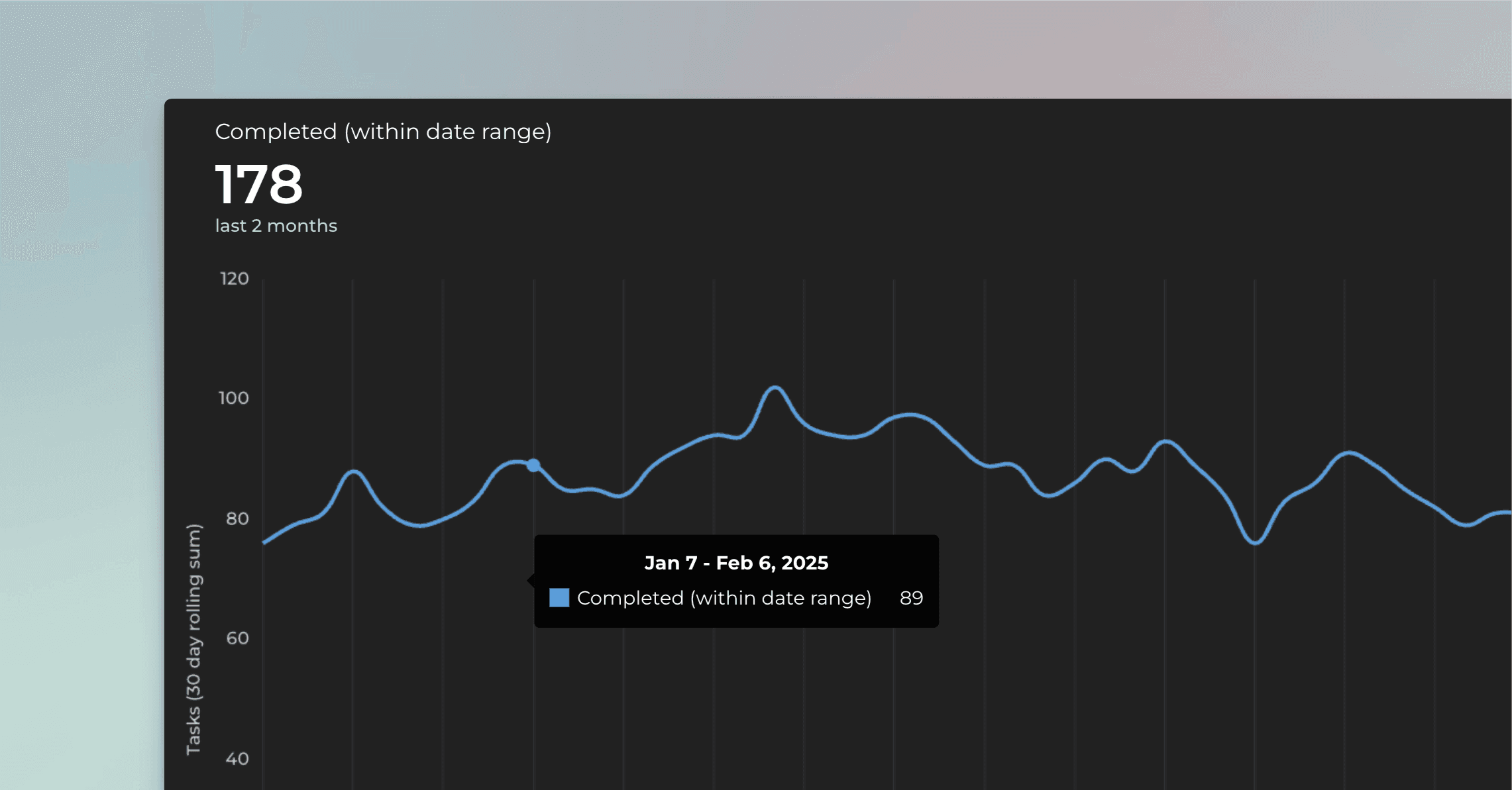
Gain insight into your GitHub velocity metrics. Are you dedicating more time to high-value work and less to rework or bug fixing?
Learn more about tracking your completed work.
Track timings: how long it took to complete a task?
See how long it takes to complete an issue on average. Track your lead, reaction, and cycle times. See how long issues stay in each status.
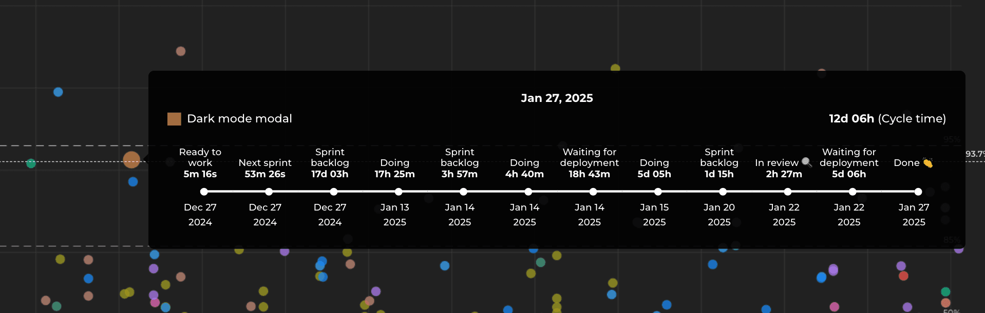
Hovering the mouse over a circle, you can see all the movements between the columns in your board, along with how long an issue stayed in that state. This view shows all the moves between the states, including the bounces backwards in the pipeline.
The cycle time per workflow state chart shows the average time spent on each status. The numbers represent the average time an issue has stayed in that specific workflow state over the selected period.
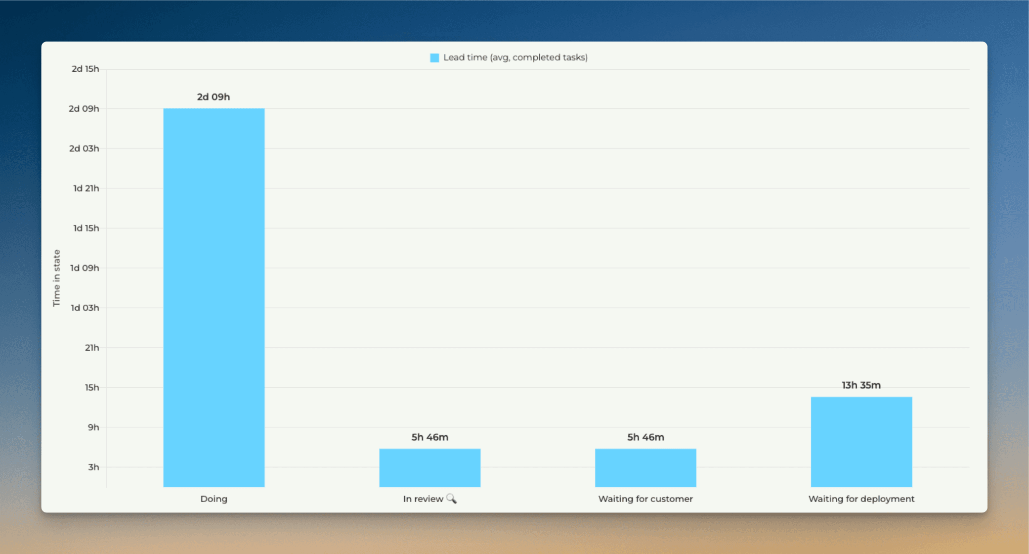
This chart tells which steps in your workflow are the quickest and which are the slowest. For example, if tasks spend a lot of time waiting in some specific state, removing that delay would increase your throughput and overall delivery speed.
Learn more about the timing metrics.
Track metrics by your custom Date fields
You can track work based on any of your custom Date fields. When you create a custom chart, you can pick a date field instead of a workflow state as the primary filter. This lets you track the tasks completed based on set completion dates.
Let's assume you have a column Completion date on your board. You can create a chart that shows how many cards have the date in the past by selecting by Completion date as the metric for the chart.
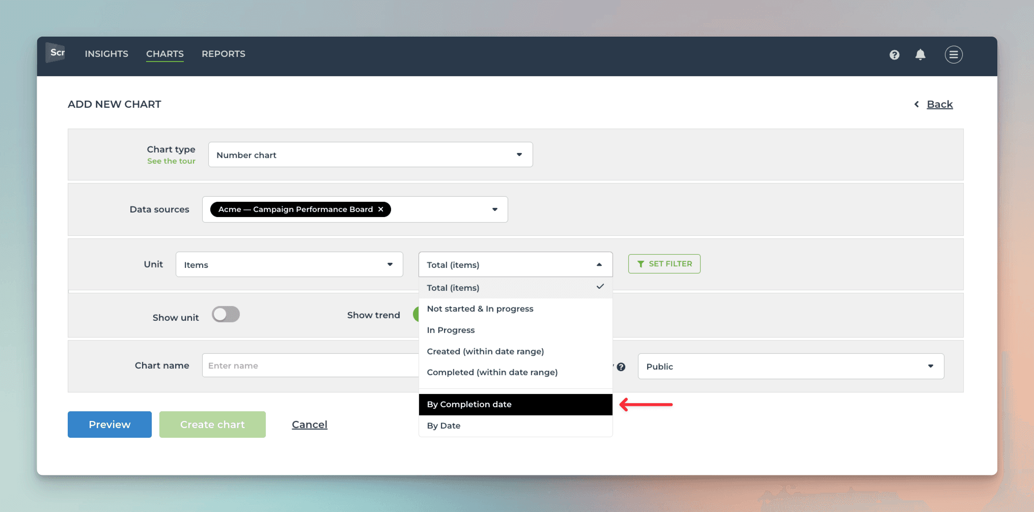
That will work the same way as if you had selected Completed (within date range), except that it will only look at the value in the date field. If the date is within the selected date range, it is included in the chart, regardless of the workflow state of that issue.
Here's the resulting chart:
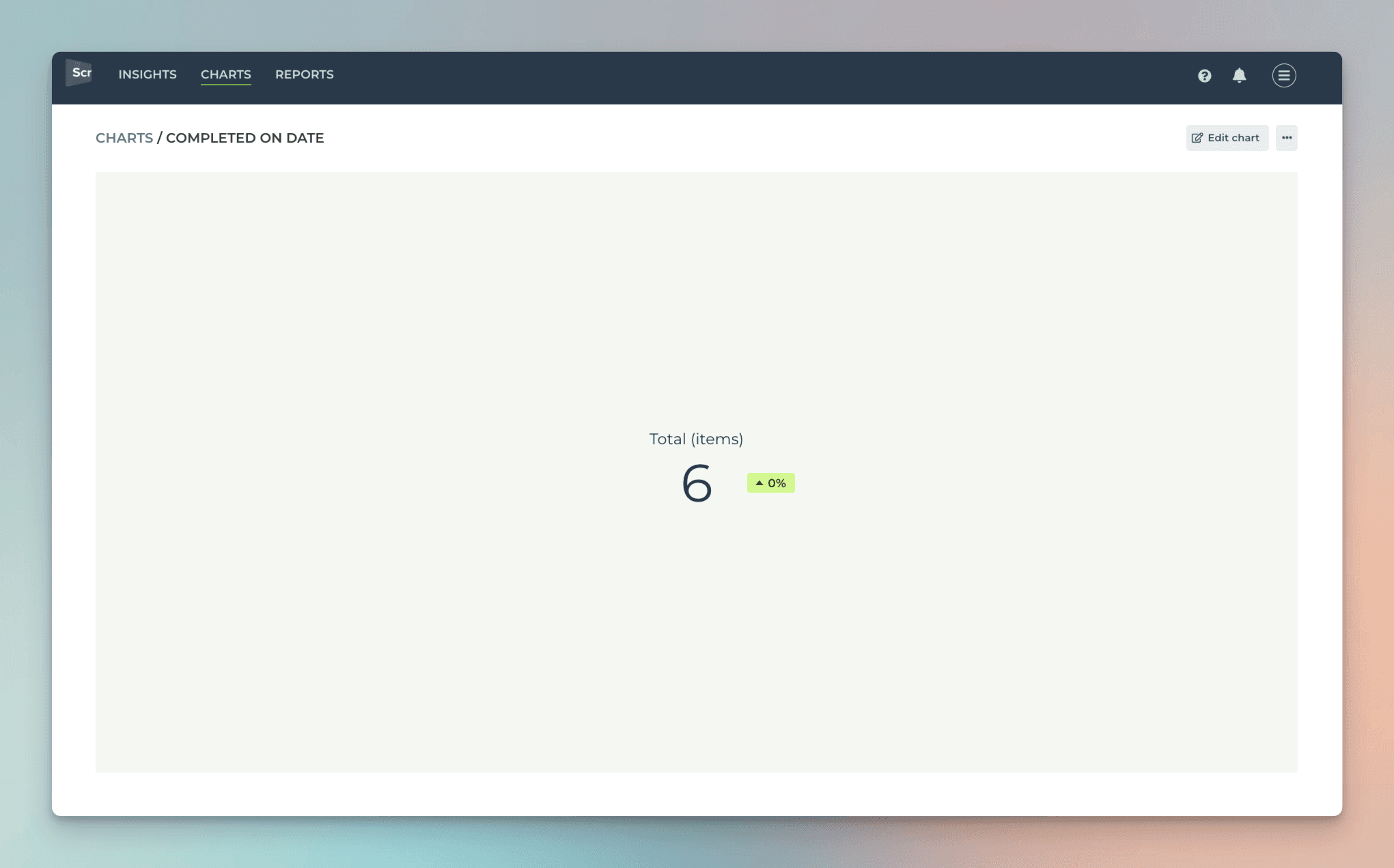
You can click through the number to see the list of issues.
Learn more about tracking GitHub Projects custom fields.
Track GitHub Pull Requests
See the number of pull requests opened vs merged.
The total number of PRs that have been created but not necessarily merged yet.
The number of PRs that have been successfully merged into the target branch (e.g., main or develop).
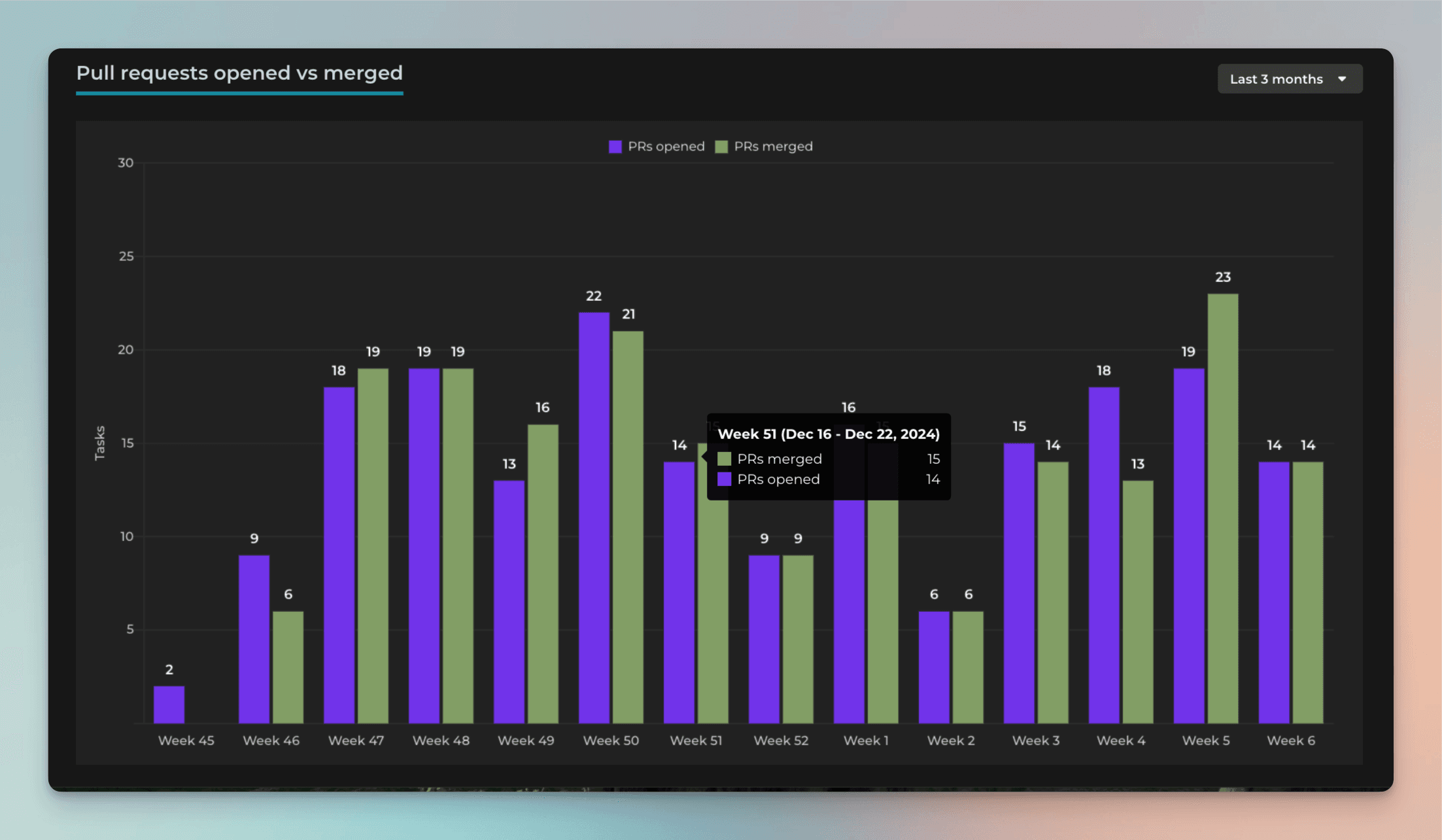
Are you opening more PRs than you can close?
To measure how long it took to merge a pull request in GitHub, you can use the scatter plot chart:
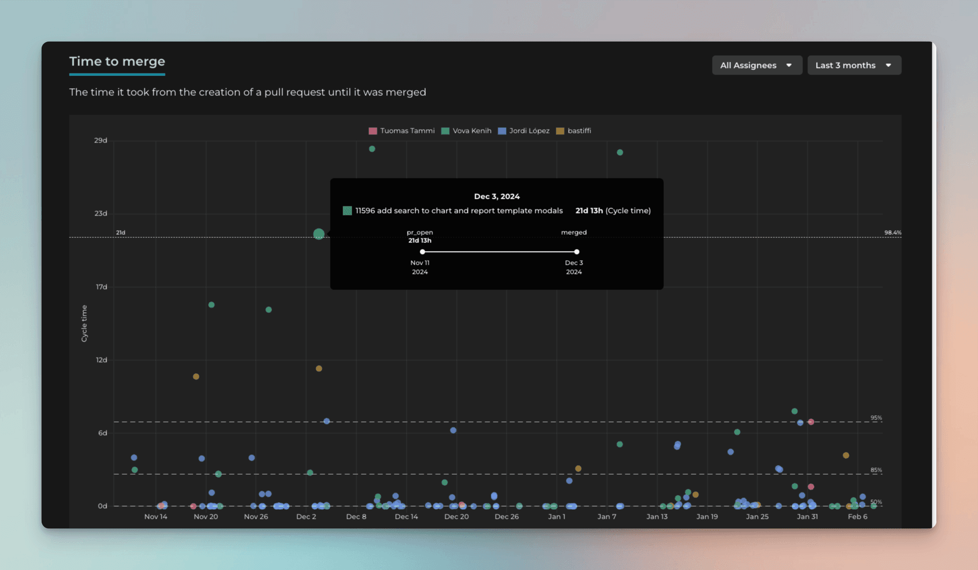
Each circle is a completed pull request. The horizontal line shows when a PR was closed. The vertical line shows how long it took to complete a PR. The higher the circle, the longer it took to complete. You can see more detailed timings when you hover the mouse over the circle.
By default, Screenful shows both issues and pull requests. You can include or exclude either one using the item type filter:
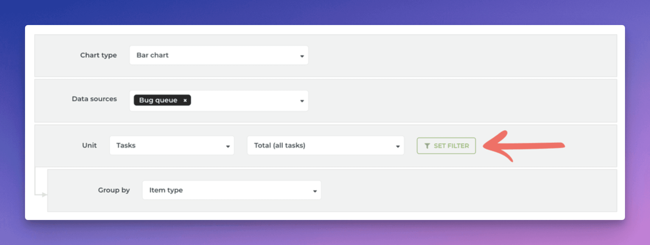
Clicking Set filter opens the filter modal:
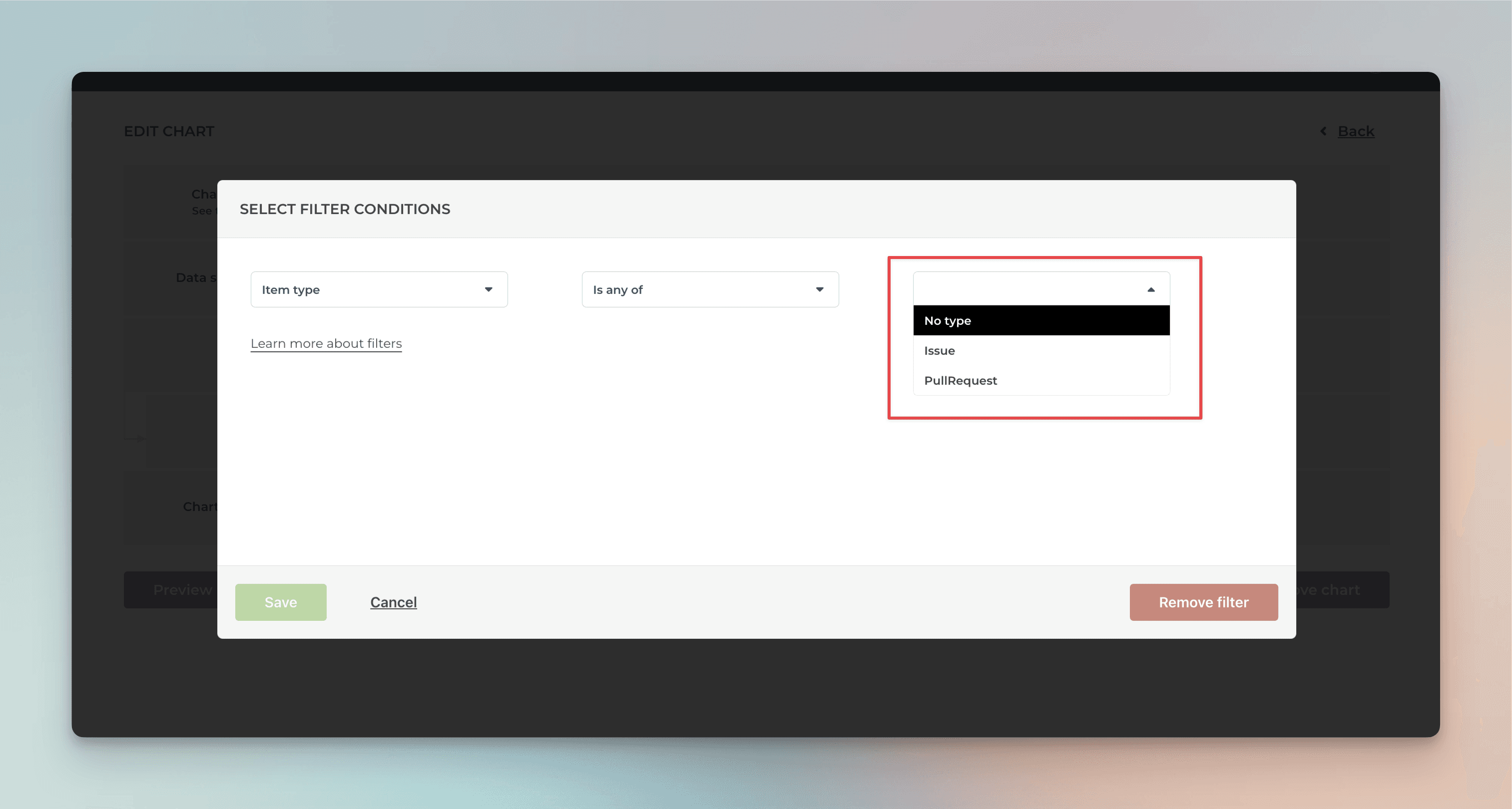
When you select Pull Request, the chart will display data only from Pull requests.
Smart chart click-throughs
We've added more click-throughs to our charts. When you click a chart, a modal is shown listing the items used to calculate the number. The columns in the list are automatically selected based on the selections you've made in the chart editor so that you'll see the most relevant details for each item.
As an example, if you have selected a custom field as the unit for the chart, the click-through list will also show the same unit:

No more guessing why the numbers are as they are since you can click through to see the underlying data 🙌
About Screenful
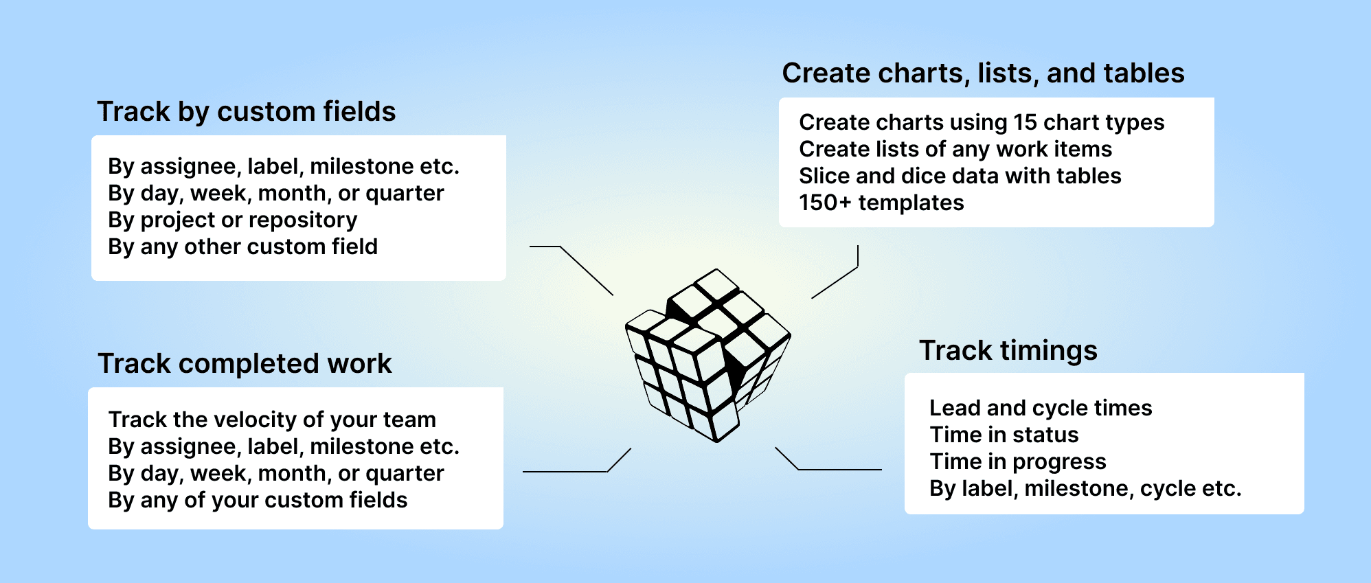
Screenful provides multidimensional analytics of the data in GitHub. You can slice & dice your data with 15 different chart types, and click through to drill into details.
To get started, start a free trial via the GitHub Marketplace. For more information, see the guide for setting up Screenful with GitHub.
Let us know if you have questions or feedback by contacting hello@screenful.com. To stay on the loop, read our blog, or follow us on LinkedIn.
