
Measuring lead and cycle times of GitHub issues
Nov 25, 2025
Timing metrics help you understand how long it takes to complete an issue. Cycle time measures the elapsed time from the start of work on a GitHub issue until it’s completed.
With Screenful, you can track timings for issues in GitHub Projects with 15 different chart types, and share that information with other stakeholders by scheduling automated reports.
Contents:
How to measure lead and cycle times correctly?
Capturing the full cycle time of a GitHub issue can be done by observing the issue history available via the GitHub API. However, some pitfalls should be avoided. To get accurate timings, you should take into account the following aspects:
What if an issue skips workflow states, or there is no sequential workflow?
What if an issue is moved from the “not started” state directly to “done” without going through any of the “in progress” states?
How does the cycle time work if an issue is moved into "in progress" and then back to "not started"?
What if a task is moved from "in progress" to "done", but then back to "in progress" again?
Should the out-of-office hours and weekends be included in the cycle time calculations?
Read on to learn how to visualise lead and cycle times of one or more GitHub Projects with various charts.
See the trend of your cycle time
The Cycle time trend shows your cycle time over the selected date range. You can filter the data according to task type to track a specific aspect of your work, such as projects, leads, or support tickets. Timings are calculated from the completed items.
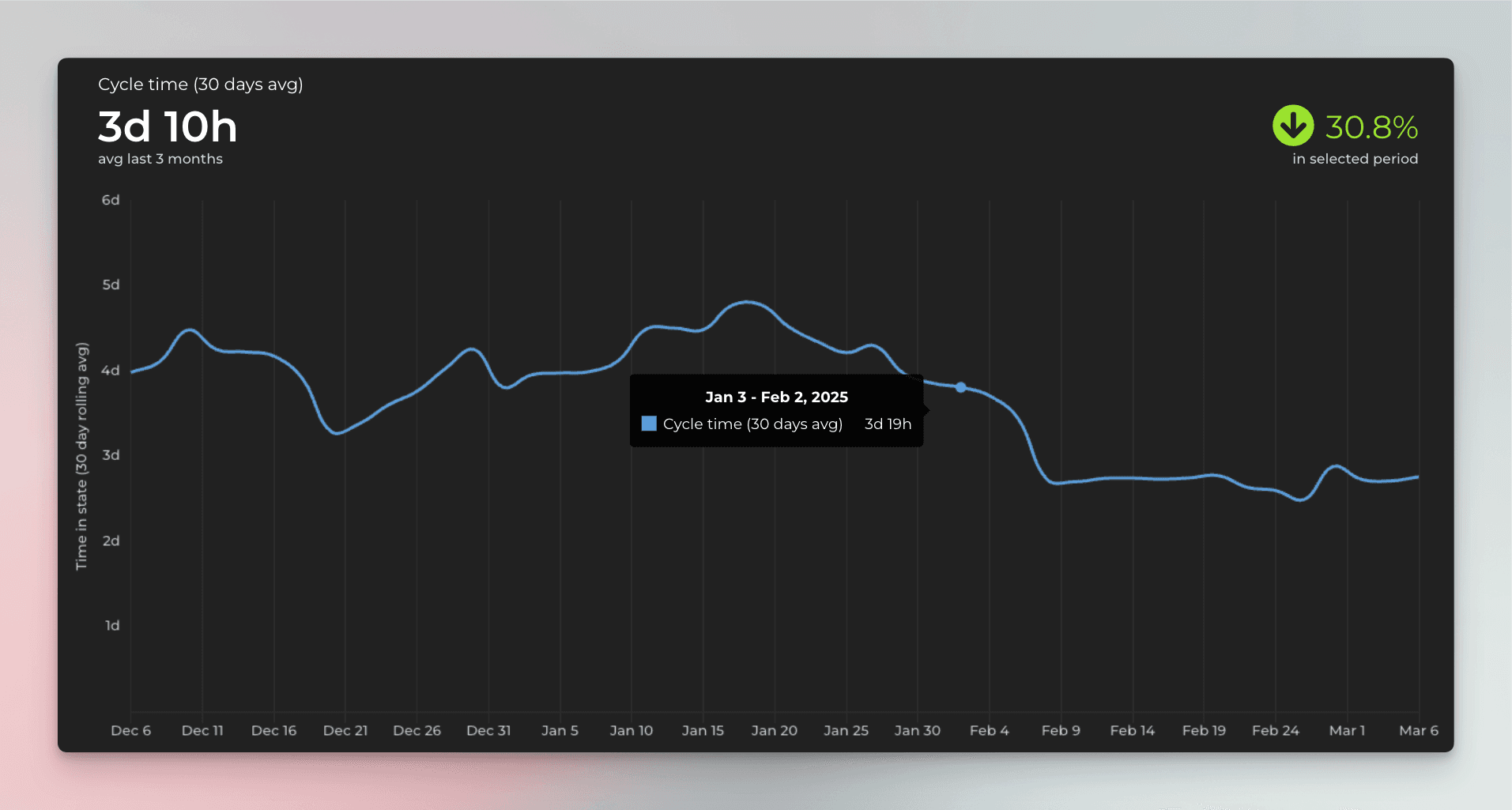
Cycle time is a measure of the elapsed time from the start of work on a task until it is deployed.
What can you do with that data? Let's consider a situation where your team is asked by business owners how it takes to implement a piece of work. Instead of just making a guess, the team can look at the data to see how long it has taken in the past to complete similar tasks and provide a data-driven estimate.
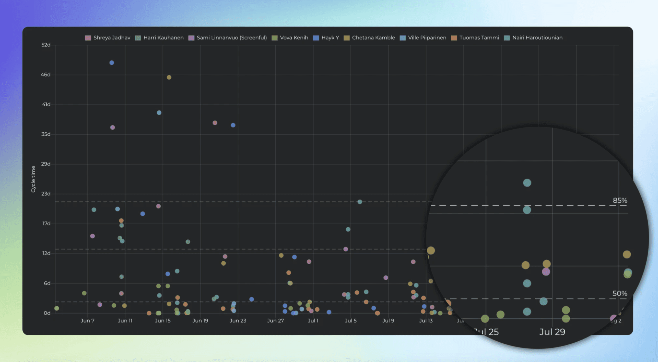
Another good way of visualising cycle times is by using a scatter plot, which presents data points in two dimensions according to the selected variables - cycle time and completion date.
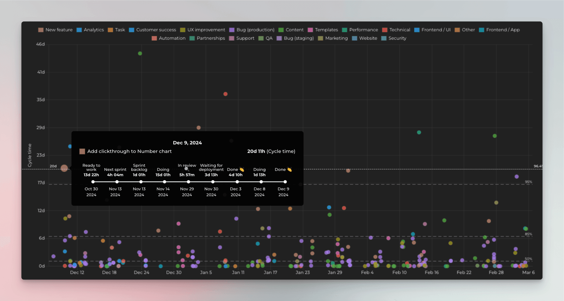
Each circle corresponds to a completed issue. The higher the circle, the longer it took to complete it. The horizontal axis is time. That allows you to visually see the outliers. For example, you can see how many issues took more than 7 days to complete.
The dotted horizontal lines represent the percentiles. The default ones shown are 50th, 85th, and 90th percentile. The left edge shows the number of days, and the right edge shows how many percentages of the issues were completed in less than that time.
See how long each workflow step takes
While it is helpful to know your overall cycle time and its trend, you may want to dig in deeper. The Cycle time per workflow state chart shows the average time spent on each status. Workflow steps are the statuses of your issues when they progress through your workflow.
The numbers represent the average time an issue has stayed in that specific workflow state over the selected period.
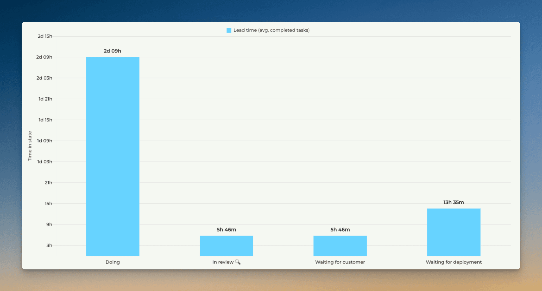
This chart tells you which steps in your workflow are the quickest and which are the slowest. For example, if tasks spend a lot of time waiting in some specific state, removing that delay would increase your throughput and overall delivery speed.
If you want to know which tasks are the slowest ones for each workflow state, you can analyse the timings of individual tasks.
You can also track the cycle time trend of any individual workflow state. Here's a line chart showing the trend for the In review state:
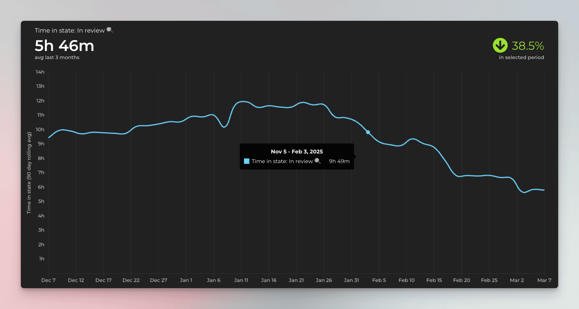
In this example, the review time has decreased by 38,5% during the selected time period, which is a positive trend. If the trend turns and the review step starts getting slower, you might consider adding more QA resources or exploring other ways to reduce delays in that specific step.
See timings for work in progress
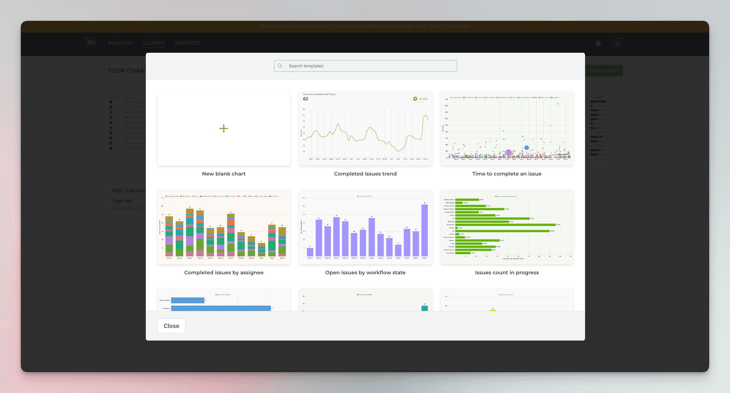
To create a custom chart with Screenful, go to the Charts tab and click Add new chart in the top right corner. A modal is opened with a set of chart templates. You can either create a new chart from scratch or pick one of the predefined charts.
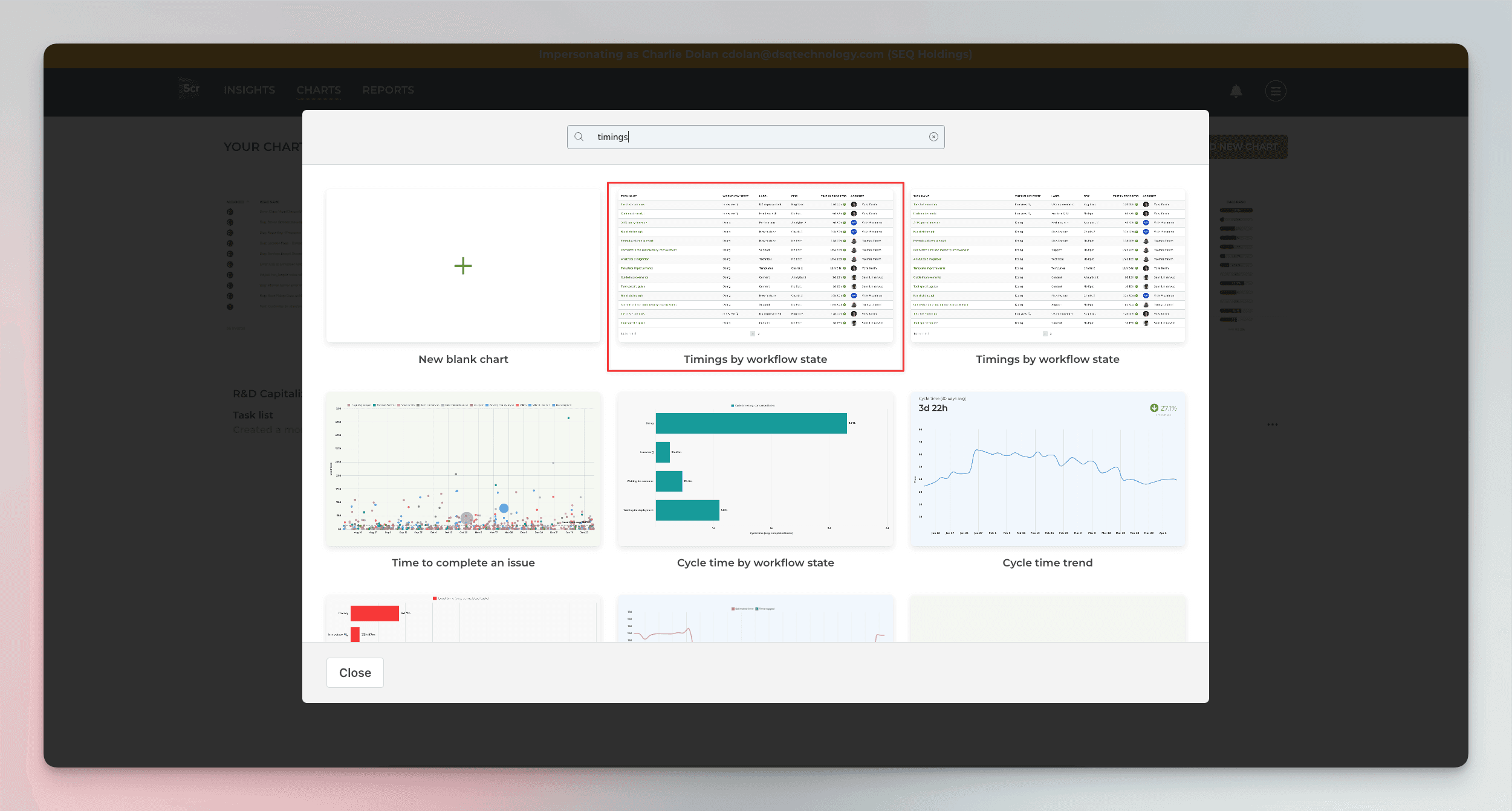
You can filter the template list using the top search box. Searching "timings" shows the charts related to the timing metrics. Click the first template called Timings for work in progress:
The resulting chart shows the current work in progress and how long they've been in progress so far:
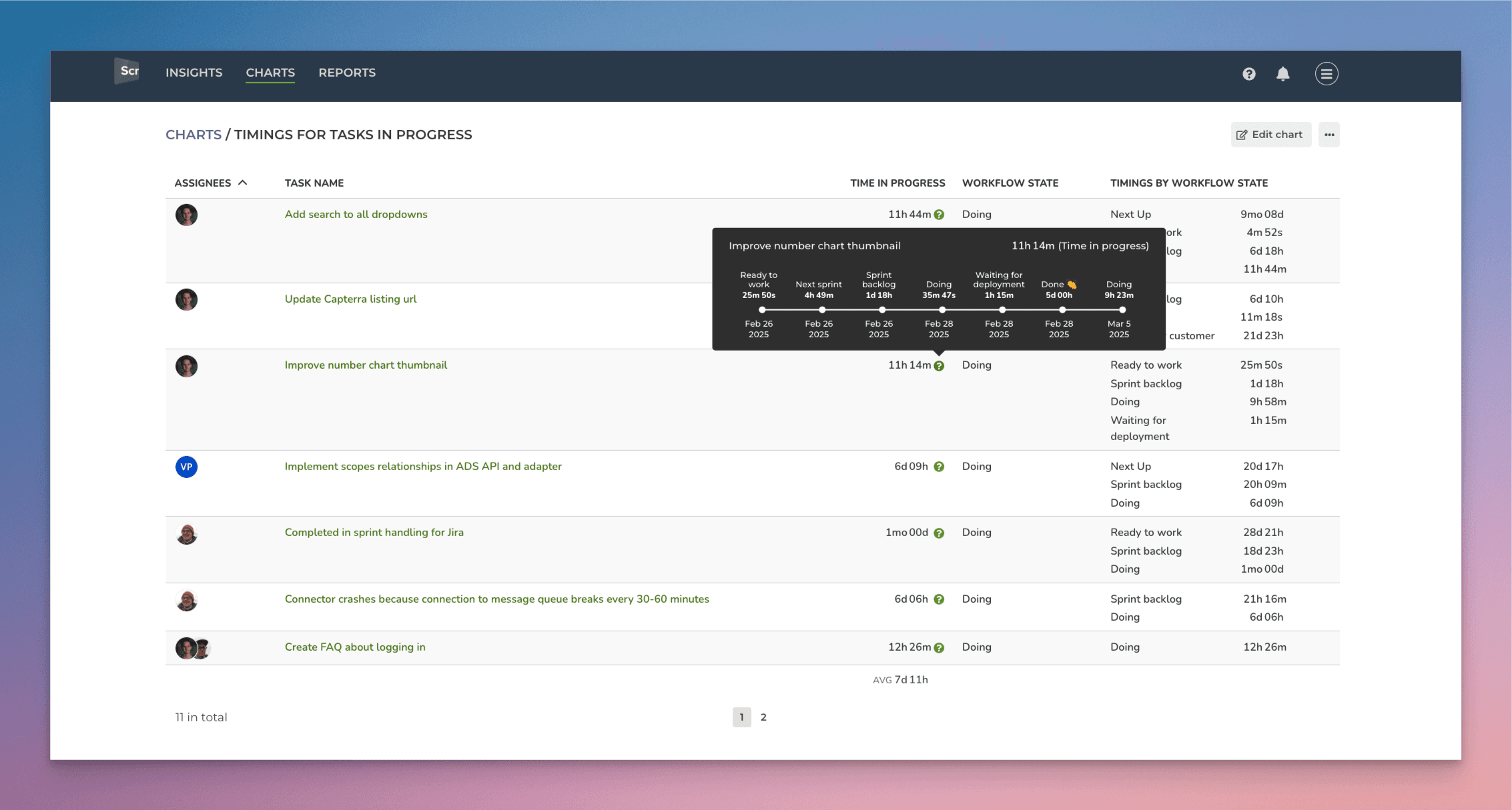
The Time in progress column shows how long ago the issue was started. The summary at the bottom shows the average time in progress across all issues currently in progress.

You can configure the summary in the chart settings to display either sum, average, or median.
When you hover the mouse over the question mark, you see the movements between workflow states:
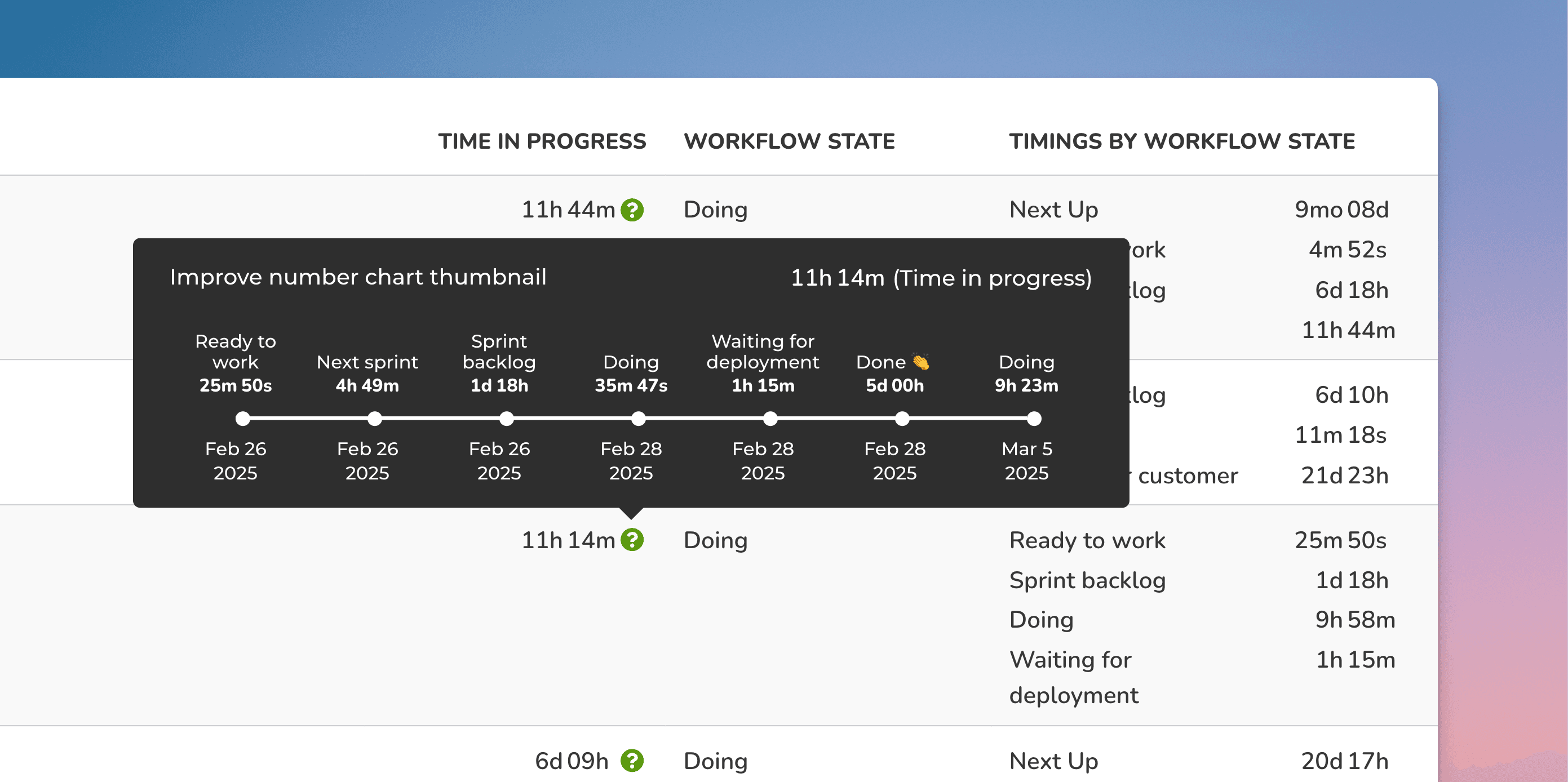
On the modal, you can see all the movements between the columns in your board, along with how long an issue stayed in that state. This view shows all the moves between the states, including the bounces backwards in the pipeline.
The rightmost column shows the totals per workflow state:
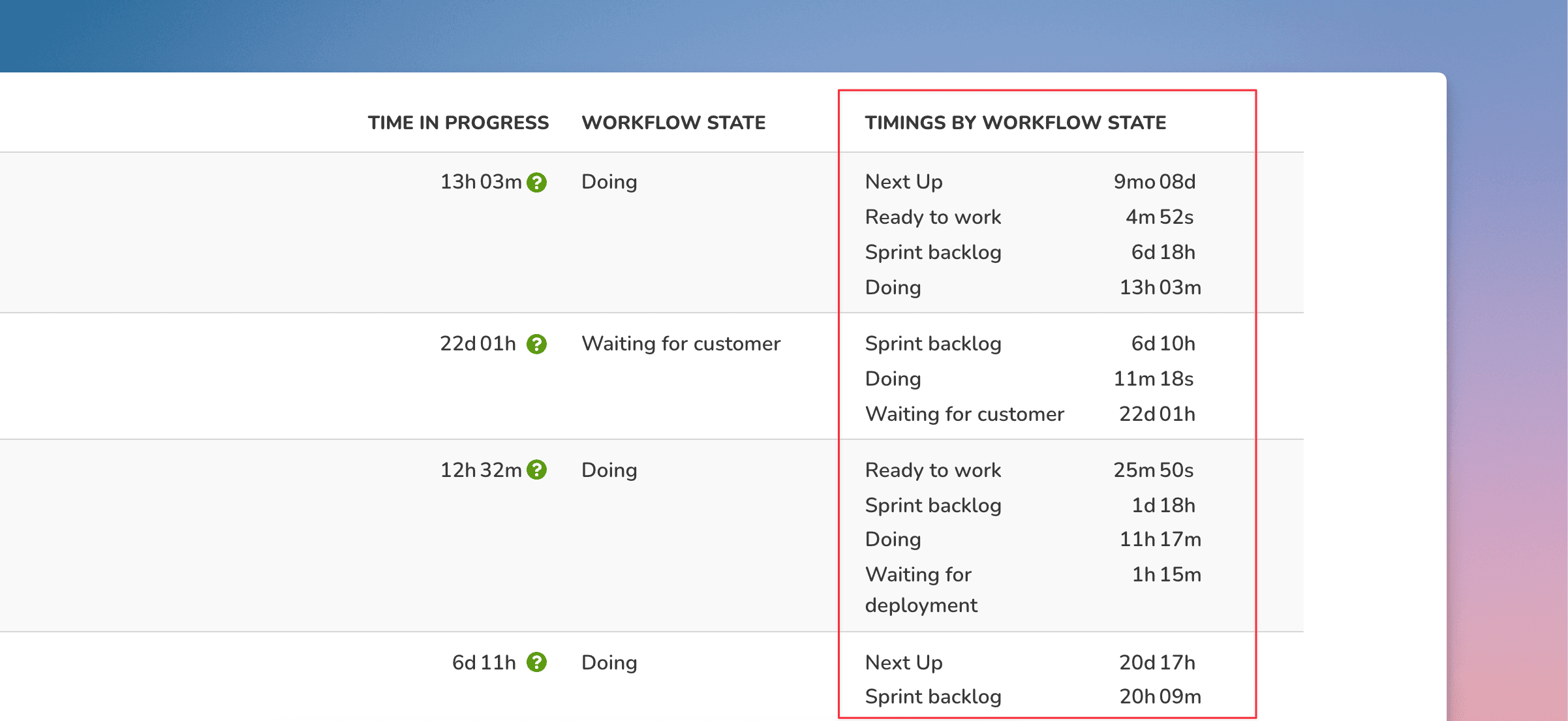
The Timings by workflow state column shows the total time the task has spent in different states so far.
You can use the Task list chart to display the timings for any GitHub issue.
Set working hours
When you create a chart using the Time in state unit, there is a checkbox only working hours. When selected, the chart will calculate the timing metrics from the working hours only.

The working hours can be specified in the Account settings:

Create a cycle time report from a template
The quickest way to get the cycle time metrics is by using a report template. Go to the Reports tab and click Add new report:
A modal opens, showing the available templates. Select Timings report. You'll get a complete report containing the metrics introduced in this article.
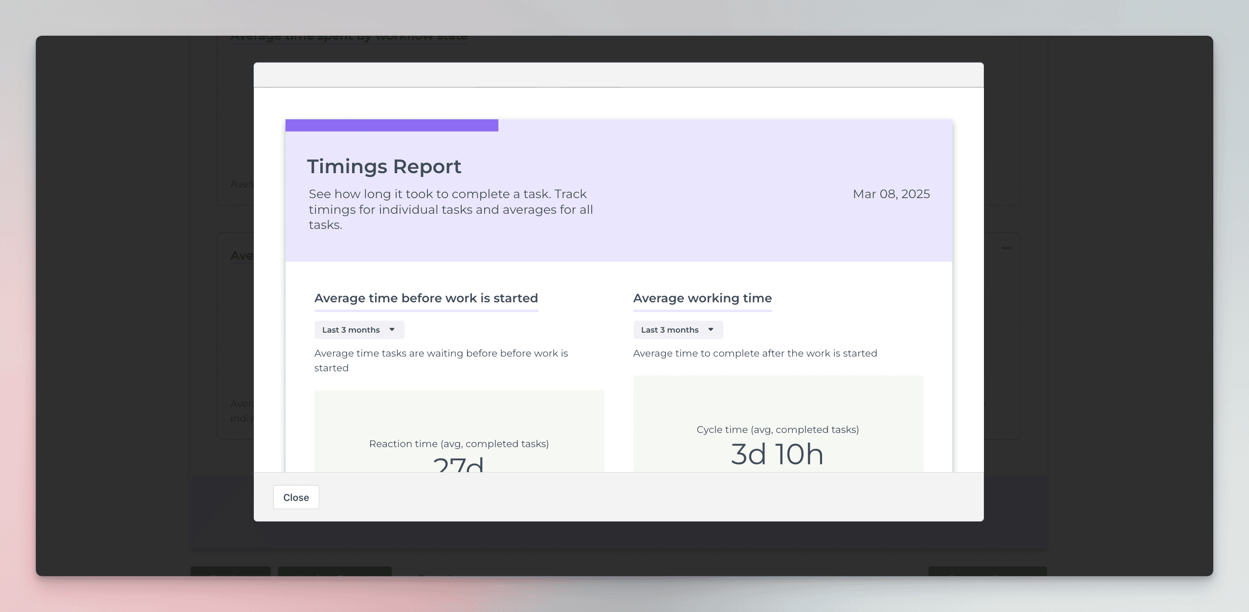
The best thing is that each chart in the report is configurable so you can create the exact report you need.
See also:
About Screenful
Screenful provides multidimensional analytics of the data in GitHub. You can slice & dice your data with 15 different chart types, and click through to drill into details.
To get started, start a free trial via the GitHub Marketplace. For more information, see the guide for setting up Screenful with GitHub.
Let us know if you have questions or feedback by contacting hello@screenful.com. To stay on the loop, read our blog, or follow us on LinkedIn.
