Configuring the summary row in a Task list chart
By default, the Task list chart does not include a summary. To enable the summary row, visit Chart settings and use the toggle Show summary row to enable the summary row for the chart.
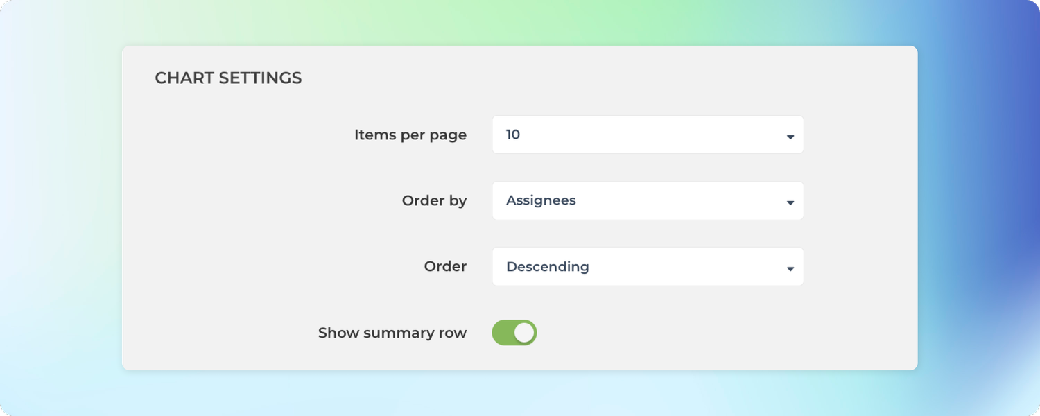
In the Chart settings, you can configure the type of summary for each column to be either sum, average, or median. If you select None, no summary is displayed.
The summary menus are shown for each column that contains numerical or timing data.
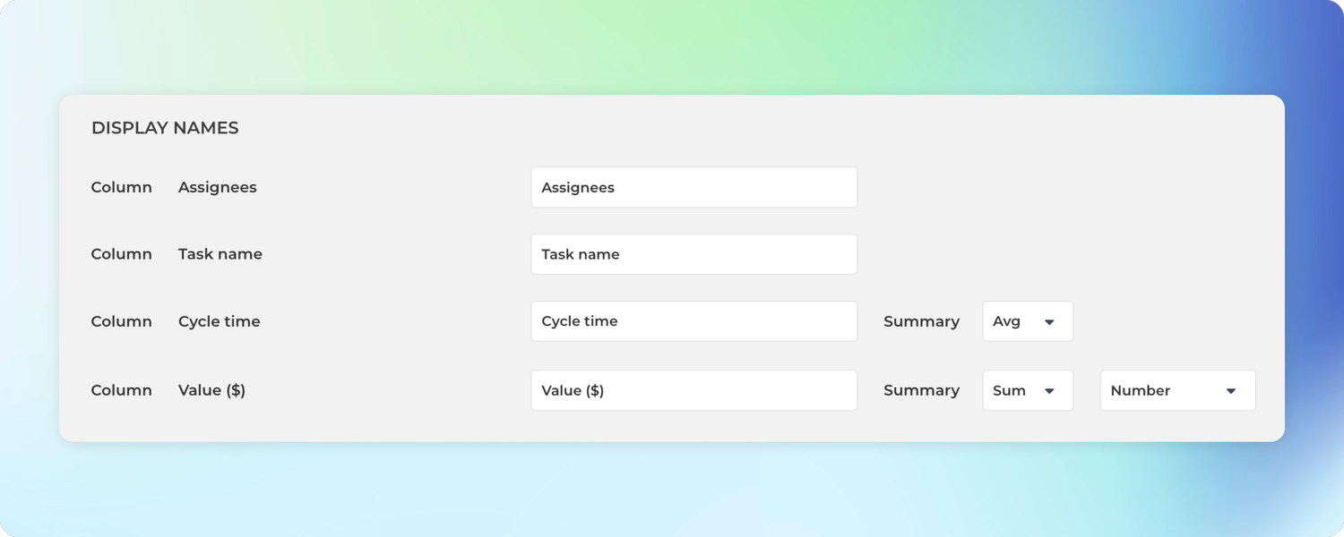
Once you have saved the settings, the chart starts displaying a summary row at the bottom.
If you have added numerical columns to your reports such as estimates or story points, or financial data like budgets and costs, you can use the summary row to display the totals for the selected columns. That makes your reports much more powerful!
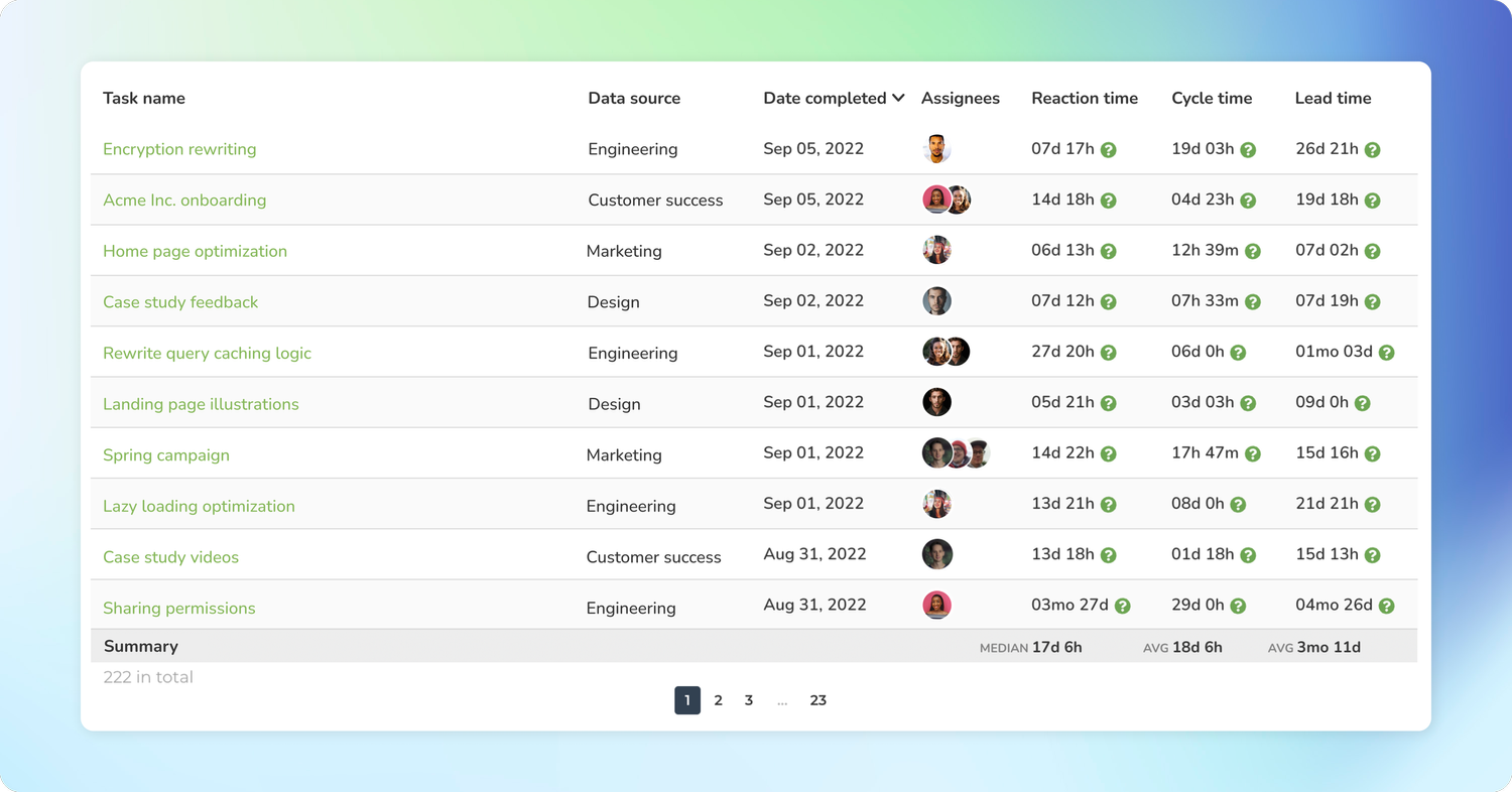
Configuring the summary row in the Table chart
The Table chart also comes with a summary row that displays the sum, average, or median for each column in the table. You can configure the summary type in the chart settings
Here’s an example Table chart with the summary row:
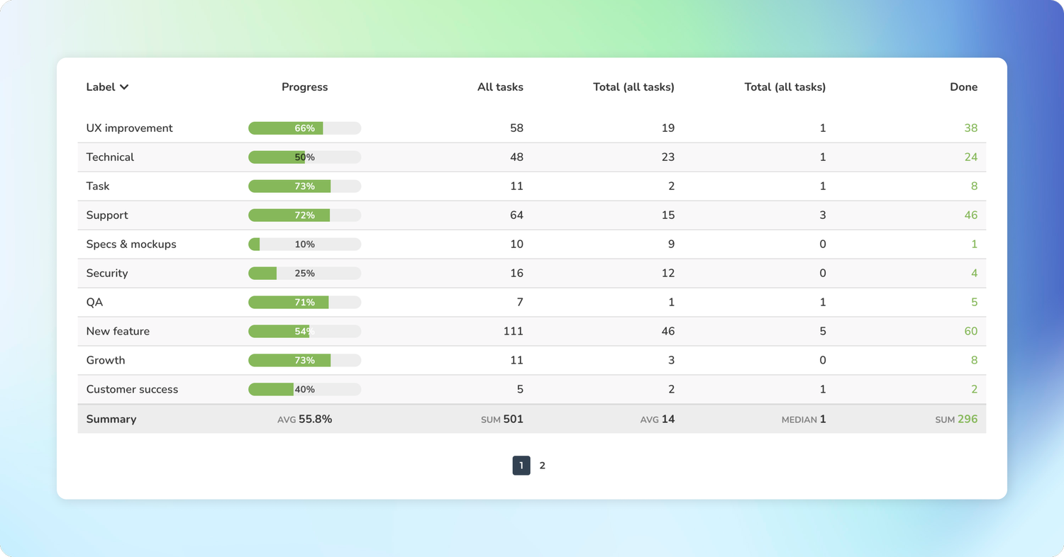
Unlike in the Task list chart, the summary row in the Table chart is fixed, and there is no setting to toggle it on or off. However, you can configure each column separately, and if you select None, no summary is displayed for that column.