
Analytics 2 is now available to all monday.com users 🚀
Mar 17, 2025
Our new analytics engine, Analytics 2, is now available to all our monday.com users. It is a complete rewrite of our data warehouse, data model, data retrieval algorithms, and APIs. With Analytics 2, we are bringing you the most flexible and scalable analytics for monday.com data. That means faster loading of charts and the ability to tackle the more advanced analytics cases that weren't possible with our previous analytics engine.
With our new AI assistant, you can combine the leading LLMs with advanced multidimensional analytics to bring your monday.com data analytics to the next level!
Contents:
Create charts using Formula columns
Monday's Formula columns can be used as units in the charts. When creating a chart, formula columns are selectable in the unit menu:

In this example, the unit menu contains two Number columns: Budget and Spent. There is also a formula column Remaining, that shows the difference between the budget and spent. When you select Remaining as the unit for the chart, you'll see the sum of Remaining:

When you click through the number, you'll see the individual items and how much is Remaining per each item:

Read the blog post for more information.
Track work by any date or timeline column
You can track work based on any of your Date or Timeline columns. When you create a custom chart, you can pick a date field instead of a workflow state as the primary filter. This lets you track the items completed based on set completion dates.
Let's assume you have a column Completion date on your board. You can create a chart that shows how many items have the date in the past by selecting by Completion date as the metric for the chart.

That will work the same way as if you had selected Completed (within date range), except that it will only look at the value in the date column. If the date is in the past, it is considered completed, regardless of the workflow state of that item. It is an alternative way of tracking work completions.
Here's the resulting chart:

You can click through the number to see the list of items.
You can also create Task lists and filter them by custom date columns. Here's an example configuration for a Task list:

When you pick a date column from the menu, the resulting task list contains items that have the date within the specified date range:

You can track work based on your Timeline column in the same way as your Date column by mapping the column to the Start date and Due date in the custom field mapping. To access the custom field mapping, select Data Mapping under the main menu and navigate to the Custom Fields tab.

The rightmost column shows the the mapping of the column. You can adjust the mapping by clicking the item from the list:

Since Timeline contains both start and end dates, you can map it to either a start date or an end date, and the other date is automatically mapped to the same Timeline field.
Improved Mirror column handling
Your Mirror columns are automatically imported and made available for charts. Their handling depends on their type. If a mirror column contains a number, it is mapped to Unit, and can be used as a unit in all charts. All other mirror columns are mapped to Text and can be used as columns in the Task list.
Mirror columns come with an aggregation function. Screenful applies the aggregation function to the values and stores the result as either a number or text, depending on the type of the mirror column.
If a mirror column is of type Date, there is a setting that specifies how that mirror column is displayed on your board:

That setting dictates whether a single date is shown or a date range:

Screenful reads that setting and formats the Dates accordingly when they are displayed in a Task list. If the Summary is set to Earliest or Latest, a single date is shown:

If the Summary is set to Earliest to Latest, a date range shown:

So, the format used in the Task list follows the format configured on your board.
New Time tracking report template
You can create a time-tracking report by using a report template. Go to the Reports tab and click Add new report:

A modal opens, showing the available templates. Select Time tracking report:

A report containing time-tracking data from the selected Monday boards is created.

Learn more: Creating charts based on monday.com time tracking data
Smart chart click-throughs
We've added more click-throughs to our charts. You can now click through from Table chart, Number chart, Bar chart, Stacked bar chart, and Burndown chart. When you click a chart, a modal is shown listing the items that were used to calculate the number. The columns in the list are automatically selected based on the selections you've made in the chart editor so that you'll see the most relevant details for each item.
As an example, if you have selected a custom field as the unit for the chart, the click-through list will also show the same unit:

Likewise, if you have a chart showing the total amount of hours logged for a project, the click-through list shows the time logged per each item:

No more guessing why the numbers are as they are since you can click-through to see the underlying data 🙌
New guides added
We've added more guides to help you get more out of these new analytics capabilities.
monday.com units, metrics, and properties - Screenful Guide for monday.com
Create charts using different monday.com column types - Screenful Guide for monday.com
Stay tuned for more analytics capabilities for monday.com that we will be introducing in the coming months!
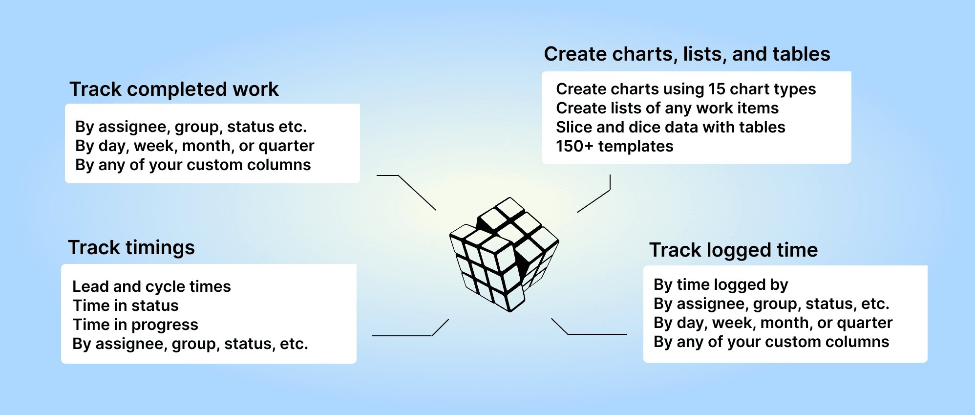
About Screenful
Screenful provides multidimensional analytics of the data in monday.com. You can slice & dice your data with 15 different chart types, and click through to drill into details.
Analytics & Reports by Screenful can be installed via the monday.com Apps Marketplace. Once installed, it adds an entry to the left menu that allows you to access your charts and reports within the Monday UI.
Let us know if you have questions or feedback by contacting hello@screenful.com. To stay on the loop, read our blog, or follow us on LinkedIn.
